
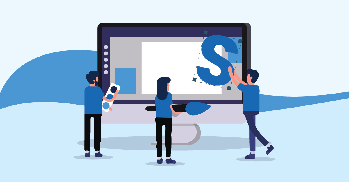
Even if logos are one of the first things your target audience sees, it takes them time to recognize your brand. According to Zippia, it takes around 5 to 7 looks before a logo is ingrained in their head. Make first impressions count with your logo. That said, if you have a business that starts with an S and you need a logo, check out the letter S logo design inspirations below. These letter S logo ideas are made by fantastic graphic designers here at Penji!
Why Do You Need a Custom Logo?
Many businesses start with S across different industries. Some examples include Shell, Salesforce, Starbucks, Shangri-La Group, State Farm, Sony, and so much more! And if you want to differentiate your business from your competitors and other brands, here’s why you need a custom logo.
- It gives a visual representation of your brand. Imagine if the companies mentioned above don’t have a logo. Their names wouldn’t be mentioned at all. The custom logo will make your brand recognizable and memorable.
- Having a custom and unique logo will give you a leg up over the competition. Sure, you might want to save a couple of bucks to create your own logo. But, having one created by professionals shows that you’re willing to invest in establishing a solid brand.
- It will capture the essence of your business and your target audience. Generic logos don’t have that quality. If you hire designers for your logo, they will ensure that your business is well-represented in the logo and that it will capture your target audience’s attention.
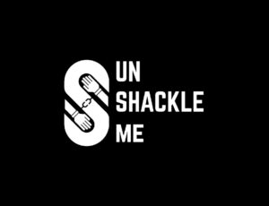
1. UnShackle Me

Although their name doesn’t start with an S, Unshackle Me uses an S for their combination letter mark and pictorial logo. The S would represent shackles, which are opened to free someone. And the hands appear free from constrictions.
Let your brand voice be heard with a unique S logo
Hire a logo designer today and get your logo in 1 to 2 days
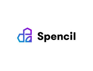


2. Spencil

Most interior design logos would show illustrations of houses or furniture. But this one for Spencil is different. Upon closer look, their logo has an S that appears like an infinity sign. Plus, the pencil tip is also there, representing a part of their business name. It’s a modern, simple, and unique letter S logo.
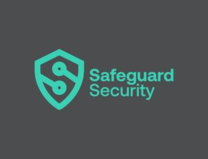
3. Safeguard Security

Logos set the first impressions of your brand. And being visual, it’s easier for them to recognize a business better. If, at first glance, you want a recognizable logo and one that would set you apart from the competition, check out this logo for Safeguard Security. Without even knowing the name, you’ll know they’re a security or cybersecurity company based on the shield. If you look closely, you’ll see the shape of an S in the shield too.
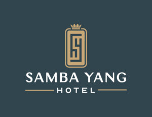
4. Samba Yang Hotel

Many hotel logos would usually ooze elegance or luxury to show they’re a revered hotel guests should stay in during their vacation or business trip. This one for the Samba Yang Hotel is no exception. The combination mark logo uses an emblematic format. If you look closely, you’ll see the letter S formed by the small letters h and y, which represent “hotel” and “Yang.” Plus, the added crown is a nice touch to the emblematic logo, giving it a more luxurious feel.
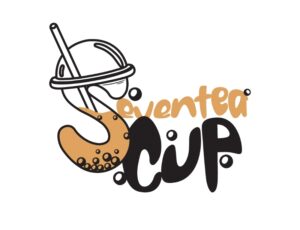
5. Seventea Cup

If you’re planning on starting a bubble tea business, you can use the Seventea Cup logo for inspiration. Most bubble tea logos use a plastic cup with milk tea and boba. Instead of sticking with the usual cup shape, the Seventea Cup logo forms an S with the plastic cup, making it stand out from other bubble tea stores. Moreover, the font used appears like liquid, similar to the product they’re selling.
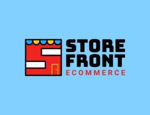
6. Store Front eCommerce

Most eCommerce logos are wordmark types; prime examples include Amazon, Warby Parker, and Modcloth. But this one for Store Front eCommerce is unique and recognizable. It uses a combination logo with a pictorial mark and wordmark. The designers shaped a letter S on the storefront. Aside from that, the logo uses red, which grabs the attention of people browsing online.
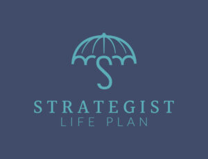
7. Strategist Life Plan
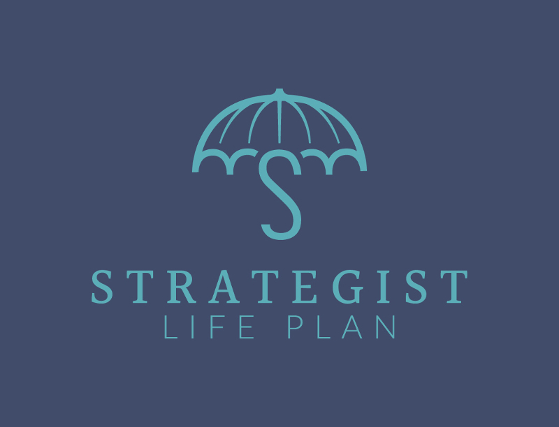
Make your target audience save for a rainy day with this logo for Strategist Life Plan. Sure, most insurance logos would show houses for home insurance or shields for protection or security. But the Strategist Life Plan is different from most insurance business logos in a good way! It’s unique, and you will rarely see umbrellas on logos.
8. Streamline Clothing
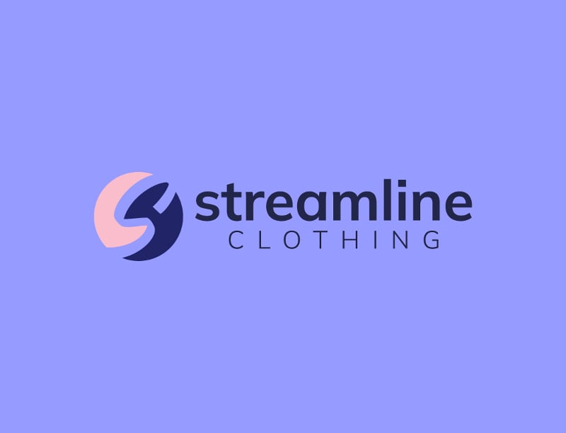
Stick to the basics like this logo for Streamline Clothing. One element of logo design is simplicity. Using a combination mark, Streamline Clothing has an abstract mark of sharp figures that form the letter S and the added wordmark. One way to make your business name recognizable is by using bolded letters. It will help your target audience remember your name better along with the imagery.
9. Struck Solar
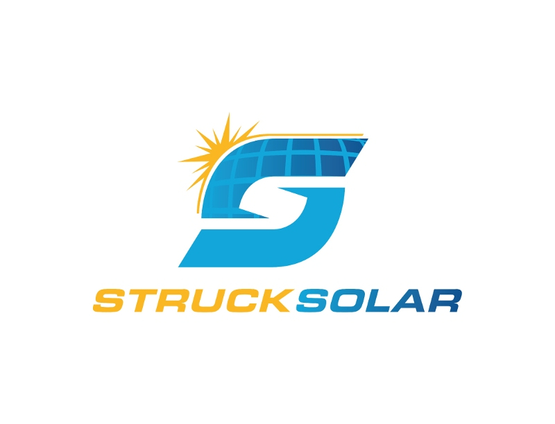
Brighten up your logo like this one for Struck Solar. The logo shows solar panels, which will help their target audience know they’re in the solar power business. Aside from the imagery, the added yellow gives the logo more life, showing the audience what solar power does.
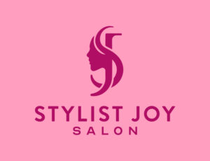
10. Stylist Joy Salon
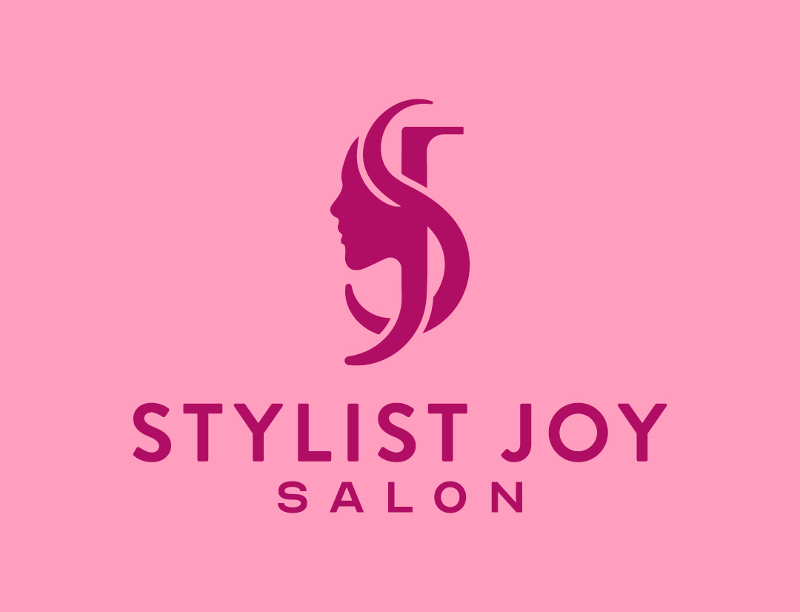
Hair salon logos would usually show scissors to signify cutting hair. But this one for Stylist Joy Salon enhances the branding for the stylist by combining the letters S & J and showing a silhouette of a long-haired woman. Plus, the pink hues represent femininity, which may mean that Stylist Joy Salon markets to women.
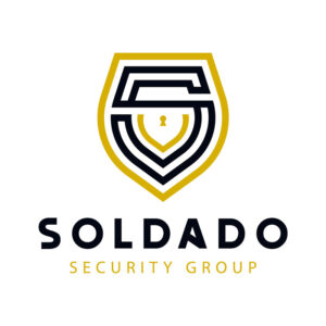
11. Soldado Security Group
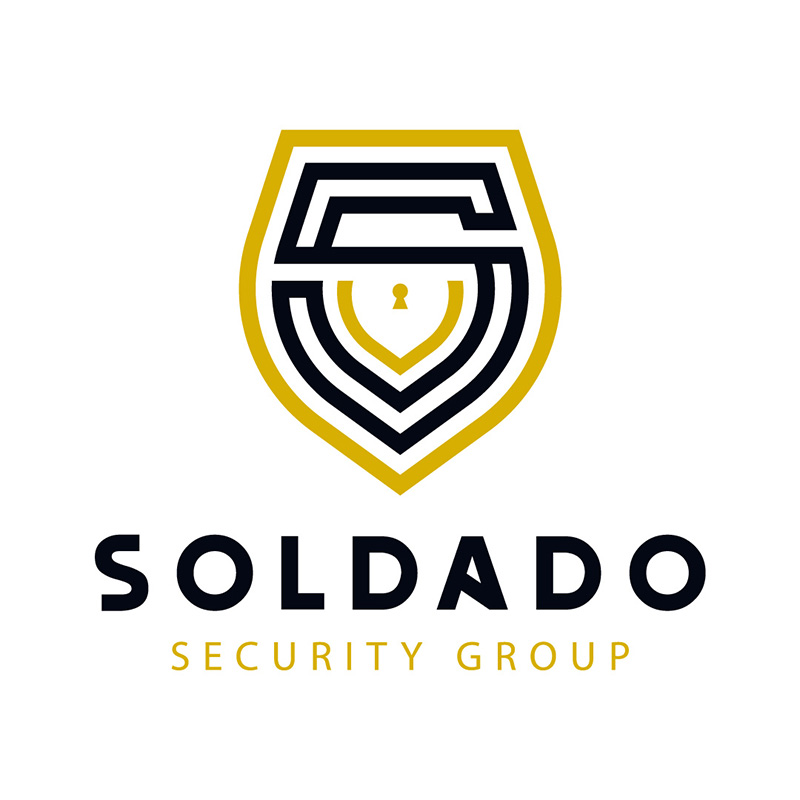
Having the color gold on your logo is a great way to show your commitment to providing the best for your clients. Soldado Security Group did this to show that they are the “gold standard” in their services. The shield icon is perfect for letting people know that it is a company that provides protection and security.
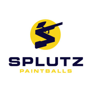
12. Splutz Paintballs

It’s easy to see that Splutz Paintballs is a company that provides products and services related to paintball. Whether it’s the facilities they offer or the equipment and gear, this is a solid choice for a logo design. The font choice is strong and bold, showing the company’s robust and energetic personality.
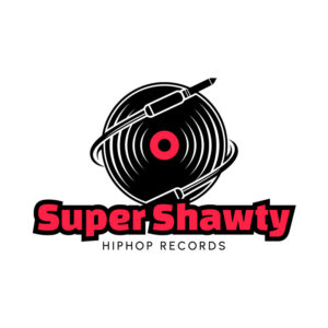
13. Super Shawty Hip-Hop Records
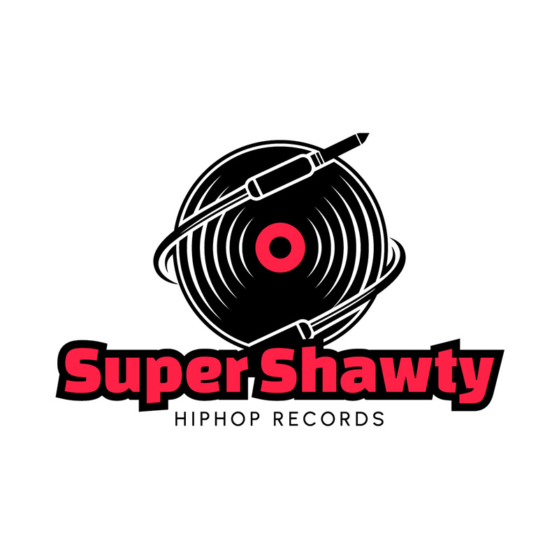
Two of the most commonly associated colors with hip-hop are red and black. So, it’s only natural that Super Shawty Hip-Hop Records used them in their logo. The record icon also fits with what seems like speed lines to show movement and give energy to the overall design.
14. Safari Glass
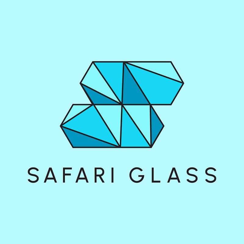
Designing the letter S to have facets of glass makes this a logo befitting the company Safari Glass. It uses multiple shades of blue, perfectly representing the product and service they are selling. The logo design has a cool, calm, and crisp aura thanks to the colors, font type, and icon.
15. Safehaven Charity Organization
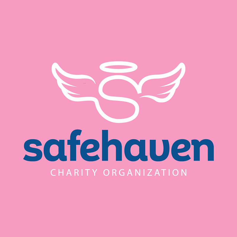
A logo should be memorable and consistent with the company’s message and mission. This is true with Safehaven Charity Organization, as evident in their logo design. This company provides shelter to women and children, thus, choosing pink and light blue for its colors is most ideal.
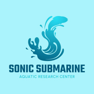
16. Sonic Submarine Aquatic Research Center

This beautifully-designed S logo perfectly summarizes what Sonic Submarine Aquatic Research Center does. The letter S is formed into a water splash to add a touch of fun to an otherwise formal business nature. Of course, blue is the one choice of color that would fit this brand to a tee.
17. Savannah’s Summerwear
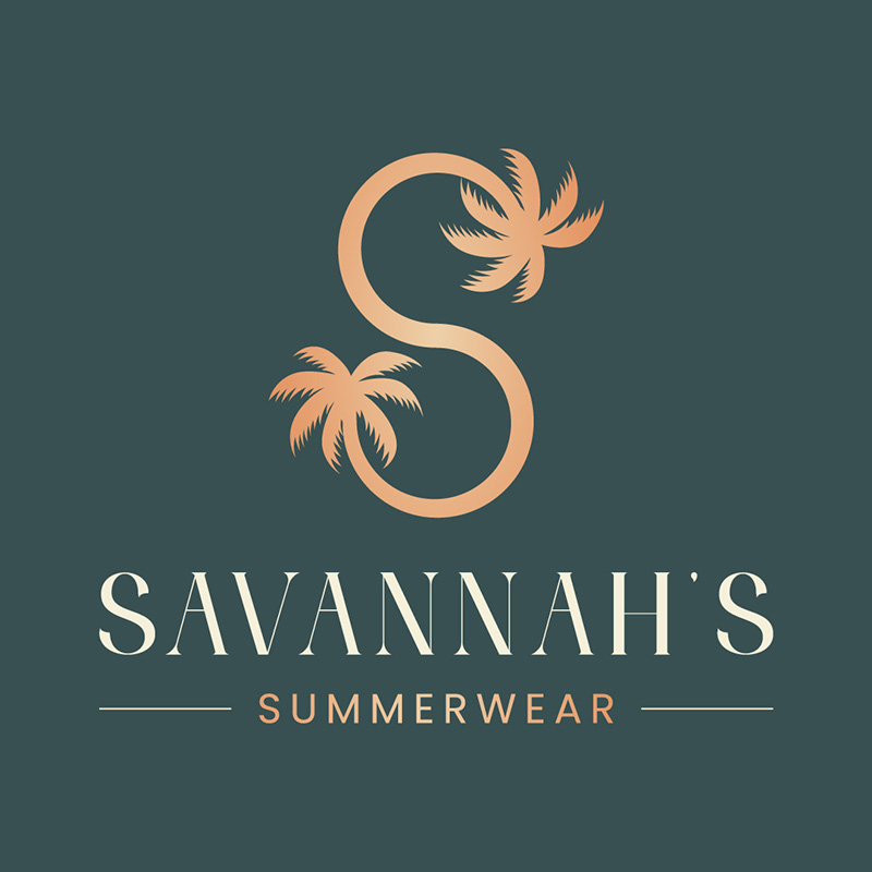
Palm trees and toned-down colors suit this logo designed for Savannah’s Summerwear. It gives a laid-back attitude that sums up what summers should be about. This clothing company specializes in summerwear, thus, the easygoing and mellow brand personality.
18. Sicario Apparel
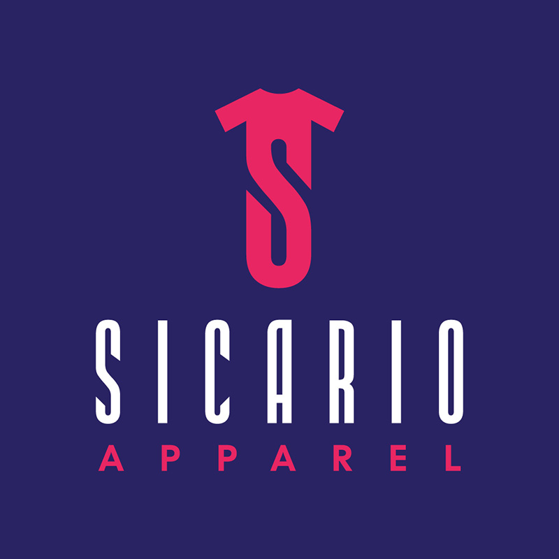
Using a t-shirt icon incorporating the letter S in it, this logo created for Sicario Apparel is worth your attention. The font pairing is superb, and the color combination is spot-on. It is an excellent example of a highly-scalable logo, meaning it would look good on whatever platform you use it.
19. Sloan Cabins
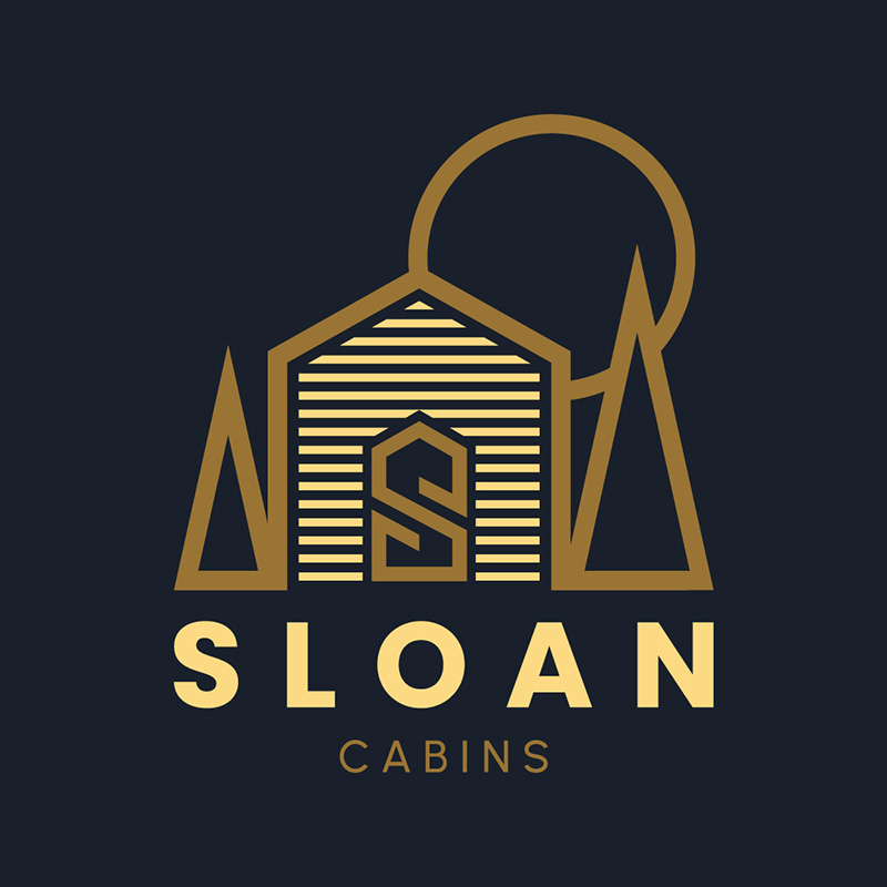
Cabin rental company Sloan Cabins has a beautiful logo that suits the brand quite well. It has an illustration of a cabin with trees on its sides and a circle behind it to represent the sun. The design uses gold and black to show elegance and sophistication. This is a great example of how colors can show personality in a design.
20. Slapjacks Breakfasts
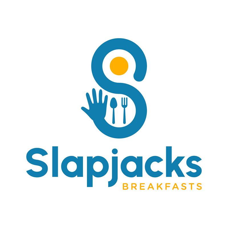
A wordplay on the breakfast item flapjacks, Slapjacks Breakfasts shows its fun and light side in their logo. It uses the letter S as a hand with a spoon, fork, and a sunny-side-up egg as its main design element. The blue and yellow add charm and appeal, making it a warm and welcoming logo design.
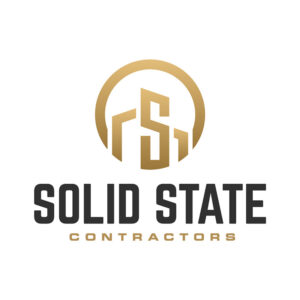
21. Solid State Contractors
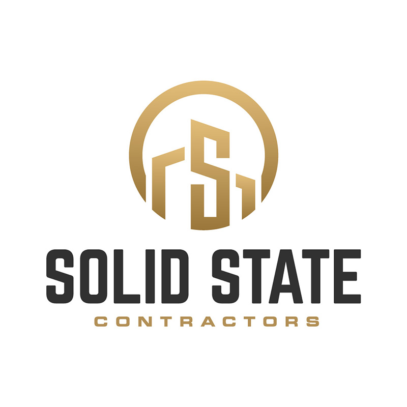
The logo designed for Solid State Contractors is an excellent inspiration for those in the construction and remodeling business. It has a circle around the letter S with silhouettes of buildings beside it. At a glance, you can quickly identify the industry the company is in, which is the primary purpose of a logo.
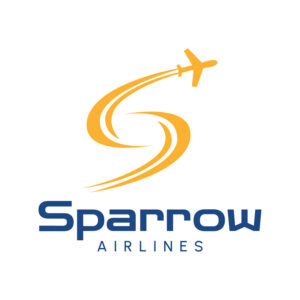
22. Sparrow Airlines

If you’re in need of an airline logo, this one designed for Sparrow airlines is a great example to emulate. It uses the letter S as its main design element, with a small airplane zooming upward through the skies. The design shows forward movement, which is essential in a high-end business such as the airline industry.
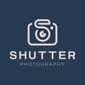
23. Shutter Photography
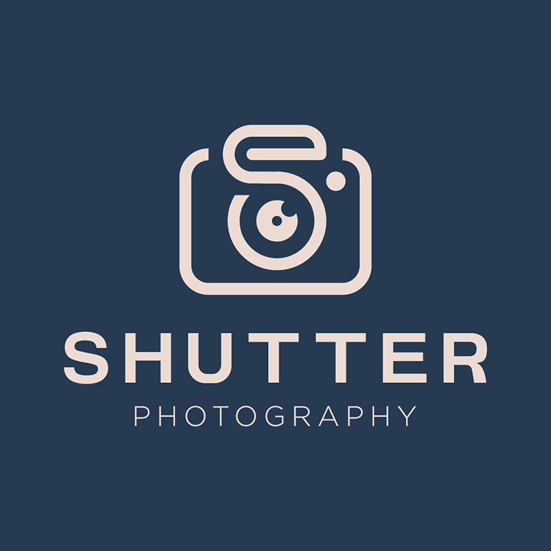
A very straightforward design, the Shutter Photography logo is a design inspiration for no-nonsense companies. It uses simple fonts, a subdued color, and an uncomplicated logo icon. A camera icon with the letter S inside it that would go well even without the brand name attached to it.
24. Slutty Pumpkins Costumes
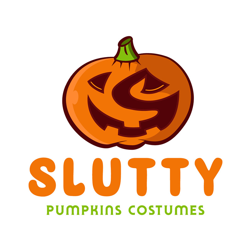
From the brand name to the logo design, this company illustrates how using humor can be advantageous for business. It uses a grinning pumpkin with the letter S placed neatly inside it. The loud colors also effectively show the brand’s fun and lively nature, which is appealing to its audience.
25. Seconds Boxing Trainers
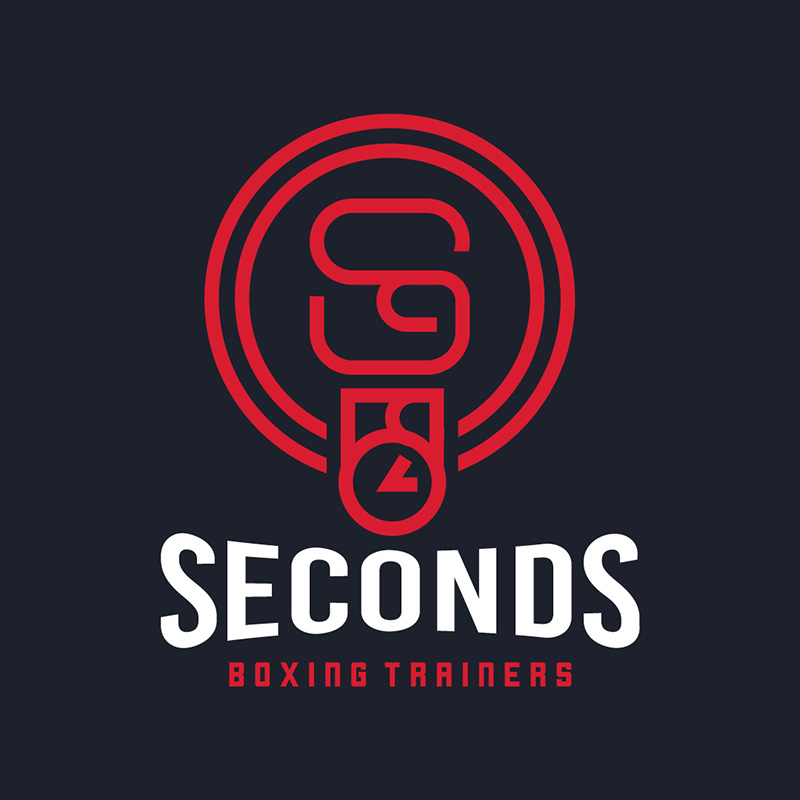
Red and black are the colors you want to use if you want to show strength and power in your brand. In this logo design for Seconds Boxers Trainers, they used these colors along with a ring bell icon. These are the most suitable elements to show that the business is committed to its mission to train boxers.
26. Santander Southern Tequila
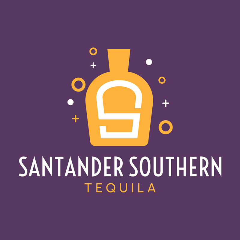
When you’re in the business of providing fun and leisure, you need to check out this logo designed for Santander Southern Tequila. The colors and icons show nothing but having a good time and a merry experience. The contrasting colors, simple fonts, and superb layout all contribute to a letter S logo design worthy of its place in this list.
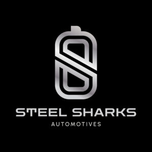
27. Steel Sharks Automotives
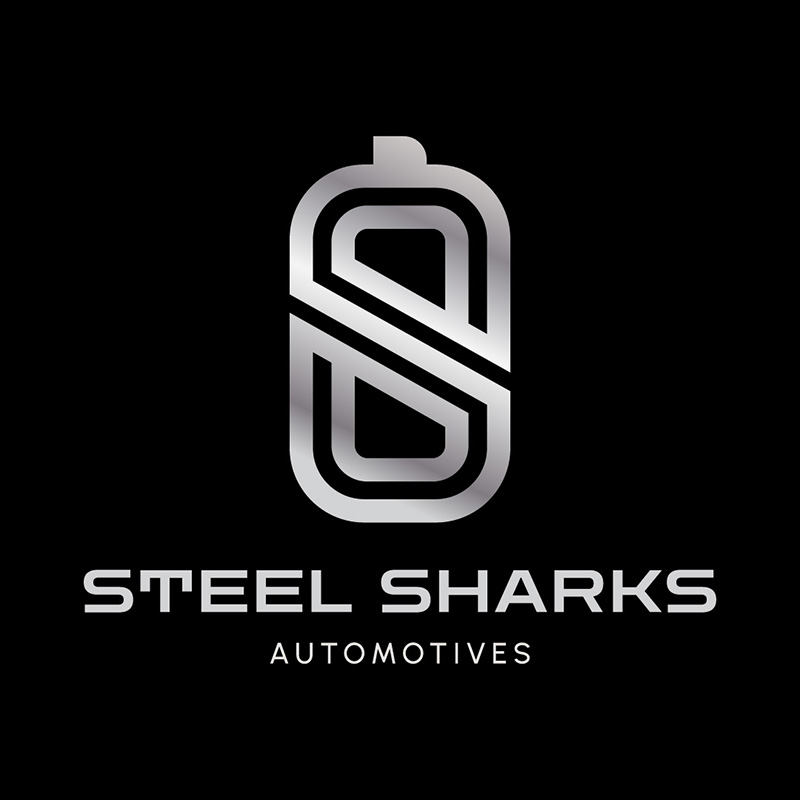
The color silver is often associated with elegance, sophistication, and wealth. Thus, this logo designed for Steel Sharks Automotives is fitting. It uses non-serif typefaces, which are perfect for the brand personality. The black background adds to its luxurious and opulent nature.
28. Sushi Guy Japanese Cuisine
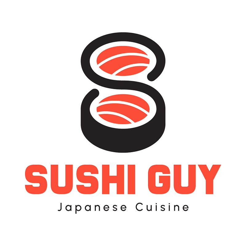
What better way to represent your brand than using the exact product you’re selling, isn’t it? And so, Sushi Guy Japanese Cuisine uses images of sushi with the letter S cleverly incorporated in them. The color choice is also spot on, as orange is a vibrant and attention-grabbing color often used in restaurant logos because it is associated with hunger and appetite.
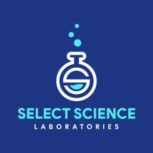
29. Select Science Laboratories
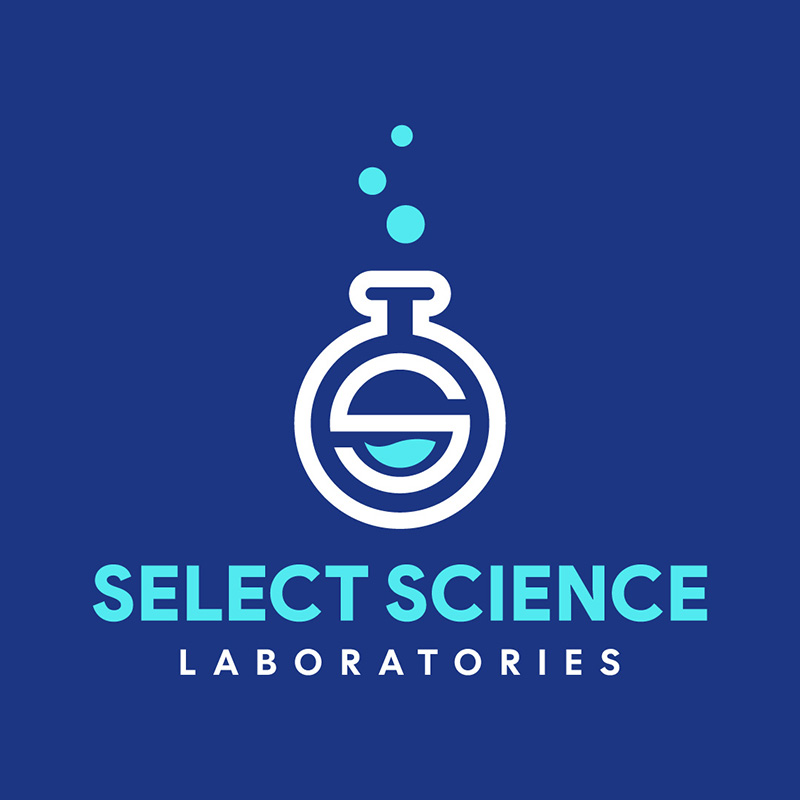
Using a flask icon with the letter S inside it, the Select Science Laboratories logo can inspire those in the chemical business. You can use the logo on business cards, signages, and anywhere you need to place it without any problems. The design scores high in the scalability spectrum.
30. Sharp Edges Cutlery
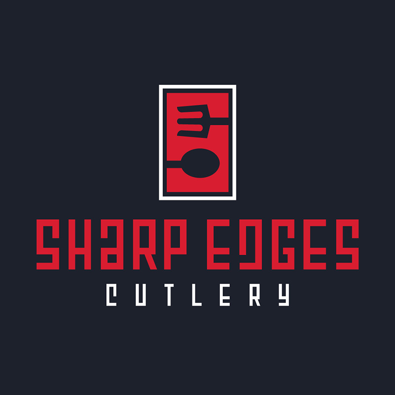
When you take a closer look at the logo design for Sharp Edges Cutlery, you will find a letter S inside of it. And as its name suggests, its font is edgy and trendy, something unexpected for a company that sells knives and other kitchen utensils. If you want to be seen as an innovator in your field, take the same route as Sharp Edges Cutlery did.
Subscribe to Penji for Your Logo
Do you like seeing any of the examples above? If you do, why not try out Penji for your custom logo? Penji designers ensure that you’ll receive a unique, recognizable, memorable, versatile, and simple logo. Our amazing designers have the knowledge and expertise that will put your business on the map with a logo that’s tailor-made to your business. Plus, they will know how to integrate branding into your logo and look at your competitors’ logos to make yours even better!
If you want to start your journey with Penji, subscribe here and give Penji a try for 30 days!
About the author

Katrina Pascual
Katrina is a content writer specializing in graphic design, marketing, social media, and technology. In her spare time, she writes monthly personal blogs to practice her craft.
Table of Contents
- Why Do You Need a Custom Logo?
- 1. UnShackle Me
- 2. Spencil
- 3. Safeguard Security
- 4. Samba Yang Hotel
- 5. Seventea Cup
- 6. Store Front eCommerce
- 7. Strategist Life Plan
- 8. Streamline Clothing
- 9. Struck Solar
- 10. Stylist Joy Salon
- 11. Soldado Security Group
- 12. Splutz Paintballs
- 13. Super Shawty Hip-Hop Records
- 14. Safari Glass
- 15. Safehaven Charity Organization
- 16. Sonic Submarine Aquatic Research Center
- 17. Savannah’s Summerwear
- 18. Sicario Apparel
- 19. Sloan Cabins
- 20. Slapjacks Breakfasts
- 21. Solid State Contractors
- 22. Sparrow Airlines
- 23. Shutter Photography
- 24. Slutty Pumpkins Costumes
- 25. Seconds Boxing Trainers
- 26. Santander Southern Tequila
- 27. Steel Sharks Automotives
- 28. Sushi Guy Japanese Cuisine
- 29. Select Science Laboratories
- 30. Sharp Edges Cutlery
- Subscribe to Penji for Your Logo


