Today’s trending logo designs are characterized by sleek lines, simple letterings, cool colors, and highly defined elements. Combining these components with classic designs creates a brand mark that looks fresh and unique. But here’s the thing about logos. They should perfectly symbolize what exactly your business does. We have collated these 30 letter P logo designs created by skilled graphic designers of Penji. Scroll down and jot down notes about the best designs that will catch your attention.
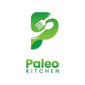
1. Paleo Kitchen
Starting the list of letter P logo design trends for 2022 is a single, stylized letter. It represents the brand in several ways. First, it is a clean yet classic mark making it an excellent choice for a brand that wants a fancy yet straightforward design. Second, it can elevate a seemingly boring brand identity. And finally, it works in any context – from product packaging to social media marketing.
Brands like Paleo Kitchen chose this logo design trend. It’s a neat way to make their product look fresh and appealing to customers.
2. Progress
The Progress logo features a letter P icon with a lightning illustration, which symbolizes light and speed. The design is neat and easily identifiable everywhere. You can use this streamlined logo to inspire you in your proposed logo design.
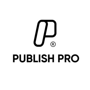
3. Publish Pro
Publish Pro’s trendy letter P logo is emphasized in a classic black and white combination. The shadow effect in the icon demonstrates the double “P” initial of the brand. A stylized letter logo like this is incredibly versatile. Modern brands can use it across all materials and platforms – from social media to product packaging.
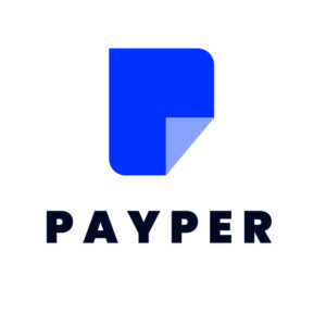
4. Payper
Payper’s two-dimensional logo is original and unique. At first glance, you can see a piece of paper folded at the lower right. But if you look closely, the dark blue portion of the figure shows the letter P logo.
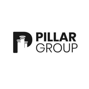
5. Pillar Group
Unlike the standard designs, the symbol is placed beside the text. The balanced size of the overall design makes it more flexible. It is easier to adjust the size of the logo when being integrated with various marketing materials such as signages, brochures, and even business cards.
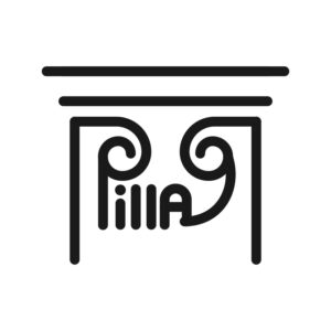
6. Pillar
While the brand name sounds similar to the previous example, this emblem-type logo stands out from the rest. This playful style of mixing the texting within the image might be one of the fantastic design trends today. Like most designs, texts within images or vice versa are nothing new. But right now, they’re worth raving about. If you want an image showing your product, you can try this one.
7. Poste
This is the third logo about pillars in our list. The term “poste” means column or pillar. And that’s what is demonstrated in the letter P logo through the two posts or pillars in mirrored look. The emblem is emphasized because of the brightly-colored background.
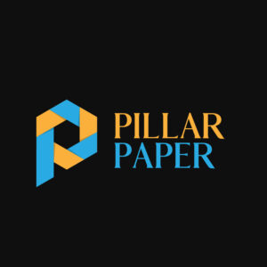
8. Pillar Paper
Pillar Paper’s design trend features a folded paper art forming the letter P logo. The modern color palette used in this logo is suitable for modern brands. Since the clarity of the text is vital, the adequate spacing makes the business name readable despite the dark background.
9. Pacific Doctors & Specialists

In this example, the two main elements of the brand are combined in one symbol. It’s the cross shape that symbolizes medicine practice and the brand’s initial (letter P). The blue and white color palette fits the health industry, wherein the brand is affiliated.
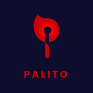
10. Palito
The unique figure in Palito could instantly grab people’s attention. It also embraces an unusual illustration of the letter P logo. Also, the simple lettering complements the bold and trendy images.
11. Pharaoh’s Hotel and Restaurant
When a restaurant of this style and level wants to achieve a particular reputation, a sleek and elegant logo like this fills the bill. Pharaoh’s Hotel and Reastaurant lets the clean lines and sexy curves speak for its brand identity. The color palette also fits the entire vibe of the hotel and restaurant, making it respectable in a sophisticated way.
12. PivotPoint Sports Equipment
The PivotPoint Sports Equipment logo screams machismo in every way. The sans serif font is apt for the brand’s offers since selling sports equipment means catering to active people. Moreover, the black-and-red color combination complements the font well, strengthening its foothold on authority.
13. Phenomenal Basketball Club

This basketball club logo has all the makings of a memorable and unique design. Phenomenal Basketball Club combines various elements into one circular and coherent design. The circle resembles a basketball, with red semi-circles, and the letter P sits in the middle. The blue accent on the lower right side fills the missing piece and ties the design together.
14. Pastry-rrific Bakery
This Pastry-rrific Bakery logo has a unique style that makes it stand out among its competitors. The first letter of the brand name forms the letter P, using elements that suggest it’s a pastry shop. The bread and croissant form a letter P and doubles as a chef. The toque is evidence of this double meaning.
15. PooleParty Aqua Resort

The logo process involves carefully choosing design components that represent your brand. These components must tell your target audience what your brand is about and what you offer. And PooleParty Aqua Resort manages to communicate its identity through its logo’s well-thought-out design. You’ll instantly notice the person swimming in the pool, a tree, and an abstract sun that seemingly looks like the letter P.
16. Pierre’s Premium Wines
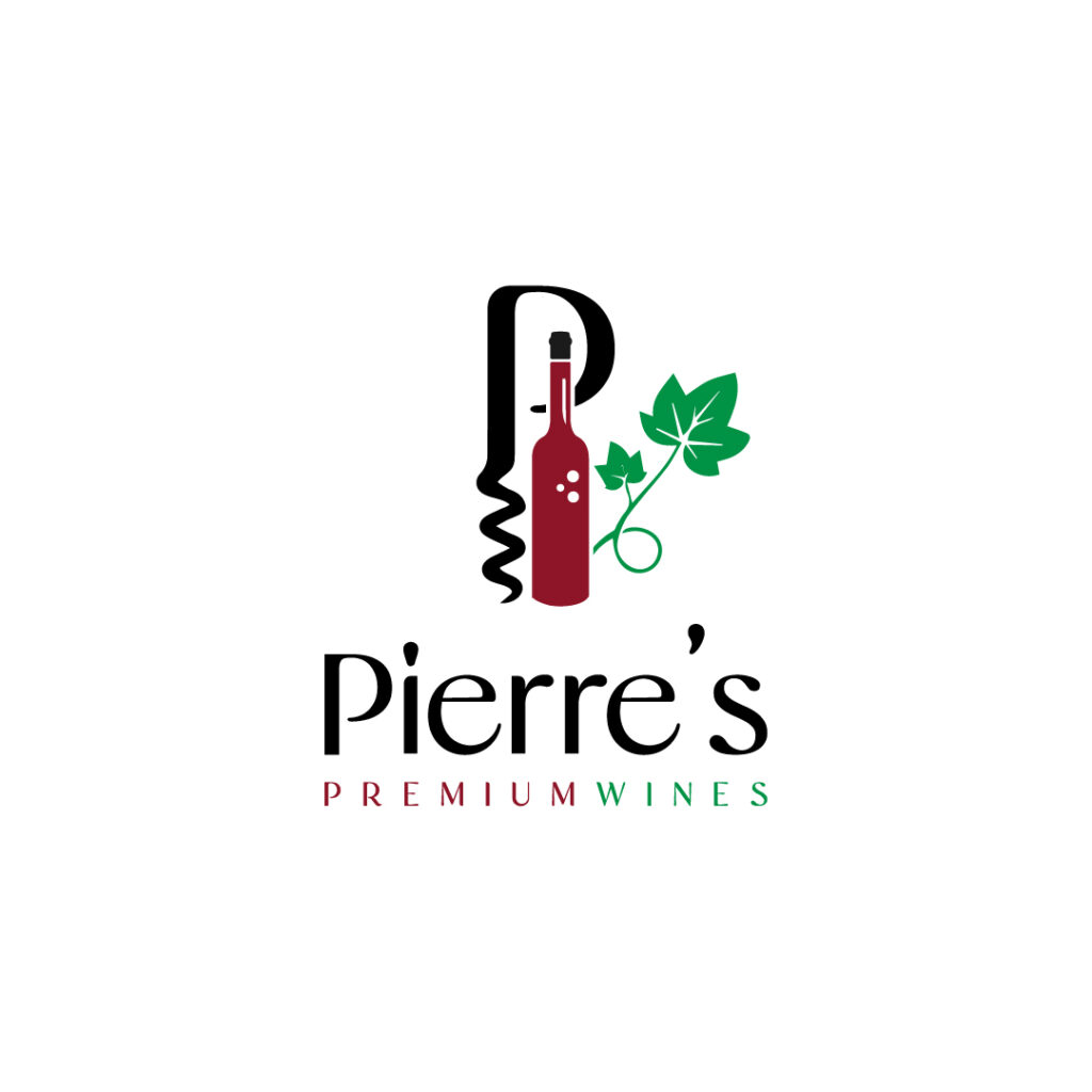
The varying colors catch your attention at first glance. The beautiful combination of different icons complements each other very well. For instance, the corkscrew forms an elegant letter P, with evident screws at the bottom. The red wine bottle stands tall in the middle, while the green leaves represent Pierre’s Premium Wines’s vineyard.
17. Paco Power Tools

A logo must be akin to the brand’s personality and target audience. This way, people will immediately relate to the brand through its logo and establish affinity. Paco Power Tools does just that and more. The logo doesn’t shy away from the brand’s offers, which are indicated in the hammer and nail icons.
18. Protecto Security Systems

Establishing authority in your niche is hard, especially if you’re a neophyte. That said, creating a logo that exudes an air of credibility is essential, especially if you’re a security company. Protecto Security Systems shows trustworthiness in its logo from top to bottom.
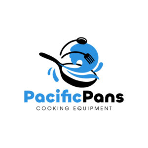
19. PacificPans Cooking Equipment

The PacificPans Cooking Equipment logo instills movement in the icon. It shows a slightly slanted pan, indicating it’s being used. The blue content above the pan seemingly looks like liquid spilling out. Also, the bold and light-faced font combination doesn’t overwhelm viewers and steals the limelight from the overall design.
20. Pallet Group of Painters
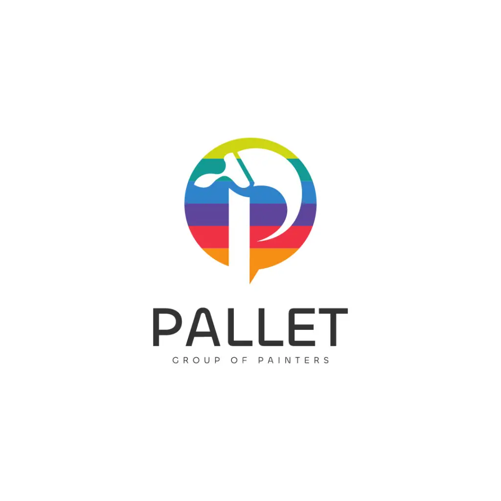
One way to make your logo unique and memorable is to curate the best symbols of your product and showcase them creatively. Pallet Group of Painters did so by playing with negative space to display a letter P, doubling as a paintbrush.
21. Pancake Tower Bed and Breakfast
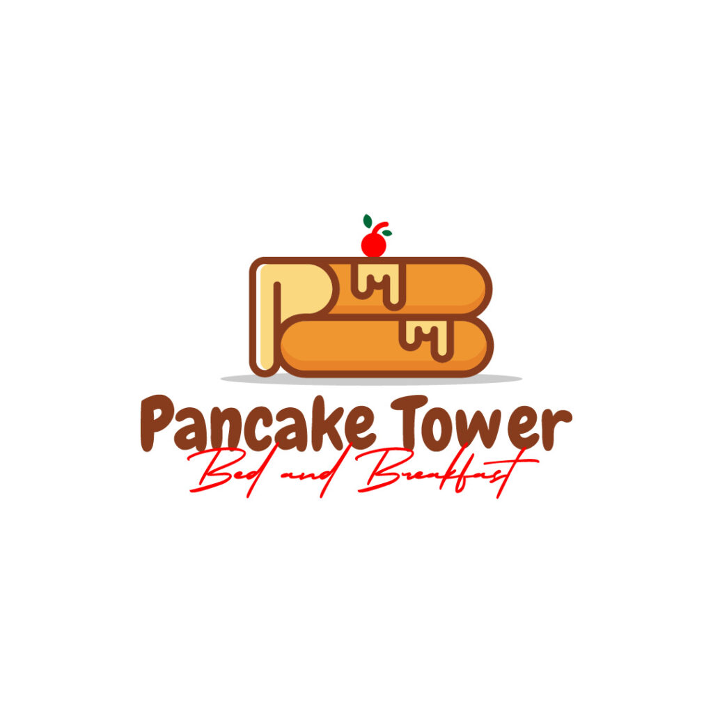
Pancake Tower Bed and Breakfast displays a stack of tempting pancake illustrations with oozing syrup on the side. If you look closely, the syrup resembles the letter P, invoking fun and creativity in such a simple concept. The bold and script font combination also weaves into the entire design perfectly.
22. Power Player’s Club and Casino

A well-designed logo is a must for a club and casino that want to establish authority and credibility. Remember, a logo reflects your brand identity. Power Player’s Club and Casino’s logo features a spade and emanates an air of power and dominance. This clearly shows how this club and casino company is reputable in this industry.
23. Parmesan Corner
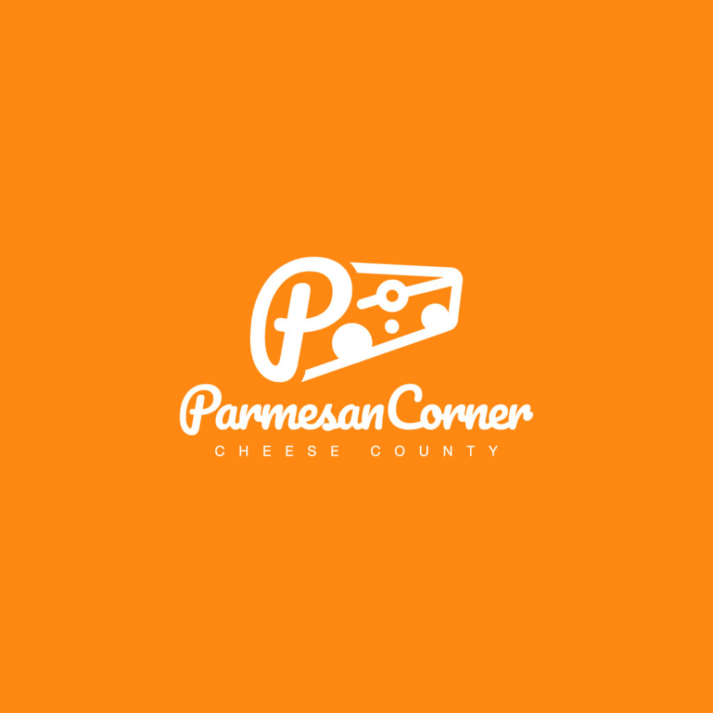
For all cheese lovers out there, Parmesan Corner’s simple yet memorable logo will make you drool. It showcases a block of parmesan cheese, with the letter P designed as part of it. The script font amps up this novelty brand, while the light-faced sans serif font maintains balance.
24. Petal’s Bar
Line art is another popular graphic design method that clearly communicates a brand’s offers. In this particular logo, Petal’s Bar shows a line art illustration of a glass, bottle, and petals. The font is also a good wingman for the icon, as it dons a simple and modern look.
25. Prey Armaments
This logo exudes a certain level of masculinity for a company selling weapons only the male demographic understands. The gun icon is designed creatively with wings that indicate movement.
26. Parthenon Constructions
Nothing beats an impressive logo, especially if it connects with target audiences instantly. Parthenon Constructions dons an abstract building that makes this logo design timeless and impactful.
27. Paul’s Hobby Shop
Paul’s Hobby Shop integrates negative space to include the rocket ship in its letter P logo design. The dominant yellow is vibrant and fits the overall brand identity and offer.
28. Praying Partners Club
Praying Partners Club is a spiritual company that helps people with mental issues. They aim to stabilize their mental health through spiritual means, which shows through the logo’s cross icon. The symbol of two open hands also holds the cross, implicating protection and security.
29. Pauline’s Baby Products
Pauline’s Baby Products knows how to market its offers by featuring a baby’s face and a yellow star. The overall design is fun, playful, and welcoming, apt for a store that sells baby products. Additionally, the stylized font also complements the icon pleasantly.
30. Pacific Preservatives

At first glance, you’ll notice the letter P, which resembles a swirl lollipop. Pacific Preservatives ensures this icon doesn’t confuse viewers by attaching two green leaves at the top. This way, people with a green thumb will identify this brand as a preservative store. After all, these swirls could look like a moving element that allows the leaves to grow.
How To Create A Logo that Fits Your Brand

According to experts interviewed by Forbes Magazine, a logo is more than just an elaborate icon to attach to product or merchandise. More importantly, it is an expression of the company’s brand loyalty. Moreover, it must be easily- recognizable to set it apart from other existing businesses.
In many situations, the logo is the very first thing new and potential clients notice about the company. As with any first impression, the message it tries to communicate must be clear and understandable.
Here are the practical tips for creating a logo that fits your brand:
- Do your research first – Getting the logo correctly needs a deeper understanding of the overall brand.
- Start with a brand story – Shiloh Holmes of Open Roads Marketing suggests starting with your brand story, and the rest will follow.
- Keep the design simple – Go for something that’s simple and recognizable.
- Integrate the voice of your employees – encourage active participation while working on a logo
- Create And Test Different Brand Versions – Form focus groups to test which branding your target audience wants.
- Consider the emotion you want to convey – Use the name, typography, icons, and colors to catch your ideal customer’s attention.
- Make it memorable – Create something that is memorable and quirky.
- Promote unique value representation – A logo should speak loudly about the company, its products or services, culture, and core values.
- Trust your gut – start with listing brand names using at least ten words linked to the company’s values and mission, then pick a font and color.
- Focus on your niche – Create an idea that entices your target audience.
- Future-proof or secure your brand name – Keep your company name broad since the market and business will change in the future.
- Keep SEO in mind – With an original name, it will be easier to rank in the algorithm, which minimizes the competitive pain point for your product or service.
Don’t DIY your logo if you want to separate your brand from the competition. Instead, sign up for Penji for your design needs. They hire the best talents to help you create fantastic logo designs that fit today’s modern brands. And one of the biggest perks of signing up with Penji is that you get access to unlimited graphic design for a fixed monthly fee.
About the author

Rowena Zaballa
With a background as a former government employee specializing in urban planning, Rowena transitioned into the world of blogging and SEO content writing. As a passionate storyteller, she uses her expertise to craft engaging and informative content for various audiences.
Table of Contents
- 1. Paleo Kitchen
- 2. Progress
- 3. Publish Pro
- 4. Payper
- 5. Pillar Group
- 6. Pillar
- 7. Poste
- 8. Pillar Paper
- 9. Pacific Doctors & Specialists
- 10. Palito
- 11. Pharaoh’s Hotel and Restaurant
- 12. PivotPoint Sports Equipment
- 13. Phenomenal Basketball Club
- 14. Pastry-rrific Bakery
- 15. PooleParty Aqua Resort
- 16. Pierre’s Premium Wines
- 17. Paco Power Tools
- 18. Protecto Security Systems
- 19. PacificPans Cooking Equipment
- 20. Pallet Group of Painters
- 21. Pancake Tower Bed and Breakfast
- 22. Power Player’s Club and Casino
- 23. Parmesan Corner
- 24. Petal’s Bar
- 25. Prey Armaments
- 26. Parthenon Constructions
- 27. Paul’s Hobby Shop
- 28. Praying Partners Club
- 29. Pauline’s Baby Products
- 30. Pacific Preservatives
- How To Create A Logo that Fits Your Brand

