
If you want your business to shine through all the competition, a distinctive and creative W logo design is what you need. Here are 30 W logo inspirations created specially by our talented design team at Penji.
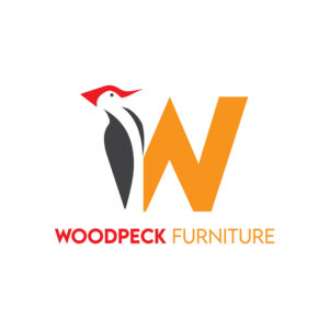
1. Woodpeck Furniture
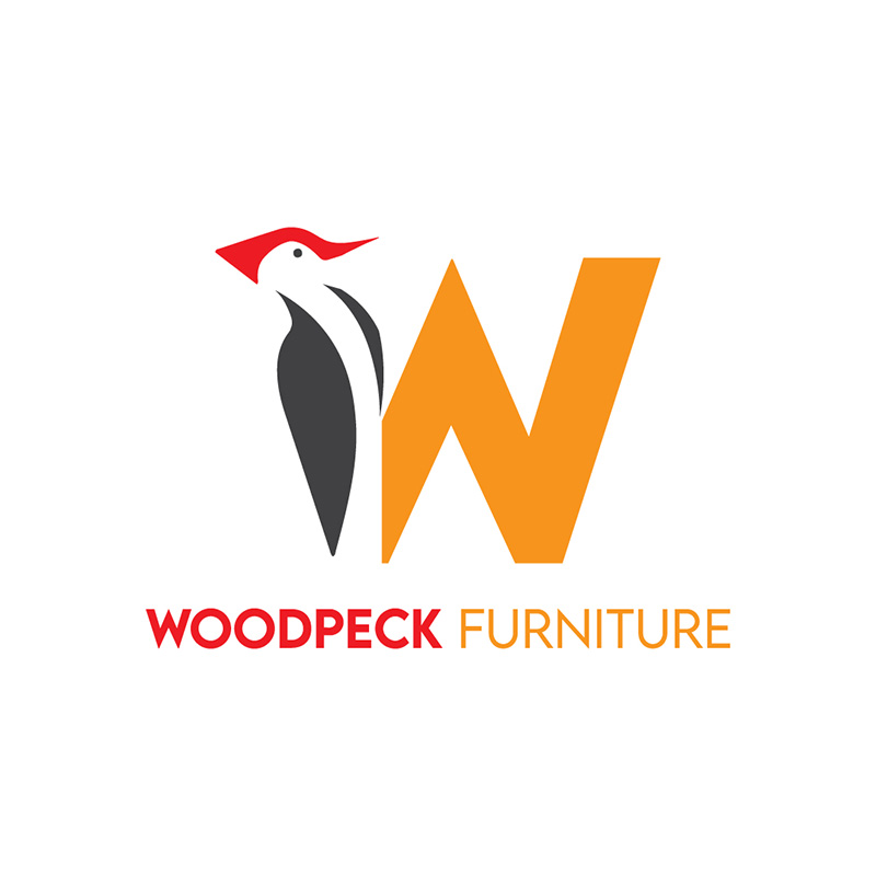
As its name suggests, this logo from Woodpeck Furniture uses an image of a woodpecker. It is incorporated into the letter W, which would make it easy to remember. It uses orange as the predominant color, a good choice for a brand that manufactures furniture.
Paired with a splash of red and black on the bird’s body, this color scheme exudes warmth and comfort. It is very much ideal for a company that sells products that should have these characteristics as its main selling point. The font choice blends in quite well, adding to its appeal.
Professionally-made W logos to promote your brand
Create your logo project today and get your concepts tomorrow
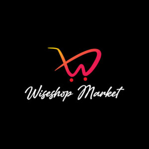


2. Wiseshop Market

With the letter W designed in the shape of a shopping cart, this Wiseshop Market logo is genuinely eye-catching. The black background is an excellent choice as it brings out the red and yellow colors of the main logo component. The brand name in white makes it outstanding and easily seen.
The Wiseshop Market logo uses a script font for its name. It resembles a handwritten note, much like a shopping list. It is in Italics mode to denote speed, movement, and efficiency.
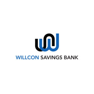
3. Willcon Savings Bank

This cleverly designed letter W logo for Willcon Savings Bank is perfect for the brand. Financial institutions require logos that are trustworthy, authoritative, and reliable. This logo design projects these qualities quite well.
Even the choice of colors is suitable for the brand. Blue and black signify knowledge, power, stability, and wisdom, among many others. The font type used is a sans-serif one which gives the logo a professional look. Its modern touch prevents the logo from looking outdated and boring.
4. White Dough Cakes
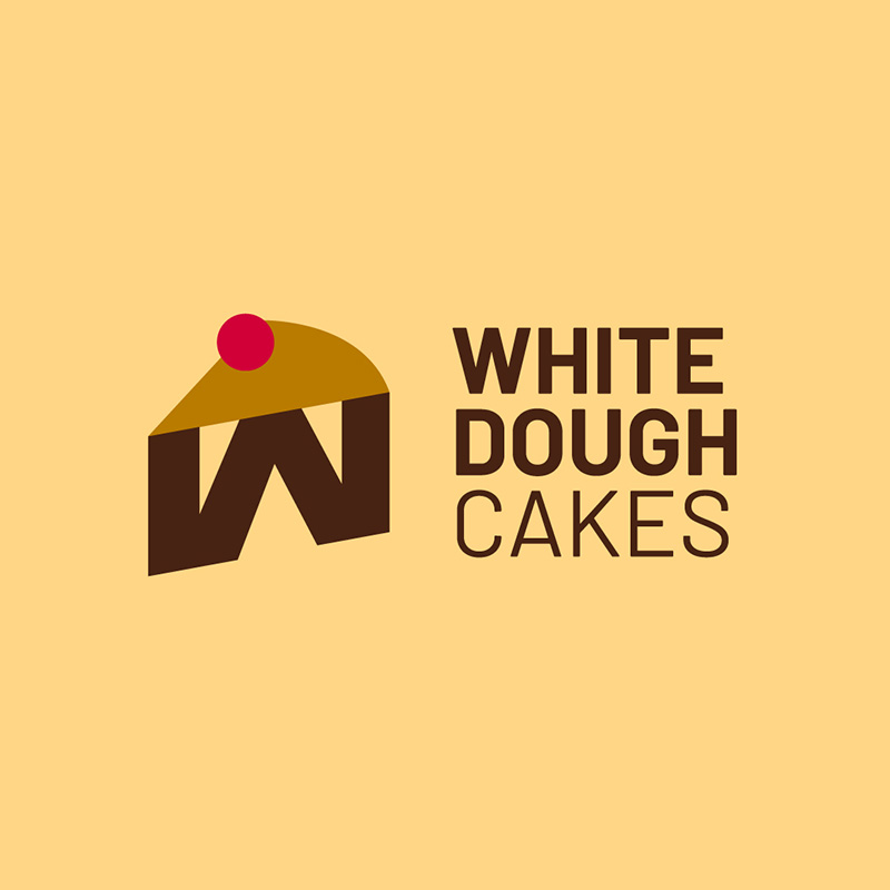
This letter W logo created for White Dough Cakes is quirky, cute, and charming. It has a piece of cake, with the letter W placed ingeniously underneath. The colors brown and yellow, plus the red dot that serves as a cherry on top, complete the wholesome look of the logo.
This logo uses two types of sans-serif font, a perfect combination that adds appeal. It is high on the scalability chart, making it a good choice for use on letterheads or posters.
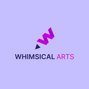
5. Whimsical Arts

If you want to project an image of being fashionable, trendy, or feminine, a color scheme of purple and pink is a great choice. This Whimsical Arts logo does precisely that and succeeds in standing out. It is whimsy, fun, and lighthearted, making it an upbeat and trendy design.
The tilted W is poised like a pencil ready to draw, with the small triangle acting as the nib. The font choice is superb as this type of logo does not need a fancy typeface as it can only be distracting.
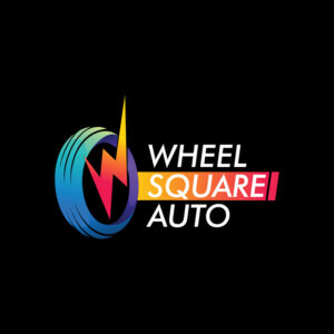
6. Wheel Square Auto

This colorful logo designed for Wheel Square Auto is a sure attention grabber. An auto repair and maintenance service business is usually stern and standoffish. In this case, the logo design made it look friendly and welcoming.
It has an illustration of a wheel to make the business known to first-time customers. The brand name is written in an all-capital, slightly slanted font to show movement and speed. It is placed against a black background that’s perfect for standing out.
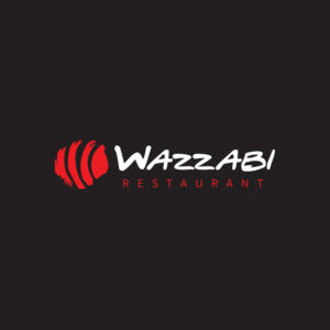
7. Wazzabi Restaurant
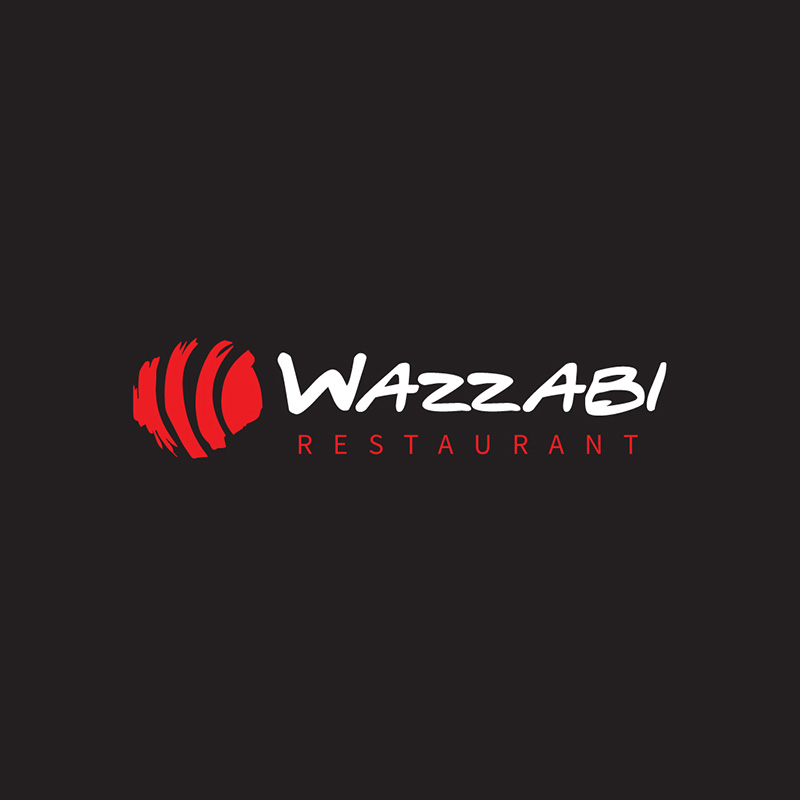
A Japanese restaurant like Wazzabi requires a logo that’s trendy and appealing to the fashion-conscious. Penji’s team created this letter W logo for the brand, which is precisely what it needs. It uses a red icon that seems like a representation of a piece of sushi.
The font it uses is quirky yet chic and contemporary. The brown background is a perfect alternative to black, which can be commonplace for restaurant and bar logos. The font combination is appropriate for making the overall design look stylish.
8. Wayward Tech
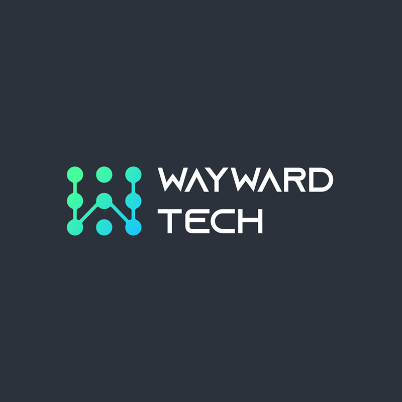
Designing for a tech company is all about imagination, ideas, and a forward-thinking personality. This letter W logo from Wayward Tech is one excellent example. It has a modern and edgy look made more appealing by its color combination. The blues and greens project growth, youth, and dependability, ideal for this niche.
The font is also very suitable as it is minimalistic yet looks futuristic. The gray background is a welcome change from all the blacks that we usually see in tech companies.
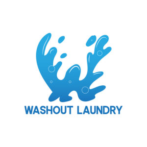
9. Washout Laundry
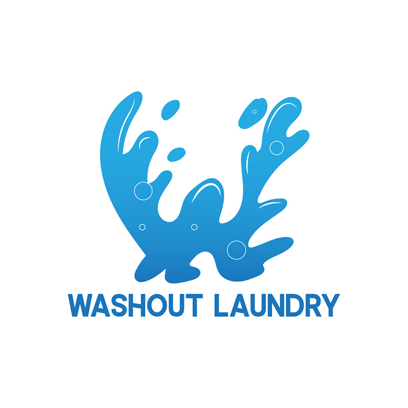
This simple logo design created for Washout Laundry has a refreshing and clean look. It is an image of water splashing about and shaped like the letter W. It is monochromatic but enough to add excitement and energy to the logo still.
While blue typically signifies calmness and peace, it shows spirit and vigor in this instance. The font type it uses may seem basic at first glance, but it has variations on some letters that add a charming appeal to it.
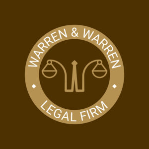
10. Warren & Warren Legal Firm
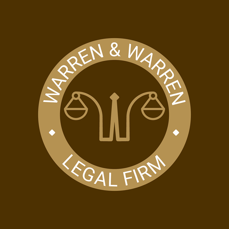
When designing for a legal practice, you have to instill an image of trust, authority, and wisdom in it. This Warren & Warren Legal Firm logo does that superbly. Everything about it is formal and professional, from the color choice to the typeface it uses.
The color brown is ideal if you want to show security, safety, resilience, and honesty. It has a scale logo typical of a law firm, but this one is designed differently to make it stand out.
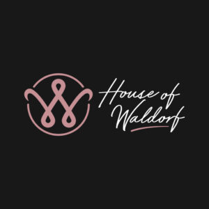
11. House of Waldorf
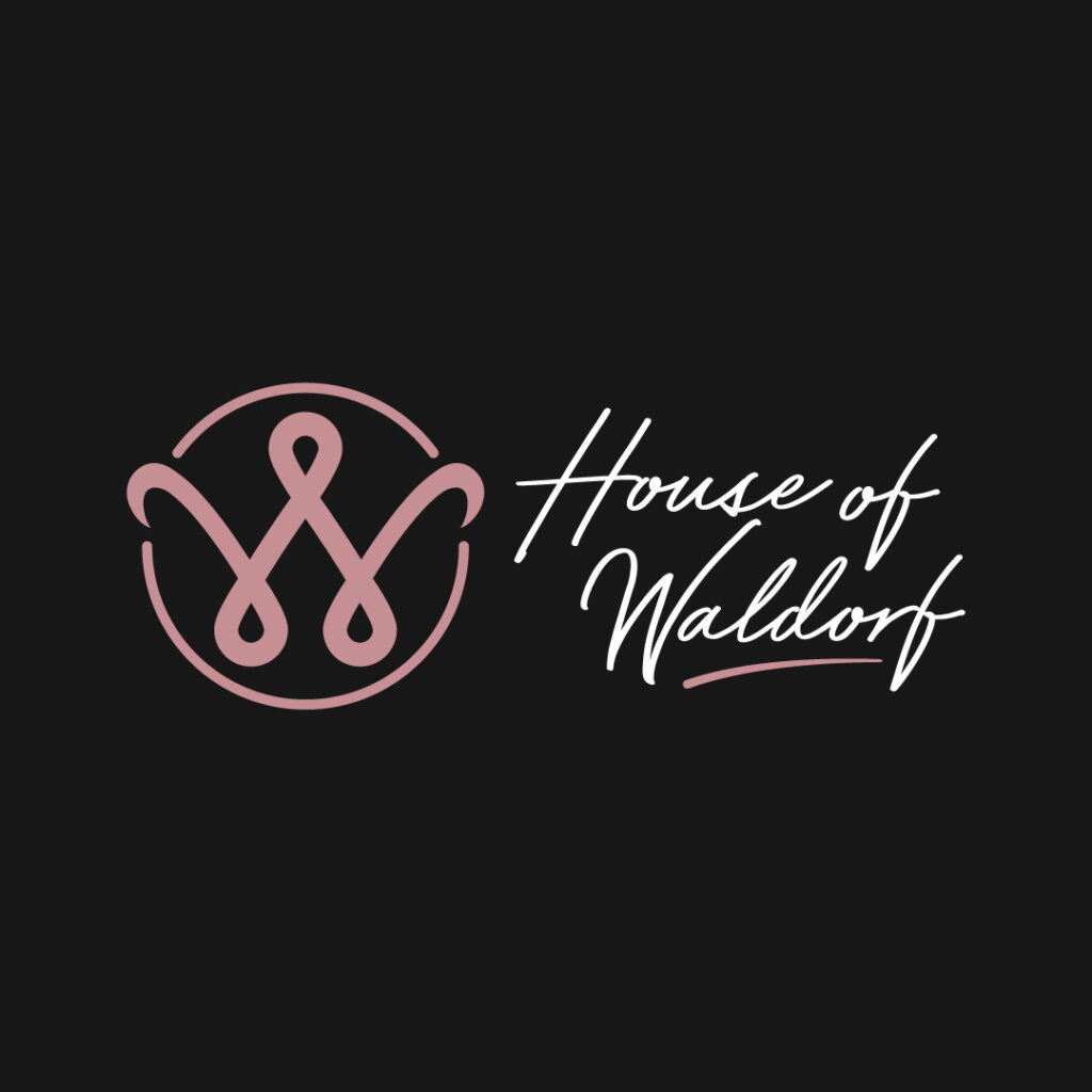
If it’s an air of femininity you want in your logo, then the House of Waldorf should serve as an example. Elements that give it a feminine appearance are the curved W logo, thinly-weighted script font, and the pink motif. On top of that, you can achieve balance and variety through shapes and weights.
12. Warm and Weighted Blankets
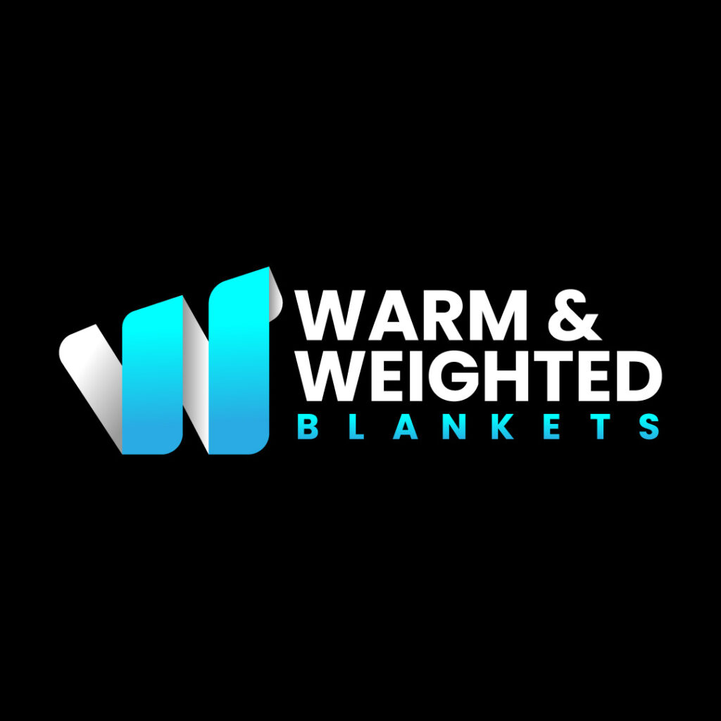
The Warm and Weighted Blankets logo shows us a W, seemingly wrapping something. It’s a smart way to present a product’s purpose: a blanket to wrap around you as you sleep. In addition, a blue motif is ideal, especially if you want to convey calm and relaxation. It’s the right color to use for the company.
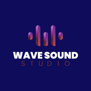
13. Wave Sound Studio

Soundwaves are the best visual to use for the Wave Sound Studio logo. But the imagery has a twist since it makes the letter W. Like this logo design, you can create contrast through font weights and visual hierarchy.
14. Winona Winston Wedding Photography
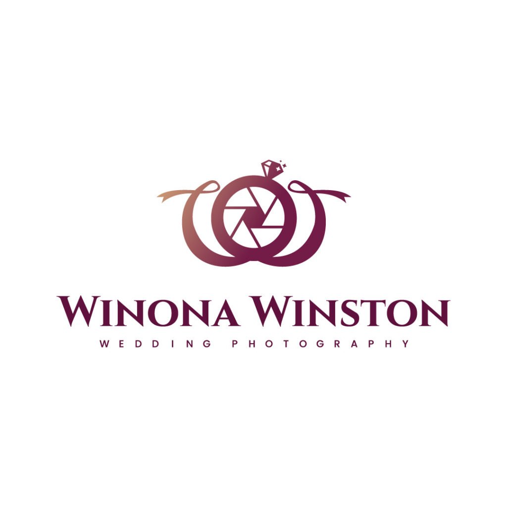
You can combine elements into one image like this logo for Winona Winston Wedding Photography. The camera lens is the dominant feature. But you’ll also notice an engagement ring on top of the lens. Plus, there are bows that could also signify a wedding. It’s a simple and relevant logo for the photographer.
15. Warrior Workout Gym and Fitness
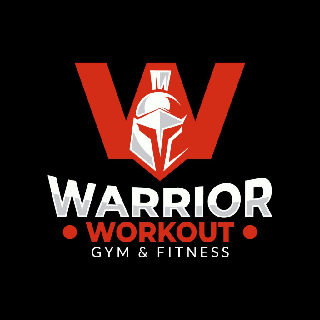
When it comes to fitness logos, bold is associated with it, and for a good reason. You need an attention-grabbing logo that will drive customers to your gym or fitness studio. That’s the case for Warrior Workout Gym and Fitness. The red motif and big letters will catch your eye. Plus, they cleverly added a warrior silhouette to the W, giving it a unique look.
16. Watsons Advisors
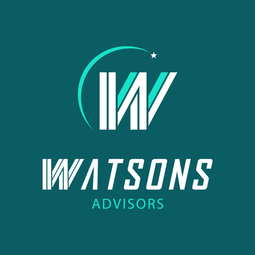
Here’s a professional W logo for Watsons Advisors. Green is another color to demonstrate reliability and trust. The added tilt creates the impression that your business can move forward with Watsons Advisors with their help.
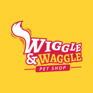
17. Wiggle & Waggle Pet Shop

If you want a prominent logo, you can use the Wiggle & Waggle Pet Shop logo for inspiration. Yellow is a bright color and will draw customers to view the logo for a long time. Aside from that, the added tail on the W is a nice touch to enhance branding. Plus, a playful font like this can give the brand a fun personality.
18. Wild Spirit Yoga Studio
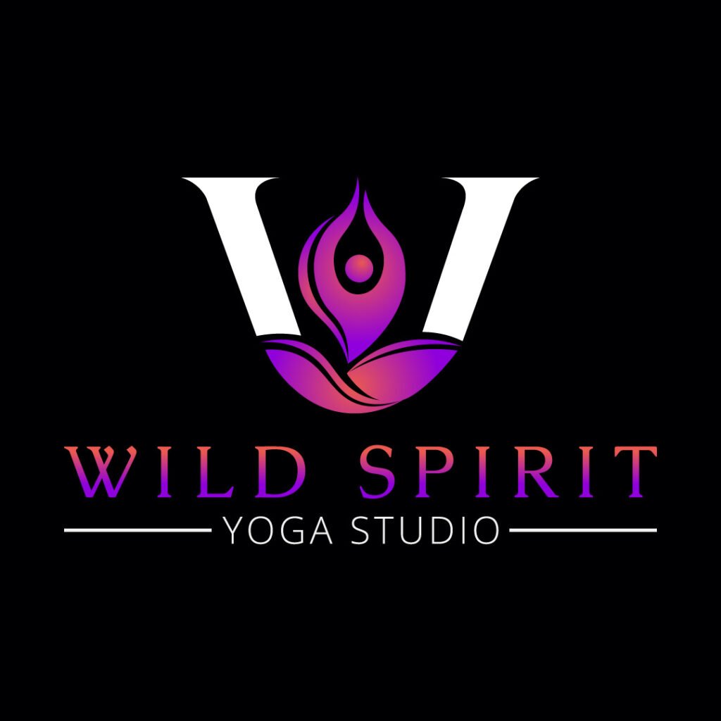
At first glance, you might see a hand on leaves. However, upon closer look, the Wild Spirit Yoga Studio also uses a person in a yoga pose. What makes this different is its integration into the letter W. Plus, the gradient colors are a smart choice in creating a unique yoga studio logo.
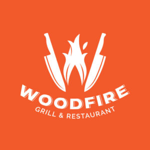
19. Woodfire Grill & Restaurant

Here’s one logo example to use for your restaurant logo design. To represent the grill, fire is used instead of the actual one. Plus, the utensils used for the Woodfire Grill & Restaurant logo are knives instead of spoons and forks. Together, these two elements establish what the restaurant is about.
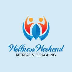
20. Wellness Weekend Retreat & Coaching
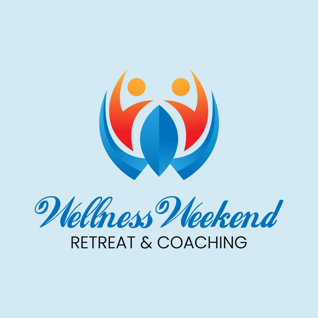
Using script fonts on a logo can be tricky, but choose readable ones like this logo for Wellness Weekend Retreat & Coaching. Aside from the font choice, another great feature of this logo is the W. You’ll notice that people form the letter, and it appears that the people are closer to one another or participating in an activity.
21. Wonder World Kid’s Parties and Events
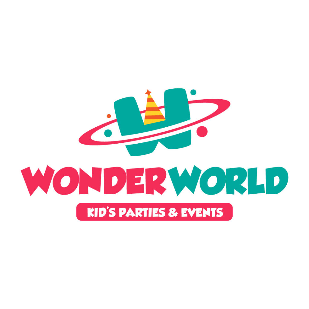
The Wonder World Kids’ Parties and Events logo is bright, fun, and playful. It’s an ideal logo design for event businesses. Plus, the added party hat is a great way to demonstrate that they are a party and events business.
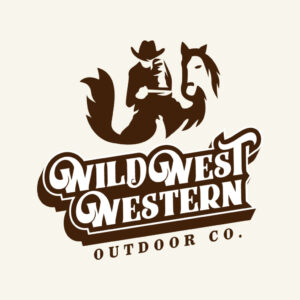
22. Wild West Western Outdoor Co.

Without using the letter W, the Wild West Western Outdoor Co. logo uses imagery to form a W visual. It’s clever to use a pictorial mark and show off the brand’s creativity. Plus, they stick to the retro theme by using a vintage font.
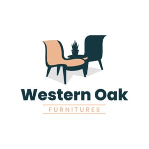
23. Western Oak Furniture

This is the second logo using images to form the letter W. The Western Oak Furniture logo looks simple, but it’s made specifically for the business. It shows us that you don’t have to stick with letters for monograms. If you can, try using icons or illustrations of your products to form the monogram.
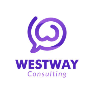
24. Westway Consulting

As a consulting company, Westway Consulting designed an appropriate logo. The speech bubble symbolizes the advice and guidance they provide to clients. Plus, the purple motif emphasizes the wisdom they impart.
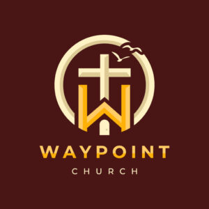
25. Waypoint Church
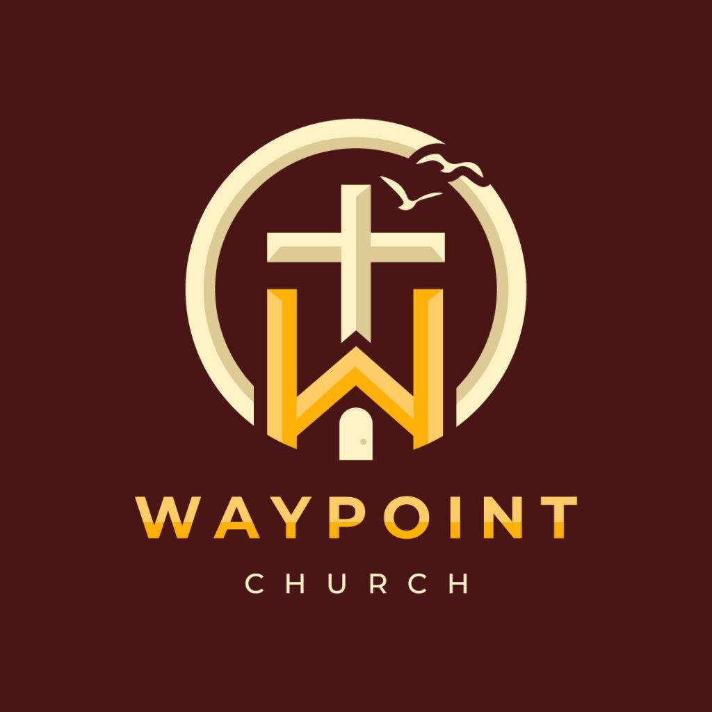
Religious organization logos keep it simple by using a cross. Or, they could use the image of the person they’re honoring. But Waypoint Church uses the W to show their establishment. Another notable feature of this logo is the birds, which is another way to establish its identity as a religious organization.
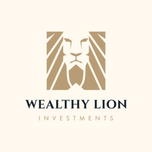
26. Wealthy Lion Investments
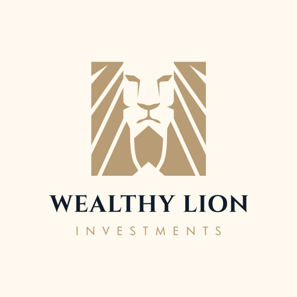
Here’s an example of a subtle W logo. Wealthy Lion Investments uses the lion’s mane to double as sun rays and to create a W logo. Other than that, gold is the best choice for an investment company logo. After all, gold is associated with luxury and wealth.
27. Winston Real Estate Group
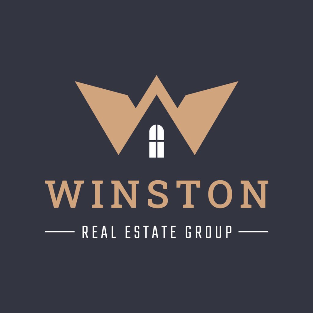
You will typically see real estate logos using houses or buildings. Although Winston Real Estate Group uses the house visually, they have a unique take by using whitespace. On top of that, they veered from the usual real estate logo colors, which are red and blue. Instead, they use gold to show they handle high-end clients.
28. Wash & Wait Laundry Shop
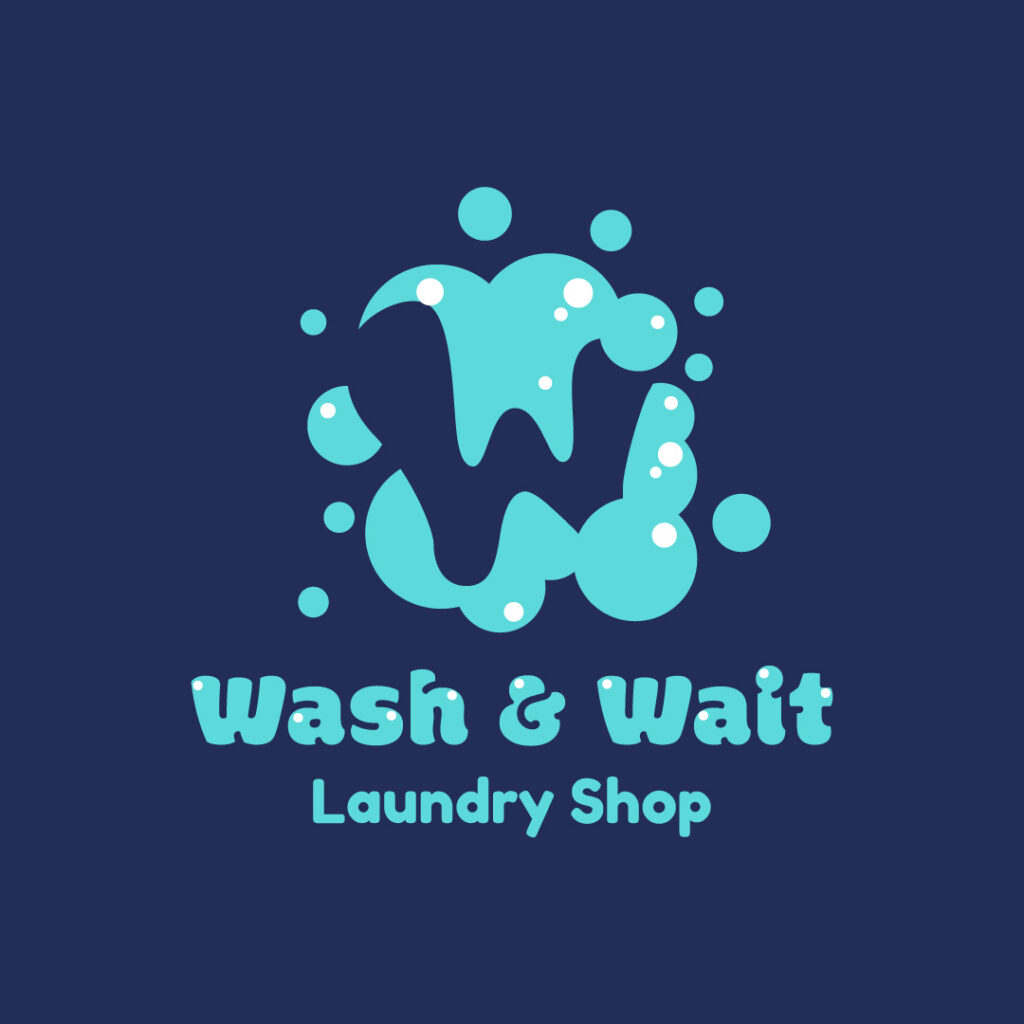
The Wash & Wait Laundry Shop is different from most laundry shop logos. Instead of a typical washing machine, they use suds. Like this logo, you can rearrange the suds to form the letter W. It’s a creative way to make your logo unique from your competitors.
29. Wired Digital Wallet

Fintech companies like Wired Digital Wallet have futuristic logo designs. It shows that they’re forward-thinking and innovative companies. Their gradient finish adds to the modern appearance of their logo.
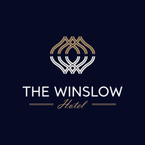
30. The Winslow Hotel
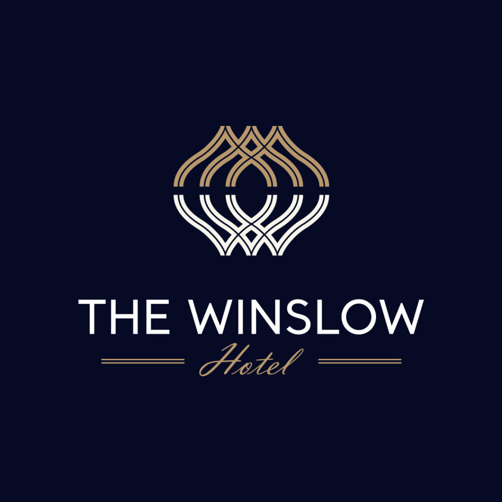
Luxury can be interpreted in different ways in a logo. The Winslow Hotel shows us that gold does that, and the abstract geometric visual adds to the elegant feel. Plus, you can further emphasize the sophisticated feel by mixing two fonts.
Helpful Tips When Designing a W Logo
Designing a logo for your business using the letter W can be a real challenge. You will also need careful consideration to craft one that is unique and memorable. Here are a few tips you can do when designing a W logo:
Identify Your Concept and Meaning
Determine what your brand represents and design a W logo that visually conveys your values. Incorporate symbols, shapes, or icons that resonate with your brand story. And of course, design with your target audience in mind.
Consider Design Elements
Use white space to add visual interest to your W logo. Experiment with different fonts to discover the most suitable type. Also, choose colors. shapes, and symbols that support your brand, but always be mindful that you do not clutter the design.
Maintain Technical Aspects
Make sure that your W logo works in varying sizes and formats. It should be scalable and memorable in any platform you place it without losing quality.
Final Thoughts
Designing a logo for a specific niche is straightforward, especially when you have basic knowledge of color psychology and the proper uses of fonts. However, if you are having a hard time deciding on these factors, it’s time to get the help of professionals. Penji’s team of graphic designers can create beautiful logos for your brand, whatever niche you may be in.
Sign up through this link to start working with us and get the logo designs of your dreams. Watch our demo video here to learn more.
About the author

Celeste Zosimo
Celeste is a former traditional animator and now an SEO content writer specializing in graphic design and marketing topics. When she's not writing or ranking her articles, she's being bossed around by her cat and two dogs.
Table of Contents
- 1. Woodpeck Furniture
- 2. Wiseshop Market
- 3. Willcon Savings Bank
- 4. White Dough Cakes
- 5. Whimsical Arts
- 6. Wheel Square Auto
- 7. Wazzabi Restaurant
- 8. Wayward Tech
- 9. Washout Laundry
- 10. Warren & Warren Legal Firm
- 11. House of Waldorf
- 12. Warm and Weighted Blankets
- 13. Wave Sound Studio
- 14. Winona Winston Wedding Photography
- 15. Warrior Workout Gym and Fitness
- 16. Watsons Advisors
- 17. Wiggle & Waggle Pet Shop
- 18. Wild Spirit Yoga Studio
- 19. Woodfire Grill & Restaurant
- 20. Wellness Weekend Retreat & Coaching
- 21. Wonder World Kid’s Parties and Events
- 22. Wild West Western Outdoor Co.
- 23. Western Oak Furniture
- 24. Westway Consulting
- 25. Waypoint Church
- 26. Wealthy Lion Investments
- 27. Winston Real Estate Group
- 28. Wash & Wait Laundry Shop
- 29. Wired Digital Wallet
- 30. The Winslow Hotel
- Helpful Tips When Designing a W Logo
- Identify Your Concept and Meaning
- Consider Design Elements
- Maintain Technical Aspects
- Final Thoughts


