
Creating airline logos requires expertise and careful planning, otherwise, you’ll end up with a mediocre design. Online logo templates are out of the question, as they can be generic and bland. The best way to go is to work with the pros. Here are Penji’s best airline logos to get your creative juices started:
1. Spark Airways
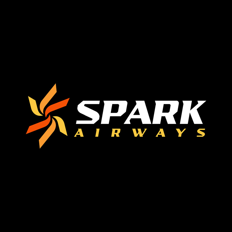
Airline logos are commonly placed on the tails of planes. When you have a memorable logo, people can easily identify your brand, even from down below. This logo design created for Spark Airways is a great example of this concept.
It is an image of a spark that can look good even from 30,000 feet up in the air. The colors are an excellent combination of yellow, red, and orange, which signifies warmth and hospitality.
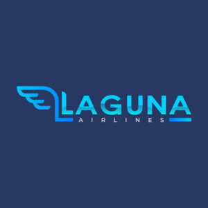
2. Laguna Airlines

From a word that means bay, inlet, or a large body of water, the Laguna Airlines logo sports a primarily blue color scheme. On the brand name itself, we can see waves of water that add interest to the otherwise plain font type used. The wing at the beginning of the logo perfectly tells us what the brand is about.
This airline logo projects a cool, innovative, and trendy appeal that’s suitable for business that thrives on these traits.
Fly to the skies with confidence with an airline logo
Let professionals take charge of your logo
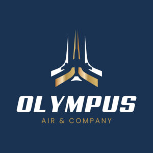


3. Olympus Air & Company
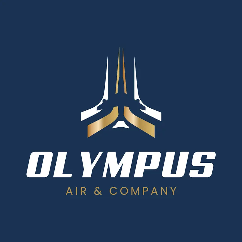
This beautifully designed airline logo for Olympus Air & Company is one for the books. The image has lines pointing upwards to signify flight. When you look closely, you will see the silhouette of an airplane in the middle.
The logo uses gold, blue, and white, which perfectly exudes class, sophistication, and elegance. You can instantly see that this is a high-end brand.
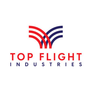
4. Top Flight Industries

For non-airline companies who still want a related logo, check out this one we made for Top Flight Industries. The series of lines on it is reminiscent of an airplane tail to show their connection with the airline industry. It uses bright colors to show strength, reliability, and modernization.
The designer chose straightforward font types to give the brand a no-nonsense personality. This will be effective in showing the company’s commitment to its craft.
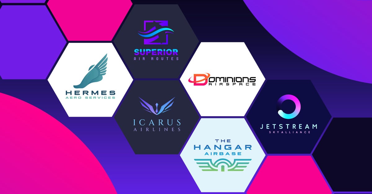
5. Superior Air Routes
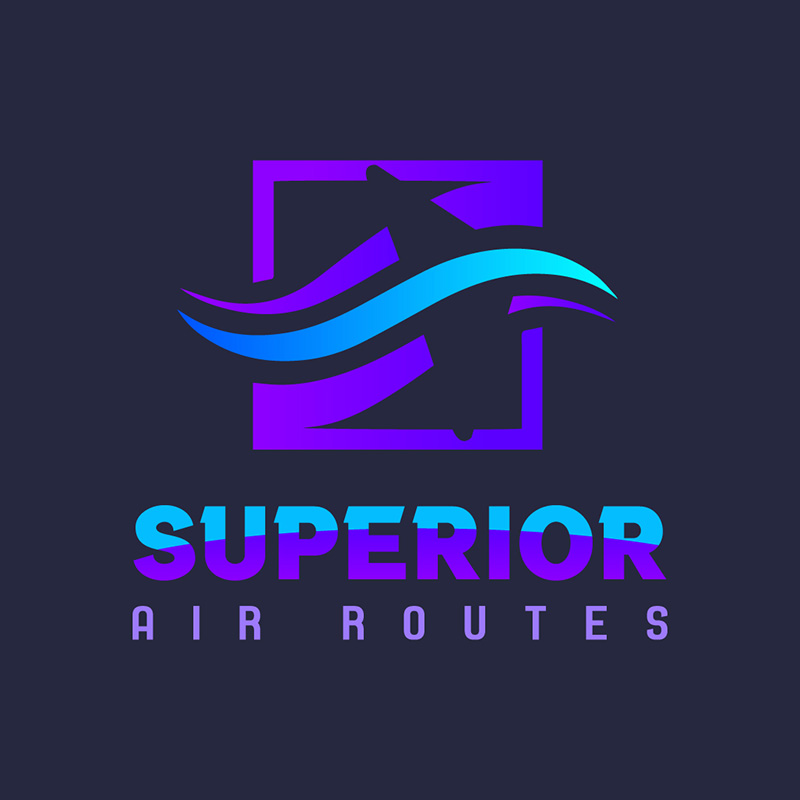
Expect to see more images of airplanes in these airline logos, just like this one made from Superior Air Routes. It has a streamlined image of an airplane that seems to go with the lines. It is excellent in showing movement that’s ideal for airlines, cargo services, and many other similar businesses.
This logo uses a color palette with violet as its main color. It fits the brand well, as the color violet projects creativity, power, ambition, and independence.
6. Hermes Aero Services
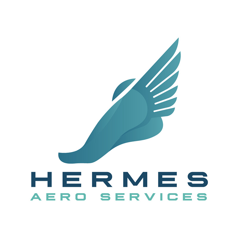
Named after the Greek God, Hermes Aero Services chose the right deity to represent them. He is considered the protector of travelers, among many others. In the logo, we can find an image of a foot with wings that signify flight.
If you place this logo on an aircraft, a van, or a billboard, you’ll instantly see that they are in the courier niche. The choice of dark green for its logo color suits the brand well, as it symbolizes transition, wealth, and diplomacy.
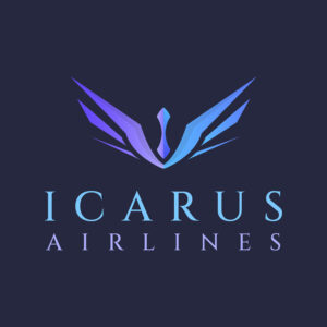
7. Icarus Airlines
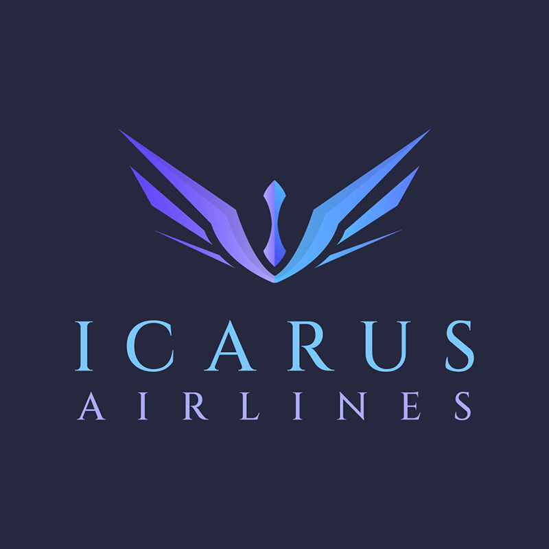
This airline, named after a winged personality from Greek mythology, has a logo that oozes style, flair, and grace. Like the character this airline was named for, the logo includes wings to show flight and movement. The Icarus Airline logo uses different shades of blue and violet, which is ideal if you want to give your brand a powerful and stable persona.
The choice of font type is suitable, too, as serif fonts give an authoritative, professional, and trustworthy brand identity.
8. Dominions Airspace
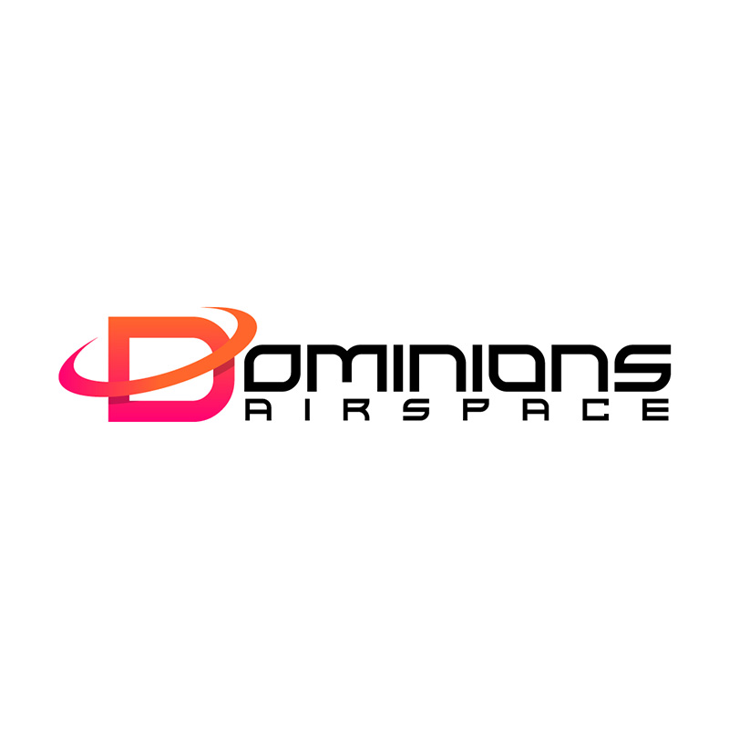
This logo design for Dominions Airspace is another example of a logo that is scalable and would look good on an airplane tail. The designer placed a circle around the letter D to make it look dynamic, innovative, and trendy. The warm colors add life and vibrancy to the overall design.
The designer chose a futuristic font type to highlight the company’s use of advanced technology. It is an excellent font if you want to have that modern and sleek style.
9. The Hangar Airbase
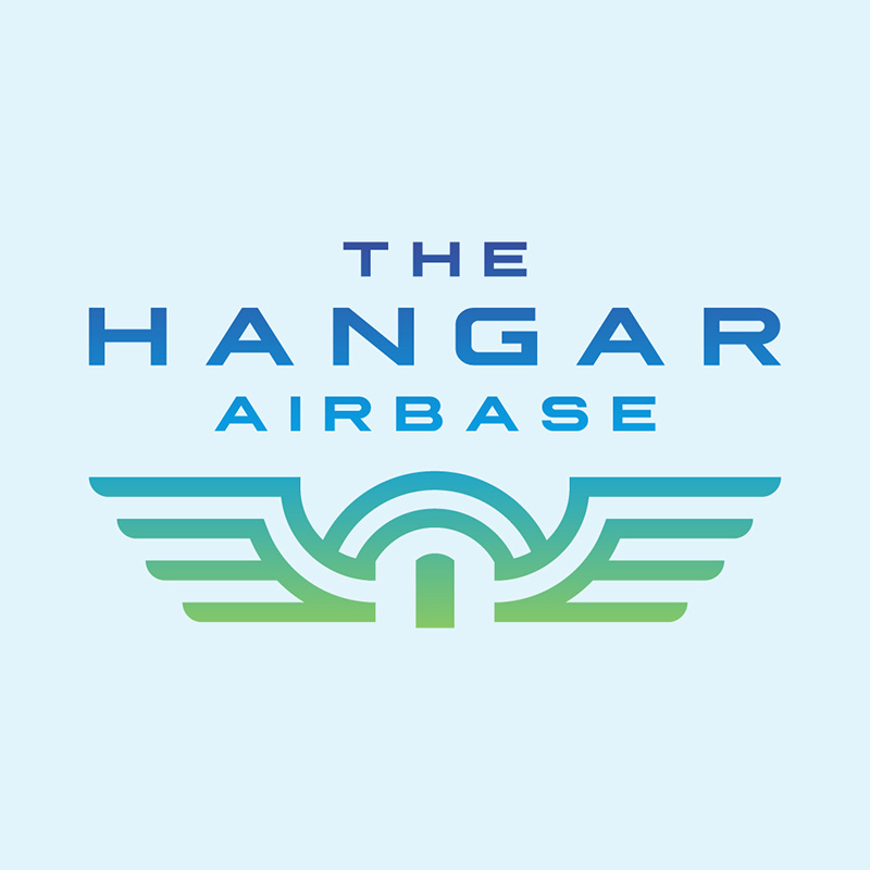
Looking at this logo, the first thing that comes to mind is a bar/grill/restaurant that has an aeronautics theme. Whatever the nature of the business, a great logo design should reflect what the brand is about. The Hangar Airbase’s does just that.
The logo has an image of wings with a small door in the center, evidently a welcoming gesture. The colors are very fitting and the font choice is superb, all of these describe the brand’s personality well.
10. Jetstream Sky Alliance
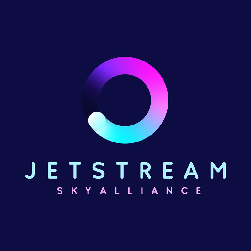
This bright and colorful logo designed for Jetstream Sky Alliance is ideal if you want your company to show its active, happy, and playful side. The circle above the brand name has multiple colors to show the company’s versatility, flexibility, and friendliness.
The font choice is a simple type with rounded edges that will look good on letterheads, business cards, and other branding collaterals.
A few tips when designing airline logos
The airline industry has a high standard when it comes to designing a logo. It has to show the niche’s prestige, professionalism, and a touch of glamor. Below are a few things you need to consider when designing an airline logo:
Your brand identity: Your logo should reflect your airline’s personality, which includes its mission, vision, values, and target audience. It should convey its unique selling point and set it apart from the competition.
The symbolism: Use symbols or icons that are relevant to your industry. For airline logos, you can use airplane wings, clouds, globes, or any other aviation or travel-related imagery.
Simplicity: A simple and easily recognizable design is a must. Go for a logo that’s uncluttered, memorable, and versatile. It should look good on a business card, an airplane tail, or wherever you put it on.
Your brand colors: If you don’t have them yet, select your brand colors that evoke emotions and associations related to travel. Blue is an excellent choice to represent the sky, while red can convey energy quite well.
Timelessness: Go for a logo design that will remain effective and relevant for a long period of time. As much as possible, avoid jumping on trends that can become outdated quickly.
There are more considerations and if you find these complicated, you may be in need of professional guidance. Penji has a great team of logo designers that can help you achieve the best airline logo, or any industry logo for that matter. Watch our demo video here to learn more about how we do it.
Conclusion
Airline logos may seem similar to each other, so how do you make your brand stand out? Get inspiration from the above airline logos and picture your brand’s name on them. Replace the colors and fonts with your brand’s own. But you don’t have to do it yourself. Subscribe to Penji today! Or check out our new Marketplace to get designs in two days!
About the author

Celeste Zosimo
Celeste is a former traditional animator and now an SEO content writer specializing in graphic design and marketing topics. When she's not writing or ranking her articles, she's being bossed around by her cat and two dogs.


