


The National Restaurant Association reported there are more than one million restaurants in the country, and many Americans can choose various cuisines. One of the most popular cuisines is Japanese. So far, there are more than 30,000 Japanese restaurants, as IBIS World reported. And if you’re planning on setting up one, a way to distinguish yourself from the crowd is through a unique Japanese restaurant logo. Read more below to view logos for inspiration.
Elements of Japanese Restaurant Logos

Before we get to the list of the best logos for inspiration, here’s what you need to know before designing a Japanese restaurant logo.
Typography or Fonts
Calligraphy is typical in most Japanese restaurant logos. The writing style is embedded in history and culture. You’ll notice that some Japanese restaurants would use only Japanese writing characters or Latin script in calligraphy form.
Eventually, you would have to choose a font that would fit the image your business wants to project. If you want something classy and professional, go with serif fonts. If your Japanese restaurant is on the casual side, use sans serif, geometric, or calligraphy-style fonts.
Color
Red, black, and white are the usual ones you’ll see in most Japanese restaurant logos. Red, in particular, represents luck and power. You’ll see it in temples and even on their flag.
Of course, if your business uses different colors, it most certainly will enhance your brand. Plus, it will stand out from other restaurants.
Mascots, illustrations, or icons
It’s not usual to see characters or mascots on a Japanese logo. Most logos would have written Japanese characters or romanized letters. And if there would be mascots or illustrations, it’s likely the main food they’re selling or a person wearing traditional Japanese clothing.
Hence, if you want to give your logo some life, adding a character or Japanese-related elements will make it unique.
Style
We’re talking about minimalism when it comes to style. Minimalism is ingrained in Japanese culture, and you’ll see it on most logos. Some logos might only have one kanji character, or it would be only a wordmark logo.
Should your logo follow a minimalist style? Not exactly, but you want to go with something simple. You want to avoid overcomplicating your logo. Stick to elements that will represent your brand.
This raises the question: should I have all of these elements in my Japanese restaurant logo?
Not really.
Here’s the thing about logos. Although you want a one-of-a-kind design, you want a restaurant logo that encompasses your brand. It could be your values, what you serve, and the people behind the restaurant.
Make sure that your logo follows these branding elements, simplicity, relevancy, memorability, uniqueness, and timelessness. And if you still need ideas for a well-designed Japanese restaurant logo, here are 15 examples to check out.
Professional logo designs to level up your brand
Have your brand logos created by the best design team


15 Japanese Restaurant Logos
1. Ramen Shokudo
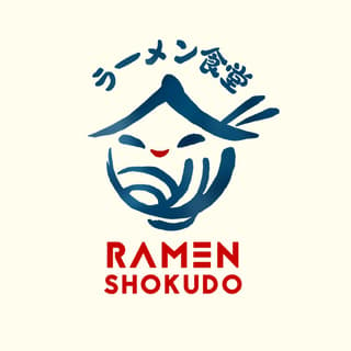
If your brand wants to present authenticity, why not look at the Ramen Shokudo logo. According to Kenny Tai, Ramen Shokudo makes ramen by using fresh ingredients and everything’s handmade. Plus, the brand is deeply rooted in tradition. Not only that, Tai ensured that the logo was different from other Japanese ramen restaurants by adding a face that represents warmth and quality.
2. Sushi Hachiko
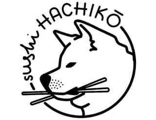
Have you heard the tale of the loyal dog, Hachiko, who always waited for its master in the train station, even if its owner had passed away? The restaurant Sushi Hachiko takes inspiration from that story, making Hachiko the main character in their logo. Plus, they added chopsticks to Hachiko’s mouth to show that they are a sushi restaurant.
3. Dohtonbori
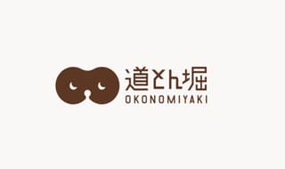
A mascot is the main character of the Dohtonbori logo. It’s a tanuki or a Japanese raccoon dog, and Donhtonbori uses the eyes of the tanuki in their logo. They explain that the tanuki is their mascot because of the familiarity of the character. It could also suggest that, like the tanuki, their main dish–okonomiyaki– is also something that everyone can enjoy.
4. Umi

If modern is at the core of your brand, the Umi logo is one example to look at. They say their brand exudes contemporary and sophisticated. And that’s translated into the logo. But it also has elements of minimalism and simplicity, which is what the Japanese are known for.
5. Afuri
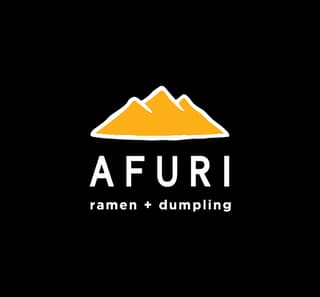
Afuri pays respect to the mountain Mount Afuri in Japan. It’s a place of pilgrimage for Japanese people, and the restaurant uses the mountain in the logo. Similar to the pilgrimage, Afuri aims to become better or “higher.” And by using the Afuri mountain in the logo, it’s a reminder they should aim higher and become a go-to Japanese restaurant in their area.
6. Feng Sushi

If sushi is your specialty, take a look at this logo from Feng Sushi. The sushi illustration looks like it was drawn with a brushstroke, taking inspiration from the calligraphic style that most Japanese logos would have. And if you look closely, the sushi looks like it has two fishes swimming in a pond, which symbolizes balance. It’s also what you’ll notice on their wordmark, using two different font weights.
7. Coco Ichibanya
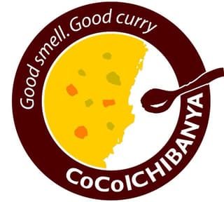
Food is not a usual component in most Japanese restaurant logos. But Coco Ichibanya defies that by putting their signature dish on the logo, the curry. Plus, it looks like the logo is the plate where you can enjoy their tasty curry. Not only that, but they added their motto and a spoon in the logo too.
8. Sushi of Gari

The Sushi of Gari logo is reminiscent of the classic Japanese restaurant logos. The font is similar to calligraphy. Plus, the illustration could be of Gari, the founder, and the master sushi chef. Not to mention, having this kind of logo may also suggest authenticity not only in who’s serving the sushi but also in the experience one will have while dining.
9. Sakae Sushi
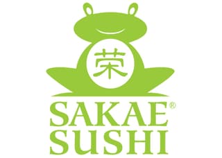
Although the logo for this Japanese restaurant was from its parent company, Sakae Holdings, it’s still relevant to the restaurant and brand. Since Sakae is a Singaporean-based company, the logo presents the marriage between the Japanese and Chinese cultures. The CEO of Sakae Holdings, Douglas Foo, further explains the meaning of the logo in an interview with Canon. He mentioned the frog represents prosperity. The frog also resembles the number eight. Plus, the frog’s lower body is like a rice bowl, which can signify abundance.
10. Sarku
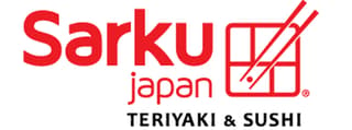
A bento is a mainstay in most casual Japanese restaurants. You will rarely see bentos in logos, but Sarku uses one to show its target audience immediately what they’re serving. Since bentos are perceived as affordable meals, it may indicate that Sarku is serving affordable yet delicious meals for anyone craving Japanese food.
11. Standing Sushi Bar
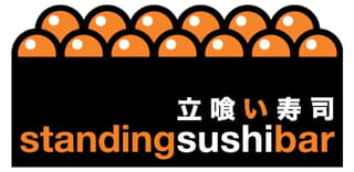
Here’s one unique Japanese restaurant logo. The Standing Sushi Bar uses an illustration of sushi with the seaweed and tobiko (orange eggs) being prominent on the logo. It’s like a treat for the eyes because it will make you crave sushi. Plus, it’s one logo that you won’t miss when you pass it by.
12. Sukiya
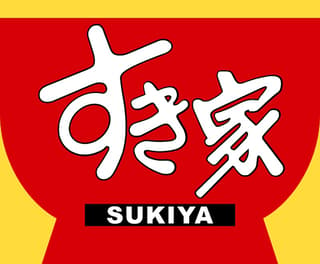
Sukiya is one of the most well-known gyudon chains in Japan. It’s only appropriate that their logo contains a red bowl, which they serve their famous and delicious gyudon. Aside from red being a prominent color in the country, red can also indicate an appetite increase. Plus, with the added yellow, people will flock to one of their chains to get a taste of their gyudon.
13. Yoshinoya
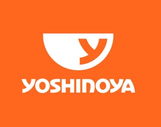
Yoshinoya is another popular Japanese food chain that uses a bowl in its logo. Likely a competitor to Sukiya, Yoshinoya uses an orange motif instead of red and yellow. Chermayeff & Geismar & Haviv explained the redesign of the Yoshinoya. They removed several elements to make it enticing for American audiences, keeping only the Y and aligning it to the side of the bowl. According to Yoshinoya, sales have gone up 22% with the redesigned logo.
14. Wasabi
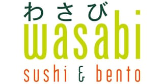
When we think of wasabi, we remember its spiciness and the green paste. Wasabi used the color of the paste on the logo. It also uses orange, which matches well with this shade of green. Another way of looking at the orange is the sushi or the tobiko. Either way, you can use this logo as inspiration if you need something simple or minimalist.
15. Restaurant Le Samouraï
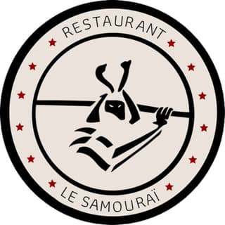
The logo for Restaurant Le Samouraï is straightforward. It shows an illustration of a samurai holding a sword. The circular logo has six stars on each side. This could signify excellence, and the restaurant owners may imply that they’re the best Japanese restaurant in the area.
Hire Penji for Your Japanese Restaurant Logo and Other Designs
With more than 30,000 Japanese restaurants in the United States, how can you make your restaurant different from the others? Aside from the excellent service and great-tasting food you offer, the image you also present to new and existing customers is important too. One way to do that is with a well-designed and unique logo that will catch the attention of your target audience. And if you need one, you’re in luck because you’ve landed in the place.
Here at Penji, our designers can create a logo that will set yourself apart from your competitors. They’re masters at their craft, as they research the industry well, create logo variants that will match your brand, and make it unique to entice your target audience. And if you want to get started with Penji, the first step is to choose your plan and request your first design. It’s that simple. Try Penji for 30 days and see the difference.


