


If you ask any experienced entrepreneur or marketer, they will emphasize the importance of logos. In today’s highly competitive landscape, your company logo must outshine your rivals to establish a visible brand with widespread reach. And if your business name begins with the letter K, you’re in luck! Today, we present a collection of stunning letter K logo designs crafted by Penji.
1. Ketobells Lifestyle
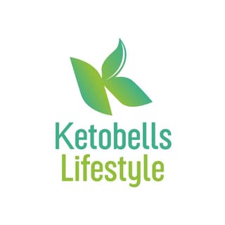
The keto diet isn’t only a fad that health and fitness enthusiasts are raving about today. Experts have commended its effectiveness, so more people are adopting this type of lifestyle. And Ketobells Lifestyle, a brand that sells packed meals and supplies centered on the keto diet, wants a slice of the pie.
They did their letter K logo beautifully by captivating their target audience with the green color. In color psychology, green represents freshness and organic and is also associated with the health industry. The gradients are extremely warm to the eyes, and the letter K seemingly looks like leaves, which indicates low-carb greens.
Let your brand voice be heard with a unique K logo
Hire a logo designer today and get your logo in 1 to 2 days
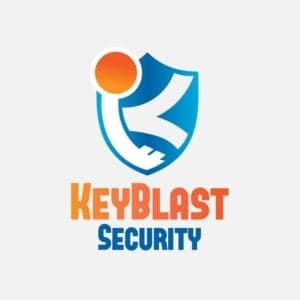


2. KeyBlast Security
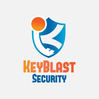
KeyBlast Security is a brand that sells internet anti-virus software and offers security software installations. The brand represents its offer through an Internet Shield, which is known to protect computers against unwanted attacks from the internet or from inside the LAN.
On the shield is also a key that shows their files and confidential documents will be locked and secured. They’ve created white strokes to form both the key and letter K, which looks good amidst the blue shield background.
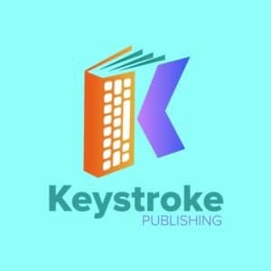
3. Keystroke Publishing

Another innovatively done letter K logo, Keystroke Publishing, has smartly incorporated various design elements to convey its identity. First, the brand displays a book with almost invisible pages. The side of the book also looks like a building, which represents the publishing company. Finally, a letter K replaces the book’s cover to gel everything together. The purple color is also an excellent contrast to the bright orange and makes the logo more eye-catching.
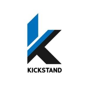
4. Kickstand

Kickstand dons one of the simplest yet compelling logos on this list. It’s a letter K logo design that embodies the five elements of a logo. It’s simple, with only a few corroborating design components. You get the blue geometric lines that make up the top part of the letter. The bottom lines complement the upper part by finishing it up with a solid black color. It’s memorable due to its simplicity, and this logo is undeniably scalable even on big or small branding and marketing collaterals.
5. Kilo Joule Electronics
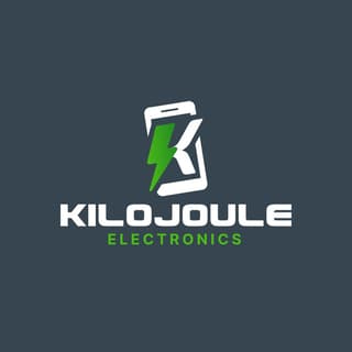
Kilo Joule Electronics is a company that sells gadgets and anything tech-related. The brand included memorability in its logo by ensuring its target audience would immediately know what they’re offering. This is through the clever take on a mobile phone wrapping the letter K and the lightning symbol.
The lightning icon also represents speed and efficiency, which customers are looking for in today’s gadgets. Plus, the green color is an excellent way to break the monotony of the white frame and letter.
6. Kingcraft Arts
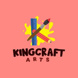
Professional logo designers know what design elements should go into your logo to convey your brand’s personality. This example will show four components that instill top-of-mind awareness within its target market. The ruler, pencil, brush, and yellow paint in the background are enough to instill recall.
Since Kingcraft Arts caters to kids, the ensemble is exceptionally playful and welcoming. The color combinations are also eye-catching, especially among its younger target audience.
7. Kingfisher Gaming
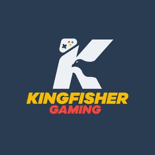
Kingfisher Gaming is another brand that utilizes negative space for its letter K logo design. This example has all the commendable components of a simple yet appealing logo. Let’s start with the fierce-looking bird that cuts through the middle of the letter K as its negative space. Then the letter K design ties everything together by creating continuity. Last but not least, you’ll notice that a controller sits on top of the letter to indicate it’s a gaming company.
8. Knifepoint MMA Training
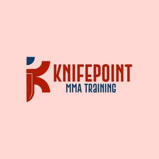
Getting in shape is becoming more popular these days, especially with the threat of pandemics and new viruses. Gyms are increasing because of the demand, so making your visual assets stand out to capture your prospects is crucial. Knifepoint MMA Training does this so well due to its creative integration of various design components.
They made the letter K logo look like a person in a fighting stance. The brand also added a head on top of the letter to resemble a person. Finally, a knife in the letter’s body is subtly displayed to strengthen the brand name.
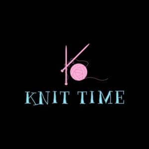
9. Knit Time

For the knit lovers out there, you can instantly relate to this letter K logo design from Knit Time. Relevance is vital when designing your logo so brands can establish a connection with their target audience. In this example, the letter K logo idea comprises knitting materials such as knitting needles and yarn.
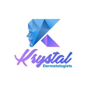
10. Krystal Dermatologists

Krystal Dermatologists aims to make their customers happy by giving them a youthful and flawless glow. This letter K logo example suits the more modern derm clinics and exudes just the proper authority to captivate audiences. The face, coupled with the crystals, has an air of superiority that ups this derm clinic’s trustworthiness factor. The beautiful use of contrasting colors is also a great way to establish trust as blue emanates reliability and purple exudes dignity and wisdom.
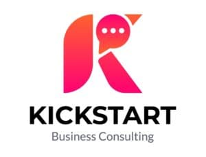
11. Kickstart Business Consulting

Blues, reds, and blacks are the most popular colors in logos. And if you want people to recognize your logo, the Kickstart Business Consulting logo should serve as inspiration. Pinks aren’t utilized in most logos because of its associations. However, pink can present a hopeful and optimistic side to your brand.
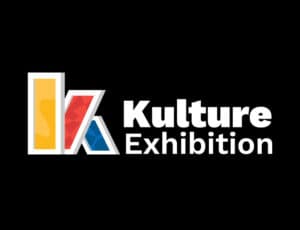
12. Kulture Exhibition
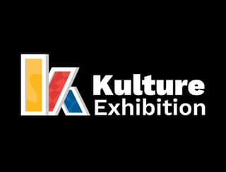
There’s no need to overcomplicate logo design, especially if you can tweak several elements to suit your brand. In this instance, Kulture Exhibition has a letter K logo using primary colors and paintings. Even without the wordmark, a gallery or exhibition viewer will know exactly what the organization is doing.
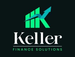
13. Keller Finance Solutions
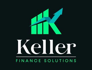
You can establish trust and reliability through color, like this logo for Keller Finance Solutions. The green motif shows us they will help clients with financial needs. Plus, the blue arrow further strengthens its branding by guiding clients through investments.
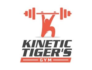
14. Kinetic Tiger’s Gym

The Kinetic Tiger’s Gym logo is a great example of a logo showing us that you don’t have to make an animated or moving logo to depict movement. A simple tilt with typography can do the trick. Plus, you can use imagery to achieve that. It’s also worth noting that orange represents vitality and energy. And this is most evident when you see people work out in the gym.
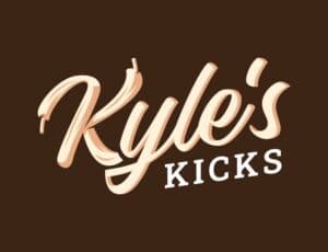
15. Kyle’s Kicks
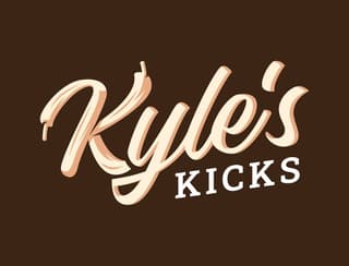
Sneaker sellers like Kyle’s Kicks aim to be one of the leading sellers in the online community. A logo like theirs can capture their target audience’s attention. After all, most sneaker sellers would use the shoe imagery or have no logo at all. With this logo, they are demonstrating professionalism and legitimacy.
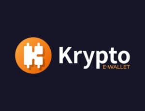
16. Krypto E-Wallet
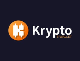
More than 80+ cryptocurrency wallets exist today. The Krypto E-Wallet logo uses the standard yellow-orange coin to show that their e-wallet accepts any cryptocurrency, making it a relevant logo. Not only that, but it’s also unique with the use of the letter K logo inside the coin.
17. Koala Kids Playhouse
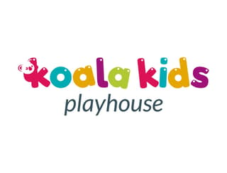
Your logo should not only represent your brand, but it should also resonate with your target audience. The Koala Kids Playhouse logo is an excellent example of that. Their logo is colorful, yet they make sure that all colors complement one another. In addition, they use a playful font and have a tiny koala clinging onto the K.
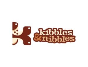
18. Kibbles & Nibbles
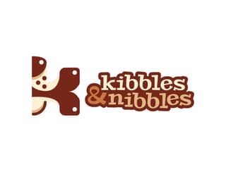
Using animals for your pet food logo could be tempting, but the Kibbles and Nibbles logo is one example where you don’t need to have your furry friends as the main attraction. Aside from the compelling pictorial mark, one way to make your logo unique is through fonts. You can present a fun and playful side to your brand with text.
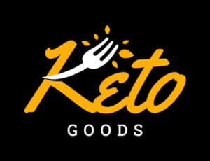
19. Keto Goods

Keto Goods is another keto food provider on this list. They distinguish themselves from the competition by adding a fork to the letter K logo. In addition, the brand wants to provide an enjoyable eating experience with the food they create or provide through the use of yellow. Yellow evokes warmth and cheer.
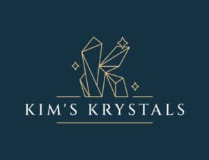
20. Kim’s Krystals
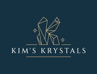
Kim’s Krystals gives the impression of chicness and elegance, thanks to their letter K logo. The use of minimalist line illustration gives the brand that vibe. Plus, the gold motif adds to the sophisticated feel of the logo.
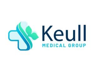
21. Keull Medical Group
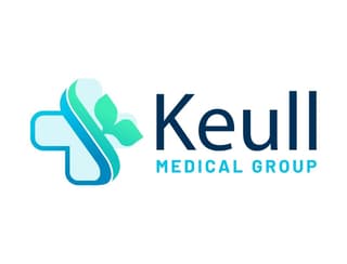
Although hospital logos may use crosses to represent life, you can tweak the cross to your own brand, like this one for Keull Medical Group. Instead of using a whole cross, part of it is grayed out and replaced by two lines. These two lines represent trust and safety, which are the core values of the medical group.
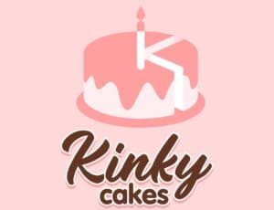
22. Kinky Cakes
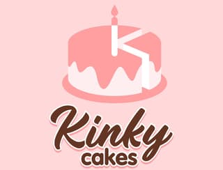
You can stick to the basics of your logo design by making some adjustments to it like this logo for Kinky Cakes. Although they could have stuck with the cake as the main image, they sliced it and added a candle to form a letter K shape. It’s one trick you can try for your bakery logo.
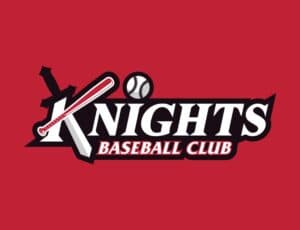
23. Knights Baseball Club

If you want to make your baseball club official, check out the logo for the Knights Baseball Club. You can make your logo different by putting an iconic image or element based on your organization’s name. Theirs is a sword, which was added to the letter K logo. Plus, you can also make use of elements from your organization, such as a baseball or a bat, to signify that you play the sport.
24. Kind Youth
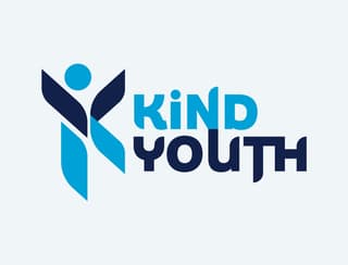
The Kind Youth provides another logo example that meets all the principles of logo design. The geometric illustration of the human forms the letter K. Another thing of note in this logo is the typography. You’ll notice that the font is similar to the shapes used in making the letter K logo.
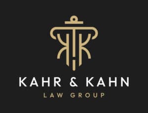
25. Khar and Kahn Law Group
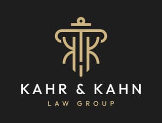
The Kahr and Kahn Law Group logo shows us you can use a recognized image and turn it into something creative. It’s okay to make tweaks to well-known icons or figures to integrate your branding into your logo. After all, you want a unique logo that your target audience can recognize after seeing it a few times.
26. Kumu Milktea & Pastries
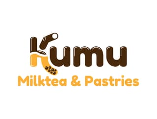
You can make customers feel hungry without using the color red in your logo. One such example is the Kumu Milktea & Pastries logo. In one glance, you’ll notice the boba on the letter K logo. But the boba was also subtly added on the upper part of the K and the “umu” was achieved through a shiny effect.
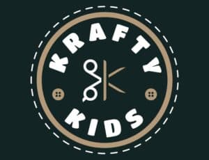
27. Krafty Kids
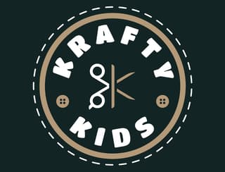
Shapes are one way to tell a story through your logo or if you want to be perceived in a certain way. In this case, the Krafty Kids logo uses a circular logo depicting warmth and approachability. Plus, it’s a relevant logo to use, considering that the target audience is kids who are into crafts.
28. Kelly’s Kitchen Essentials
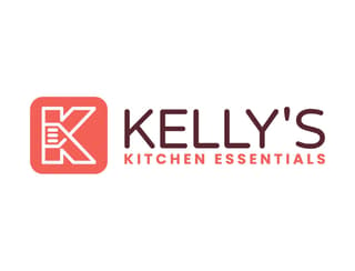
Kelly’s Kitchen Essentials is another simple logo you can get inspiration from. One way to integrate the kitchen branding into the letter K logo is by adding a kitchen essential like a spatula. Finally, you’ll notice that the logo is more noticeable because of the red color to help the brand stand out from the competition.
29. Kapstones Real Estate
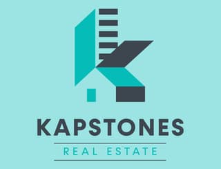
The Kapstones Real Estate logo is another example where negative space was used effectively. Instead of just using the letter K, there’s a house and all other real estate elements to ensure that it is unique to the brand. Plus, Kapstones wants to show its target audience that there are endless possibilities when prospective homeowners are looking for their new homes.
30. Kronwell Manpower Agency
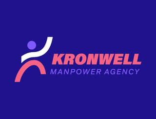
The Kronwell Manpower Agency logo reminds us to keep it simple. Since they’re a manpower agency, it makes sense to have a human as the imagery. But they took it up a notch by forming a letter K with the body. Plus, when it comes to colors, make sure to stick ones that match and are pleasing to the eyes.
Conclusion
Your letter K logo should communicate well with your target audience. You’ll instill brand recall once you hook them with relevant, consistent, and quality visual assets. If you want your letter K logo professionally made by experts, let Penji’s logo designers craft the most unique and high-quality logo for you. You can try Penji’s money-back guarantee for 30 days and request many designs since the turnaround time is only 24 to 48 hours. If you want a better deal, sign up now for a 15-percent off your first month.


