

Crafting a logo serves as a strategic move for companies, enabling individuals to recognize their products or services readily. That’s why an appropriate logo provides a competitive advantage to a brand. Today, companies are consistently looking for designers to create new or improve their logos. While logos are part of your brand identity, consistently using them has a long-term impact. Let’s browse through these letter t logo designs for inspiration.
But what makes a good logo?
A good logo design should consist of the following characteristics:
- A logo should be eye-catching.
- It should be memorable and timeless.
- It should work well, large or small.
- And lastly, it should encompass our brand vibe.
Once you discover your brand vibe, the logo-making process can get much simpler. In order to make the most of your brand identity build-up, check out these 30 letter T logo examples made by talented designers at Penji for its clients.
1. Tablespoon Kitchen
In creating a logo, you can be literal, but make sure it fits your organization. That said, this logo example is fit for a bar or restaurant. Tablespoon Kitchen logo is sleek and straightforward. The letter T logo shows silverware, particularly a spoon figure which is apt for the brand name. Plus, the black and silver color combination adds to the simplicity of the design.
Unique T logos perfect for your brand!
Create your logo project today and get your concepts tomorrow.

2. Thirteens Apparel
As the brand suggests, the Thirteens Apparel logo exudes a young and trendy vibe suitable for the target audience. The “thirteen” text mark has an almost-gradient font color if you look closely. It makes the design more attractive and stands out from the rest of the competitor brands within the industry.
3. Turtlecup Design
Turtlecup Design has been really clever with its logo design. First, the bright and lively brand color palette in the Turtlecup Design emphasizes the brand name. Green and yellow really blended perfectly in this logo. Then the text orientation, which is slightly slanted, makes it distinct from common logos nowadays.
4. Taskmaster Software
The Taskmaster Software has the most flexible logo design in this collection. When we say flexible, it’s a suitable design for any company’s marketing assets. It’s great for designing the company website, signs, banners, packaging, business cards, official apparel, letterheads, presentations, or even company vehicles.
5. Touchdown Travels
The entire travel industry was a hardly-hit sector during the pandemic. Now that travel bans and restrictions are gradually lifted, it is an excellent opportunity to improve your branding. Similarly, enhancing your logo design may help you stand out in the crowd. This is why you have to use your logo to promote your niche and offer a specialized service. Touchdown Travel used the letter T logo to represent the hopeful perspective of a travel agency.
6. Threefolds Library
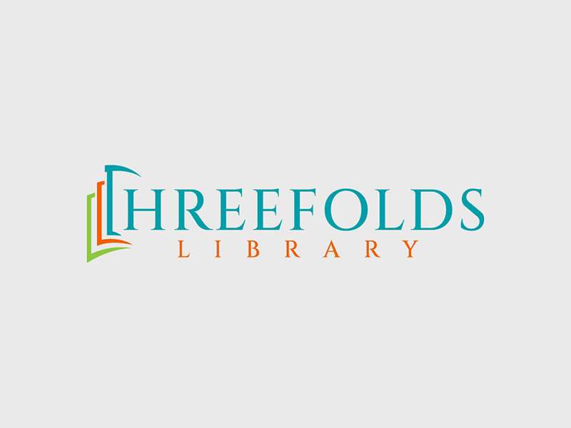
Libraries play a significant role in the information services industry. Threefold Library logo design focuses on the primary services of libraries, such as the circulation of books and reading for educational, professional, and personal development. The leftmost icon, which is also a letter T initial, shows three layers of books, signifying the organized arrangement of books in the libraries.
7. Truckload Logistics
As mentioned above, the goal of having a logo is to make the brand timeless and memorable’
This letter T logo design represents mobility because of the arrow pointing forward. As a logistics company, responsible, fast, and efficient delivery of services is crucial. Additionally, creatively-chosen typography and colors can also quickly draw attention whenever the logo is used.
8. Trattoria Bar and Resto
Is it a coincidence that Italian dishes are often associated with the colors of the Italian flag? It might be true, just like this Trattoria Bar and Resto logo design. The red and green colors from the Italian flag are incorporated into the design, specifically in the letter T logo. Said strategy can be effective in enticing customers who love Italian food.
Adding this small pop of color prevents your design from looking flat and boring. This is a trick designers use most of the time. The Trattoria Bar and Resto logo is a great example of this.
9. Textile Textures
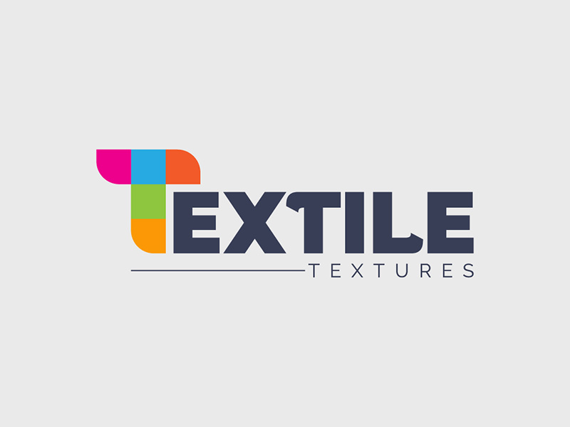
The letter T symbol in this brand logo is a pile of colorful fabrics. Simple but powerful! Likewise, the combination of two different fonts in the letter marks blends perfectly with the happy colors used in the logo. In short, it brings out outstanding visuals, thereby creating an impactful logo.
Going back to font style, it’s good to see that the designer did not limit himself to combining two different font styles. In fact, there are more cool colors you can play with your logo design. Check out these 64 cool fonts we’ve curated for you!
10. Tsunami Advertising
This is a creative example of how the letter T logo is designed and how advertising thrives in an industry where creativity reigns. The smart inclusion of waves in the Tsunami Advertising logo design clearly projects an impressive brand image.
11. Trips, Tours & Travel Agency
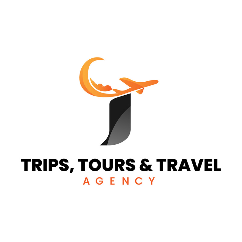
A letter T designed to include an airplane, a cloud, and a swirling speed line, Trips, Tours & Travel Agency’s logo is noteworthy. The orange paired with black gives it a warm yet professional personality that’s perfect for a travel agency. Doing this shows that your company is flexible and competent.
12. Threadwell Consulting
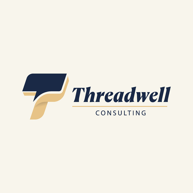
Showing professionalism in your logo reflects your company’s mission and vision. It lets your customers know you’re determined to give them the best products or services. This Threadwell Consulting logo does this perfectly. The letter T logo is slightly slanted to show forward movement, while the colors are light and never loud.
13. Thunder Freight & Logistics
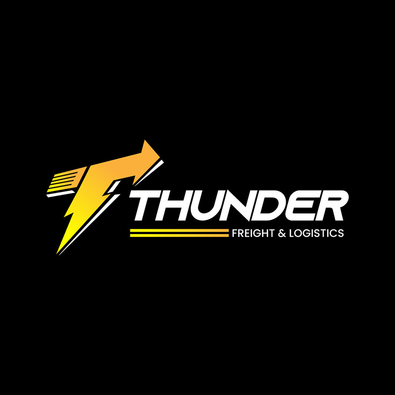
Regarding forward movement, it’s natural to find Thunder Freight & Logistics’ logo to have this trait. Speed and power are key to providing the best logistics and shipping services, thus the brand name Thunder. And to match its suitable name, a logo that shows its promise of delivering prompt and reliable services.
14. Top Dog Kennel
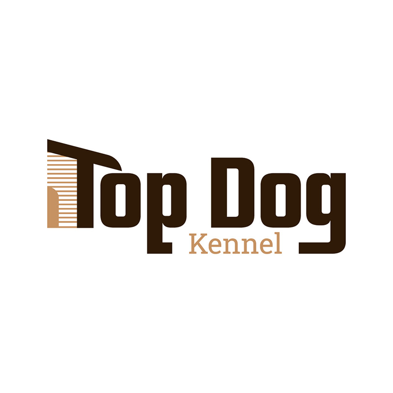
A letter T designed to form the side of a house, Top Dog Kennel’s logo is a welcome sign for its patrons. The logo design illustrates the company’s objective to provide a safe and secure second home for its customers’ beloved furbabies. The color choice is spot on, as we commonly associate brown with earth, dirt, and nature, which is the natural habitat of animals.
15. Tom’s Bar & Grill
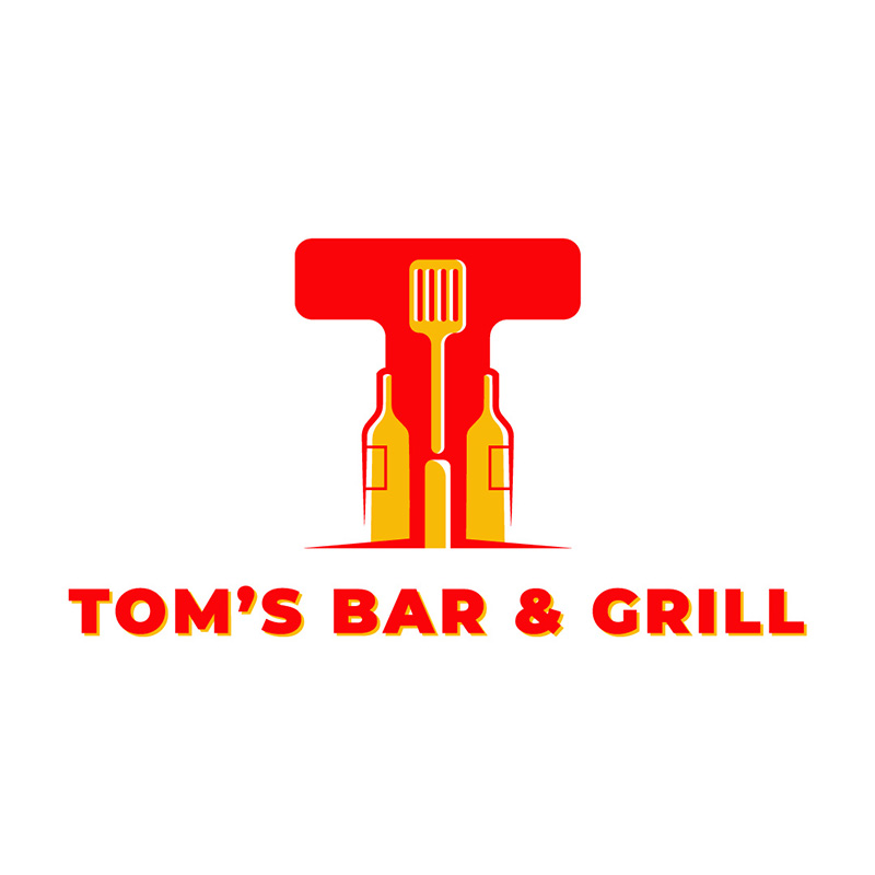
Using a letter T with drink bottles surrounding it, this Tom’s Bar & Grill logo really hits the nail on the head. The logo uses warm colors such as red and yellow as these are known to stimulate appetite. In addition, it gives the brand a lighthearted and welcoming appeal.
16. Tropical Fuel Gas Station
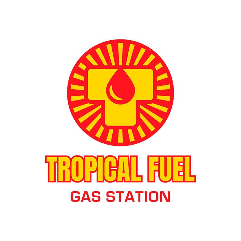
Gas station logos such as the one created for Tropical Fuel needs to be highly scalable. It ensures that your logo will look good when seen on a large sign from far away. It should also look equally great when placed on a business card. This is an excellent design inspiration if your business is similar.
17. Thrive Investment
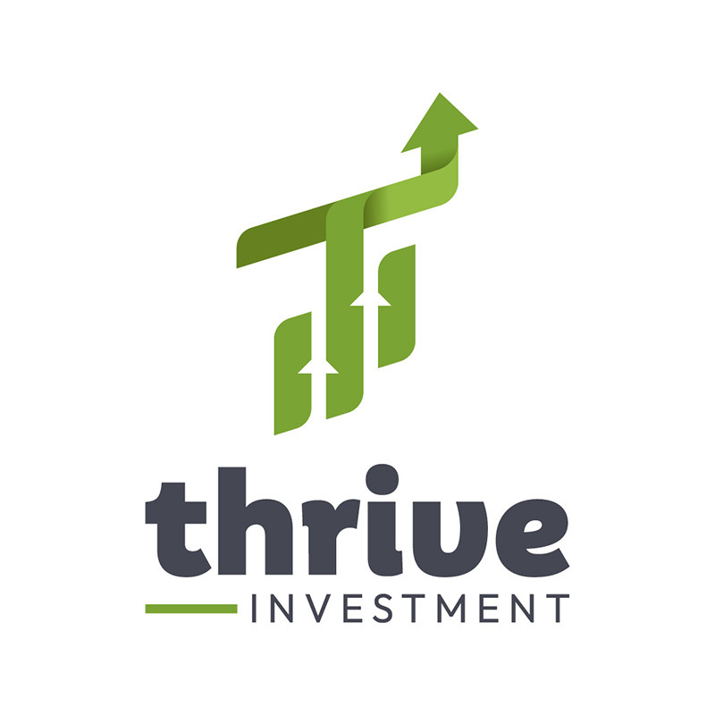
Green is the color we mostly associate with growth and money. Thus, Thrive Investment uses this in its logo design. It is to show that an investment in the brand will mean prosperity and success to its customers—the lowercase letters used in the name hint at a friendly business nature.
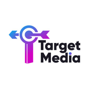
18. Target Media

A bullseye logo symbolizes target, focus, and accuracy. It often represents a company’s aim to provide precise, quality services or products. And so, Target Media has this image in its letter T logo. It has an arrow running through it, aptly telling customers that they do more beyond their call of duty.
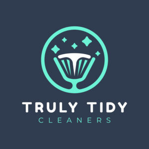
19. Truly Tidy Cleaners
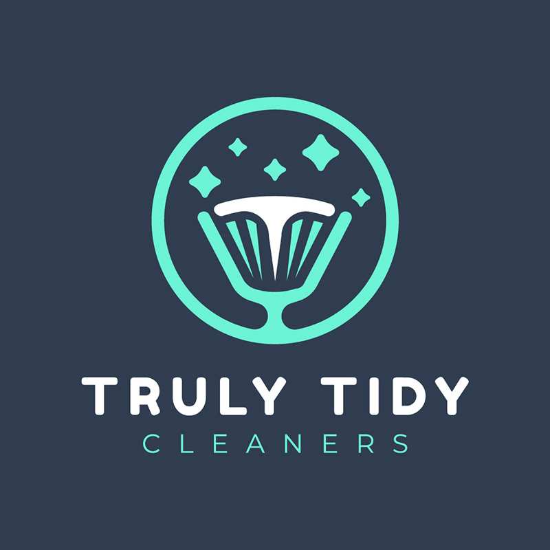
Fonts can be powerful in giving your brand the correct image it needs. In Truly Tidy Cleaners’ logo, it uses simple fonts that are clean and uncluttered. It has an icon incorporating the letter T with some four-pointed stars that typically show sparkle and shine. The grey and light green colors denote freshness, youth, and innovation.
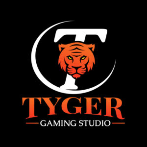
20. Tyger Gaming Studio

Even if the brand name is spelled differently, you’d still expect Tyger Gaming Studio to have a tiger’s face. Tigers have long been symbols of power and strength due to their impressive physical abilities, such as agility, speed, and raw power. In gaming, these are skills you need to have to succeed.
21. Techno Hub

When designing a logo for a specific industry, it’s essential to include relevant design elements. In the case of techno Hub, it uses connected dots that are generally used in technology. This represents the idea of interconnectivity and the flow of data or information between different components or devices.
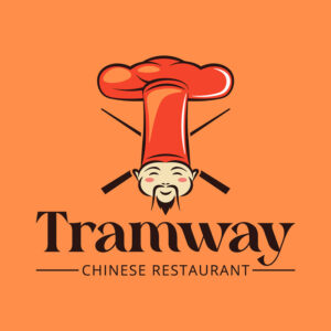
22. Tramway Chinese Restaurant
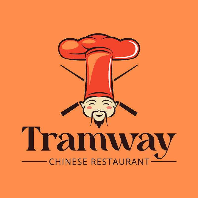
With a top hat shaped into a letter T, Tramway Chinese Restaurant’s logo is a great inspiration if you are in the same business. To emphasize the restaurant’s specialty, which is Chinese food, it included a cartoony image of a Chinese chef in it.
23. Turbo Tempo Music Store
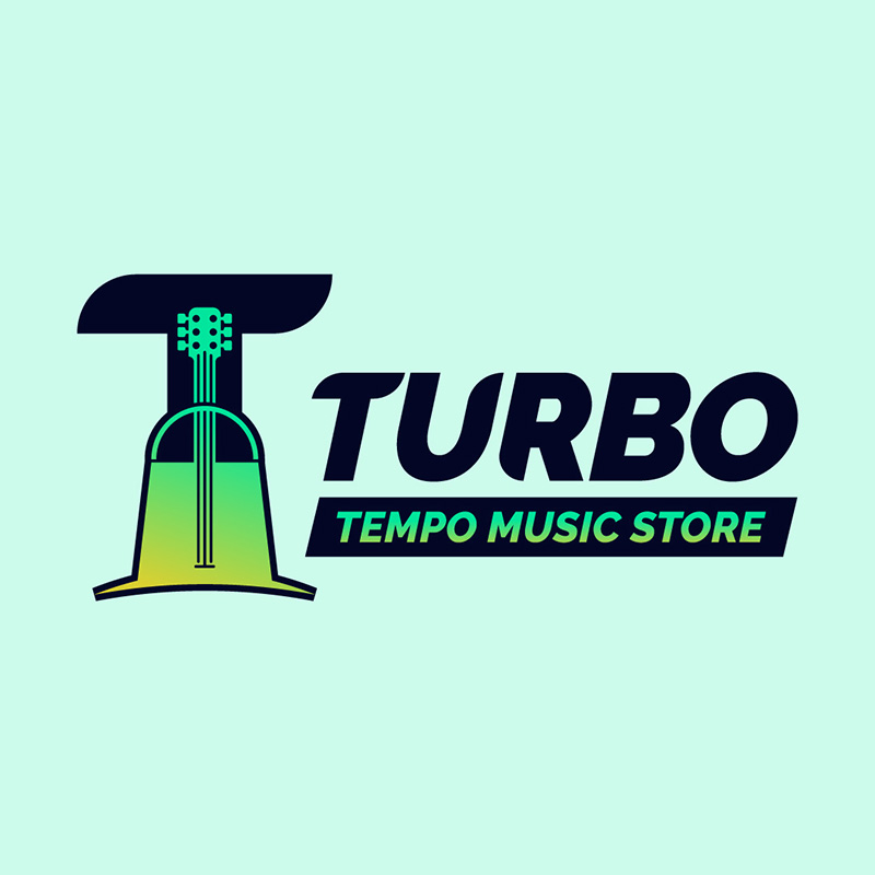
In some musical contexts, “turbo” refers to a faster tempo or beat to get listeners moving and dancing. This is precisely what Turbo Tempo Music Store has done in its branding efforts. The logo design is lively and upbeat, very much suitable for its brand personality.
24. Topnotch Agency
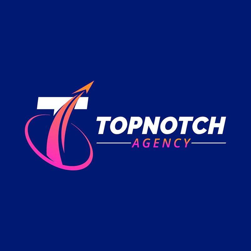
An arrow pointing upwards is the first thing you’ll notice when you look at Topnotch Agency’s logo. They want to show that they mean it when they call themselves top-notch. The color blue perfectly shows authority and trustworthiness, which are essential in the company’s industry.
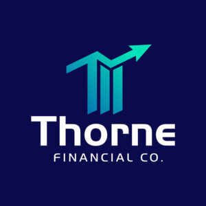
25. Thorne Financial

Again, an arrow used in a logo to show growth, movement, and success, the Thorne Financial logo is worth emulating. The unique font, excellent color combination, and simple icons make it a design ideal for a finance logo. Designing a logo for a finance company can be difficult as it is often seen as a serious and conservative industry.
26. Tago Jazz Bar
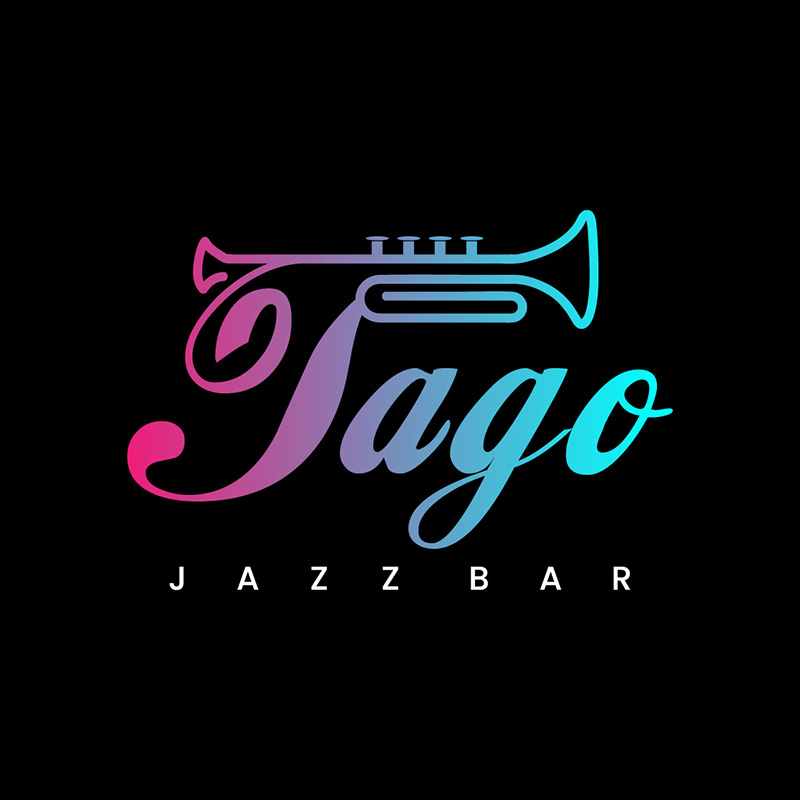
This wittily-designed letter T logo for Tago Jazz Bar is another excellent inspiration if you are in the same niche. It uses a wind instrument commonly used when making Jazz music. The multiple colors show the brand’s fashionable side, which is ideal for attracting new customers.
27. Terra Inc.
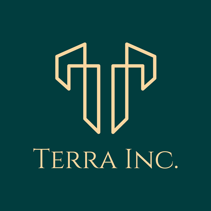
Terra is a Latin word that means “earth” or “land,” making it a great brand name for a real estate company. This logo designed for Terra Inc. shows professionalism, class, and elegance, that’s perfect if you have a high-end brand you want to introduce. This is also a great example of a scalable logo.
28. Tribune Therapy

Fonts are great for showing emotions in a logo. Tribune Therapy knows this and did it in its design. The name was done using a fancy typeface that shows its caring side. It illustrates the company’s objective of providing personal and affectionate service.
29. Terry Tyrell Photography
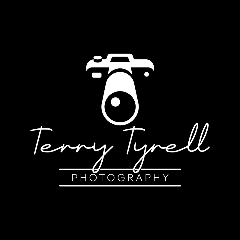
A black and white letter T logo for Terry Tyrell Photography is flawless. It is a classic and timeless color scheme that can convey sophistication and professionalism. Also, black and white can evoke a sense of timelessness and simplicity, which is vital for a photographer’s logo, as photography is all about capturing memories and moments.
30. Turner & Thompson Law Firm
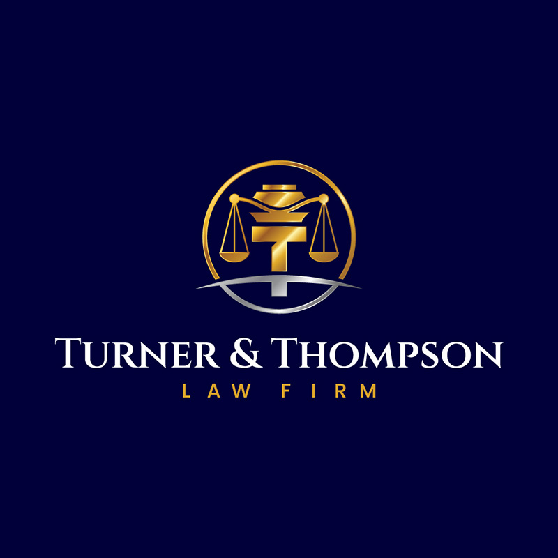
The Turner & Thompson Law Firm conspicuously included the letter T in its logo design. It gives the overall design balance as the T fits the scales perfectly. The gold and blue combination stands out to show the brand as a company with the highest of standards.
Final Thoughts
You don’t have to search for designers everywhere for your logos. Sign up for Penji, which provides unlimited graphic design services. Aside from logos, you can create any project ranging from advertisements to marketing materials to website and app designs.
Penji offers three simple pricing plans such as Pro, Team, and Daytime. Pro is priced at $499 a month while the Team plan is at $699 a month. With the $999/month Daytime plan, you’ll get everything the Team plan offers plus access to USA daytime designers, same-day turnaround time, and a dedicated art director. Sign-up now and get a 15 percent discount on your first month and a 30-day money back guarantee.
About the author

Rowena Zaballa
With a background as a former government employee specializing in urban planning, Rowena transitioned into the world of blogging and SEO content writing. As a passionate storyteller, she uses her expertise to craft engaging and informative content for various audiences.
Table of Contents
- But what makes a good logo?
- 1. Tablespoon Kitchen
- 2. Thirteens Apparel
- 3. Turtlecup Design
- 4. Taskmaster Software
- 5. Touchdown Travels
- 6. Threefolds Library
- 7. Truckload Logistics
- 8. Trattoria Bar and Resto
- 9. Textile Textures
- 10. Tsunami Advertising
- 11. Trips, Tours & Travel Agency
- 12. Threadwell Consulting
- 13. Thunder Freight & Logistics
- 14. Top Dog Kennel
- 15. Tom’s Bar & Grill
- 16. Tropical Fuel Gas Station
- 17. Thrive Investment
- 18. Target Media
- 19. Truly Tidy Cleaners
- 20. Tyger Gaming Studio
- 21. Techno Hub
- 22. Tramway Chinese Restaurant
- 23. Turbo Tempo Music Store
- 24. Topnotch Agency
- 25. Thorne Financial
- 26. Tago Jazz Bar
- 27. Terra Inc.
- 28. Tribune Therapy
- 29. Terry Tyrell Photography
- 30. Turner & Thompson Law Firm
- Final Thoughts


