
A logo that effectively differentiates your business from the competition is a crucial component of establishing brand recognition. A good example of this is the rebrand Elon Musk did for Twitter, now known as X. Here are 30 X logo designs crafted by Penji’s talented logo designers. We also included the story behind X’s rebranding journey. Enjoy!
Twitter Rebranding: Why a Letter X Logo?
When Elon Musk secretly bought out Twitter in October 2022, it surprised everyone. When Elon Musk launched Twitter’s rebranding to X in July 2023, the move not only surprised everyone. It may have pushed Twitter’s legacy users away. But should they jump ship?
Twitter may not be the same anymore. These are the thoughts of all pioneer and new users who enjoy posting 280-character-long tweets on current world events. Indeed, Twitter may long be dead. But lo and behold, Elon Musk always has a trick up his sleeve.
Clue: Tech and banking.
The announcement came at night, like lightning striking any unexpecting victim, on July 24th. Executive chair Elon Musk said Twitter would now be called “X,” and all Twitter branding would be dropped.
Once you log in to twitter.com, a bland X logo welcomes you, with the copy “Join Twitter today” underneath. But that’s not the only URL that directs to Twitter. Elon Musk’s online banking app coined in 1999, X.com, also now redirects to Twitter—or X.
Why Elon Musk Rabranded Twitter to X
This move is all just a part of the tech juggernaut’s plan to use Twitter to launch X, THE “everything app.” If anyone could recall Musk’s push-and-pull buyout in 2022, it would all make sense now.
Linda Yaccarino, X’s CEO, said the platform will change its course from social networking to a broader range of digital products and services. Gone are the quick 280-character long posts, as X is now considered a space for anything AI-powered. Messaging, banking, marketing, media, videos? You bet.
On another note, the rebrand is also a part of reputation control. While old Twitter users might be wary of the new platform, the rebrand gives X a fresh start. Twitter has received public backlash due to harassment, fake news, and toxic discourse. And the rebrand puts Twitter in a new light and gives X a fairly new beginning.
Elon Musk’s Love for the Letter X
If you have followed Musk since 1999, you’ll notice the tycoon loves the letter X. In 1999, he founded the online banking app x.com. The following year he started the space development project to reduce space travel and eventually colonize Mars. He called this project Space X.
In 2020, Musk dated the famous indie pop star Grimes and bore a child infamously named X. Finally, in 2023, Musk rebranded Twitter to X with a surprisingly forgettable logo.
But did the company do a great job with the logo? Or has he lacked the judgment for a better letter X logo? We think the logo is forgettable, and Musk should’ve hired Penji’s professional graphic designers. Check out some examples of our letter X logos below.
Why Do Companies Rebrand?
Rebranding is necessary to start anew. Facebook rebranded to Meta, and Philip Morris rebranded to Altria, so why can’t Twitter rebrand to X? If it means expanding to a much bigger user base, a rebrand might be imperative. On top of that, here are some reasons why companies rebrand.
Shift to another industry/niche
A rebrand is necessary if a company wants to enter a new market. Shifting to another industry often happens if the company can’t keep up with its competitors or if its current industry isn’t lucrative. Changing your brand identity would require new branding visuals, including your brand name and logo. This way, you’ll reflect the new vision, mission, values, products or services, and company structure.
Offer fresh reputation
Another reason why companies rebrand is due to reputation control. They say negative publicity is still publicity. Unfortunately, some brands fail to recover regardless of how good your PR team is. This often leads to product or service boycotts. A rebrand, such as giving your company a new name or logo, will subconsciously imprint new branding, management, and values in your audience.
Get with the modern times
A rebrand may involve subtle changes to the logo or a complete overhaul of the existing one. Whether it’s the former or the latter, most companies change branding visuals to modernize. Graphic design and aesthetics are changing, and getting with the times is one way your brand can keep up. You’ll notice simpler and flatter logo designs nowadays.
Expansion or reduction
Whether you’re growing or shrinking as a company, a rebrand may be necessary to reflect the new changes. You may have new products, services, management, structure, or values. Conversely, you may be dropping your entire product line and making way for new ones when expanding to a new market. Either way, making your branding assets reflect your current offers will help your brand maintain its authoritative place.
Looking for a graphic design assistant to help you with your rebrand? Let Penji craft a new company logo that conveys your new values, mission, personality, and offers.
30 Compelling Letter X Logo by Penji
If you’re looking for reliable graphic designers for your company logo, work with Penji. Here are some of our letter X logo designs.
1. Xyllo’s Chicken
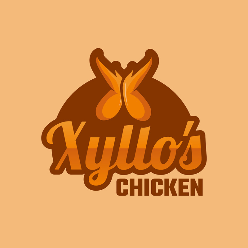
All the logos you’ll see in this article use the letter X as their focal design point. So, for Xyllo’s Chicken logo design, the chicken wings were designed to look like the letter X. It is wittily designed to add humor and make it interestingly good.
The logo design uses varying shades of brown and orange to show warmth, heat, and an overall sense of fun and happiness. The font type it uses projects a friendly and welcoming demeanor expected from a business of this kind.
Fantastic letter X logos perfect for your brand
Get your X logos in 1 to 2 days from professional graphic designers


2. Xtra Hertz Supplies
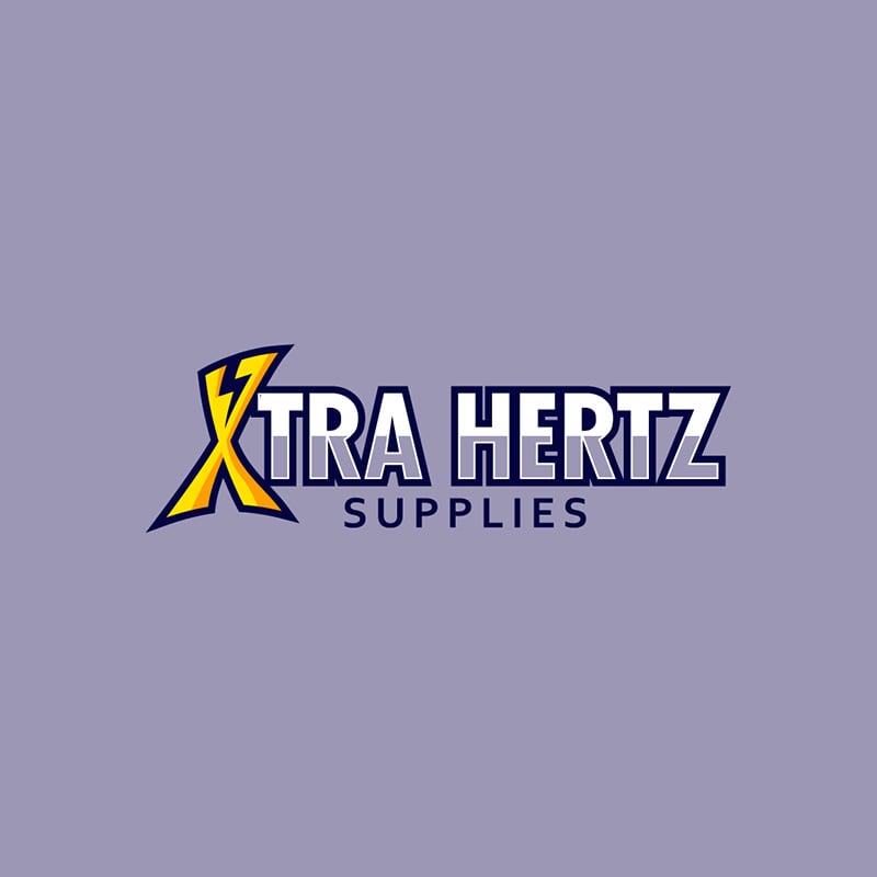
This energy-filled logo gets its “power” from the lightning icon on the letter X and its bright yellow color. This Xtra Hertz Supplies logo is eye-catching and fits the business quite well. Its use of a light shade of violet makes it ooze with wisdom, reliance, and stability.
The straightforward font type gives out a no-nonsense image that’s excellent for scalability. This is one to emulate if you want a logo that can be placed in large or small spaces.
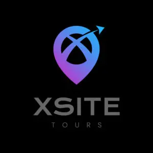
3. XSITE Tours
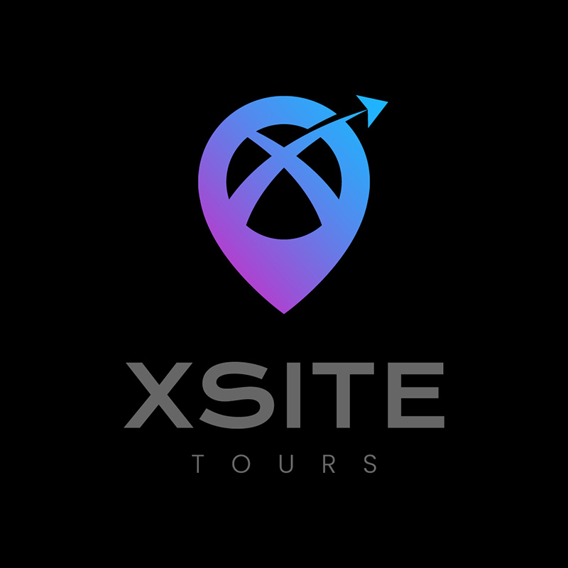
This beautifully-designed Xsite Tours logo has an icon resembling a map marker, ideal for a company that handles tours and travel. It has an X in the middle and an arrow pointing upwards to signify growth and forward movement.
While black and grey can carry some negative connotations, these are colors that brand names use to convey elegance, mystery, and intellect. In this case, these colors are the perfect fit. They make the logo stand out and give the brand a classy touch.
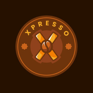
4. Xpresso
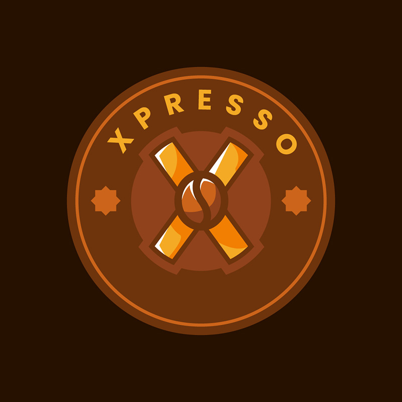
Designing logos for coffee shops can be enjoyable. You can be ultra-creative while ensuring excellent differentiation qualities for the brand. In Xpresso’s case, the logo exudes a light and jolly personality without compromising uniqueness and individuality.
From the font to the color scheme, this is an excellent idea for a cafe logo. You can instantly imagine it on your business card, cup designs, and cafe signage. The colors blend well, making it one of the most appealing letter X logos on this list.
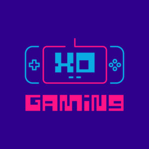
5. XO Gaming

Using bright colors and almost similar to neon signages, XO Gaming has made itself stand out from the crowd. The vibrant colors project the company’s personality, which is trendy and futuristic. Not every industry can get away with this, as it may risk professionalism and efficiency. However, if you can indeed get away with it, these are great colors to take note of.
The font used in this logo fits the brand suitably well, as it is an appropriate choice. It has a cutting-edge and futuristic touch to it that’s great for those in this niche.
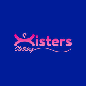
6. Xisters Clothing

This logo designed for Xisters Clothing uses vivid colors that are great for a fashion retail company. There are no set rules when choosing colors for this niche as long as they embody the company’s vision and mission. In this instance, they went for bright colors, with pink as the dominant color to denote femininity.
The font combination is highly commendable, as they are the perfect pair. These font types complement each other and make the overall design easy to read even from afar.
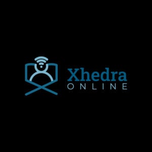
7. Xhedra Online

Most of the time, logos need not have too many distractions on them, such as fancy fonts or unnecessary icons. These can only distract the viewers’ attention from the logo’s message. Xhedra Online’s logo is an excellent example of a no-fuss logo design.
The colors are simple: different shades of blue against a black background. The illustrations perfectly capture the nature of business. The font pairing is superb.
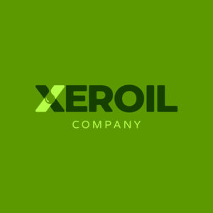
8. Xeroil Company

When you want to think outside the box, this logo from Xeroil Company is one from which to get inspiration. It uses the color green, which is generally associated with nature and sustainability. This is a great choice to veer away from the idea that oil companies are not eco-friendly.
The fonts used are straightforward typefaces making them easily readable wherever you place them. The tiny droplet in the logo illustration captures the company’s industry so well.
9. Xcavate Planners
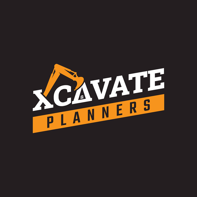
With a piece of excavating equipment on the logo, people will quickly see what this brand is about, even without seeing the name. The dark brown color reminds us of soil which is what this type of business mainly deals with. The first A represents a house window, showing more of the company’s business.
The company’s color combination alone is enough to make an eye-catching logo. The orange, white, and brown color scheme is truly captivating. Imagine it on a t-shirt or the sides of machinery equipment, you couldn’t think of any color more apt.
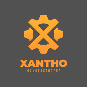
10. Xantho Manufacturers

If your business wants to project an image of dependability and balance, then the color grey is the right choice. This logo from Xantho Manufacturers does just that. The logo itself is that of a perfectly balanced gear with the letter X in the middle.
Again, this logo uses orange to balance its seemingly all-grey background. This helps the brand name pop out and adds a touch of brightness to the otherwise somber mood that grey brings.
11. Xomira Watches
Watches have evolved from cherished heirlooms to futuristic, technological creations. An excellent brand watch logo is crucial whether for enthusiasts seeking a unique timepiece or an addition to a fine jewelry and watch collection. With that said, the logo design should be unique and appealing, too.
Our next X logo example is featured in Xomira Watches logo. The design comprises a simple round dial with hands resembling two check marks. When viewed from different angles, these check marks show the letter X logo. For the colors, the designer elegantly combined black, white, and yellow to highlight the important elements of the design.
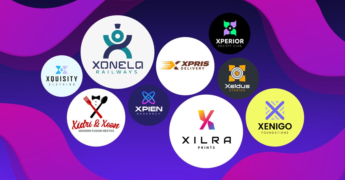
12. Xonela Railways
Xonela Railways leans toward curved lines, both for the logo and letterings. The elements are suitable for the characteristics of railway engineering. Likewise, curves resonate with how railways offer climate-smart and efficient transport systems. The color palette also radiates a clean and compact representation of the brand.
13. Xcellero Rhum Refinery
If you’re seeking a unique logo that demonstrates excellent brand quality, our next design inspiration is perfect. Xcellero Rhum Refinery’s logo stands out on a solid royal blue background. The gold colored-icon shows a wine bottle separating the letter X. Meanwhile, a generous amount of lines, dots, arrows, and infinity symbols altogether highlight the unique brand image.
14. Xiuium Gym
Are you looking for a gym logo inspiration? Search no further because we have here an outstanding logo design. The logo primarily shows bars and straight lines representing the common shapes of equipment found in fitness gyms. These include training benches, treadmills, balance trainers, and resistance bands.
Draw inspiration from this logo design, especially if you’re a gym or fitness studio owner. Besides, a captivating logo ensures a higher chance of attracting more customers and maximizing profits.
15. Xtended Computer Shop
For a small business logo to become visually appealing, you must be updated with the latest trends. This logo is a good example of a modern design suitable for a technology-based business. The dark green X logo creates a reflectorized look, thanks to the solid black background. In addition, limiting the colors to only three makes the design simple yet attractive.
16. Xilra Prints
Here’s an example of a gradient logo with a simple typeface. A bright gradient letter X logo is positioned above the Xilra Prints lettering. Collectively, it creates a minimalist and clean layout that is suitable to the nature of business. It is best to learn that a simple design does not always look bland. Adding one element that stands out, in this case, the gradient logo mark, is a surefire way to create a fantastic brand logo.
17. Xpesa Experience
This neon logo will definitely catch the audience’s attention. Not only is it a bright color, but also the X symbol is pretty unique. The pointed ends of the letter demonstrate the brand’s promise to bring out the best experience among its customers. Meanwhile, the designer’s decision to use a single font color helps the design look simple yet eye-catching.
18. Excelsior Comics
Good news, comics hobbyists and business owners, here is an inspiring design for Excelsior Comics. The company’s identifying mark features a flying superhero image. Behind the image is a circular illustration with dotted details. Meanwhile, the light blue background makes the design more flexible and applicable to other branding assets. So if you are looking for a comics business logo, this one is specially made for you!
19. XPris Delivery
The brand that uses the wordplay of “express” has a straightforward logo design. The spikes leaning forward in the letter X logo symbolize speed. It resonates with the brand’s promise to provide express courier delivery services to its clients. See, a logo doesn’t have to look complicated to relay the message to its target market and prospective customers. A layout as simple as this example is enough to promote your brand!
20. Xalarate Pharmacy
To cover medical-related business in this collection, here is a pharmacy logo example to inspire you. The logo shows an adhesive bandage which can be viewed as a capsule (medicine) that makes the letter X symbol. In particular, the blue and white color palette represents the medical field.
21. Excelena Publishing
As a publishing company, books are the obvious brand representation. Excelena Publishing’s logo features images of partly-opened books with an orange cover. Showing the book’s inner pages symbolizes the company’s services. Meanwhile, the dark gray background complements the colors of the image and text.
22. Xavron Records
Here’s an example of a vintage logo. The image and font style is a resounding illustration of classical design. First, there is an image of a vinyl record or phonograph record, an analog sound storage medium invented in the 1940s. Second, the script font style with a playful addition of musical notes is found in the letter X of “Xavron.” Collectively, the classical look of the Xavon Records logo makes it enticing to prospective customers of any generation.
23. Xezios Medical Technologies
Xezios Medical Technologies’ cross logo provides a perfect description of the brand. This is because the logo incorporates a medical device that relays the company’s product or service. The color combination also applies to any branding material, like product packaging, signages, promotional items, brochures, business cards, and more.
24. Xilra Gaming
Xilra Gaming also has an iconic gradient symbol with a fun, quirky color combination. To balance the design, a simpler font style was chosen. The intricate dark blue background helps the logo stand out. It is worth knowing that if the icon or symbol is bright, tone down the design by using a simple font style. This way, you avoid the overwhelming first impression from the audience.
25. Xquisity Clothing
The clothing line logo design is an excellent example if you are looking for a light-colored logo. A letter X with a diamond at the center stands out against the light blue background. Indeed, Xquisity Clothing did a good job creating a simple but elegant logo design.
26. Xidri and Xeon Modern Fusion Restos
Sometimes choosing the right restaurant logo is a challenge. Luckily, the designer or the owner did a good job combining the black spoon and red fork images to form the letter X logo. In addition, there is a necktie that invisibly speaks of the 2023 business goals and ideas.
27. Xperior Society Club
The four petals in violet and green comprise the company’s unique symbol. The circular object within the logo looks like a tire representing a wheel. Emphasizing the first word of the brand name is good. Going back to the color choices, the black background creates a glowing logo effect.
28. Xeldus Studios
An effective logo design helps you hit the target. This is the first statement that came to mind after completing the logo. To connect the design to the business type, the Xeldus Studios logo tells the audience that they promise to deliver outputs that ensure success.
29. Xenigo Foundations
Xenigo Foundation emblem demonstrates the path the organization wishes to take. It is because the X logo has pointed arrows and perpendicular lines representing pathways or perhaps pedestrian markings. The logo itself is enough to deliver the message. That is why the designer opted for a simple font style.
30. Xpien Research
The Xpien Research logo focuses on science and technology. And in case you are asking where the letter X logo is – it is composed of two intersecting rings. Draw inspiration from this design if you own a scientific research company logo.
Here are a few tips to guide you through the process of designing an X logo:
Understand your brand: Get to know it by understanding its identity, target audience, and values. An effective X logo is one that communicates all these.
Brainstorm different concepts: Think of ideas and concepts surrounding the letter X. You can find many elements you can integrate the letter with to create a captivating and unique logo design. Experiment and explore with different versions until you find the most suitable one.
Simplicity should be a priority: The simpler your logo, the better. Simplicity is the key to a memorable design. Avoid adding unnecessary elements that can clutter the logo.
Incorporate negative space: Use negative or white space creatively to add interest and cohesiveness to your logo design. Doing so also adds depth and intrigue to your design, which is effective in establishing consumer recall.
Final Thoughts
These letter X logos are sure to provide you with the inspiration you need when getting a logo for your business. Designing a logo takes careful planning and consideration. It’s not as easy as creating one on an online logo template website. Your best course of action if you want a unique and original logo is to work with us at Penji.
Watch our demo video here, or better yet, sign up today to get our designers working. Not only will you get logos, but you can also send requests for other design assets.
About the author

Celeste Zosimo
Celeste is a former traditional animator and now an SEO content writer specializing in graphic design and marketing topics. When she's not writing or ranking her articles, she's being bossed around by her cat and two dogs.
Table of Contents
- Why Elon Musk Rabranded Twitter to X
- Elon Musk’s Love for the Letter X
- Why Do Companies Rebrand?
- Shift to another industry/niche
- Offer fresh reputation
- Get with the modern times
- Expansion or reduction
- 30 Compelling Letter X Logo by Penji
- 1. Xyllo’s Chicken
- 2. Xtra Hertz Supplies
- 3. XSITE Tours
- 4. Xpresso
- 5. XO Gaming
- 6. Xisters Clothing
- 7. Xhedra Online
- 8. Xeroil Company
- 9. Xcavate Planners
- 10. Xantho Manufacturers
- 11. Xomira Watches
- 12. Xonela Railways
- 13. Xcellero Rhum Refinery
- 14. Xiuium Gym
- 15. Xtended Computer Shop
- 16. Xilra Prints
- 17. Xpesa Experience
- 18. Excelsior Comics
- 19. XPris Delivery
- 20. Xalarate Pharmacy
- 21. Excelena Publishing
- 22. Xavron Records
- 23. Xezios Medical Technologies
- 24. Xilra Gaming
- 25. Xquisity Clothing
- 26. Xidri and Xeon Modern Fusion Restos
- 27. Xperior Society Club
- 28. Xeldus Studios
- 29. Xenigo Foundations
- 30. Xpien Research
- Here are a few tips to guide you through the process of designing an X logo:
- Final Thoughts


