
Your company logo is one of the branding assets that lures your target audience. However, even seasoned entrepreneurs don’t know what goes into a standout logo. Although some with a creative eye and minimal graphic design experience can DIY company logos, it’s recommended to entrust this colossal task to the experts, especially if you’re creating a letter D logo design.
Letter logos are a bit more complicated and require appropriate logo design practices to achieve design cohesion. The professional logo designers at Penji will ensure that your letter D logo communicates your brand’s personality while connecting with your target audience. If you want help with logos or any branding and marketing designs, read until the end for a special discount. Meanwhile, here are some examples of letter D logo designs Penji made for clients.
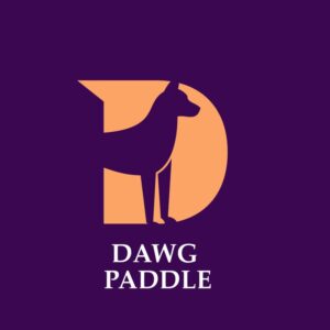
1. Dawg Paddle

This is one example of a unique logo that screams creativity. Dawg Paddle is a company that caters to “pawrents” who love their furry companions. Both the serif text and letter D match, strengthening its branding consistency. Moreover, the designer integrates the dog as the negative space in the middle of the D. It gives this letter D logo design visual interest and inventiveness.
Let your brand voice be heard with a unique D logo
Hire a logo designer today and get your logo in 1 to 2 days
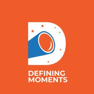


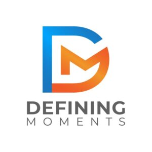


2. Defining Moments

Defining Moments is what it is — making your moments memorable through the best viewing experience. They’ve represented their offer by including a telescope and a bunch of stars occupying the letter D. It’s a brand that offers an excellent view of the city skyline and the night sky. They also put their twist on this letter d logo by positioning the telescope in the middle to resemble the usual inside space of the letter D.
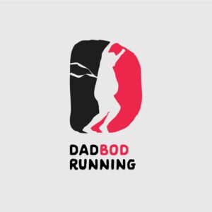
3. Dadbod Running

This brand is a gym that caters to the older male generation, specifically fathers who want to stay fit amidst their hectic schedules. You can see that the letter D design is separated by the negative space in the middle, which resembles a person with a “dadbod.” They’ve also implied movement, which shows the person running by the bent knees, shoes and crossing the finish line indicated by the strip at the back. Overall, this is an excellent example of letting your target audience know what you’re offering right off the bat.
4. Do Buy Learn
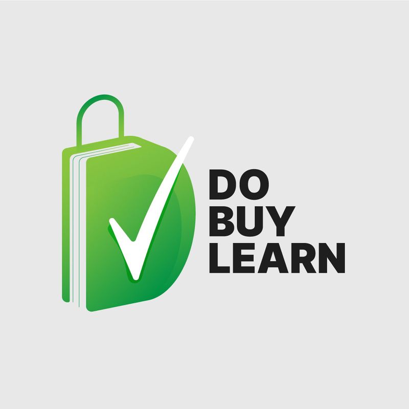
The combination of different design elements that make up the letter D logo design captivates attention for this example. First, the word “Do” can be seen through the letter D shape that steals the entire design. The second word “Buy,” is depicted by the white checkmark that symbolizes you’ve checked something on your list. Finally, the term “Learn” is creatively represented as a book, which is the letter D’s shadow. When separated from the brand name, this letter D logo can stand alone and still convey the brand’s unique selling proposition.
5. Danny’s Bow & Arrow
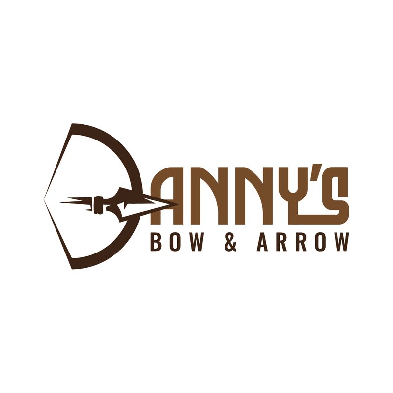
Danny’s Bow & Arrow sells, you guessed it, bows and arrows and also has a range for practicing. The company shows off its sleek letter D logo through the stylish design of a bow and arrow. The bow resembles the shape of the letter d. It also beautifully accompanies the entire brand name by complementing it with a darker brown color. Also, the arrow cuts across the middle of the letter, seemingly striking the letter A. This is a quintessential logo that banks on creativity and harmony.
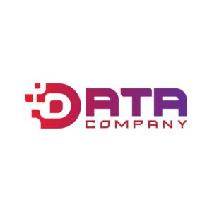
6. Data Company
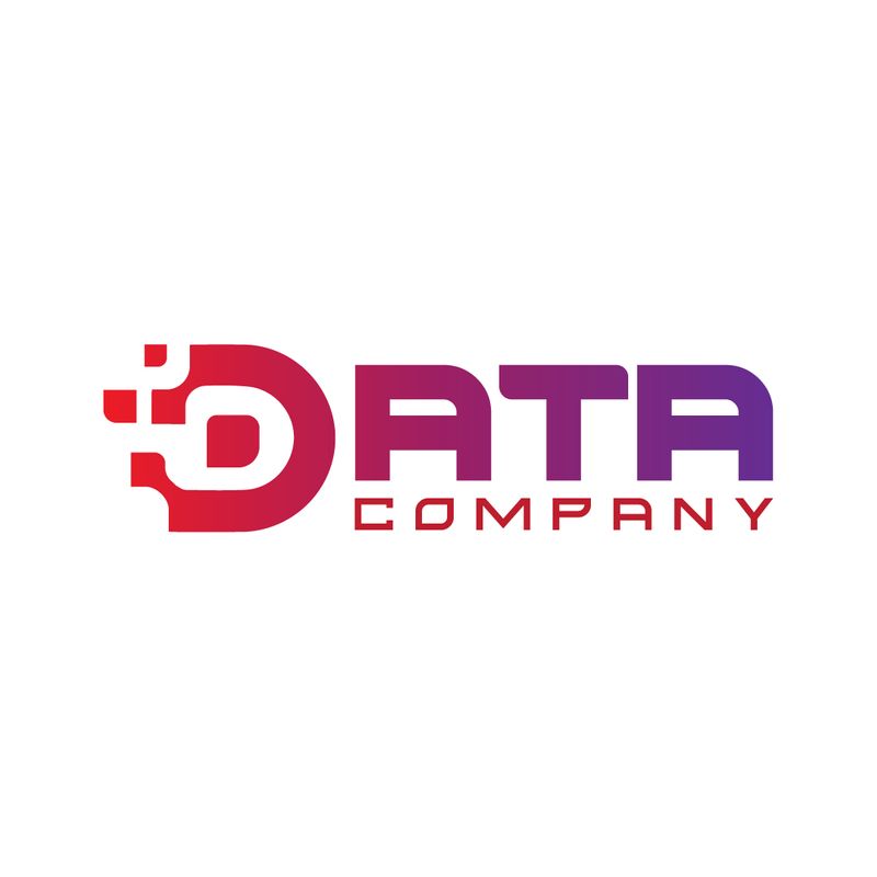
Data Company is a tech brand that chose bright and stimulating colors for its company logo. The gradients from red to purple symbolize how data can quickly change. Also, the font choice is appropriate for a tech company that wants to gain authority in its niche. The letter D logo design resembles pixels from a computer screen, which is one way to tie the logo together.
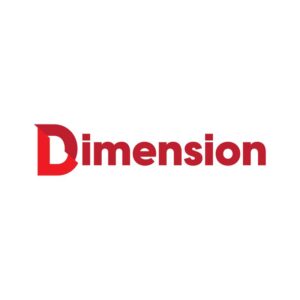
7. Dimension
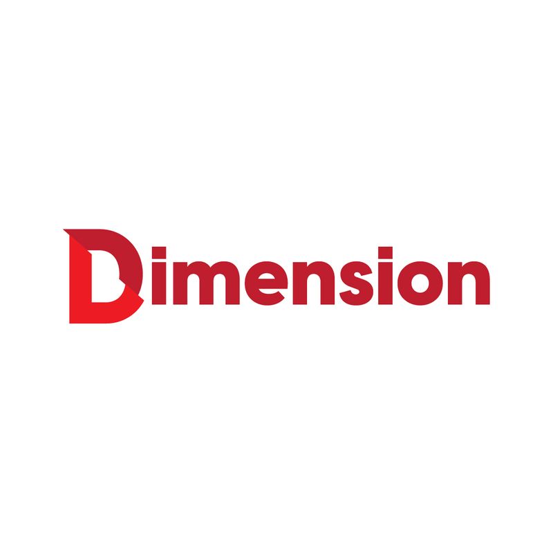
One of the elements of logo design is simplicity. This is on top of the other components such as memorability, uniqueness, scalability, and relevance. The Dimension logo is an excellent example of a simple yet attractive logo that works on every branding and marketing channel. The bold sans serif font in a fiery red color is eye-catching, making it perfect when displayed on the biggest advertising platform such as billboards. The misaligned letter D also gives this letter logo an exciting twist.
Related Article: Serif vs. Sans Serif: When to Use Which
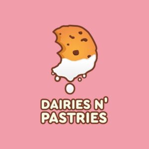
8. Dairies N’ Pastries

If you’re craving sweet and creamy treats, Dairies N’ Pastries will save the day! Restaurant logos should entice consumers with their mouthwatering products like this example. The letter D logo portrays this delicious offer by showing a cookie in the shape of a D, dipped in milk. And you can see the white and creamy milk, with drippings for a nice effect. The cookie bite also shapes the letter D logo while breaking the dullness of showing a whole cookie dipped in milk instead.
9. Defining Moments
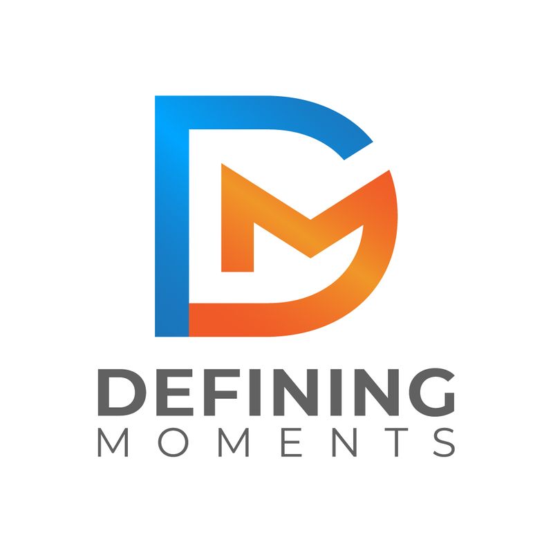
Here is the second option of Defining Moments’ letter D logo made by Penji before selecting the first one mentioned on this list. This one has a more serious vibe than the first logo, which exudes a more welcoming atmosphere. However, this example is an excellent take on a monogram logo, which showcases the letters D and M in one cohesive design.
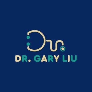
10. Dr. Gary Liu

This is a prime example of a carefully thought-out logo that embodies the brand name. Dr. Gary Liu’s logo, if you haven’t noticed, is a letter D design, followed by what looks like a small “r” after the big “D.” But when you look closely, you’ll see that the entire design is an abstract symbol of a stethoscope, perfect for representing medical services.
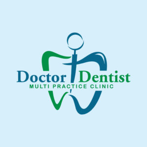
11. Doctor Dentist Multi Practice Clinic
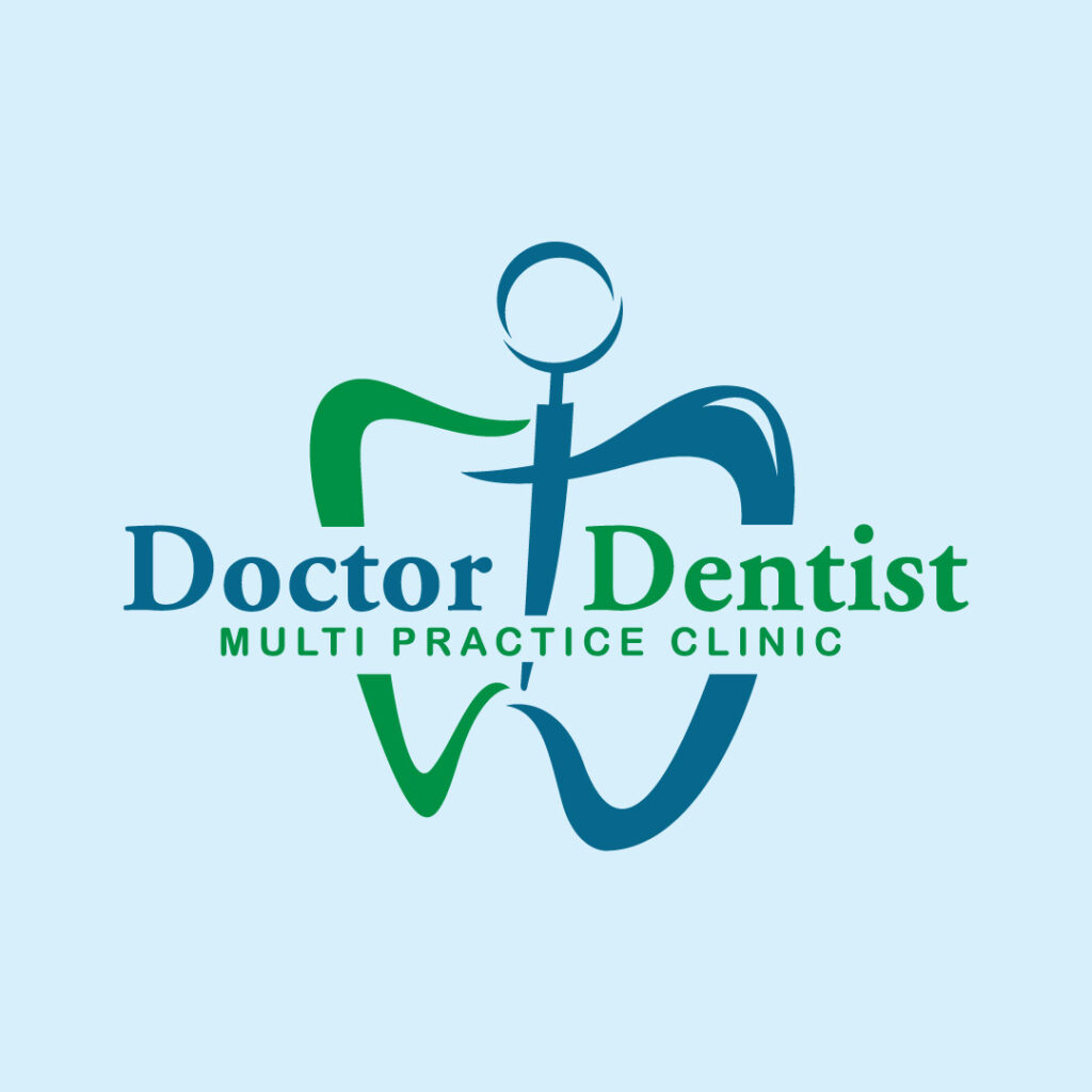
This logo design from the Doctor Dentist Multi Practice Clinic is well-thought-out with all the unique elements. You will notice the stethoscope first in blue. However, the designer makes it interesting by integrating the two letter Ds for the clinic’s initial letters. The green and blue letters also double as a tooth representing a dental clinic business.
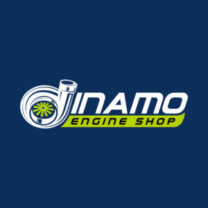
12. Dinamo Engine Shop

When creating your logo, you must ensure that it’s memorable and instills top-of-mind awareness. You must emulate this example because of its simplicity yet innovative design. The initial letter doubles as a car muffler and rim. The words “Engine Shop” also break the monotony of the white color by showcasing a green background.
13. Daze of the Dead
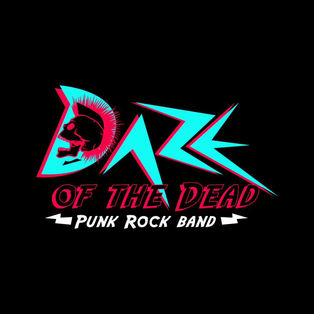
This is a punk rock band logo, which will surely excite punk rockers and rebels out there. The font style is apt for a punk rock band, and you can see a skull donning a punk mohawk hairstyle. The colors red and teal also make up most of the design, making it appealing on any branding material.
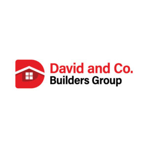
14. David and Co. Builders Group

A company logo must communicate your brand’s offerings like this David and Co. Builders Group logo. It features the letter D with an image of a house roof and window in the middle. It indicates that this brand is a construction company, making it comprehensible within its target audience.
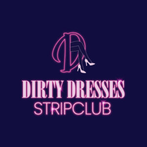
15. Dirty Dresses Strip Club
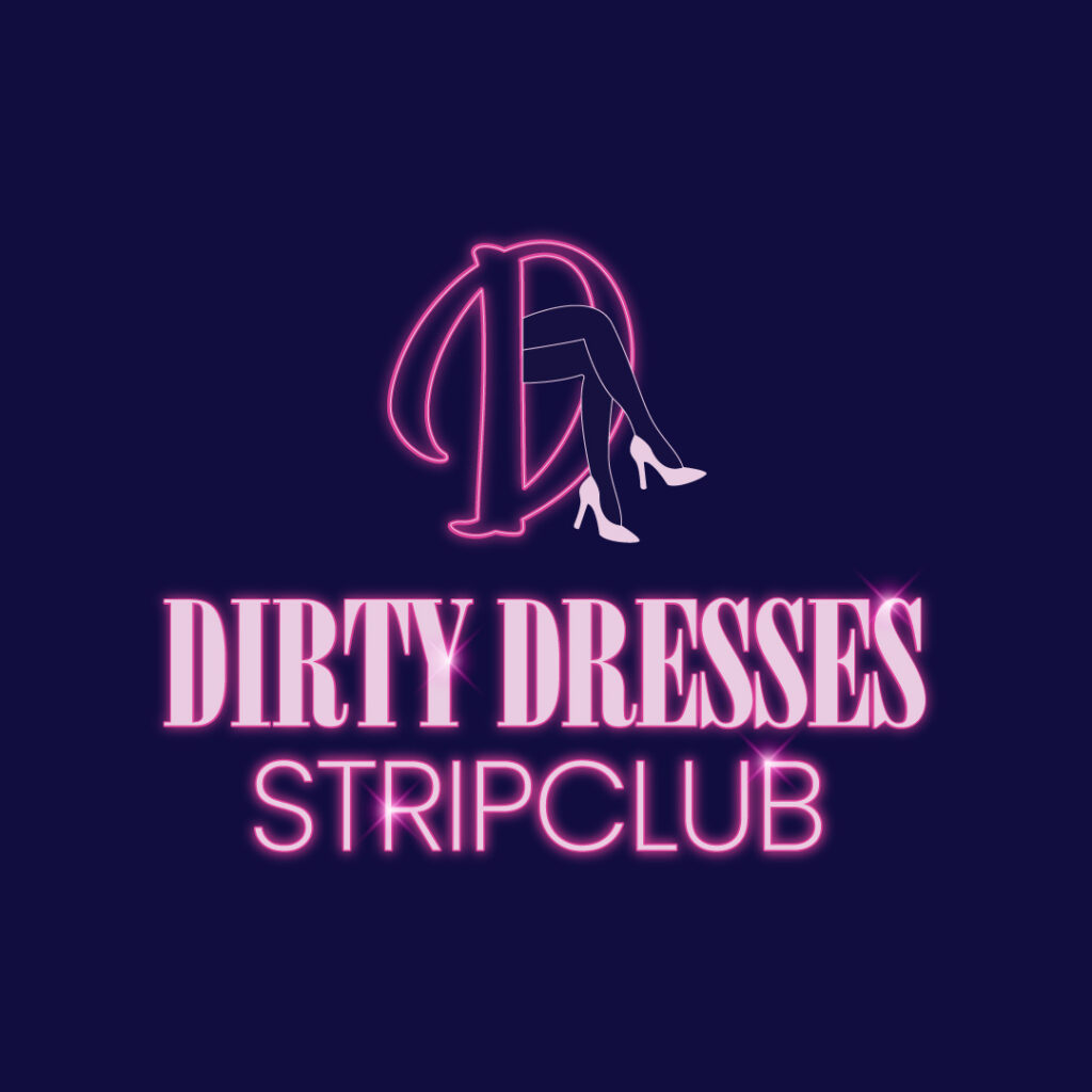
If you’re running a business that caters to the male demographic, ensure the logo is eye-catching, like this example. The Dirty Dresses Strip Club selects a light pink color that screams feminity and elegance. The font looks somewhat like it’s glowing from the specks of light. But the most evident icon is the pair of legs and stilettos that seem to entice men.
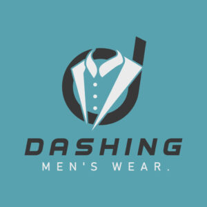
16. Dashing Men’s Wear
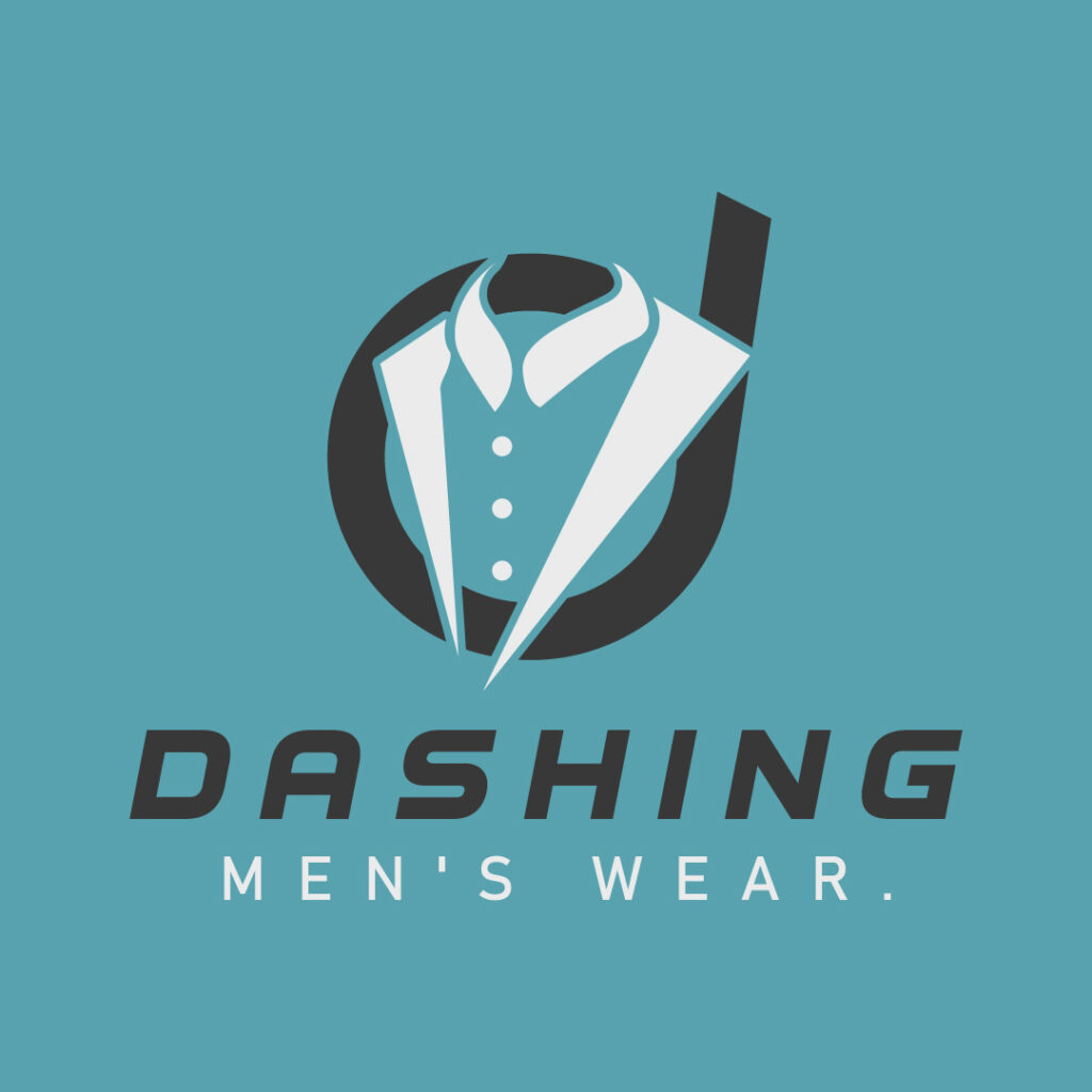
Dashing Men’s Wear caters to the male demographic, and it clearly shows in their logo design. A men’s suit is well-placed in the middle of the small letter D in black. Both white and black colors create contrast throughout this design.
17. Rainerdan Plumbing and Co.
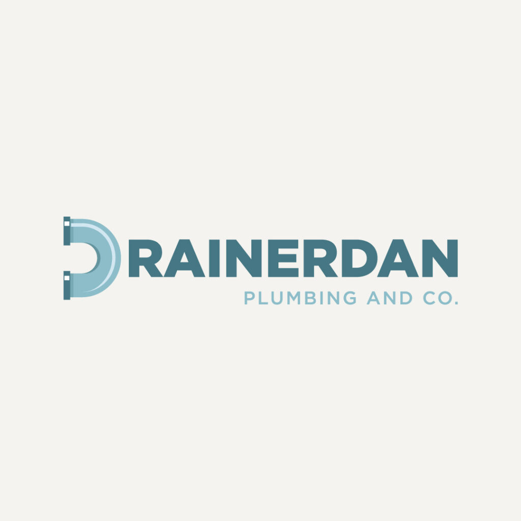
One of the elements of logo design is simplicity. A simple logo prevents confusing viewers and ensures your company logo is understandable. The Rainerdan Plumbing and Co. logo is simple yet impactful, as seen from the icon, text, and structure.
18. Dingo Detective Group
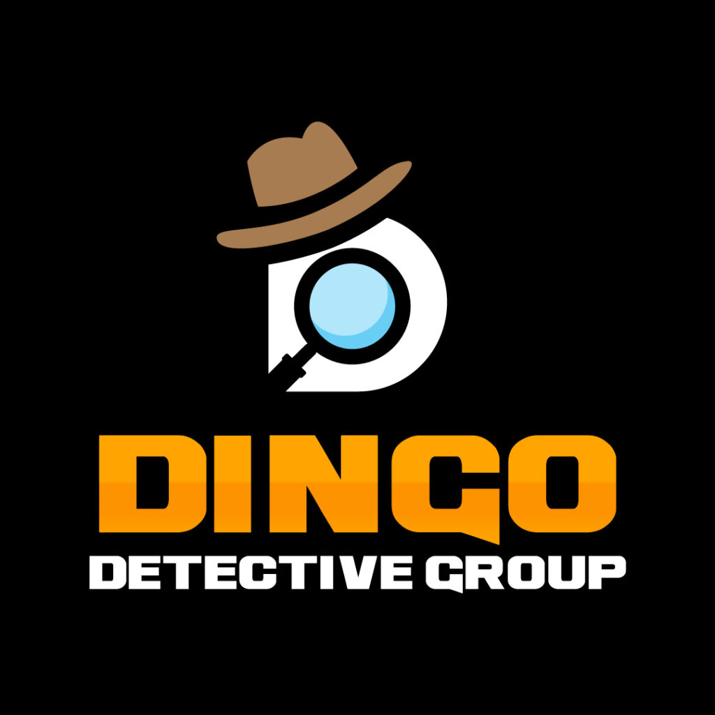
This logo’s icon will remind you of the incognito guy icon on search engines. You’ll see the detective hat and magnifying glass amidst the white letter D background. The bold and bright yellow text is the design element that pops out in this logo.
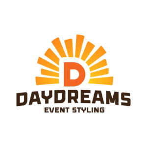
19. Daydreams Event Styling
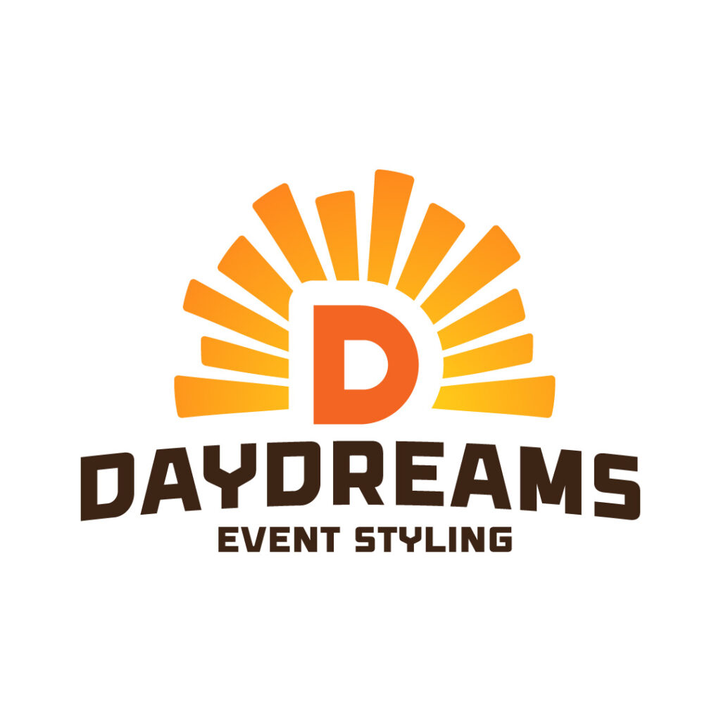
The Daydreams Event Styling logo is straightforward. Nothing beats a company logo that will look legible on any branding and marketing material. It features sans serif fonts and a vibrant letter D, seemingly surrounded by sun rays.
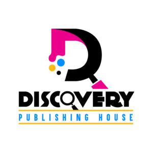
20. Discovery Publishing House

For a business in the creative niche, the company logo must also reflect style and innovation. This way, your prospects will instantly get hooked and remember your brand name. The Discovery Publishing House logo does just that. Notice how the various design components come together, making the logo cohesive. A letter D splashed with pink, yellow, and blue colors are adorned beautifully. The brand name also features a magnifying glass, representing it precisely.
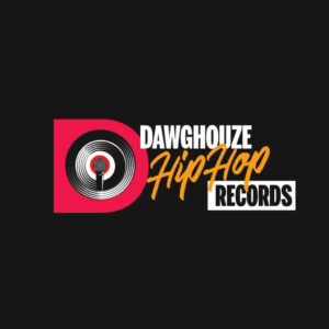
21. Dawghouze HipHop Records

This is an example of a logo design for a hip-hop recording studio. The overall logo appeal exudes a cool vibe apt for a recording company. When creating your company logo, ensure that the typography is superb, like this example. The texts come in three tiers, with the script font sandwiched between the two sans-serif texts. An image of a microphone with a phonograph record sits loud and proud.
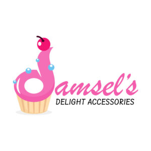
22. Damsel’s Delight Accessories
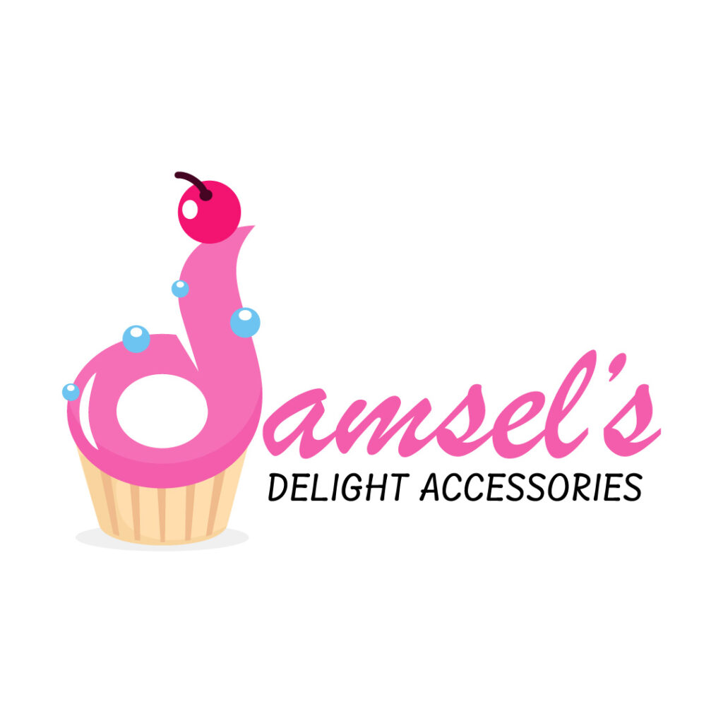
A brand that showcases its products and services front and center will gain the affinity of its target audience. The Damsel’s Delight Accessories logo keeps it light and playful by featuring a cupcake with a pink frosting. But the pink frosting maintains visual interest because it looks like a letter D. The font combination of a script and sans serif typeface also makes this design diverse.
23. Dino Deli
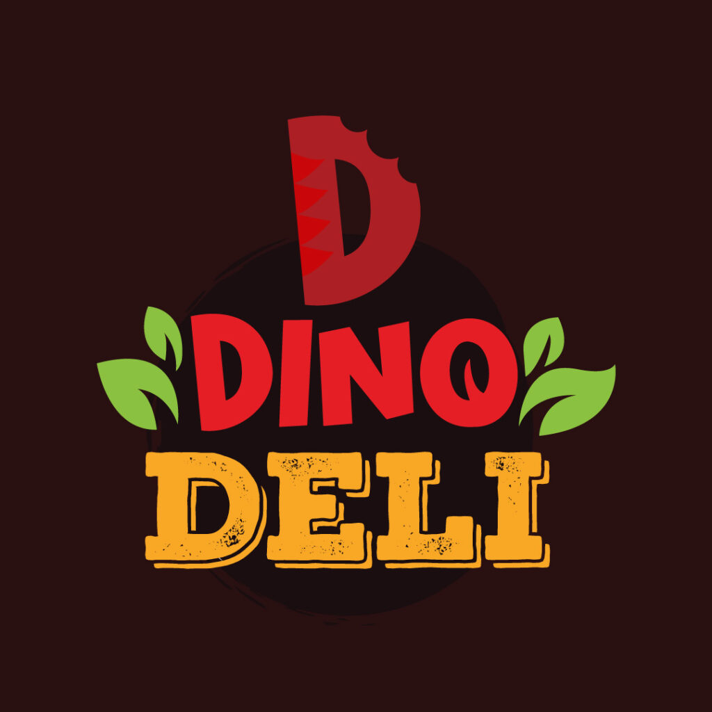
A food and beverage business must keep its restaurant logo welcoming to attract consumers through the door. The Dino Deli logo dons vibrant colors and selects red as the primary color. Red is a popular choice for fast-food chains and delis because it stimulates the appetite.
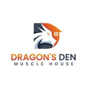
24. Dragon’s Den Muscle House

Dragon’s Den Muscle House is a gym that caters to both men and women gym goers. The logo icon can be a stand-alone pictorial logo that communicates the brand’s identity. It features the letter D in contrasting colors, a dragon in the middle, and a window to signify the structure.
25. Daruma Toys and Collectibles
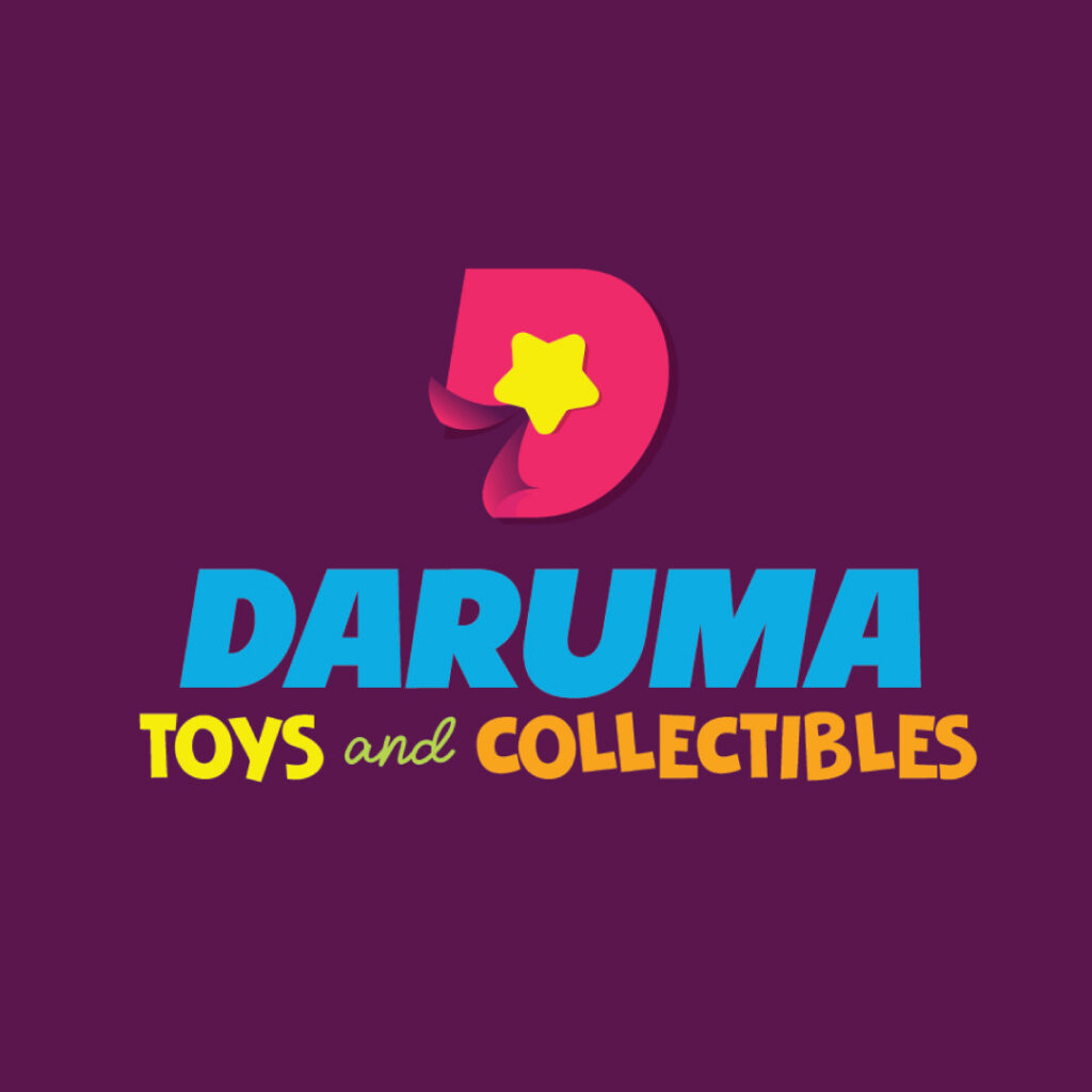
This logo design is lighthearted and tasty, apt for a brand that sells toys and collectibles for kids. The overall design exudes an amiable and welcoming vibe, perfect for children and kids.
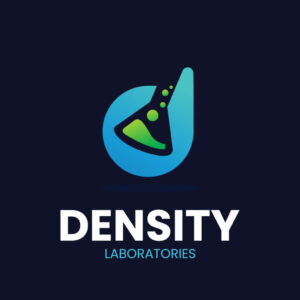
26. Density Laboratories

Density Laboratories’ logo is unique and memorable. First, the blue and teal hues will capture your attention instantly. Then, this logo leads the eyes to the laboratory flask with a bubbling green liquid. Overall, it’s one of the D logo designs that stands out in this list.
27. Dominate Boxing Gym
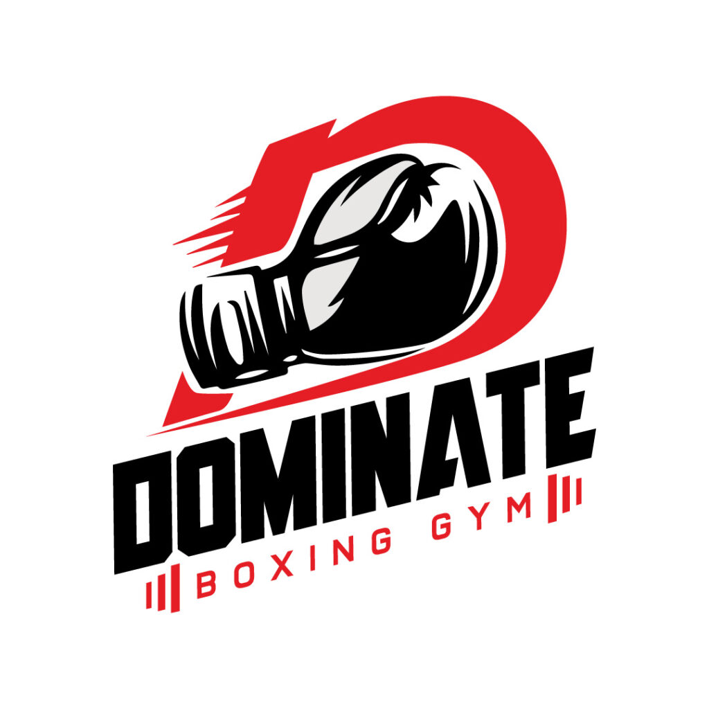
The word “Dominate” stands out in this logo design. However, the light-faced text at the bottom balances the bold text. An image of a boxing glove sits strong at the top amidst a red background.
28. De-Liver Meat Delivery
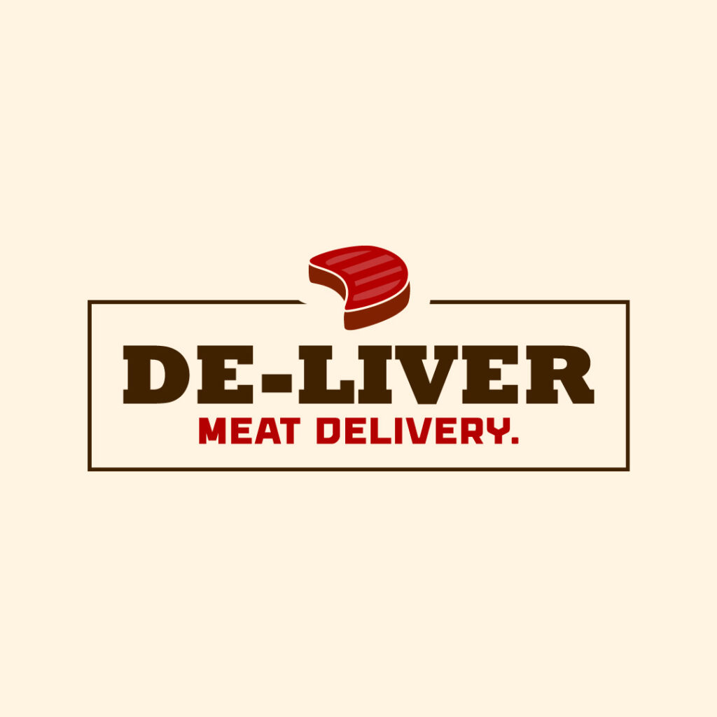
Nothing beats a simple logo that communicates the brand’s personality. And De-Liver Meat Delivery’s logo does just that. The logo is boxed, making it compact and scalable on any branding and marketing collateral. An illustration of a steak also seals the deal at the top.
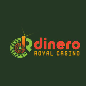
29. Dinero Royal Casino

Dinero Royal Casino’s logo is fun and playful, apt for a casino business. The icon on the left shows a roulette with an orange letter D situated in the middle. A green club symbol is also an excellent way to denote playing cards.
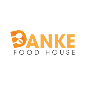
30. Danke Food House
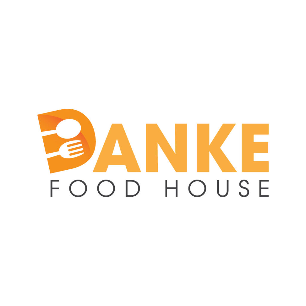
Danke Food House is a German restaurant that serves breakfast and lunch dishes. The brand name’s initial letter features a fork and spoon to signify it’s an eatery. Plus, the font selection sits loud and proud, making it the most evident element in this logo.
Conclusion
If you’re having a hard time looking for the best logo designers to create your letter D logo, don’t fret. We at Penji will let you try our services for 15 days risk-free through a money-back guarantee offer. But if you’re ready to sign up and experience hassle-free graphic design with a caring and experienced team, sign up now for a special discount on your first month!
About the author

Table of Contents
- 1. Dawg Paddle
- 2. Defining Moments
- 3. Dadbod Running
- 4. Do Buy Learn
- 5. Danny’s Bow & Arrow
- 6. Data Company
- 7. Dimension
- 8. Dairies N’ Pastries
- 9. Defining Moments
- 10. Dr. Gary Liu
- 11. Doctor Dentist Multi Practice Clinic
- 12. Dinamo Engine Shop
- 13. Daze of the Dead
- 14. David and Co. Builders Group
- 15. Dirty Dresses Strip Club
- 16. Dashing Men’s Wear
- 17. Rainerdan Plumbing and Co.
- 18. Dingo Detective Group
- 19. Daydreams Event Styling
- 20. Discovery Publishing House
- 21. Dawghouze HipHop Records
- 22. Damsel’s Delight Accessories
- 23. Dino Deli
- 24. Dragon’s Den Muscle House
- 25. Daruma Toys and Collectibles
- 26. Density Laboratories
- 27. Dominate Boxing Gym
- 28. De-Liver Meat Delivery
- 29. Dinero Royal Casino
- 30. Danke Food House
- Conclusion


