


Many of us may not be aware of it, but colors can influence our emotions and actions. For decades, graphic designers have been leveraging color psychology to create branding assets that look deep into the human subconscious. It’s because these have been proven to influence our purchasing decisions. This is why choosing the best color logo combination is essential.
The colors you choose will become part of your overall visual identity across every customer touchpoint, from your website colors to your social media presence to your email signature. While it’s a big decision, it doesn’t have to be intimidating. In this post, we’ll explain how to choose your logo colors and dive into 62 logo color combinations to get you inspired.
Types of Color Combinations
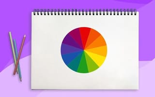
Understanding the relationship between colors is key to a harmonious logo design. Consulting a live color wheel is a good place to start. A color wheel consists of cool colors (blue, green, and purple) on the right side and warm colors (red, orange, and yellow) on the right.
The location of the colors on the color wheel dictates the colors they can pair with to create a cohesive, harmonious design. According to color theory, warm colors complement cool colors because they’re on the opposite side of the color wheel.
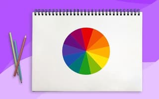
Image Licensed by Penji
Get your own unique logo color combinations today
Logo color combinations that match your brand


Understanding Color Theory
When you have a good grasp of how the color wheel works, you can create combinations to determine the best look for your logo. There are formulas for this, though, and color theory can help you choose harmonious color schemes. Here are a few common ways to combine colors:
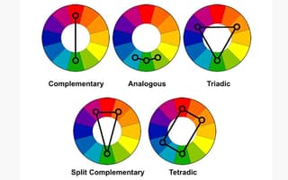
Image Credit: DesignGuru via Medium
Monochromatic: This approach uses multiple shades of the same color to create a visually soothing effect.
Complementary: These are two colors that are on opposite sides of the color wheel, like yellow and purple, green and red, or orange and blue. According to color theory, complementary colors boost each other’s vibrancy.
Split-Complementary: A variation on the complementary color scheme, this approach contains a combination of three colors: one primary color and two colors adjacent to its complement. Split-complementary colors offer more contrast than complementary colors.
Analogous: These color schemes use three colors that sit next to each other in the color wheel, like red, orange, and red-orange. This approach will result in a cohesive look.
Triadic: This color scheme takes three colors that are spaced equally on the color wheel, creating a high-contrast look. You can draw a triangle on the color wheel to come up with three colors that are evenly spaced out.
Tetradic: This approach combines four colors: two sets of complementary pairs (red and orange or blue and green, for example) with one color chosen as the dominant color, resulting in a bold look.
Understanding Color Psychology
Color psychology refers to how each color impacts the viewer. Connecting your brand to a particular emotion is a powerful way to help consumers understand and remember your brand.
Here’s a summary of the most commonly used logo colors and what they symbolize.
White: Cleanliness, purity, simplicity, innocence.
Yellow: Happiness, energy, cheerfulness, optimism.
Orange: Enthusiasm, vitality, friendliness, playfulness.
Red: Excitement, passion, love, danger.
Pink: Femininity, romance, tenderness, youth.
Brown: Stability, dependability, trustworthiness, warmth.
Black: Mystery, power, sophistication, luxury.
Purple: Creativity, royalty, wealth, luxury.
Blue: Calmness, security, sadness, tranquility.
Green: Freshness, relaxation, prosperity, stability.
Gray: Serious, conservative, professional, responsible.
62 of the Best Logo Color Combinations
Before we dive into the examples we’ve gathered, keep in mind that less is more. Combinations of one, two, or three colors are the best practice (unless you wanna go wild with rainbow design).
1. Amazon

Amazon’s logo has undergone several redesigns over the years. Its most current logo gives a vibe that’s playful and friendly as well as reliable. The orange and black color combination reinforces that balance.
2. Crown Royal
Crown Royal, a Canadian whiskey brand, uses a purple, red, and yellow color palette to symbolize monarchy and power. The red and purple scheme evokes a sense of passion and mystery, while the gold adds finesse and style.
3. IKEA
Ikea’s blue and yellow logo color combination will look familiar to some – It’s the colors of the Swedish flag. This color scheme represents the company at its best, suggesting joy, ease, safety, and reliability.
4. Barbie
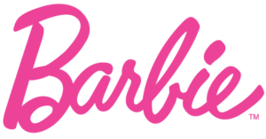
Barbie’s logo has changed several times since her debut in 1959, but the color has remained bright pink. Pink is a feminine, tender color that evokes a sense of style and elegance while also looking very playful, much like Barbie herself.
5. Harley-Davidson
The legendary motorcycle company’s orange, black, and white color palette and clear, strong lines are a reflection of power, energy, movement, and optimism. The orange color symbolizes the power of the spirit and courage while the black color means style and perfection.
6. Philadelphia 76ers
The logo for Philadelphia’s NBA team, the 76ers, features a patriotic color scheme of red, white, and blue to represent Philadelphia’s origins as the birthplace of American independence.
7. Caterpillar
Caterpillar is an American manufacturer of construction machinery. The wide yellow triangle covers the bottom parts of the first three letters, creating a bright accent. The yellow triangle expresses optimism, energy, and joy. The black color symbolizes perfection, elegance, and power.
8. Ahrefs

Ahrefs is a platform designed to help businesses with digital marketing. The name is a play on a common HTML tag, which is <a href=”></a>. The logo uses color to set the “a” apart from the rest of the letters in the name to symbolize the space within the tag.
9. Dunkin
Dunkin’s hot pink and orange color palette brings to mind the sweetness of the chain’s products and the bright shades of the donuts’ glaze. The colors create a happy, sweet mood for the whole composition.
10. Airtable
Airtable’s gray inscription is balanced out by shades and tints of the three primary colors: red, yellow, and blue. These colors next to each other feel energetic, progressive, and creative.
11. Expedia
The calm dark blue and yellow logo color combination of Expedia evokes a sense of reliability and trustworthiness. Perhaps it helps customers feel comfortable booking their trips online. The colors suggest professionalism and loyalty, while the yellow accent adds a joyful feeling.
12. Baskin Robbins
The Baskin-Robbins logo was blue and pink for years, demonstrating how well those complementing colors can harmonize. In 2022, Baskin-Robbins went back to its original 1947 logo featuring chocolate brown and pink, which suggests flavors of ice cream.
13. Mastercard
The MasterCard logo consists of two circles, one red, and one orange, representing passion and energy. It symbolizes the connection and unity between the Eastern and the Western parts of the world, showing that the company has no borders and equally operates everywhere.
14. Asana
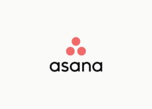
Asana is a task management tool that helps teams stay organized. The logo uses a warm color palette in a gradient, giving a vibe that’s creative and energetic, which is how users could feel using Asana.
15. Pampers
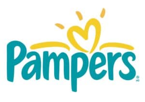
The color scheme of the Pampers logo includes two colors – aqua and yellow – on a white background. The fluffy sans-serif lettering is meant to convey softness and warmth, and the colors work together to symbolize safety and care.
16. Billie
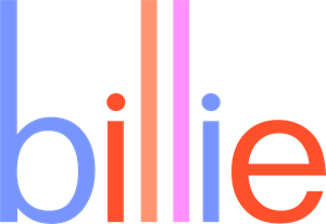
Billie is a great example of a brand that has kept its target audience in mind when developing a color palette. This subscription-based razor and body care company for women uses pastel colors to grab the attention of potential customers.
17. Heineken
Heineken’s logo uses three colors: green, red, and white. Green is reminiscent of the color of the bottle, sometimes referred to as the Heineken green. Green symbolizes tranquility, trust, and naturalness. Red and white were added to create a visually appealing contrast.
18. BP
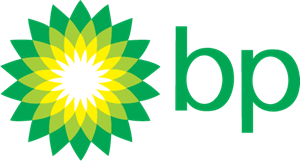
BP’s logo was redesigned in 2000 to communicate the optimism of renewable energy. It uses metaphors of the sun and a flower in a lively yellow and green design, evoking hope and new beginnings.
19. Monday
Monday is a collaboration and project management platform based in Israel. Monday’s color palette is light and bright, representing the mood and convenience of the platform. The logo evokes a very friendly and progressive feeling.
20. Brilliant Earth

A jewelry company known for its ethically sourced diamonds, Brilliant Earth brings green and gray together to suggest eco-friendliness and trustworthiness. The colors are muted, making them appear more feminine to appeal to the company’s target audience.
21. Hyatt Place
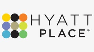
The logo for Hyatt Place consists of a colorful emblem and simple black lettering. The emblem is three rows of small circles, nine in all. Seven of the circles feature various colors, while the other two circles are black. If you exclude the black circles, you will notice the other seven form a large block letter “H.”
22. Chanel
The Chanel logo has remained untouched since 1909 when it was created by the founder of the iconic fashion house, Gabrielle “Coco” Chanel. It uses a simple and timeless combination of black and white, which looks powerful and elegant.
23. Snapchat

The Snapchat logo shows a figure of a white ghost, outlined in thick black and placed against a vibrant yellow background. The overall feel of the logo is eye-catching, fun, and confident. This color palette was selected because no other social media platform used yellow as its dominant color.
24. Burger King
It’s not common to see a brand that uses all three primary colors in one logo, but it works for Burger King. The red, blue, and yellow palette is eye-catching and vibrant and makes the brand feel friendly and energetic.
25. Corona Extra
The color palette for the Corona Extra logo has three colors: yellow, white, and blue. The dominant color of the brand is blue, while yellow is inspired by the color of the beer. The white and yellow combination is light and refreshing while the blue gives a feeling of quality.
26. Soundcloud
Soundcloud, an online music platform, has a bright yet simple visual identity, evoking friendly, warm feelings. The orange color is a reflection of positive energy and a good mood, which music gives you.
27. Docker

Docker is a platform that makes the managing processes of applications easier and faster. Like many IT companies, Docker uses a bright, vivid shade of blue for its logo to represent reliability and professionalism. The blue is also a nod to the sea-themed emblem of the brand.
28. Panera
Panera’s logo consists of a woman holding a loaf of bread as if it were a baby. The green background represents the natural products used in Panera’s recipes. The overall vibe tells customers they’ll feel warm and at home at Panera.
29. FedEx
The visual identity of FedEx is composed of purple and orange. Purple stands for professionalism and stability while orange means energy and speed, so the overall vibe is that of reliability, accuracy, and quickness.
30. Reeses
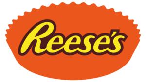
The color palette of Reese’s visual identity is a combination of yellow, brown, and orange. These shades are warm and bright, reflecting the product’s flavor and representing the brand as a high-quality one.
31. TikTok
TikTok’s musical note logo consists of four colors: vibrant pink, blue, and white on a black background. This color combination was inspired by a rock concert in a dark hall with a brightly lit stage. The logo has a 3D effect: neon colors are layered, symbolizing the vibration of the music.
32. Sprite
Since the late 80s, Sprite’s color palette has consisted of green and yellow to represent the soft drink’s lemon-lime flavor. Its most recent update in 2022 is all green. Also, the “i” has a curved arch reminiscent of a smile, evoking a feeling of approachability and friendliness.
33. Seventh Generation
Seventh Generation, a brand of eco-friendly cleaning products, uses green and white in its visual identity to symbolize life, health, growth, and loyalty. It sends the message that the brand cares about its customers as well as the planet.
34. Lays
The yellow and red color combination of the Lays logo symbolizes energy, power, and passion. In combination with white, it evokes a sense of professionalism and reliability, suggesting that consumers can expect the flavor and quality to be superior to other brands.
35. Starbucks
The iconic green and white Starbucks logo features an image of a mermaid, which is a nod to the origins of the company’s name, which was taken from “Moby Dick.” The green, minimalist design is a tribute to the company’s values, which are aimed at preserving the environment.
36. Twix
Twix’s logo color palette is based on a combination of red, white, and chocolate brown, with two black stripes. These colors give a feeling of warmth and friendliness, reflecting the chocolate taste of the product and the whimsical vibe of the label.
37. Tide
Tide laundry detergent was the first product to be packaged using Day-Glo colors, which were remarkably eye-catching when first introduced. The dark blue is meant to represent water and the bright yellow and orange conveys a sense of joy, efficiency, and energy.
38. John Deere
John Deere’s intense green and yellow logo creates a feeling of warmth and satisfaction, and it reflects the company’s mission of providing tools to help farmers to keep food on the table. The green and yellow color palette represents agriculture and evokes a sense of growth, success, and energy.
39. Frigidaire
In using blue as its primary logo color, Frigidaire is solidifying its mission of providing refrigeration to consumers. The red triangle element adds warmth and could represent a cozy home with a lit window.
40. Trivago
Trivago is an online travel service that uses tranquil blue, vibrant orange, and dark red for its logo colors. These three shades create a confident and solid image, representing the company as a professional, passionate, and trustworthy one.
41. Mountain Dew
Mountain Dew’s visual identity consists of two shades of green, red and white, a combination that’s eye-catching and intense. The sharp black and green framing and the green and red nameplate look dynamic and masculine, evoking strength and excitement.
42. Walmart
Updated in 2008, Walmart’s blue and yellow logo is reminiscent of sunshine and evokes a feeling of friendliness and hope. The bright color palette reflects the company’s new eco-friendly approach to running its global business.
43. Cigna
Health insurance company Cigna uses green, blue, and orange placed on a white background for its visual identity. The colors stand for energy, growth, and success. The blue symbolizes reliability and protection; the green shows the progressive approach of the company; and the orange suggests passion and warmth.
44. Boost Mobile
The color palette of Boost Mobile’s visual identity is based on a combination of intense yet calm shades of orange and gray, which suggest a sense of energy, power, and creativity. The orange also evokes a sense of evolution and progress.
45. Whole Foods
The green and white color palette of Whole Foods’ logo brings to mind freshness and growth. The colors also symbolize reliability and success, sending the message that customers will find the best, highest-quality products in its stores.
46. Tinder
Tinder’s visual identity is meant to evoke feelings of connection and passion. It includes a gradient flame in several shades of orange, which are complemented by a variety of light magenta tones. These ultra-warm colors suggest that Tinder is a source of burning-hot relationships and passion.
47. Illy
Illy, an Italian coffee brand has a visually powerful logo consisting of a bold, white handwritten font against a bright red background. The logo looks progressive and stylish, bringing to mind the back-to-basics approach to its coffee production as well as its passion for coffee.
48. Google Chrome
Google Chrome’s visual identity consists of a rounded figure composed of three equal segments in red, yellow, and green with a blue sphere in the middle. The segments create a sense of swirling and moving, adding a sense of speed and dynamics.
49. Canada Dry
Canada Dry’s visual identity consists of red and green with gold and white, creating a strong, bright contrast. The shades of the badge create a modern and progressive look, suggesting a sense of professionalism and power.
50. Slack
Slack’s logo brings together vivid shades of red, yellow, green, and blue arranged in the shapes of short bars and droplets. The colors suggest confidence, simplicity, and modernity, all of which represent the company’s personality and mission to boost productivity with a bit of fun mixed in.
51. Red Bull
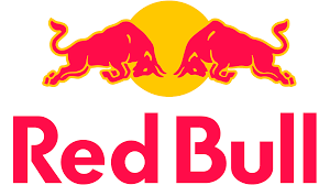
The color palette of the Red Bull logo combines a vivid combination of red and yellow. Red stands for the name of the brand and it also represents power and confidence. The yellow sun adds energy to all the elements of the logo.
52. Zendesk
Zendesk, known for its client-support apps and software, has a logo consisting of bold, balanced geometric shapes that suggest strength, professionalism, and confidence. Its dark green color adds to the feeling of power, energy, and stability.
53. Allegra
The white smooth lettering of Allegra’s logo is placed against a purple background, evoking a sense of harmony and calmness. This color combination is synonymous with relief, a choice that makes sense for an antihistamine medication.
54. Oral B
The white and blue color palette of Oral B’s logo represents the brand’s focus on mouth-care products, suggesting a sense of freshness and protection. The combination of these shades also represents the brand as a professional and trustworthy one.
55. Whiskas
Whiskas, a brand of cat food, uses two shades of purple with white and yellow accents, adding air and freshness to the regal main shade. The logo looks intense and stylish as well as playful and friendly. evoking a sense of high quality and reliability.
56. Aer Lingus
The visual identity of Irish airline Aer Lingus consists of a bright green shamrock, which is a nod to its Irish roots as well as a reflection of growth, success, and well-being. The combination of sea/blue and bright green represents the stability, confidence, and safety of the company.
57. Wikipedia
The color palette of Wikipedia’s globe-meets-puzzle logo includes shades of gray, black, and white. It’s one of the few companies that limits its colors to such a subdued palette. It conveys a sense of simplicity, seriousness, and reliability, and the globe and puzzle motif conveys the breadth and incompleteness of its content.
58. Baileys
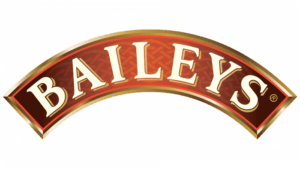
The logo for Baileys includes a rich gradient color transition – the edges are burgundy and the middle is light orange. This color combination brings to mind the indulgent nature of the liqueur and its harmony with its milky-coffee shade.
59. Duolingo
Duolingo, a language-learning application, uses an owl in its logo to symbolize wisdom and bright green to represent growth and development. The lighter shade of green symbolizes the character and mood of the company.
60. Athleta
Athleta is a brand of yoga and leisure apparel. The logo consists of a solid purple circle with a white stylized flower made up of thin triangles. The combination of colors on the emblem suggests wisdom and balance, harmony and self-confidence.
61. Penji
In using purple and pink for its logo, Penji’s visual identity sets it apart from other graphic design services and makes it recognizable. The color scheme was selected because it’s fun, vibrant, and lighthearted, which is the experience that the company hopes clients will have when using its services.
62. Orangetheory
It’s no surprise that OrangeTheory Fitness uses orange in its logo. The “O” is a stylized image of a fat cell exploding. Along with the red shade, the company’s visual identity brings to mind a sense of energy, motion, and power with the promise of fitness.
Need a logo? Get unlimited graphic designs with Penji
Logos are an important part of any business’s branding. They are the first thing people notice when they visit your website or social media page. So it’s essential to create a logo that stands out and reflects your brand values.
Penji’s team of experienced professionals can create the perfect symbol by combining the right colors, fonts, and shapes to make sure your logo – and all other designs – express who you are effectively.


