
Tech company logos are some of the most difficult to design. They need to be specific, unlike other industries that have the freedom of choosing any style that they see fit for their brands. In addition, tech companies are the first to embrace innovation which should be evident in their logos. Penji’s team of talented graphic designers has created these ten tech company logos to inspire you.
1. J5 Technologies
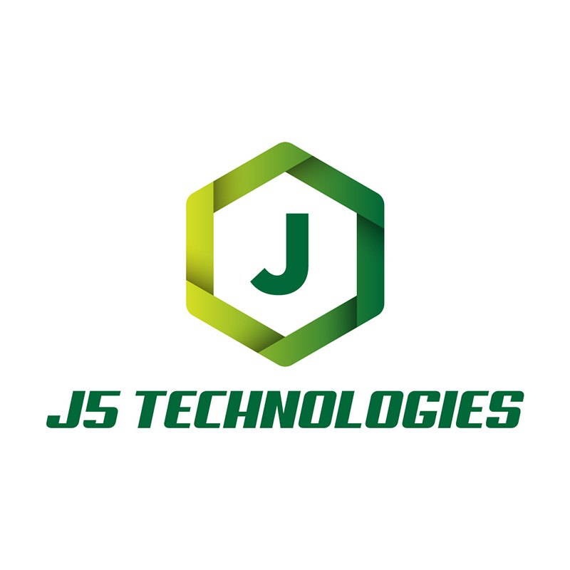
For tech companies to project themselves as ahead of the game, their logos should express this. The trend in tech company logos is the use of bright and edgy colors. J5 Technologies does this well with different shades of green, all bright and vibrant.
Color is a huge factor when designing a logo. It gives a great perception of your brand values to your target market. In this example, the hexagon logo shape and slanting font add a contemporary touch to the design.
Innovate your tech company logo with Penji
Design unique logos in 1-2 days
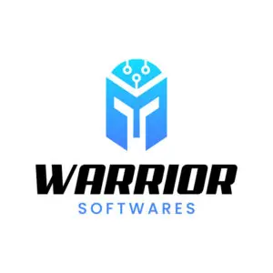


2. Warrior Softwares
Custom illustrations are a great addition to any logo design. This Warrior Softwares example uses an illustrated icon of an ancient helmet. Notice how there are lines and circles at the top, which are reminiscent of a circuit board.
If you’re looking to design a one-of-a-kind tech company logo, you may want to stay away from online template logo makers. Custom-made icons are excellent differentiators, and you won’t find them in templates. Watch our demo video here to learn how Penji can create unique logos for you.
3. InComputer
Gradients are another excellent way for tech company logos to show movement and development. This InComputer logo uses green and purple on its brand name. The icon it uses has gradating colors that perfectly show its dynamic brand personality.
In a fast-paced industry, movement and speed are traits you want to show off. This shows innovation, advancement, and modernization. Even the font choice is suitable as it looks trendy and up-to-date.
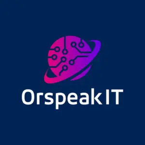
4. OrSpeakIT

Blue is one of the most popular colors in logo design. It’sIt’s because it stands for many emotions and characteristics crucial in logo design. Blue typically represents loyalty, dependability, trustworthiness, and many others.
In OrSpeakIT’s case, the combination of blue and violet works quite well. It gives a mysterious yet stylish atmosphere without losing the tech personality in the mix. The planet icon gives it a sense of community which is vital in storytelling.
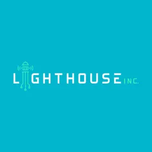
5. Lighthouse, Inc.
What may look like a cute icon to some is a compelling and impactful tech company logo. The lighthouse icon on this Lighthouse, Inc. logo was beautifully designed. The image uses the building that morphs into lines and dots that we usually associate with a motherboard.
The font choice is futuristic, which adds to the representation of a forward-thinking company. The neon color also points toward a dynamic and energetic ambiance that’s perfect for the brand.
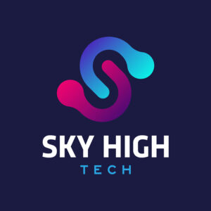
6. Sky High Tech

Another tech company logo that uses gradients for its colors is this one from Sky High Tech. While you have the option to follow trends, you also can forego utilizing this type of coloring on your logo. This one would still look good even if you use black and white or flat colors.
Vibrant colors are attention grabbers, which is the reason many companies choose to have them. In this example, the dark background does well in emphasizing the logo and its brand name.
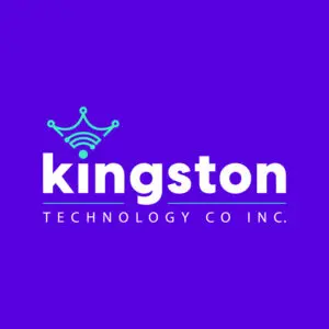
7. Kingston Technology Co., Inc.

With the word king in its name, it’s only natural for the designer to use a crown as Kingston Technology Co., Inc.’s main element. Plus, the choice of violet or purple as its primary color is no accident. It is the color that is typically associated with royalty.
The font used in this logo is a very basic type but can still command attention. Its white against a dark background quickly makes it stand out.
8. Target Technology Co., Inc.
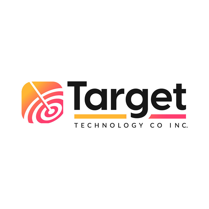
This black, yellow, orange, and red tech company logo created for Target technology is an eye-catcher. The target board enclosed in a square is spot on. What seems like an arrow that hit the bull’s eye shows that the company deals with precision in its business.
The font pairing of a thick style font with a thinner and all-caps typeface is excellent. The warm colors provide balance with the black brand name.
9. Whammy Technologies

Using the first letter of the brand name, this W logo designed for Whammy Technologies is an excellent example of scalability. The W logo icon looks great wherever you place it—on a small business card or a giant billboard. When designing your tech company logo, ensure this is a significant consideration.
The green and blue color combination adds a fresh angle to the reliable and authoritative persona. This design speaks volumes about professionalism, even if the brand name itself is on the casual side.
10. Golden Section
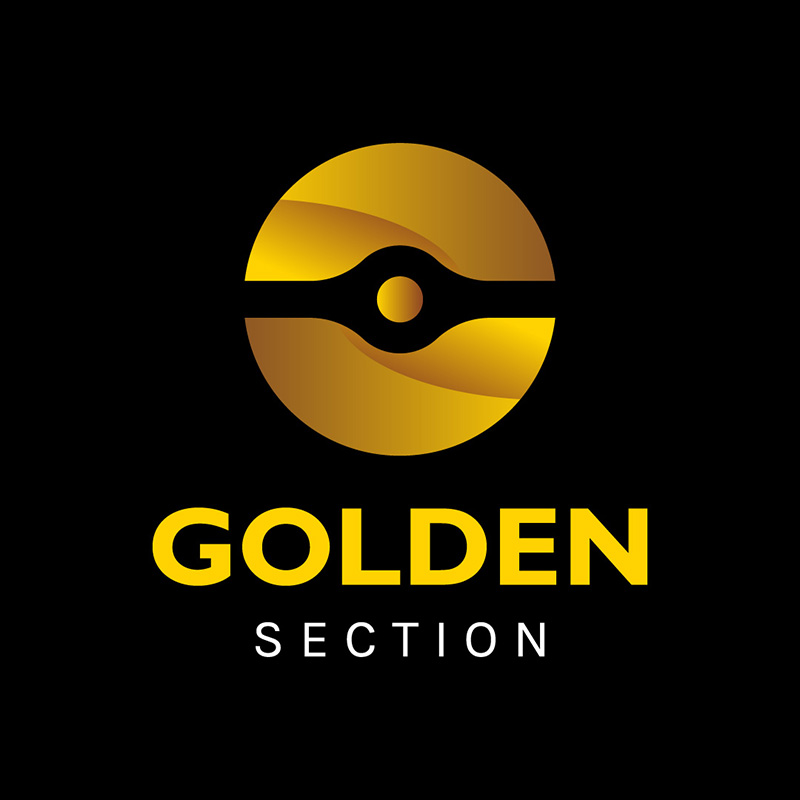
What better way to show authority and dependability than to use gold on your brand name and logo. Golden Section has a circle in the middle that looks like a disc used in many computer peripherals. The black background does a very good job of making the logo stand out.
While custom-made logo typography helps in differentiation, simple ones can be as great. This example is a perfect example of this. It uses basic typefaces but still has that authoritative appeal.
Tips When Designing a Tech Company Logo
A tech company logo may require more than other industries. It needs to show that the company is innovative, up-to-date, and always relevant. Below are a few tips when designing them:
- Choose colors carefully – your brand colors will represent your values, mission, and vision.
- Go with simple fonts – a too-ornate typeface can be distracting. It also won’t look good when used in small spaces as it can be hard to read.
- Stay fresh and young – go for a modern yet classy look, a logo that won’t look old in just a few years. Following trends is fine but not recommended.
Final Thoughts
The tech industry is a competitive one. You need to stand out to get the clients you need. It may require careful planning to get the most suitable design, but if you have doubts, go to the pros. Penji’s team of graphic designers can design the best tech company logo for you.
Tap on this link to get started.
About the author

Celeste Zosimo
Celeste is a former traditional animator and now an SEO content writer specializing in graphic design and marketing topics. When she's not writing or ranking her articles, she's being bossed around by her cat and two dogs.


