
Cool logo design ideas aren’t just about visual appeal—they trigger recognition, nostalgia, or even excitement every time we see them. Think about the world’s most famous brand logos—these designs have become so iconic that you can spot them across the room.
Let’s explore the 25 best logo examples that reshaped the way we think about design and branding.
1. Apple
When it comes to scalability, Apple is number one. The bite on the logo has urban legends behind it. It was linked to what Isaac Newton used as a symbol in his concept of gravity or Adam and Eve’s Tree of Knowledge. But Rob Janoff, the logo’s creator, said the bite is there for scalability and to make sure people think it’s an apple, not a cherry.
2. Beats
Some iconic logos don’t even need a brand name to go with it just like the Beats by Dre logo. But it’s more than just the brand’s first letter. The ‘b’ on the circle represents the headphones, and the circle represents a human’s head.
3. NBC
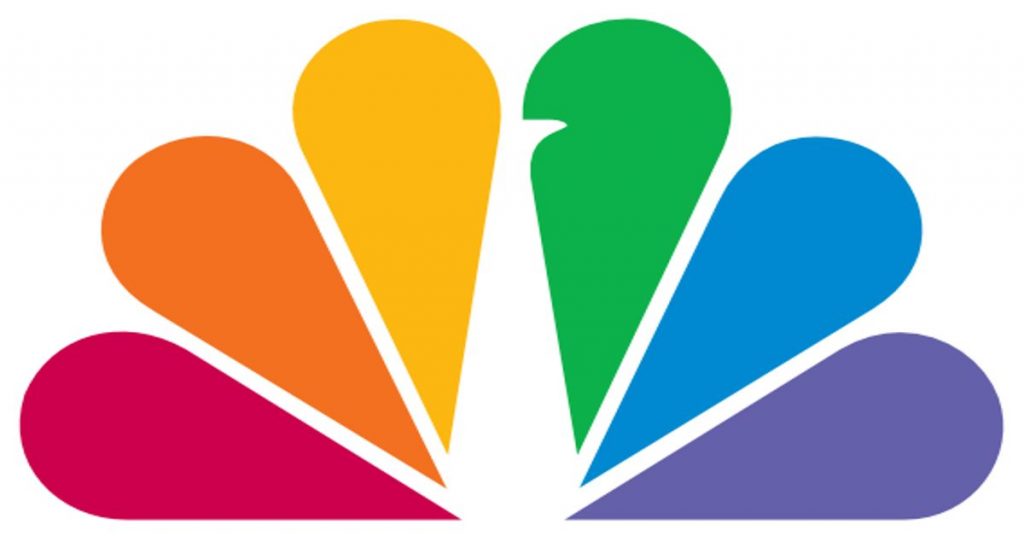
Cool brand logos should have the brand’s story in them, and NBC made use of a peacock for an interesting representation. The peacock in their logo represents color richness. NBC calls it “The Bird” and symbolizes the surge of color programming back in 1956.
4. Baskin Robbins
A customer must be able to relate to the company’s branding through its logo. Baskin Robbins’ logo exudes fun and joy, just like when you’re eating ice cream. Notice the number ‘31’ in between the ‘B’ and ‘R?’ Yup, that’s how many ice cream flavors they have!
5. Vaio
Vaio holds a spot on this list because of its smart integration of symbols and letters that make up the entire text. The wave in VA illustrates its analog products while the IO means the binary language in programming, which represents digital technology.
Want a cool logo like these?
Submit a request, get your logo as soon as tomorrow
6. Roxy
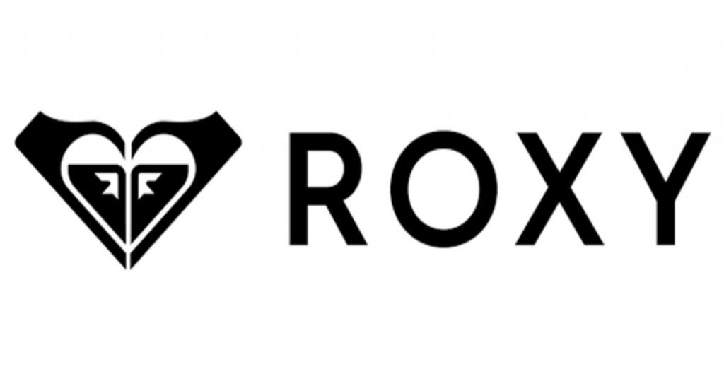
Roxy’s logo is a sight for sore eyes. It’s a feminine brand, and the logo depicts just that through the heart symbol. But when you look closely, the heart contains two Quiksilver logos turned upright. Quiksilver and Roxy are owned by the same company. However, the Roxy line was only introduced in 1990, while the Quiksilver logo was launched in 1973. The company wanted immediate brand recognition, hence, integrating the Quiksilver logo.
7. Museum of London
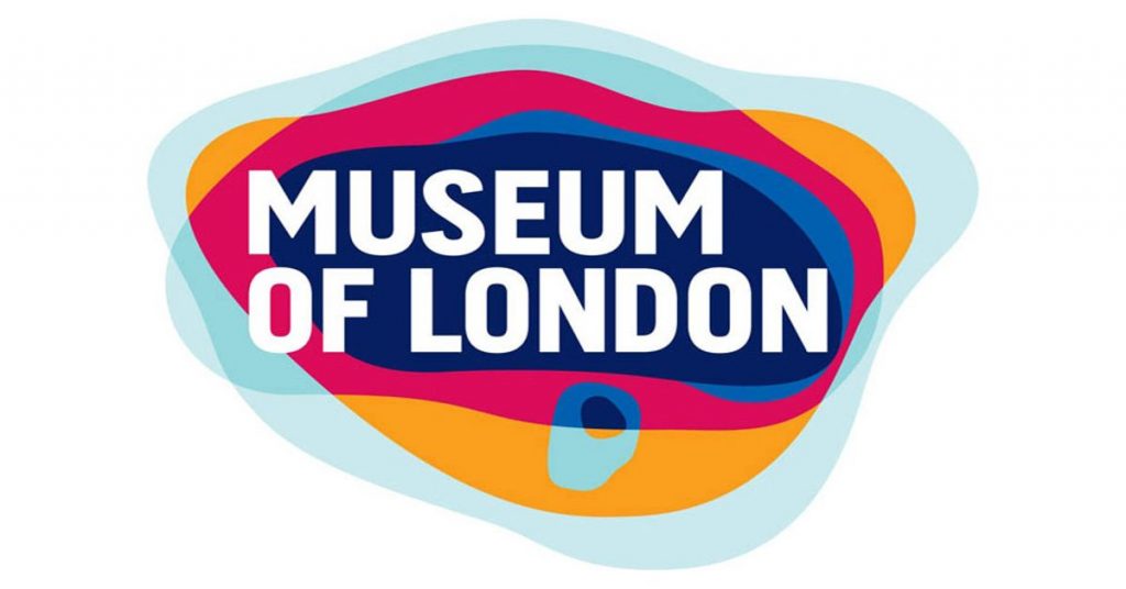
Color schemes are vital in a company logo. The Museum of London (now known as the London Museum) incorporated different colors to signify London’s thumbprint. It represents the diverse and dynamic London and Londoners. The various colors also tell the story of how London has been through wars, fires, and plagues, and eventually, emerged stronger.
8. FedEx
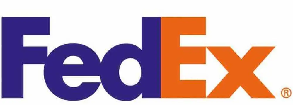
The coolest logos in the world can communicate with their target market through symbols. The FedEx logo is one such example. The hidden arrow between ‘E’ and ‘X’ indicates that the company is all about speed and precision when serving their customers.
9. Picasa
Picasa is a cross-platform organizer for images. It’s also a software for editing and viewing photos. Picasa’s logo looks like a camera shutter, but the white space in the middle is a “Casa,” which means a house in Spanish. This indicates that Picasa is a home for all your valuable photos.
10. Tour de France
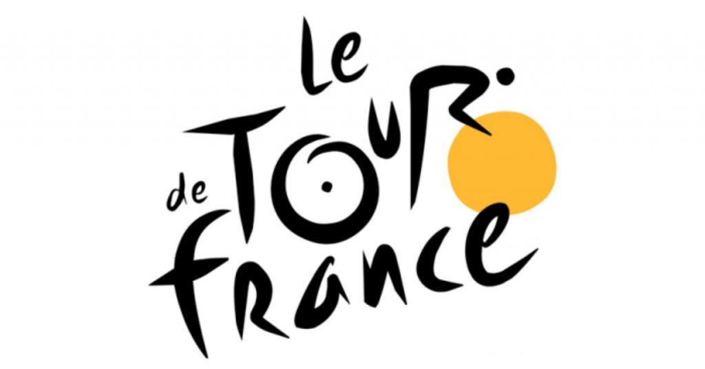
Relevance is one element in an exceptional logo, and Tour de France outdid itself with theirs. The ‘R’ is a cyclist, while the yellow circle exemplifies the bike’s wheel. It also means the sun which indicates that events are done during the day.
11. Tostitos
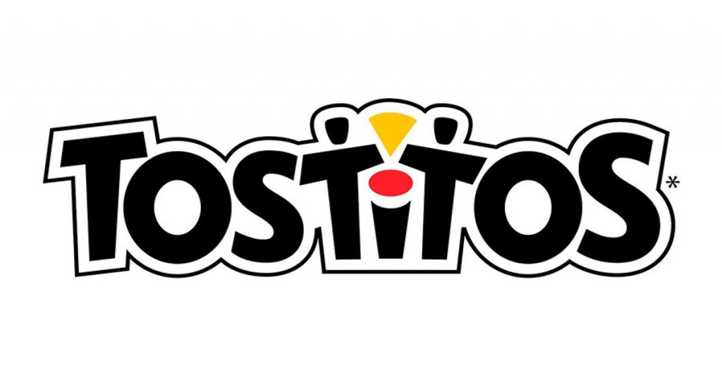
Tostitos is a snack for everybody, and the colors and symbols on their logo convey just that. The two people sharing a chip indicate that fun memories happen when they eat Tostitos. The “I” also symbolizes the dip for the tasty chips.
12. Toblerone
An excellent history must be in Toblerone‘s iconic logo. Theodore Tobler got inspiration from the Matterhorn Mountain in the Swiss Alps for the triangular shape. And if you look closely, you can see a bear standing on its hind legs. The bear signifies the symbol in the city of Bern Switzerland, where the original factory was.
13. Kolner Zoo
Unique logos are a cut above the rest, and Kölner Zoo’s logo is the perfect example. The beautiful utilization of negative space in the huge, green elephant logo comes out perfectly well. There’s a giraffe, a rhino, and the famous landmark in North Rhine-Westphalia, Germany — Cologne Cathedral.
14. Coca-Cola
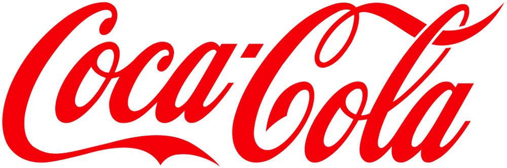
Coca-Cola‘s red logo is one of the most iconic logo designs worldwide. Experts say that the logo influenced Santa Claus’ red-and-white suit due to the brand’s first Christmas advertisement. But here’s another interesting story. Back in the day, alcohol was taxed in American drug stores, while soda wasn’t. And the company wanted to show customs and tax officers that they weren’t selling booze. So they painted their Coca-Cola barrels red for the distinction!
15. World Wildlife Fund
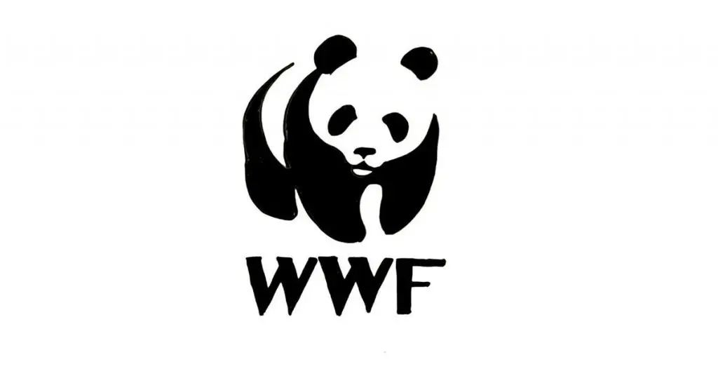
One of the bold logo examples, this design is a combination of a simple image and straightforward text. Without a doubt, WWF is one of the most well-recognized logos worldwide. The panda is the perfect symbol to express and spread awareness about the need to protect the voiceless.
16. Target
An excellent logo must be able to stand on its own. It must also look good on any marketing medium. Target boasts red rings around a circle to illustrate a bullseye. Target oftentimes uses the bullseye icon only because of how easily recognizable their logo is – surely one of the simple logo designs that make an impact.
17. Golf Spartan
Golf Spartan’s logo has a golfer swinging a golf club (of course). But the company brilliantly used the white space to represent a Spartan’s face wearing a helmet.
18. Eco-Pup

While simplicity is important in creative logo designs, it also doesn’t hurt to be more playful with it. As long as the symbols and text go together, it will come out as superior. Notice how Eco-Pup‘s graphic design service blended two elements. One is the leaf to mirror an environment-friendly branding, and the other one is a paw print to convey that they cater to dogs and cats.
19. Lego
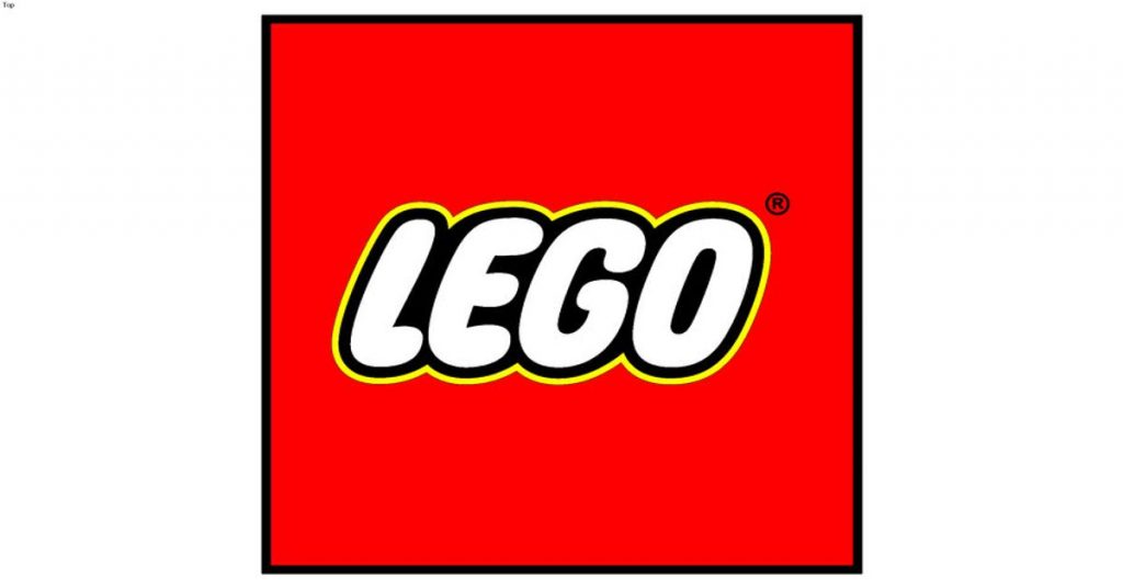
A unique typeface should also be relevant to your branding – as seen from the best examples of typography in logos. Lego’s bubble-like typography in logo brings joy to children around the world. The colors also resonate fun and happiness. The brand name is from the Danish words “leg godt.” The brand created an abbreviation out of this, which means “play well.”
20. Chupa Chups
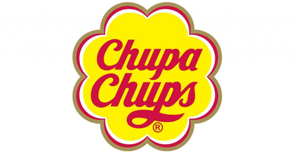
Chupa Chups is probably part of anyone’s childhood and it’s a good illustration of color psychology in logos. The bright yellow color gives children and even adults instant elation. Red, on the other hand, increases appetite and offers an extra dose of energy. True enough, there is that feeling of happiness when you’re sucking on a Chupa Chups lollipop!
21. Starbucks
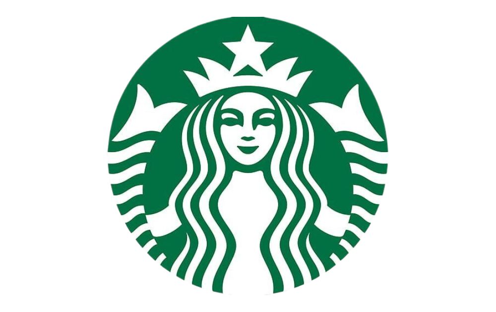
In mythology, sirens were mermaids who lured sailors at sea. The Starbucks founders saw inspiration from this, a 16th-century Norse woodcut. The logo now epitomizes the provocative fickleness of the sea. And since the first Starbucks opened in Seattle, the company wanted to represent coffee’s seafaring history and how Seattle had built a close association with the sea.
22. Warner Bros.
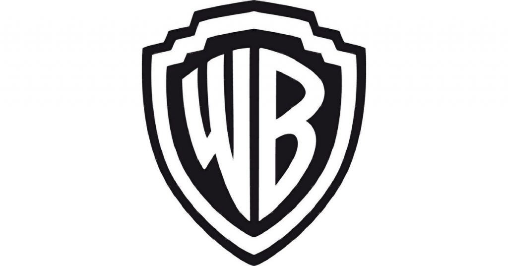
A simple logo like Warner Bros. stays true to the brand’s almost century-long history and origin and it’s a good logo inspiration to consider if you want a simple yet striking symbol. The famous shield was linked to the first WB studio in Burbank, California. It’s a shield floating amidst the clouds, and this symbol hasn’t changed since the 1920s.
23. Galeries Lafayette
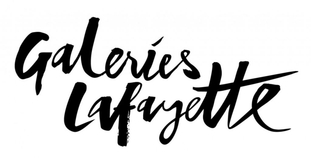
In the world of cool logos, elegant typography is one deciding factor for customers. Galeries Lafayette not only has fancy typography but also dons the Eiffel Tower in the two ‘tt’s’, incorporating the company’s roots since it’s a department store chain in France. It has many chains across France and in other parts of the world. Akin to the Eiffel Tower’s grandeur, Galeries Lafayette’s building is also a symbol of the Art Nouveau Movement. To date, it is considered one of the most outstanding department chains globally.
24. Nike
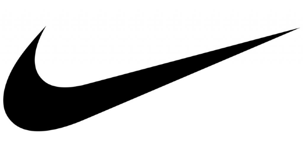
When it comes to memorability, Nike is the winner on our ‘cool logos’ list. It’s simple, it’s eye-catching, and it’s extremely memorable that the company decided to cut out the brand name in most of their products. But did you know that the logo was created by freelance graphic designer Carolyn Davidson for $35 back in 1971? The company didn’t initially like the logo but over time, it grew on them. Today, not one person in the world isn’t familiar with the ‘Swoosh.’
25. Walt Disney
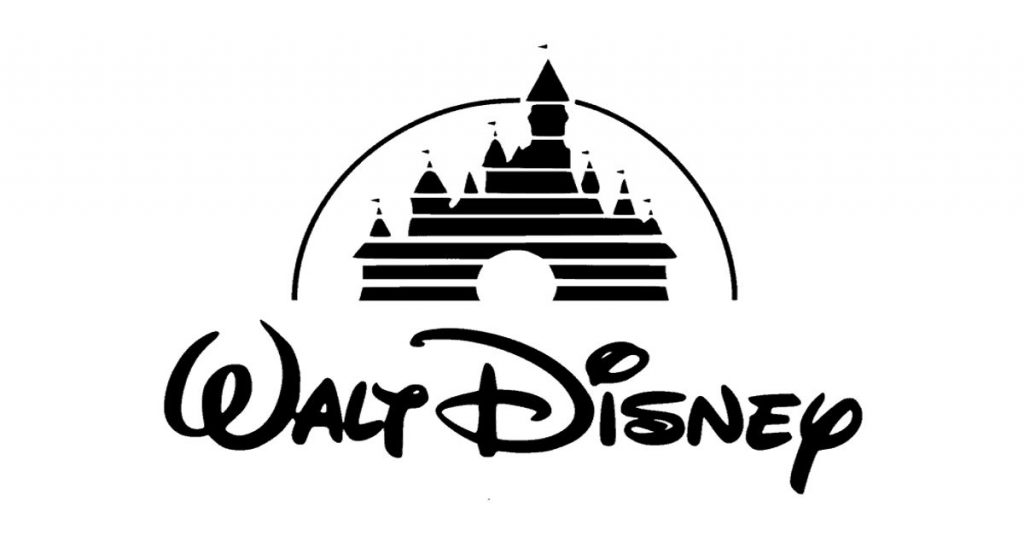
The beautiful Cinderella castle on Walt Disney’s logo exemplifies fantasy. It almost instantly takes you to a magical fairyland in a faraway place. The overall symbol, with the arc and elegant typography, brings heartwarming joy and delight to children and the children at heart. This was what Walt Disney wanted to portray when creating the logo in 1937. And the unique stylized script is the actual signature of the man himself!
Cool Logos from Penji
Penji’s team of graphic designers boasts of some of the most talented logo designers in the industry. To show you their fantastic prowess, here are a few examples of their works:
Delirium Servers
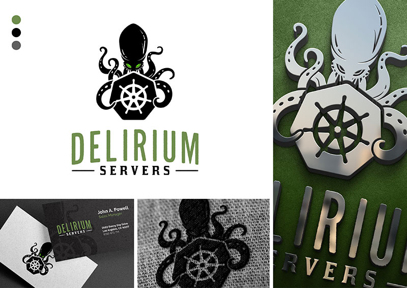
Striking the perfect balance between professionalism and edginess, this logo design for Delirium Servers sits atop the coolest of the coolest logo charts. The menacing octopus with glowing green eyes and sleek tentacles symbolize power and control. The hexagon in its front has a Kubernetes wheel that represents server management and technology, giving it a tech-savvy feel.
Pickled Agency
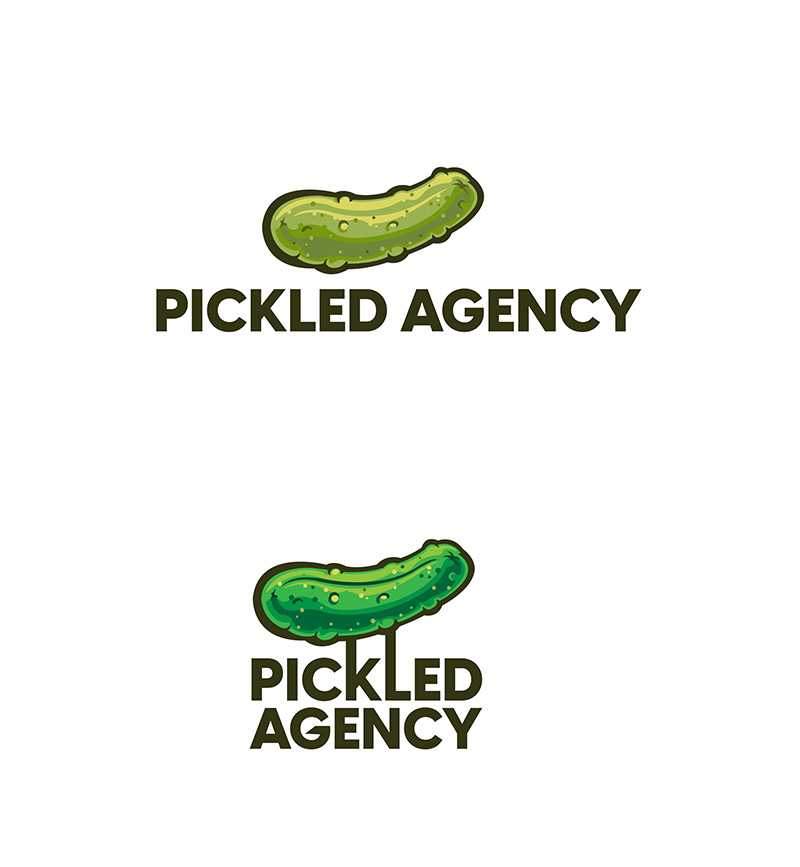
The saying “Less is More” will always be some of the most sound advice you can get when designing logos. This cool logo design for Pickled Agency reeks of sophistication, wit, and style. It is an illustration of a pickle with its brand name cleverly attached to it. This project a sense of straightforwardness that says the company means business.
BHT

A cool logo projects style, confidence, and determination. This logo design for BHT fits the bill exactly. The bull represents resilience and strength, while the font gives it a sense of fluidity and professionalism. This minimalist logo design is further enhanced by its metallic finish, giving it a polished and corporate look.
FAQs (Frequently Asked Questions)
How do you make a cool logo?
Cool logos that are memorable and timeless are made by professional logo designers. However, you can DIY your logo by using logo design tools like Looka, Canva, or GraphicSprings. You may also subscribe to on-demand graphic design services for quality cool logos at half the price.
How do you come up with a cool logo?
Cool logos don’t have unnecessary design elements that don’t contribute to the overall logo design, story, history, and identity. Coming up with a cool logo entails only these five elements: Memorability, versatility, simplicity, relevance, and scalability.
What are the seven types of logos?
The seven types of logos are:
- Monogram or lettermarks: Logos featuring a brand’s initials or a single letter
- Wordmarks or logotypes: Logos featuring a brand’s name in stylized typography
- Pictorial marks or logo symbols: An image or shape representing a brand
- Abstract logos: Visual logos without a literal or obvious meaning
- Mascots: Original characters representing a brand
- Combination marks: Logos containing both visuals and text
- Emblems: Logos featuring text and symbols within a frame
How to Get Cool Brand Logos from Penji
Hopefully, these classic logos have given you some ideas for how to make your brand stand out. But when it comes to logo design, leave it to the pros. Penji offers access to a world-class team of graphic designers for a simple monthly price so that you can hire a logo designer effortlessly.
How does it work? You can create a cool logo with Penji in just 3 simple steps:
- Sign up: Choose your preferred plan from our pricing page. Our intuitive project management tool can be mastered in under 5 minutes
- Create: Submit your logo request using our easy-to-use request forms. Include all the details about your brand, your vision, and the deliverables you need.
- Revise: Fine-tune it ’til it’s perfect with unlimited revisions. Our click-and-drag tool lets you make precise comments.
But Penji is not just a logo design service. We offer 120+ different graphic design services with results in as little as 24 hours through our subscription. Watch the demo video now to learn more about our services.
About the author

Table of Contents
- 1. Apple
- 2. Beats
- 3. NBC
- 4. Baskin Robbins
- 5. Vaio
- 6. Roxy
- 7. Museum of London
- 8. FedEx
- 9. Picasa
- 10. Tour de France
- 11. Tostitos
- 12. Toblerone
- 13. Kolner Zoo
- 14. Coca-Cola
- 15. World Wildlife Fund
- 16. Target
- 17. Golf Spartan
- 18. Eco-Pup
- 19. Lego
- 20. Chupa Chups
- 21. Starbucks
- 22. Warner Bros.
- 23. Galeries Lafayette
- 24. Nike
- 25. Walt Disney
- Cool Logos from Penji
- FAQs (Frequently Asked Questions)
- How do you make a cool logo?
- How do you come up with a cool logo?
- What are the seven types of logos?
- How to Get Cool Brand Logos from Penji


