
When looking at a piece of text, it’s easy to lose the forest for the trees, focusing on the material and less on the method of transmitting it. But one lesson both graphic designers and typographers learn is the role typefaces play in the way people digest information.
Here are a few examples of typography speaking louder than the text.
War Is Over (If You Want It)
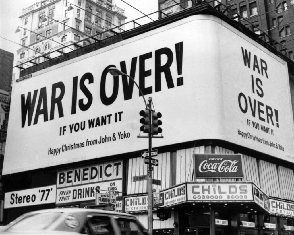
Say what you will about the naivety of John and Yoko’s politics or the detached bubble from which they posited the majority of their societal critiques. One thing is for sure: these two knew how to promote a brand while effectively communicating a message.
With the tools of mid-century minimalism; the fringe, avant-garde tendrils of Ono’s hip New York arts background; and a heaping dose of easy-come media coverage, this couple successfully created one of the most ubiquitous ad campaigns in recent history.
How did they do it?
Franklin Gothic, a brilliantly concise slogan, and a lot of empty space. Not to mention a fantastic grasp of typographic hierarchy.
In hindsight, co-opting the traditional means of advertising to promote an abstract, ill-defined, and un-profitable concept, was far ahead of its time.
Most journalists were too busy scoffing at the idea to make sense of the greater movement, and history still hasn’t found the time to properly thank Yoko Ono for her contribution to modern, high, and popular art. Still, the work itself is brilliant, timeless, and a perineal reminder of the ability of typography to create a sense of immediacy.
Just imagine.
[in_content_ads gallery=”logos” logo=”on” title=”Need graphic design help?” subtitle=”Try Penji’s Unlimited Graphic Design and get all your branding, digital, print, and UXUI designs done in one place.” btntext=”Learn More” btnlink=”https://penji.co”]
The New York Subway
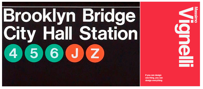
The expansive subterranean jungle underlying New York City’s streets is truly massive. Encompassing 468 stations and 230 miles of track, it can be a daunting task just navigating it.
So, who’s better suited to take a tangled, muddy cacophony and translate it into an easily communicated map than an artist? The Big Apple certainly felt this way.
Up until the mid-1960s, properly using the NYC Subway was a feat of mental endurance. The system was split between three privately run companies: the Interborough Rapid Transit (IRT), the Brooklyn Manhatten Transit (BMT), and the Independent (IND). There was no consensus on signage, including typeface. Each company was free to choose its own. This obviously led to a nightmarish experience for transit-goers. Especially those from out of town, which at any given spot in lower Manhattan, is likely the majority of people around you.
1968 saw the beginning of an overhaul. Unity developed in the form of the Metropolitan Transportation Authority, which oversaw all transportation operations in the city.
But they didn’t stop there. The city brought in graphic artist Massimo Vignelli and his business partner Bob Noorda to reimagine the way people interacted with the subway signage.
What emerged was a universally recognizable, easily accessible, and, perhaps most importantly, standard system of operation. Click here for more information regarding the rich, artful history of Vignelli’s contribution to NYC’s transportation solution.
Damn.
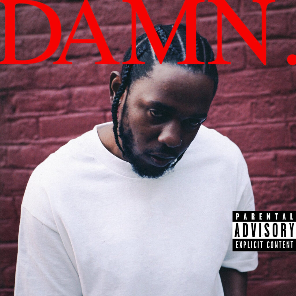
Kendrick Lamar’s 2017 full-length Damn was accompanied by a potent visual element. I remember my exact feelings when this record dropped.
His previous release, To Pimp A Butterfly, was a massive critical success, a huge commercial hit, and a deeply evocative treatise on the modern plight surrounding racial inequality and systemic discrimination. A trifecta that’s very difficult to achieve in American mainstream music.
I was looking forward to seeing where Lamar went next but was horror-stricken when I saw the album title and accompanying artwork.
I thought it was crude, boring, and simplistic.
But, I was wrong.
To be fair, the release predated my appreciation for this type of design work. And thought the brutal approach was a significant aesthetic backstep. But what I missed was the effectiveness of this decision. I wasn’t alone, however. There were many critics of the work, especially following the grand, almost Sgt. Pepper-like artwork of To Pimp A Butterfly.
One of the designers involved in its creation, Vlad Sepetov, spoke out in response to the criticism on Twitter.
already seeing a lot of discussion about the cover. and i’m really excited about it. it’s interesting to see people talk about “bad” design.
but i’m incredibly proud of this cover. i sort of bucked a lot of what my teachers taught me. i wanted to make something loud and abrasive.
[…] just given the bare bones we fleshed something out that has a lot of people talking. it’s not uber political like [To Pimp a Butterfly] but it has energy imo
Vlad Sepetov (@VSepetov) from Twitter
Whatever your opinions, the harshness of Damn‘s cover art found symmetry in its aural counterpart, creating a cohesive, uniquely expressed experience. It goes to show that sometimes you’re just ahead of the game.
An Incalculable Loss
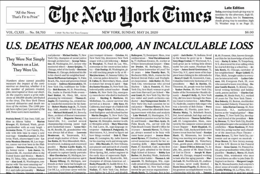
On May 24th, 2020, when The New York Times sent its product to the presses, it did so without any images on the front page. Instead, an impenetrable slab of text stood where colorful embellishments would typically be.
A monotonous stream of faceless identities in place of a nuanced layout. While at first sight, this may seem like the work of graphic design amateurs, it’s actually an incredibly well designed, and immensely artful statement made by the folks at the Times.
Compiled are nearly 1,000 names and biographical blurbs.
The statement was clear: The news of the day is the immeasurable effect of COVID-19. That’s it.
And while you may think this is a rather bland approach to news reporting, the true beauty is in its implication. At the time of this issue, there had already been 100,000 lives lost to the virus. This was, as we remember, one of the two infectious diseases swarming our culture. The second of which was the mass amounts of misinformation regarding the deadliness (or existence) of COVID.
Rarely do we look to the established purveyors of news to make such gestures, but the dire circumstances of May 2020 resulted in one of those moments, and one example of typography expressing more than the words on the page.
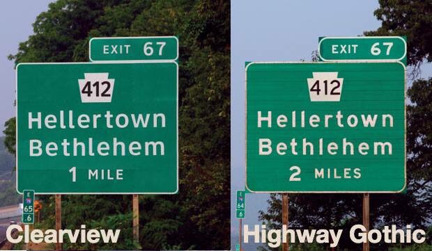
Highway Gothic / Clearview
New York City isn’t alone in its efforts to create a more visually accessible way of quickly transmitting traffic information. We come into contact with these types of signs every day. Even pedestrians will find themselves yielding to the dictatorial presence of street signs multiple times over the course of an urban stroll.
But we pay shockingly little attention to the fonts used on them. And this is a testament to their efficacy.
Starting in the 1950s, Highway Gothic became the standard. It was a decision born from the California Department of Transportation’s initiative to develop a clearer, more flexible typeface.
Prior to this change, we relied on an assemblage of various shapes, sizes, colors, and fonts to direct us on our journeys. I wasn’t around for it, but it sounds disorienting. And I’m sure the inconsistent legibility was fodder for innumerable misadventures.
The decision to standardize the typeface, and to choose one that enables quick comprehension and easy discernment of characters provided much-needed refuge from the confusion of the previous method.
In recent years, however, a new typeface has been vying for the top spot: Clearview.
With wider spaces and less chunky letterforms, Clearview may have an apparent edge. And in the future, things can always change. But for now, these two typefaces are coexisting as the main typefaces we use to communicate traffic information.
Conclusion
These are just a few notable examples of typography and its influence on our communication. There are countless other instances. Working with graphic designers who understand the importance of typography is essential. Check out Penji today to be paired with the right designer for your brand.


