
TL;DR: Brand colors communicate emotion and identity before a customer reads a single word. This post breaks down what each color signals, how to define a palette that fits your brand, and how to keep it consistent across every touchpoint.
Brand colors meaning refers to the emotional associations and psychological signals that specific colors carry when used in a brand’s visual identity.
Each color in a business’s palette shapes how customers feel about the brand before any copy is read or product is evaluated.
Choosing colors strategically means understanding both the universal associations behind each hue and the specific context of the brand using them.
Color is the first thing people see.
Not the logo.
Not the tagline.
The color. Most purchase decisions happen faster than conscious reasoning can catch up, and the visual impression a brand makes in those first few seconds carries more weight than most business owners realize.
The meaning of brand colors is not a soft creative question.
It is a business question with measurable consequences.
This post covers what each major color communicates, how to define a palette that actually fits your brand, and what to do if the colors you are currently using are not doing the job.
Why Does Brand Colors Meaning Matter for Your Business?
Most people think they make rational buying decisions. Research suggests otherwise. Studies on consumer behavior consistently find that emotional responses drive purchases far more reliably than logical analysis.
Color is one of the fastest triggers of emotional response available to a brand. It works before language does. Before a potential customer has processed your value proposition or scrolled to your pricing, color has already been sending signals about who you are and whether you can be trusted.
That is not abstract.
A business that picks colors at random, or defaults to what looked nice in Canva, is leaving a first impression to chance.
A business that picks colors intentionally is doing something much smarter: it is pre-loading the right emotional context before a customer ever engages with a word of copy.
What Does Each Brand Color Mean?
Color psychology has well-established associations for most major colors, but these are starting points, not formulas.
The goal is not to pick the “correct” color for your industry. It is to find colors that align with how your brand actually feels and what it actually stands for.
Red signals energy, urgency, and passion. It is high-stakes and high-attention. Red works for brands that want to feel bold, fast-moving, or exciting.
Used poorly, it can read as aggressive. Used well, it commands attention without apology.
Orange carries warmth, friendliness, and enthusiasm. It is approachable without being soft. Brands that want to feel accessible and human without losing confidence tend to land well in the orange range.
It is less common than red or blue, which means it stands out.
Yellow suggests optimism, clarity, and energy. It is the most attention-grabbing color on the spectrum. Brands using yellow are usually communicating something cheerful, forward-thinking, or energetic.
The challenge is contrast. Yellow is difficult to use in text-heavy applications without careful pairing.
Green sits firmly in the territory of health, growth, and reliability. It is the natural choice for wellness, finance, and sustainability brands, which also means it is crowded in those categories.
A brand in a different industry that chooses green for the right reasons can use that association to its advantage rather than disappearing into a sea of similar palettes.
Blue is the most commonly used color in corporate branding, and with reason. Trust, professionalism, and calm are among the strongest associations it carries.
Banks, tech companies, and healthcare brands reach for blue constantly. That ubiquity cuts both ways. Blue communicates credibility, but it does not differentiate.
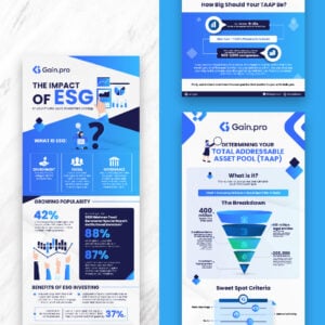
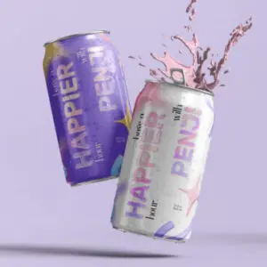
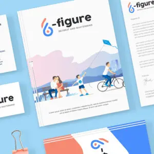
Let Penji Level Up Your Brand Colors
Get all the designs you need every month – illustrations, webpages, logos, & more


Purple carries associations with creativity, luxury, and sophistication. It is less common than blue or green, which makes it memorable.
Premium beauty brands, creative services companies, and forward-thinking tech products have all used purple effectively.
Pink signals femininity, romance, and warmth. That traditional association has loosened considerably over the past decade, with pink appearing in brands positioned toward boldness, playfulness, and confidence as often as softness.
Black is authority and sophistication done simply. It is timeless in a way that few colors are. Luxury brands and minimalist brands both reach for black because it forces everything else, the product, the copy, the experience, to do the work.
White communicates cleanliness, simplicity, and space. As a primary color it reads as modern and uncluttered.
Most brands use white as a background element rather than a primary brand color, but when it does appear as the dominant tone it signals a deliberate restraint that can feel premium.
How Do You Define a Brand Color Palette That Fits?
Whether you’re choosing brand colors for the first time or re-branding, an internal audit is key. Start byBefore opening a color tool, the more useful exercise is defining what the brand actually is.
Not what it aspires to be. What it is, and what customers already say about it.

A brand audit is a good starting point: does the current visual identity match the actual brand personality?
Does the content the brand publishes feel like the same company as the logo suggests?
Once that is clear, color selection becomes a matter of finding the palette that tells the same story the brand is already living.

A company whose customers consistently describe it as approachable and honest should not be forcing itself into a color palette that reads as cold or aggressive because those colors test well in conversion studies.
Color has to be coherent with everything else.
The practical mechanics of palette building involve choosing one dominant color, one secondary color, and one or two accent colors.
Monochromatic, analogous, and complementary color relationships are the most stable starting structures.
A graphic design service can help test these combinations across the surfaces where they will actually be applied: website, social media, print, packaging. Seeing the palette in context reveals problems that a swatch on a white background will not.
Accessibility matters here too. Color contrast ratios affect readability for a significant portion of any audience. Running a palette through contrast guidelines before locking it in is a step that saves significant rework later.
Should You Match Your Industry’s Most Common Colors?
There are recognizable color patterns across industries. Restaurants frequently use red and yellow. Financial brands tend toward blue, red, and black.
Software companies default heavily to blue. These patterns exist because the associations are real.
Red and yellow genuinely do affect appetite. Blue genuinely does signal reliability.
The question is whether fitting in or standing out serves the brand better. If a restaurant goes blue, it had better have a very clear reason, because it is working against a set of established expectations.
If a financial brand goes orange, it is claiming warmth and approachability rather than institutional gravity. That can be a smart move. It depends entirely on whether the rest of the brand story backs it up.
The useful exercise is competitor analysis. Looking at the logos and palettes of the three to five direct competitors in a category quickly reveals which color territory is claimed and which is open.
The goal is not necessarily to avoid the category’s most common colors, but to be deliberate rather than accidental about where you sit within the visual landscape.
Penji’s branding services can run this kind of competitive visual audit as part of the brand identity process.
How Do You Build Consistency Once You Have Chosen Your Colors?
Choosing colors is the easy part. Maintaining them is where most small and mid-size businesses lose ground. Without documented standards, colors drift.
The hex value that looked right in the original logo gets approximated on the website, approximated again on social media, and approximated a third time on print materials until the brand no longer looks like itself.
A brand style guide solves this. It specifies every color with its exact hex, RGB, CMYK, and Pantone values, documents how colors apply across different surfaces and contexts, and gives any designer or vendor a single reference that removes guesswork.
Brands with documented color systems look more professional. They also save time and money on every future design request because the briefing process is shorter and the revision cycles are fewer.
Once the color system is documented, applying it consistently to every design deliverable, from social media graphics to ad creative to presentations, is what actually builds the recognition that makes color choices pay off over time.
Penji’s subscription service is built for exactly that kind of ongoing consistency. Designers work from the brand’s documented standards on every request, so the visual identity holds together across hundreds of assets without constant oversight.
See what Penji can do for your brand. Browse plans and get started today.
Frequently Asked Questions
What is brand colors meaning in marketing?
Brand colors meaning refers to the emotional and psychological signals that colors communicate when used consistently in a brand’s visual identity. Every color carries associations that form before a customer consciously engages with any copy or product information.
Red signals urgency and energy. Blue signals trust. Green signals health and growth. Choosing colors with those associations in mind shapes how customers feel about a brand from first contact.
How many colors should a brand have?
Most brand palettes work best with three to four colors: one dominant, one secondary, and one or two accents. Fewer colors are easier to apply consistently across diverse surfaces. More than four tends to produce visual noise and makes it harder to maintain a recognizable identity.
Some brands operate successfully with a single primary color and one neutral. The right number depends on the complexity of the brand’s applications.
Can you change your brand colors after launch?
Yes, and many well-known brands have done it successfully. A rebrand requires careful management of the transition so that existing customers still recognize the brand while new audiences form the associations the updated palette is trying to create.
The key is documenting the new color system clearly and updating every brand touchpoint consistently and quickly. A partial rebrand, where some assets reflect the old colors and others the new, creates confusion rather than progress.
Does Penji help with choosing brand colors?
Penji’s branding services include logo design, brand identity development, and brand style guide creation. Designers can work from an existing direction or help develop a color palette from the ground up based on the brand’s personality, audience, and positioning. Subscribers can request as many iterations as needed until the palette is right.
About the author

Brianna Johnson
Brianna is a professional writer of 10+ years who specializes in branding, marketing, and technology content.


