
![10 Iconic and Award-Winning Logos [Updated in 2023]](https://penji.co/wp-content/uploads/2023/03/cover-image.jpg)
Award-winning logos often share several common design elements that contribute to their success. Award-winning logos tend to be simple and easily recognizable. They usually don clean lines and minimalistic designs, which allow for easy comprehension and versatility across different applications. Take a look at these 10 famous logos that are well-recognized worldwide.
Need help with your company logo? Penji can create one for you for only $75!
How Do Designers and Agencies Make Award-Winning Logos?

- Logo design principles – Designers abide by logo design guidelines. These principles are uniqueness, relevancy, recognizable, simplicity, memorability, timelessness, versatility, and scalability. Without these, a logo can’t tell a story or relay the brand’s message.
- Graphic design principles – Aside from logo design principles, designers must also follow graphic design principles, such as balance, contrast, visual hierarchy, whitespace, and proportion. They mix logo and graphic design concepts to ensure the brand has a one-of-a-kind logo. Plus, graphic design principles provide aesthetics and enhance the brand’s messaging.
- Symbolism or history – Logos are a visual representation of a brand. But brands want to honor their humble beginnings or add a symbol, font style, or color to signify their values or messaging. And designers may face the challenge of producing a creative logo that doesn’t lose the brand’s essence. In that case, designers add symbolism to provide more depth and meaning to their logo through abstract and geometric patterns or illustrations.
Get your own award-winning logo
Try out Penji's graphic design subscription risk-free for 30 days & get all the designs you need


Top 10 Award-Winning Logos
1. Burger King
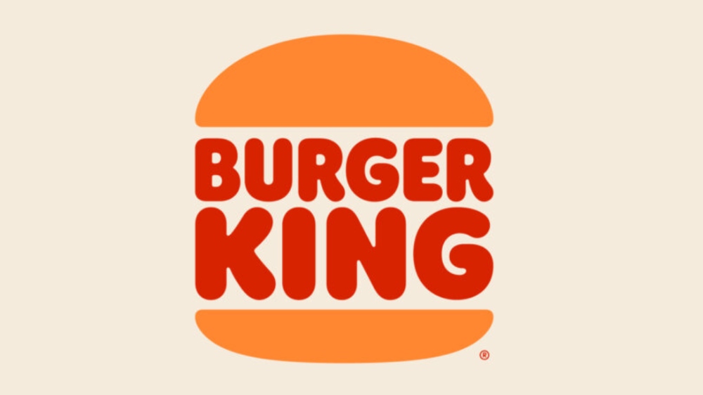
The Burger King rebrand by Jones, Knowles, and Ritchie won The One Club Gold Pencil in 2021. According to the agency, they wanted to transform the brand from synthetic to a more real and tastier brand. They explained further that they paid homage to the old iterations of their logo. Plus, the logo symbolizes fun, simplicity, and confidence.
2. TripAdvisor
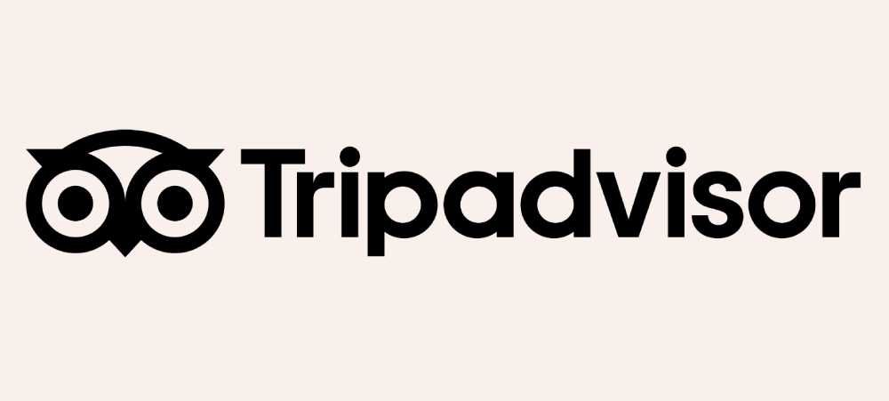
TripAdvisor is another The One Club winner in 2021. However, they received a merit. Mother Design was the agency responsible for their rebranding and refreshing the old owl logo to a simpler and more modern logo. Instead of having three colors in one logo, TripAdvisor sticks to TripGreen, giving it one cohesive look.
3. Cadbury
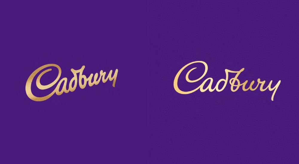
Like TripAdvisor, Cadbury won merit in 2021 from The One Club. The iconic gold gradient logo was repositioned in a straight line, compared to its old slanted one. Bulletproof stated they didn’t want to remove the brand’s British legacy from the logo to make it look contemporary.
4. Instacart
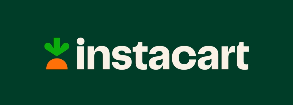
Here is one of the few recent award-winning logos on this list. Wolff Olins created the new Instacart logo and branding identity to demonstrate the brand’s values and goals for the future. It retained the carrot, symbolizing the fresh food they deliver to customers. Additionally, the brand wanted to portray a more forward-thinking and dynamic brand.
Instacart won a Silver award from the 2023 Clio Awards.
5. Eurostar
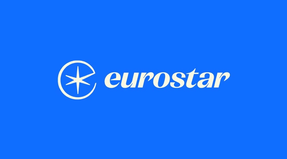
Eurostar is another Clio entry, and the brand’s logo was part of the 2023 Shortlist. One notable feature of their logo is the north star, their guiding light. Their north star incorporates a small letter E, representing their name. Also, the star has six lines, signifying direction. Also, the star can stand on its own and is meant to move, demonstrating the brand’s dynamic and flexible identity.
6. NY Philharmonic
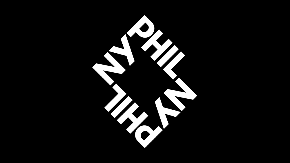
The new NY Philharmonic logo gets inspiration from its location in New York City. Like other award-winning logos on this list, the NY Philharmonic earned merit from the One Club Awards. Ogilvy reimagined the new logo as a square but with rectangular grids. The grids represent the NY streets encompassing the NY Philharmonic’s location – The Lincoln Center. Additionally, the center square symbolizes the musicians.
7. Renault

The French car manufacturer Renault was part of the shortlist of the D&AD awards. Landor and Fitch gave Renault a makeover while honoring its legacy. The diamond from its old iterations remains, but the lines never meet. According to the agency, this represented perpetual motion. Other than that, it was important for the brand to communicate that drivers weren’t just driving the car; it was an experience.
8. OnePlus
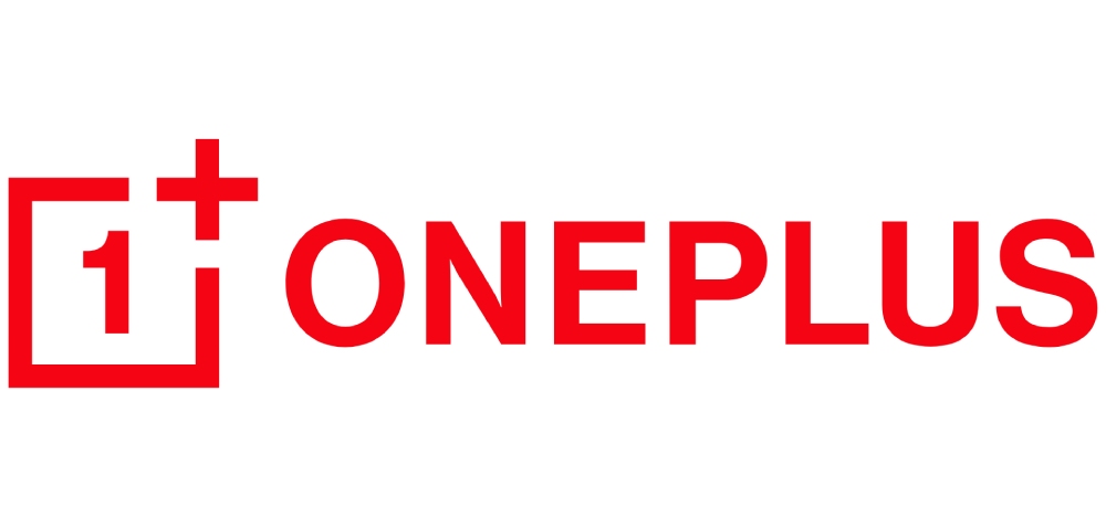
A refreshed appearance might be necessary for a well-known brand, especially if it wants to enter a new market. That’s what OnePlus did to enter the US market. Regarding the design, the logo had a few modifications. One was removing the horizontal box and changing the OnePlus wordmark from white to red. Plus, they emphasized the old logo, giving it a more modern look.
The OnePlus logo is a Reddot winner.
9. San Francisco Symphony
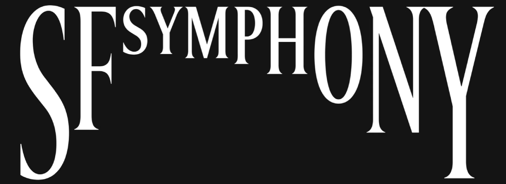
Being a dynamic brand is a common denominator of the organizations or companies in this list. The San Francisco Symphony is no exception there. Collins redesigned their logo into a serious yet dynamic one. The various letter sizes represent classical music and the musicians playing in their orchestra. In motion, the SF Symphony logo and identity look like visual, musical directions.
The San Francisco Symphony received a Gold Pencil from the 2021 One Club Awards.
10. Visa
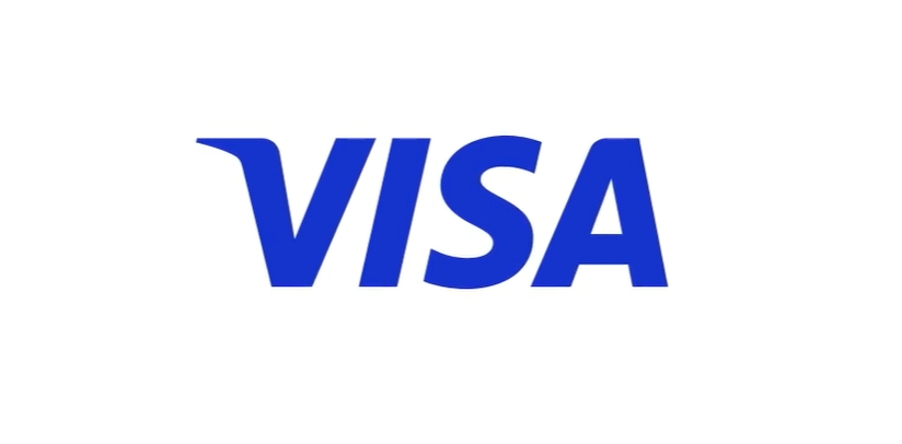
Mastercard’s biggest rival, Visa, has recently rebranded to modernize its logo. The financial institution has Mucho to thank for its new look and for grabbing the Bronze in the Brand Impact Awards. Their old logo had two horizontal stripes, blue on top and yellow on the bottom, and was taken out, keeping only the wordmark for its updated appearance.
The agency explained that it wanted Visa can be seen as a dynamic and evolved brand with the updated wordmark. But they kept the concept of trust and security associated with the brand.
Honorable Mentions
Here are other notable brands or institutions that won logo design awards in the past five years:
- Kaspersky
- Subway
- Rio Carnaval
- Dunkin’
- Eurovision 2020
- Australian Space Agency
- Fisher Price
- Android
- F1
- National Magazine Awards
- Match
Where Can You Get a Professionally Designed Logo?
It’s no secret that award-winning logos take careful planning and time to earn recognition and coveted awards. But awards shouldn’t be an indicator that your logo is one of the best in the industry.
All you need is a professional graphic designer to work on a fantastic logo you’ll love, and your audience will connect with. Fortunately, we have experienced and skilled graphic designers ready to take on your logo project. And it starts with subscribing to Penji!
Choose a plan that fits your budget, and let our Penji designers take care of the design work.
About the author

Katrina Pascual
Katrina is a content writer specializing in graphic design, marketing, social media, and technology. In her spare time, she writes monthly personal blogs to practice her craft.


