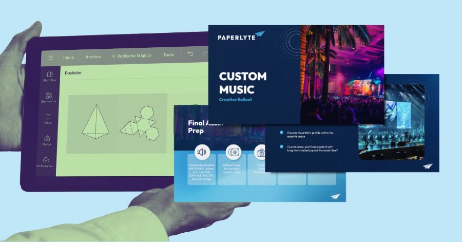
Presentation ideas are everywhere, and with the many DIY design tools around, anyone can create stunning presentations. However, standing out goes beyond crafting a slideshow. If you’re pitching to investors or sharing project updates, a creative approach can make all the difference. Here are 31 presentation ideas you can take inspiration from. We’ll also show you how to find presentation design services that can help you craft high-quality work.
1) Structure your presentation like a story
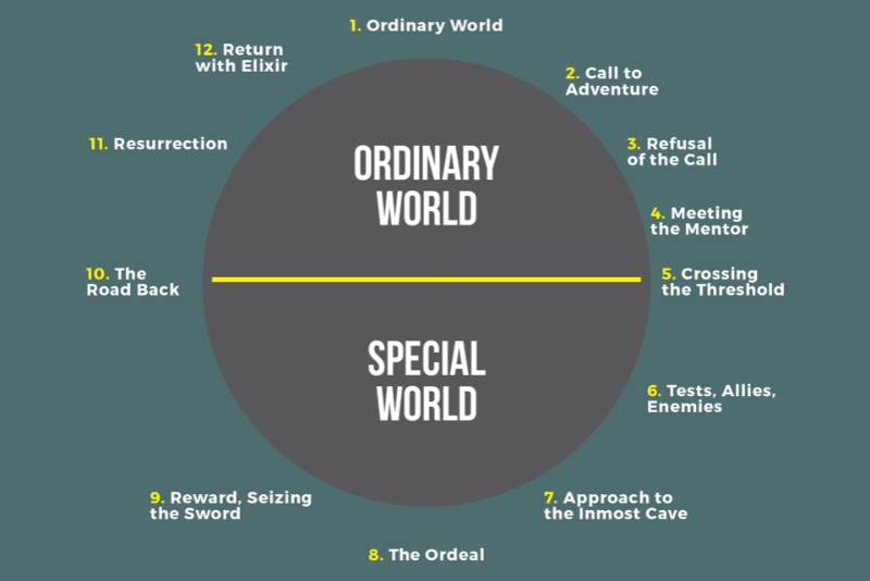
A fantastic presentation carries its audience through a journey. In fact, research reveals that more than half of the audience focus and engage better when the presentation provides a great story.
Consider your key message as the driving force that propels the audience through the storyline of your presentation. You can deconstruct it as follows:
- The current situation: Where are we now?
- The transition: What’s changing?
- The future: What’s on the horizon?
- The conclusion: Where will we ultimately land?
2) Make it minimalist
Especially in a business setting, you want your PowerPoint design to be simple, stylish, and inviting. Minimalism can be a great way to give your presentation slides a professional look without sacrificing style. A simple backdrop also helps important facts and figures stand out.
3) Color theory is your friend
As you’re designing your presentation, remember to use colors that complement each other. In this department, learning how to use the color wheel is your best weapon. Is your company’s color pale green? Combine it with an equally pale pink. To get more in-depth, there are plenty of tools online like Coolors that help you make full color palettes.
4) Black and white with pops of color

On the other end of the spectrum (no pun intended), sometimes one color is all you need. For a more minimal presentation, a black and white aesthetic with a single accent color can really stand out. You can use that color to emphasize key facts and figures, because the audience is already drawn to it.
5) Add music to your presentation
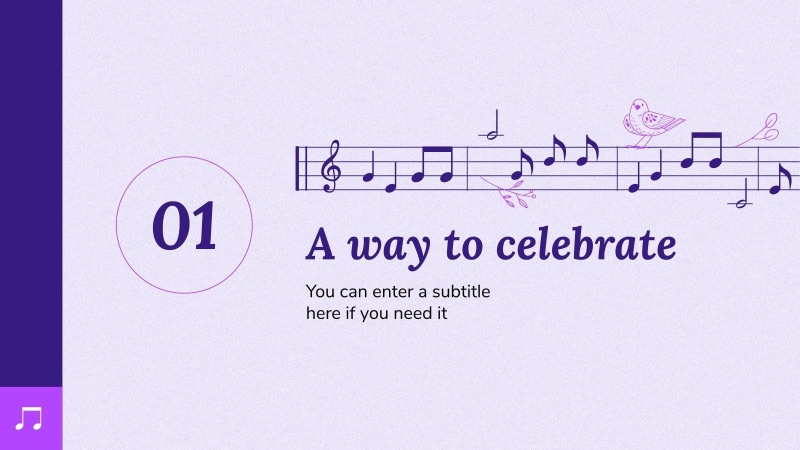
Want to take your presentation up a notch from mere static slides? Harness the power of musical cues – a swift and engaging strategy. While incorporating music into slideshows can sometimes lead to technical hitches, mastering the technique can yield remarkable audience engagement.
6) Ask your audience questions
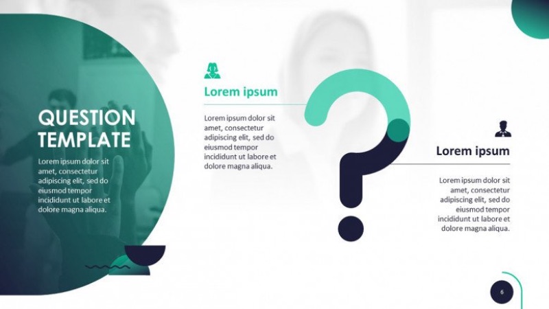
“How do I engage my audience?” Have you tried talking to them? Question and answer sections can be a great tool for team-building presentations, and they can turn potential buyers into engaged participants.
Try creating questions that will feed into your point. Rather than saying “You need ___,” ask your audience what they need and bring it back around to your product or service.
7) Visualize your data with engaging graphics
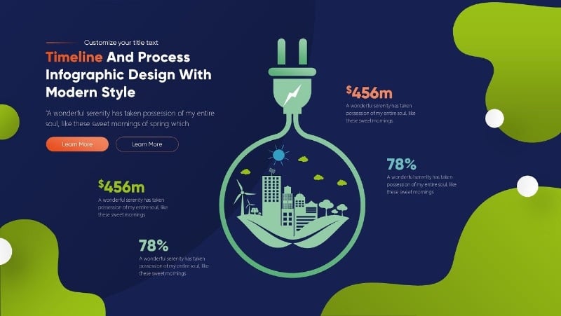
Data visualization is a key part of any presentation (okay, most presentations). Looking for engaging presentation ideas to make your data pop? Don’t settle for basic charts.
Highlight key figures with bold fonts and colors. Use imagery that conveys what your data means. It’s easy to zone out in a meeting—it’s up to you to visualize data in a way people can’t ignore.
8) Pop culture can be your friend
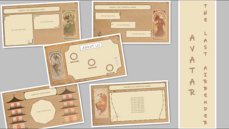
Whether you’re guiding a team meeting or captivating customers, pop culture references can pique interest and bridge gaps. Even in formal presentations, a quick pop culture nod can foster connection. But always consider your audience—avoid references that might leave them puzzled.
9) Pair fonts to keep your presentation dynamic
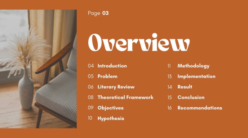
A common error among novices in presentation design is sticking to a single font. To maintain visual interest, embrace diversity. Experiment with eye-catching fonts for titles, complemented by polished sans-serif fonts for body text. Further enhance variety with distinct weights, styles, and colors for various text elements.
10) Make the right impression with visual metaphors
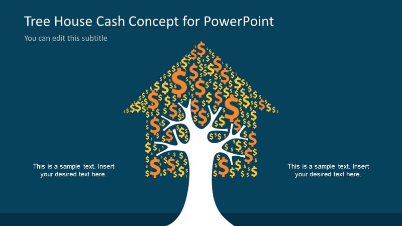
Ideally, everyone would pay attention to you. But since you can’t account for that, you want your audience to understand the ideas behind your presentation, no matter how much attention they’re paying. On top of emphasizing key data and words, visual metaphors are a great way to ensure that even the least attentive listeners are getting the gist of it.
11) Place your images into unique frames

Is your presentation appearing outdated, confined, and lacking in dynamism? The reason might be your fixation on squares and rectangles.
Incorporating distinctive image frames isn’t just visually appealing; they also expand your slide’s spatial dimension. By steering clear of rigid squares and borders and opting for circles, hexagons, and other shapes, you create a sensation of suspended freedom.
12) Juice up your presentation transitions
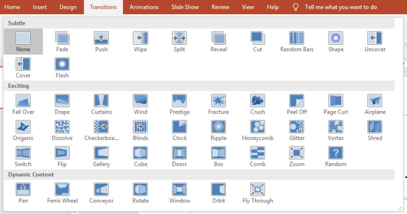
One of the classic marks of a middle schooler’s first PowerPoint: every transition under the sun. Using different transitions for each slide will make your presentation feel amateur. Instead, stick to one style of transition, or make your use of transitions thematically consistent (e.g., moving in the same direction) – it can be one of the simplest yet most effective visual presentation ideas.
13) Turn your presentation into one moving slide
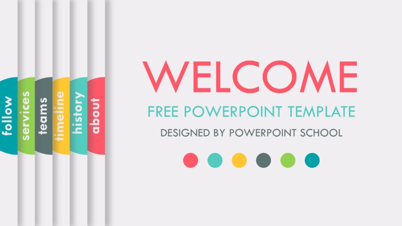
This is an advanced transition technique for all you presentation design pros out there. If you’re looking for unique presentation ideas, boost your slideshow by giving it the sense of a literal living document. You can create a flipbook or folder motif (as in the example above) or create a scrolling graphic format. If nothing else, you can mesh transitions and design to make each slide seamlessly morph into the next.
14) Make room for quotes

Whether you’re getting a point across or just trying to inspire your audience, a quote is a great addition to any presentation. Quotes by experts can help lend your point some authority. Meaningful quotes can open up the floor to discussions. Funny or inspirational quotes can provide some levity without sacrificing professionalism.
15) Get your presentation ideas from history

Much like references to pop culture, integrating historical elements into your presentation provides a shared language with your audience. Like the alien species from the Star Trek episode “Darmok,” incorporating historical moments can resonate deeply with your audience. For instance, if you’re aiming to evoke a sense of romance, a backdrop inspired by Shakespearean times could be remarkably effective.
16) Engage your audience with activities

First of all, yes, a presentation is a great idea for facilitating a group game in a classroom or office setting. But believe it or not, any presentation can benefit from capturing the audience’s attention through activities.
For team-building presentations, build trust and relationships through simple games. For pitches, create space to “test out” your product or service. The possibilities are endless.
17) Give your presentation a seasonal theme

Pop culture references can ensure your presentation is current, but depending on your audience, you may have to avoid being too current. Seasonal themes, on the other hand, keep you timely no matter who you’re presenting to. You can go all in on a theme, like the Halloween example above, or incorporate subtle elements for a more corporate presentation.
18) Be forward-thinking with a futuristic design

In the business world, particularly in the tech sector, projecting a cutting-edge image is paramount. When presenting a novel product, service, or strategy, it’s crucial that your audience perceives you as a forward-thinking entity.
That’s where a futuristic design can help. Implement sleek shapes, dark colors, and interactive elements to make your presentation futuristic. Sometimes, it’s as simple as adding images of modern tech products.
19) Keep it fresh with a modern presentation
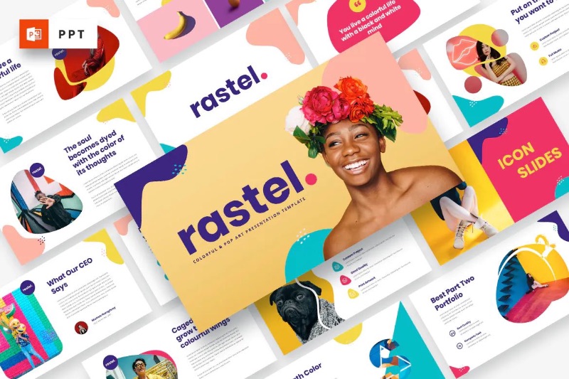
Futurism has its place, but if you want to convey a cutting-edge feel in a more subtle way, a modern, artistic presentation design is the way to go. Unique shapes and color combinations—as well as bold, sans serif fonts—can help your slides look effortful and fresh. You can work with an expert designer or a presentation design service to really make your presentation unique.
20) Enter a new dimension with 3D graphics
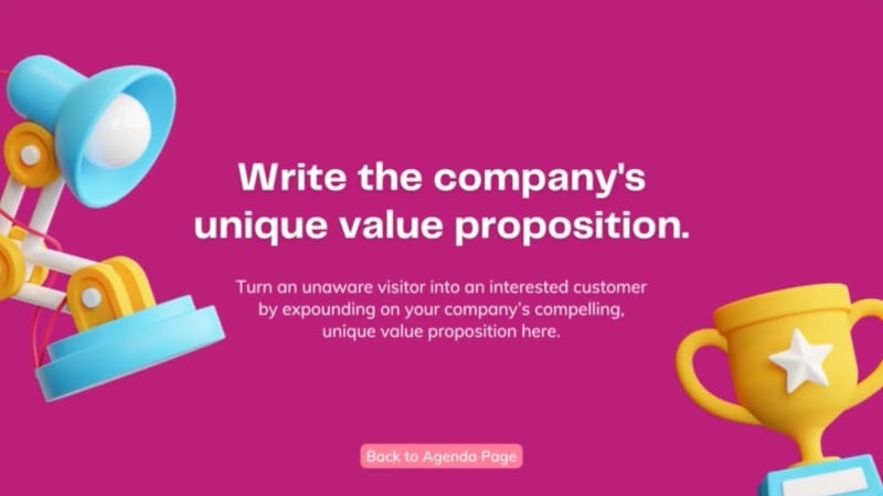
3D illustrations are relatively novel, and even freely available models are underused in presentations. Even in 2022, they still convey a sense of novelty, whether they’re playful, artistic, or scientific. On top of lending flair to your slides, they can also be great for visualizing data in informative presentations.
21) Come up with a motif inspired by your content

Elevate your presentation to a masterpiece with a well-chosen motif. Delve into your key presentation points and the emotions you aim to stir.
For instance, a lighthouse motif can symbolize navigating challenges or pioneering innovative solutions. Meanwhile, a whimsical animal theme can evoke a sense of coziness and tranquility. Embrace creativity, while ensuring meaningful content takes the lead.
22) Include your logo in every slide
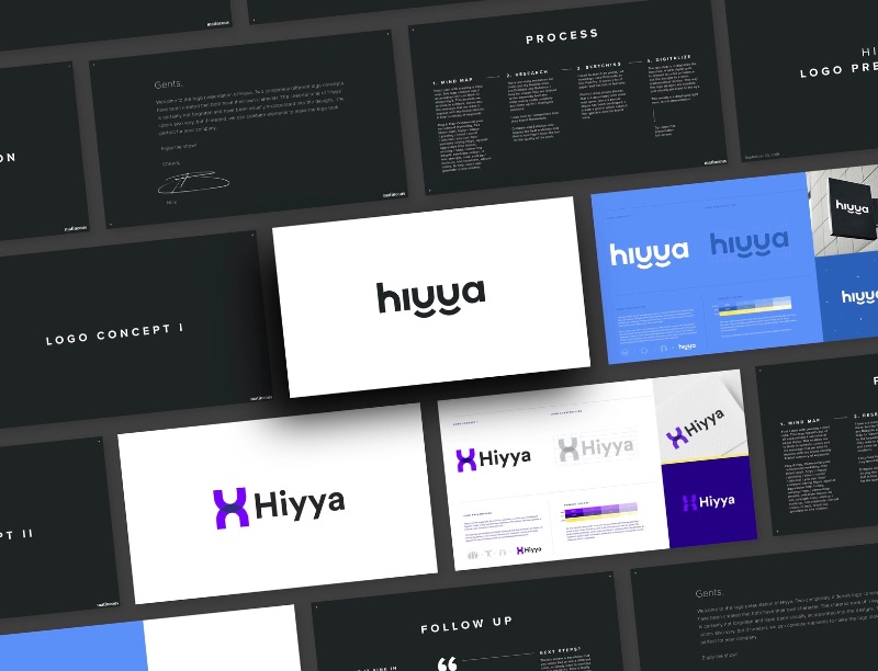
A presentation can be a great way to propose a new logo design, but your logo is a great fit for any type of presentation. For pitches, they make your brand look professional. For internal meetings, they help make it feel official, boosting engagement from your audience. Design your slides to make room for your logo and try to balance colors and fonts to fit your brand.
23) Color code your themes
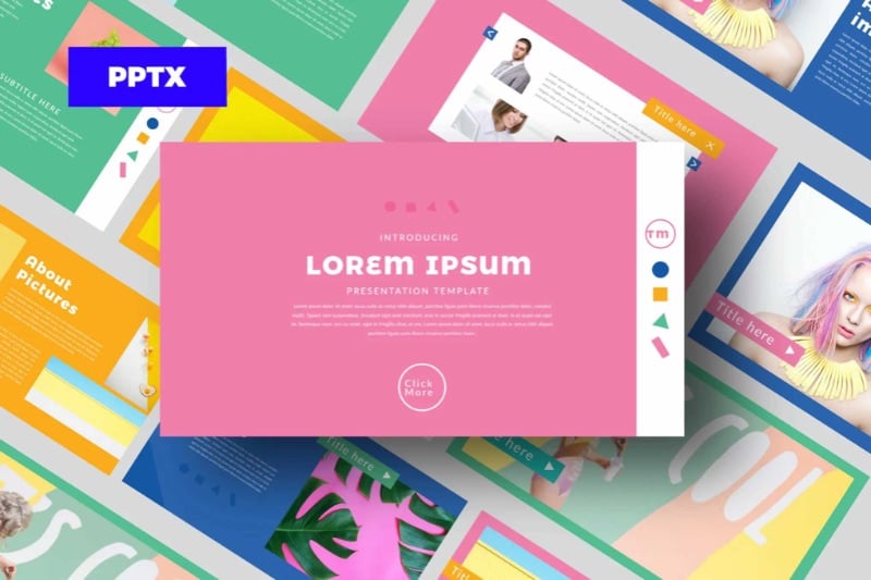
While we’ve emphasized the importance of a central theme in your presentation, it’s also true that many presentations encompass various topics or subcategories within the overarching theme. Employing diverse colors to mirror distinct subjects or slide types can infuse your presentation with nuanced depth.
24) Make it fun with GIFs
GIFs have become a crucial part of the online ecosystem. However you pronounce it (team “jif,” for the record), a GIF is a casual, effective way to evoke emotion, humor, or otherwise build a relationship with your audience. There’s a reason Twitter is overrun with these things; there’s a GIF for every occasion.
25) Shoot for the moon with an outer space theme
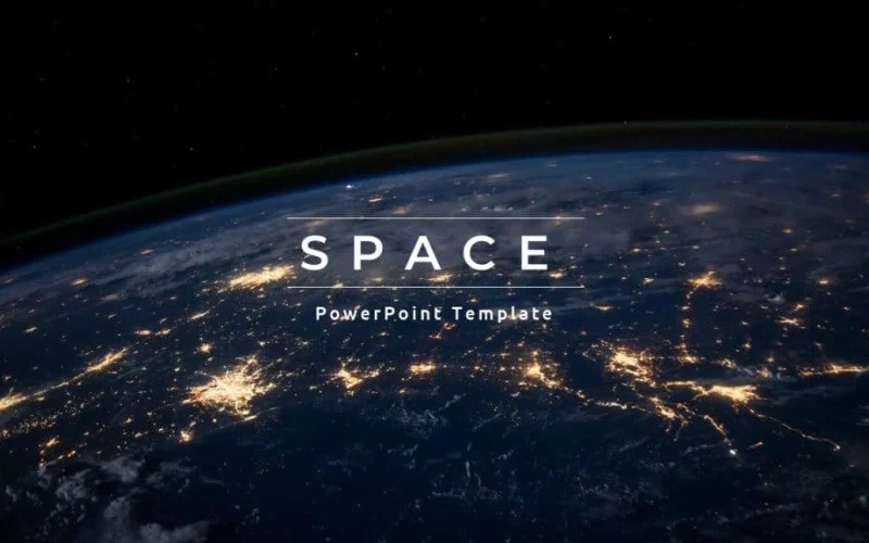
Space is one of the most versatile themes to use in a presentation design. Where a futuristic slideshow places you on the cutting edge, space creates the impression that your ambitions go even bigger. Whether you’re trying to pump up your coworkers or attract new clients, placing your presentation in the final frontier is bound to inspire them.
26) Keep it lighthearted with humor and memes

While certain presentations are all business, remember that public speaking often centers around forging a connection with your audience. A surefire approach to achieve this is by strategically incorporating a meme or a clever punchline.
Yes, it’s true that meme culture travels fast, and it can be hard to tell what will still be fresh when you’re presenting. But if there’s one place where you can get away with an old-school, impact-font-over-JPEG meme in 2022, it’s in a business presentation.
27) Format each slide like a social media post
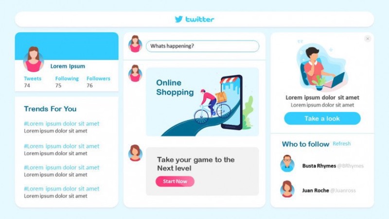
Here’s an out-of-the-box idea: what design layout are people most familiar with today? Chances are, a format inspired by social media is one of the best ways to make your audience feel at home. This is best for a presentation where social media is relevant, but it can also serve a similar function to memes, creating a fun dynamic with your audience. Your slide text shouldn’t be longer than a tweet, anyway.
28) Bring your presentation to life with motion graphics
We’ve already gone over transitions, the animations taking you from one slide to the next. But that doesn’t have to be the only animated thing about your presentation. Motion graphics can help each slide come alive, as well as emphasizing key facts and helping visualize data. Just try not to make the graphics too distracting.
29) Get everyone involved with interactive elements
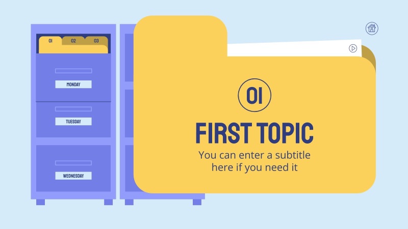
Ever sat through dull vacation photos? Well, a lackluster presentation can feel the same. To truly involve your audience, interactive elements are a must.
Think animations and clickable transitions or even a lighthearted quiz. It’s all about sparking engagement.
30) Make it cohesive with photo overlays
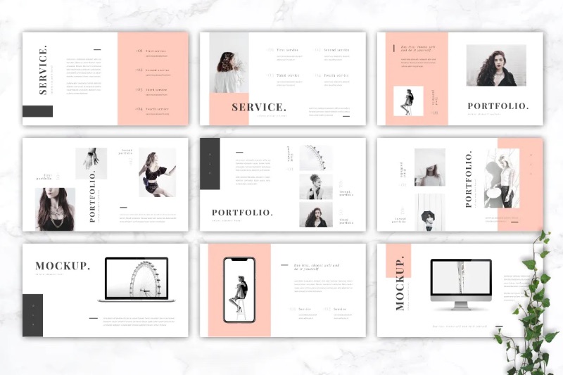
Maybe you’re showcasing your photography work. Maybe you’re presenting a product with a series of photos. You might just be using stock photos to illustrate your point.
Either way, most presentations will involve at least a few photos. If you want a slick, artistic look, you can use color overlays and filters to make these photos part of your slides’ aesthetic. Use complementary colors and keep them consistent for each photo you put in, or go black and white for a luxury look.
31) Alternate your slide formats
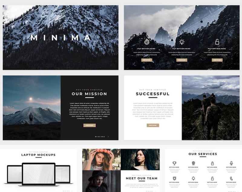
Here’s a common rookie blunder, and it’s easy to overlook. Even with a striking design and captivating content, if you sense something’s amiss, your presentation could be too monotonous.
To infuse dynamism, mix up slide formats, particularly for text-heavy ones. Just shifting text from left to right can work wonders. It’s a vital trick to keep your audience engrossed.
BONUS: Give your presentation a pro polish with Penji
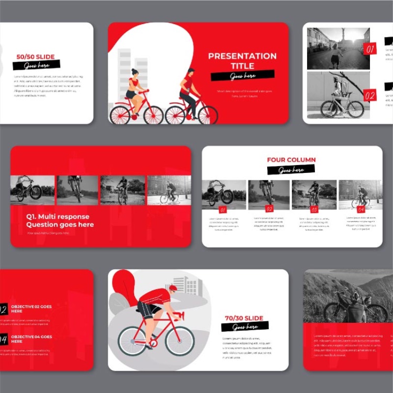
These presentation design tips are all about shaping a presentation that delivers real results. But if you’re aiming to craft a truly impactful PowerPoint, you might not want to go the DIY route. Opting for a presentation crafted by a certified pro is the ultimate method to impress your audience. And if you want consistently professional designs every time, then you want Penji.
Our unlimited graphic design service works with the world’s top design talent to provide you with stunning presentations, logos, websites, packaging, and everything else you need.
Still have questions? You can request a design today by clicking on this link, or sign up for a demo to see how Penji can work for you.
About the author
Table of Contents
- 1) Structure your presentation like a story
- 2) Make it minimalist
- 3) Color theory is your friend
- 4) Black and white with pops of color
- 5) Add music to your presentation
- 6) Ask your audience questions
- 7) Visualize your data with engaging graphics
- 8) Pop culture can be your friend
- 9) Pair fonts to keep your presentation dynamic
- 10) Make the right impression with visual metaphors
- 11) Place your images into unique frames
- 12) Juice up your presentation transitions
- 13) Turn your presentation into one moving slide
- 14) Make room for quotes
- 15) Get your presentation ideas from history
- 16) Engage your audience with activities
- 17) Give your presentation a seasonal theme
- 18) Be forward-thinking with a futuristic design
- 19) Keep it fresh with a modern presentation
- 20) Enter a new dimension with 3D graphics
- 21) Come up with a motif inspired by your content
- 22) Include your logo in every slide
- 23) Color code your themes
- 24) Make it fun with GIFs
- 25) Shoot for the moon with an outer space theme
- 26) Keep it lighthearted with humor and memes
- 27) Format each slide like a social media post
- 28) Bring your presentation to life with motion graphics
- 29) Get everyone involved with interactive elements
- 30) Make it cohesive with photo overlays
- 31) Alternate your slide formats
- BONUS: Give your presentation a pro polish with Penji

