

Do you know those presentations where slides are so boring that attendees pinch themselves just to stay awake? These free PowerPoint slide design ideas will help you avoid such situations – especially when you’re the one presenting.
If you don’t want to get stuck with a lousy Powerpoint slide design that would make your audience lose interest, read this article as we discuss:
- Awesome Powerpoint slide design ideas
- The science behind a good slide template
- BONUS: how to get customized slide templates
When it comes to presentations that make or break a career or business, it’s best to leave the slide design to a professional. Keep scrolling to learn how to get custom Powerpoint templates from Penji for that important meeting.
Awesome Powerpoint Slide Design Ideas
Let’s take a look at a few Powerpoint slide design templates that display key visual perception concepts.
1. Geometric Design
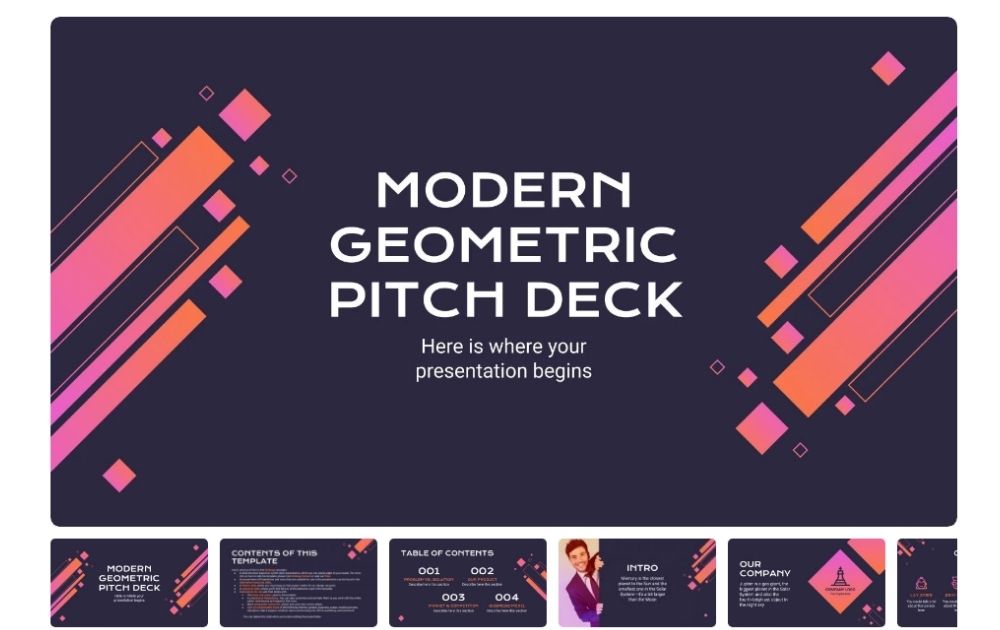
This template called Modern Geometric Pitch Deck from Slides Go features a mix of blocks and outlines. Despite having various sizes of squares and rectangular shapes, the elements are placed close together, creating proximity. As a result, the designs look interesting without overwhelming the eyes. The bright colors are also a nice contrast from the black background.
2. Black and White
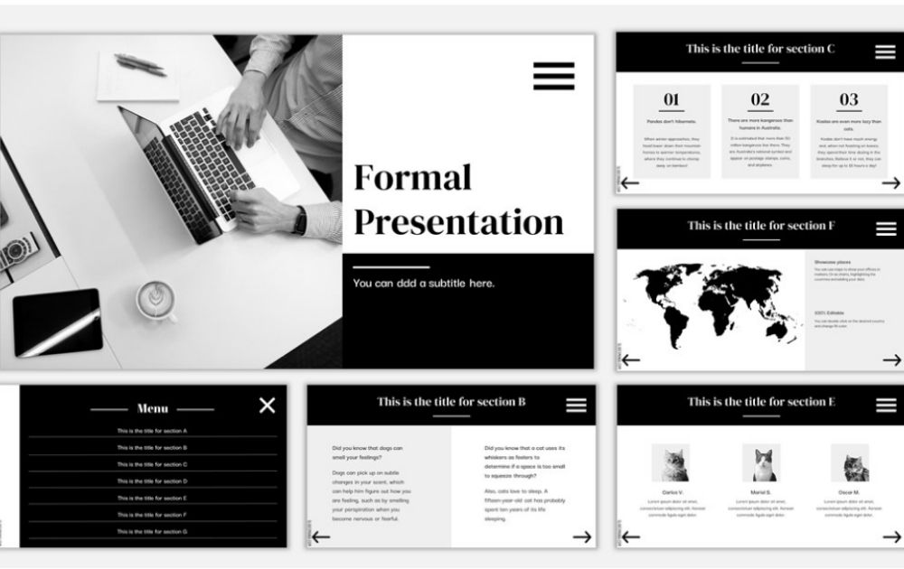
Though you can use bright colors to express meanings to your audience, using black and white slides can be just as powerful. Just take a look at this design called Formal Presentation Template from Slides Mania. As black is associated with power and white with innocence, the palette strikes a good balance. Also, the black block on top of each slide is a great touch for quickly identifying the heading.
3. Minimalist Retro
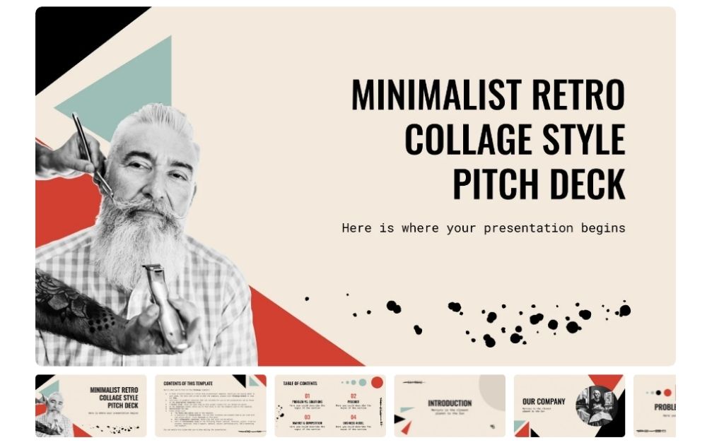
If you’re looking for Powerpoint templates free download that has a touch of retro without looking too dated, check out this design from Slides Go. Titled Minimalist Retro Collage Style Pitch Deck, the slides display a good grasp of the law of similarity. Aside from having the same background color, each slide uses the accent hues, albeit in different ways.
4. A Touch of Color
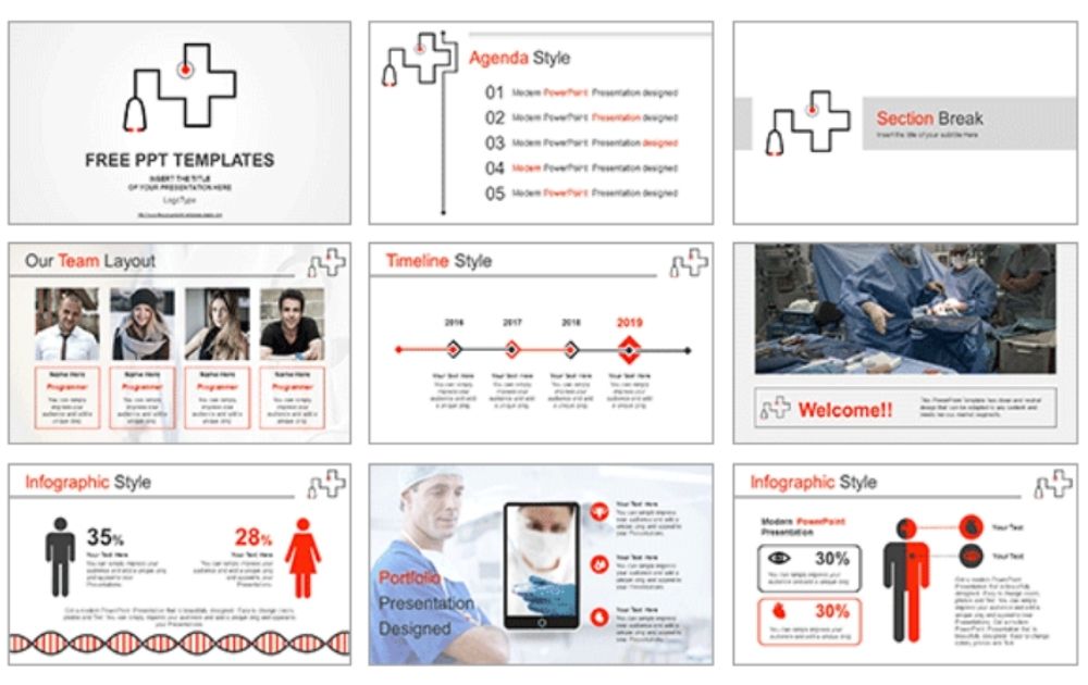
Some people aim for a minimalist palette but find black and white to be too plain. If this is the case for you, check out this Stethoscope Hospital Symbol design from All PPT. The slides are mainly in white, gray and black. But the touch of fire red wakes up the palette instantly and adds energy to the visual. The creative use of lines, curves, and various shapes and images is also a good way to present the data on every slide.
5. Cute Accents
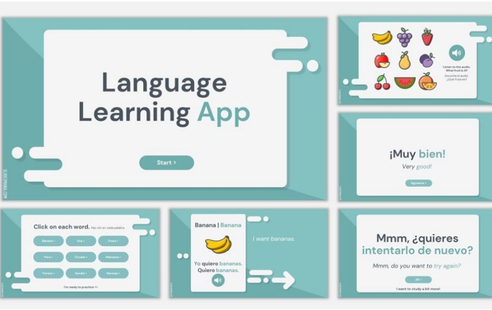
Here’s an example of an eye-catching Powerpoint slide design for education. Named Learning App for Vocabulary by Slides Mania, the design features a cohesive look, thanks to its uniform round-edged shapes and accents. Overall, this template offers a clean and uncluttered look.
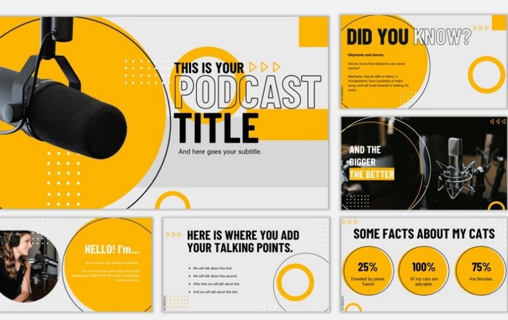
6. Uniform Color
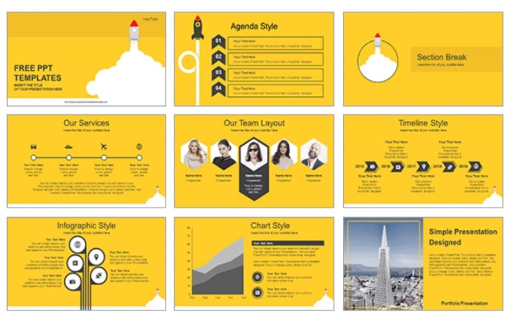
This All PPT design called Rocket Launched uses the same shade of canary on all its slides. The consistency of chevrons and clean lines also adheres to the law of similarity. On top of using similar colors, this template stands out due to the creative methods of presenting information. Choose between Agenda Style, Timeline Style, Infographic Style, Chart Style, and more.
7. Frame within a Frame
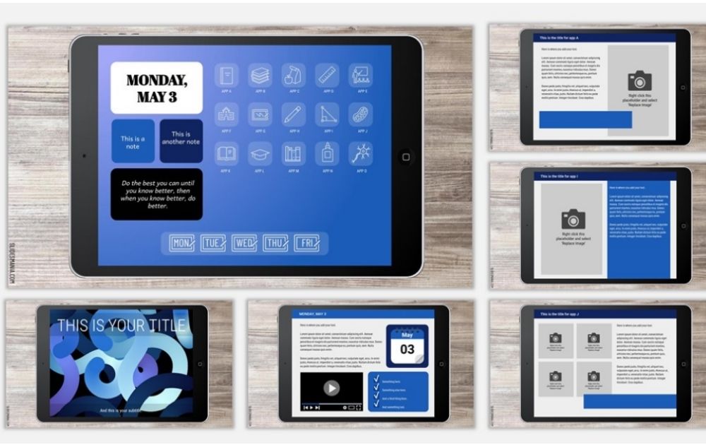
There’s a style in photography called frame within a frame, where a visual element is used to frame the primary subject to add depth. That’s the principle used in this Slides Manila called My iPad Presentation. Aside from the creative style, the layout also displays good symmetry, making it a simple but interesting template.
8. Creative Use of Colors
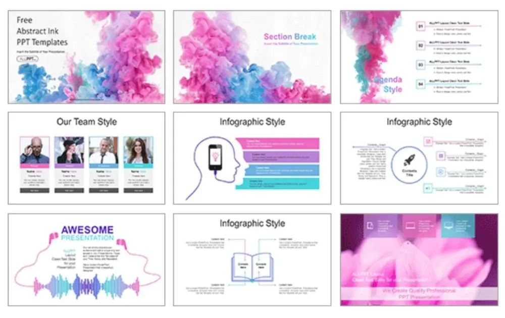
You don’t have to use the same image for all your slides to achieve cohesion. Just take a look at this All PPT designed called Abstract Ink Drop. In some slides, the palette of pink, purple, and blue shows on the abstract ink image. Other slides use the same palette for frames, shapes, and even text. Creatively using a splash of colors makes your slide designs fresh and modern.
9. Neutral Palette
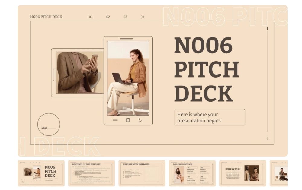
If you want to take a break from power colors, neutral palettes can also make a mark when it comes to professional Powerpoint templates. Free download template named N006 Pitch Deck from Slides Go, for instance uses a pale apricot background. Paired with thin lines, the neutral shade makes for a modern, ultra-sleek look.
10. Consistent Shape
Color doesn’t have to be the only thing that ties your slides together. For instance, this example from Slides Mania called Reegan is one of those modern Powerpoint templates free download files that use the shape as a cohesive element. As seen from the image, the slides use various kinds of circles – hollow, filled, and outlined. Nevertheless, the slides look like they’re part of one unit. In addition to that, the yellow and black color combination is eye-catching.
The Science Behind a Good Slide Template
For us to grasp the science behind good PowerPoint slides, let’s take a look at an example of an embarrassing slide design example:
Image Licensed by Penji
But what exactly makes a slide presentation interesting to you? The truth is, there’s more to presentation slide design than mere art. In fact, design artistry must be backed up by science. After all, knowing how viewers perceive design allows us to fine-tune our presentation and get the results that we want.
When it comes to effective design, learning about Gestalt psychology in visual perception is a good starting point. I know it sounds all academic and “textbooky,” but let’s go over a few simplified principles and how you can apply them to slide design.
- Proximity
This principle is pretty simple – the closer objects are to one another, the more likely they’ll be perceived as part of a group.
For instance, when you see circles scattered around the page, you’ll perceive them as individual shapes. On the other hand, if you see them arranged close together, forming a square, you’ll automatically perceive them as one unit.

Image Licensed by Penji
How it applies to slide design: You need to be conscious of how you arrange elements in your slides. For instance, if you’re presenting to a group composed of several companies, placing their logos too far apart in the slide could emphasize borders and division.

Image Licensed by Penji
Arranging them close together, on the other hand, subtly signals a more unified look.

- Similarity
This Gestalt concept suggests that visuals that look similar to one another will be perceived as part of a group. In short, a design must be cohesive if you want it to be perceived as organized parts of a whole.
Image Licensed by Penji
How it applies to slide design: Though each slide may contain different elements (texts, images, or videos), requiring different layouts, there must be an element that ties everything together. For instance, your color palette, fonts, and aesthetics must be the same throughout.

- Symmetry
The law of symmetry tells us that the visual elements must be balanced in order for the viewer to see them as whole or complete. For instance, how does an imbalanced slide design like the one below make you feel as a viewer?
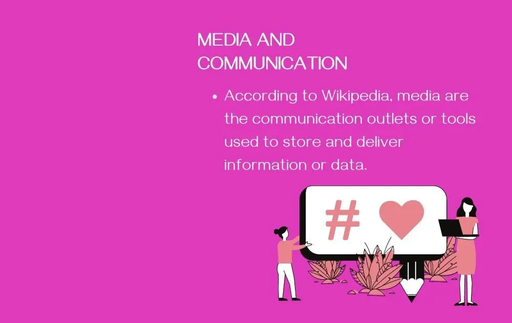
Image Licensed by Penji
Aside from making you feel obsessive-compulsive, such an imbalanced design might also make you feel like there’s something missing.
How it applies to slide design: If you don’t want your audience to feel like there’s something lacking from your presentation, pay attention to balance.
However, that doesn’t mean you have to arrange everything in perfect symmetry. In fact, there are instances when it’s just not possible. That said, the crucial step is to make sure that you’re arranging things consciously and not just randomly throwing everything on the slide.
- Color Psychology
Aside from the Gestalt psychology principles mentioned above, it’s also vital to apply Color Psychology to your slides. In a nutshell, this field of study says hues can convey info and influence moods and decisions.
For instance, which of the images below would you use if you’re giving a talk about relaxation?

Image Licensed by Penji

Image Licensed by Penji
Yup, the blue one is the better choice because it evokes peace and calm. Here’s a cheat sheet about hues and the moods or emotions they produce:
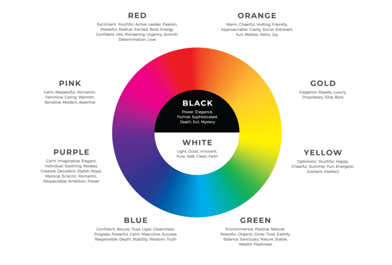
How it applies to slide design: Color psychology influences your branding and imparts an emotional appeal. Think of your slide color palette as an extra layer to your storytelling. Select hues that express what you want to say without you needing to verbalize that message.
Key Takeaways
Here are a few takeaways to remember before you go on a hunt for the best PPT templates free download online:
- Be mindful of proximity or which visual elements you place beside one another on the slides. The layout can communicate hints of unity and division to your audience even if you don’t intend to.
- Make sure that your slides look cohesive. Lack of a similar element can make the presentation look disheveled and all over the place.
- Pay attention to the template’s symmetry. An imbalanced visual can make your audience think that there’s something amiss even if your presentation is spot on.
- Choose a color palette that’s appropriate for the mood or feel you’re trying to evoke from your audience.
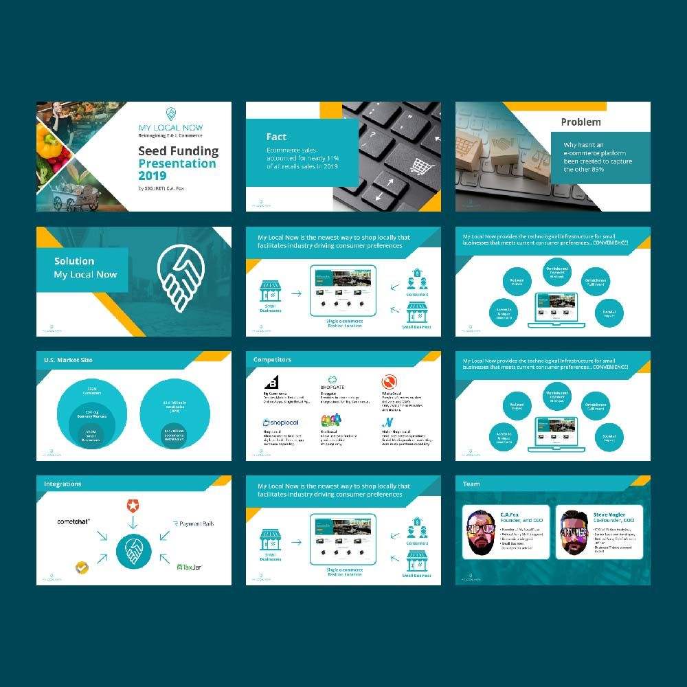
When generic free Powerpoint slide design templates won’t cut it, we at Penji are here to the rescue. Since we offer unlimited graphic design at a flat monthly rate, you can have all the designs you need without spending an arm and a leg. From startup pitch deck designs to Powerpoint slides and everything else beyond and in between.
Here are some of the slide designs we’ve done in the past:
Want to get customized Powerpoint slide design templates? Sign up now to enjoy 15% off the first month of any plan. The best part? You can try any of our packages risk-free for 15 days so there’s nothing to lose.
About the author

Carla Deña
Carla is a journalist and content writer who produces stories for both digital and legacy media. She is passionate about creativity, innovation, and helping small businesses explore solutions that drive growth and social impact.


