


Not all fonts are created equal. And the same goes for font pairings. But whereas font effectiveness involves concerns like legibility and aesthetics, font combinations necessitate concerns like hierarchy and contrast.
When working on a project, you’ll almost certainly be tasked with pairing fonts. So, it’s reasonable to ask: what should I look for in a pair? How much room is there for experimentation? How can I test the effectiveness of a pair?
One of the most common combinations you’ll find is the classic pairing of the headline with body copy. This combination can be found in magazines, newspaper articles, advertisements, etc. But, there’s no shortage of instances where two or more fonts may come together. Today, we will discuss a few tips to ensure your font pairings are always on point, creating an even, visually appealing means of consuming information.
Get two (or more) for one.

A good method for stretching the versatility of typefaces is utilizing superfamilies. A superfamily is a set of fonts that are crafted to work together in harmony. These fonts are related by their sharing of certain characteristics.
Within superfamilies, different character styles can coexist, providing both consistency and variety. They have the ability to shift their personalities while retaining the defining characteristics of the typeface. For instance, Macklin — designed by Malou Verlomme and offered by Monotype Studio — includes sans, slab, text, and display. This proves that a well-constructed superfamily can single-handedly flesh out a magazine or newspaper layout.
An example of the stylistic variety included in some typefaces is well represented in a typeface like Aeonik, released through CoType in 2018. Aeonik offers 7 different weights (air, thin, medium, regular, bold, and black) and all of them can be italicized. That means that, with one typeface, you have 14 different personalities at your disposal.
[in_content_ads gallery=”logos” logo=”on” title=”Need graphic design help?” subtitle=”Try Penji’s Unlimited Graphic Design and get all your branding, digital, print, and UXUI designs done in one place.” btntext=”Learn More” btnlink=”https://penji.co”]
Create a visual hierarchy.

When a potential customer lays eyes on a graphic design, whether it be the front page of a magazine, newspaper, subway advert, billboard, etc. a subtle, yet important series of processes take place. And while it might seem effortless, there is a lot going into the brain’s processing of information. Eventually, you’ll have to integrate visual hierarchy.
To the learned typographer, body text will always be the subject of interest. But for normal people, and those not applying design theory to the work, the typeface for the body should not elicit strong emotions one way or another. One shouldn’t think, “Oh, wow, what a cool font,” when seeing the body copy. Instead, the content should be the core of the message.
Beyond the actual text itself, font sizes that complement one another can help. Creating a visual hierarchy by utilizing point size and weight can help two typefaces coexist healthily on a page or screen.
Contrast, not clash.

Pairing fonts is all about finding traits that complement one another.
An easy starting point when experimenting with combining fonts is by mixing one serif font with one sans serif font. While experimentation is key, there are some tried and true practices. For example, utilizing a sans serif for a headline with a serif as the body copy.
There is an ongoing debate among designers about whether serif or sans serif is more legible. In print, specifically with body copy, serif fonts can increase legibility. The serifs are the little feet on the ends of certain characters. It’s believed that these increase readability by leading the reader’s eye from one character to another.
Conversely, sans serifs are considered better suited for the digital landscape, being more easily consumed on a screen than their serif counterparts.
Use fonts with similar x-heights

Another helpful rule of thumb for finding fonts that work well together is using fonts that have similar X-heights. The x-height refers to the height of the lower-case x for a typeface. Font with this similarly has a tendency to blend well. Be sure to give this the eye test though, as it’s not a foolproof theory. Additionally, certain font pairings that don’t have matching x-heights can still work together in the right circumstance.
Avoid double script
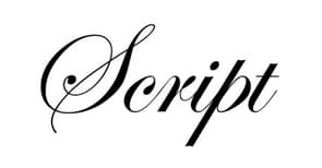
Ah, weddings.
We’re all familiar with this delicate, flowery style. It conjures sensations of calligraphic flourishes and obligatory RSVPs. And while this style can be of tremendous value in the appropriate setting, it looks out of place on most occasions. The nature of script typefaces includes lettering that connects, providing an elegant look for display text but an illegible nightmare for body copy.
A script font can be defined as a font that mimics cursive handwriting. There are two subcategories of script fonts: formal and casual.
A good rule of thumb is to never combine two script fonts.
Font Pairing Generators
Sometimes we need a little guidance when first learning a skill. Good news! The internet is chock full of websites to help you along the way. The following resources are good tools to assist you in finding quality typeface matches for your next graphic design job. Even better, all of these sites are free and easy to use!
For more typeface inspiration, check out Penji’s learning center today.


