

Earlier in the month, I wrote a pointed critique of Comic Sans and Papyrus. While it was admittedly an enjoyable bit of writing, I do feel as though it was merely one admission to a near-endless stream of typographic muckrakers making barbed accusations of the long-despised punching bags. Those fonts are bad. But they’re not alone.
So, in the interest of some good old-fashioned educational fun, let’s outline a more expansive list of some of the worst fonts of all time and why to avoid them.
Courier New
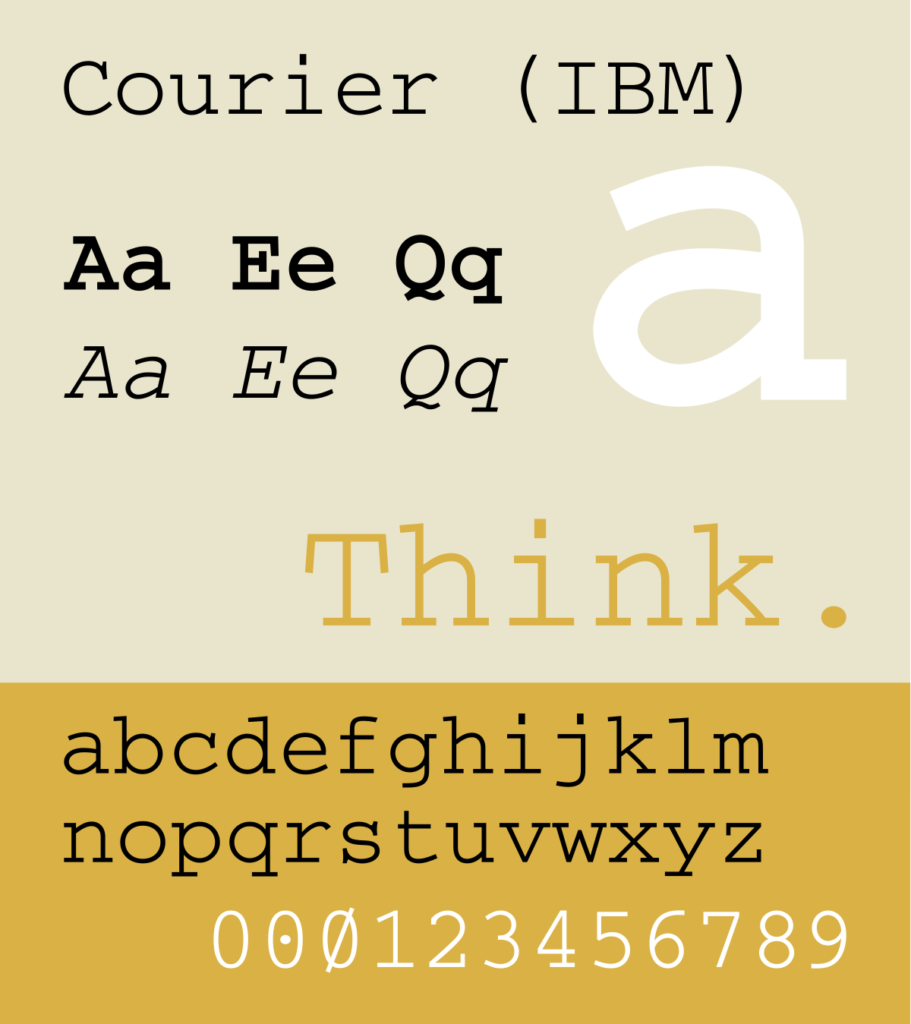
My friends with graphic design degrees will berate me for not expressing that this font— and its other monospaced counterparts— are helpful for coding purposes. But those nerds aren’t here, and let me just say: I can’t imagine a respected brand relying on Courier New to convey an enticing identity.
But I didn’t always feel this way. When I was younger, I loved this font because it imitated a typewriter (which I’ve never used) and looked excellent on screenplays (which I’ve never written). This isn’t a coincidence. In fact, Courier was designed by Adrian Frutiger for IBM and their typewriters.
Courier New was then developed for the digital world, offering a typewriter-inspired feel for computer word processors.
But today, it looks bland and unexpressive. It would be a worthwhile venture to avoid this bad font.
[in_content_ads gallery=”logos” logo=”on” title=”Need graphic design help?” subtitle=”Try Penji’s Unlimited Graphic Design and get all your branding, digital, print, and UXUI designs done in one place.” btntext=”Learn More” btnlink=”https://penji.co”]
Curlz
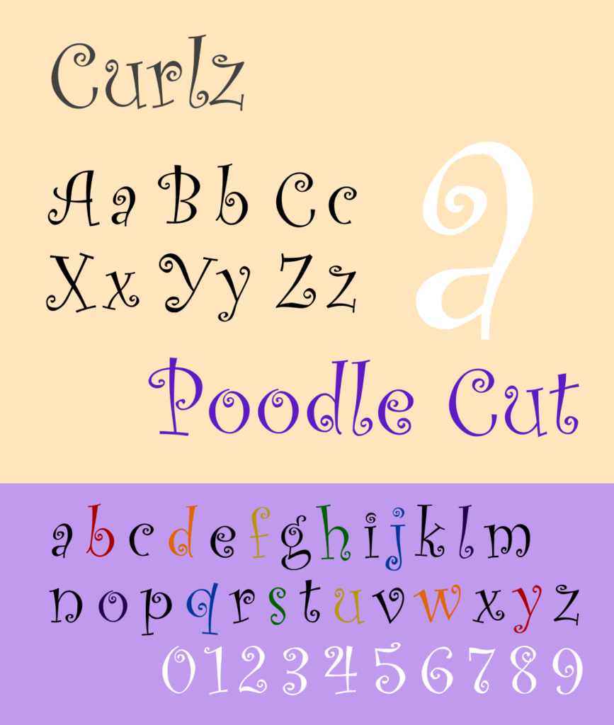
At first sight, Curlz might seem like a funny joke that you’re not in on. Try as you might, you just can’t seem to find the humor. It reeks of a toddler’s clothing store or the dilapidated consignment shop by your parent’s place.
It’s whimsical, flamboyant, and cheeky. Love that. But on the off chance that you want to be taken seriously, you should resist the temptation to drape your text in this bad font.
Developed by Carl Crossgrove and Steve Mattison for Agfa Monotype, Curlz’s sole claim to fame is its status as runner-up for the Most Likely To Be Found in A Dr. Suess Book category of an award show that I made up. Next.
Impact
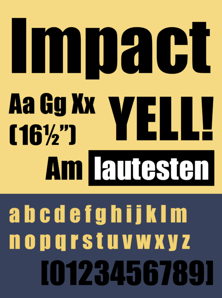
If there is a trend emerging with these entries, it’s probably something like this: Default fonts on word processing software during the mid-2000s. And to an 8-or-so-year-old, Impact was in high regard. It was the font you reached for when you weren’t messing around.
When you needed something attention-grabbing. Something earnest. And that’s just it. The aura given off by Impact is exactly that. An eight-year-old who’s not messing around.
This is likely not the company you’re looking to keep in developing a brand identity. There are tons of typefaces out there that do what you think Impact is doing— only better. Do yourself a favor and avoid the amateur status inescapably linked to this bad font.
Bradley Hand
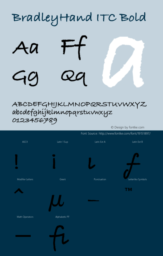
This typeface is a casual font intended to mimic the handwriting of its creator, Richard Bradley. You might think that’s an arrogant move until you see the actual characters. It’s bad. The final design looks like some middle schooler’s detention activity and feels just as fun.
Despite this marker-on-white-board look, Bradley Hand has actually proved popular enough to stick around and is typically found on any Microsoft product, as they released the font in 1996.
Now write these lines 1000 times:
I will not use Bradley Hand.
I will not use Bradley Hand.
….
Arial
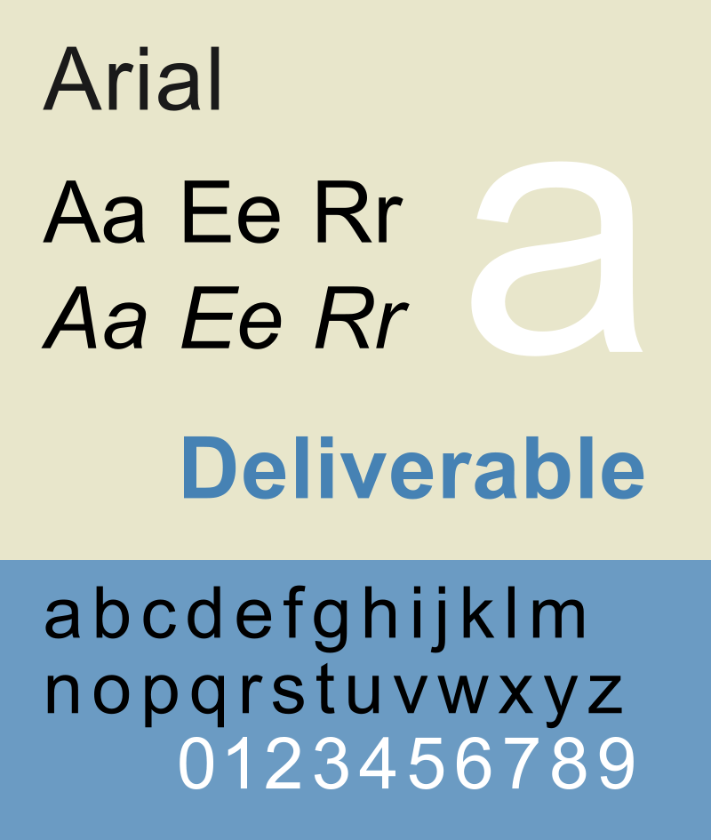
Just use Helvetica.
Seriously though, Arial was actually designed as a direct competitor to Helvetica in 1982. Published by Monotype Typography and concocted up by Robin Nicholas and Patricia Saunder, Arial has been considered a default font on most Apple computers since the mid-80s.
There are some slight differences between Arial and Helvetica.
Arial is more rounded, with softer curves and more open counters. But it fails to differentiate itself enough to avoid coming off as a less interesting younger sibling.
Helvetica, on the other hand, is still the creme de la creme of sans serif typefaces. It’s well balanced, modern, and its fingerprints are all over some of the most successful brands of all time.
Can Arial say the same?
Bleeding Cowboys
This is the most recently designed inclusion on the list, having first hit the market in 2007. And unlike Courier New, Impact, or Ariel– all of which were once semi-welcomed fonts with some degree of utility, and whose primary crimes are that of overuse and outdatedness– Bleeding Cowboys was dead on arrival.
Overly busy, aggressive, and tacky. A trifecta of flaws suited for only the highest echelon of typographic barbarity. And is there an instance riper for an aggressively tacky typeface than the front cover of dozens of mid-to-late 2000s pop-country records?
Despite having a very specific style, Bleeding Cowboys was everywhere for a while. But’s is best to stay a spectator to this excessively ornamental beast, and not contribute to its pervasiveness.
10-4, Partner?
Trajan
This typeface has been seen on countless movie posters. Perhaps to an exhausting extent.
Trajan was designed by Carol Twombly in 1989 and based on Roman square capitals. James Mosley, a well-known historian who specialized in the history of printing and letter design, claimed that “Trajan is the new Helvetica.” On what grounds I can’t say.
But time has proved him wrong anyway.
Trajan had its moment, and like many bad fonts that arrive on the scene with immediate wide use, they risk burnout. It’s like semantic satiation of the eye. And that’s the story of Trajan. While it’s less showy than Bleeding Cowboys, its overuse makes it easy to avoid.
Get Better Fonts with Penji
It’s easy to recognize bad design when you see it, but designing epic brand assets isn’t always common sense. With unlimited graphic design, you get all the designs you need, from landing pages to ads, logos, social posts, and more. Never worry about bad fonts (or weak designs from subpar designers) watering down your brand ever again.


