

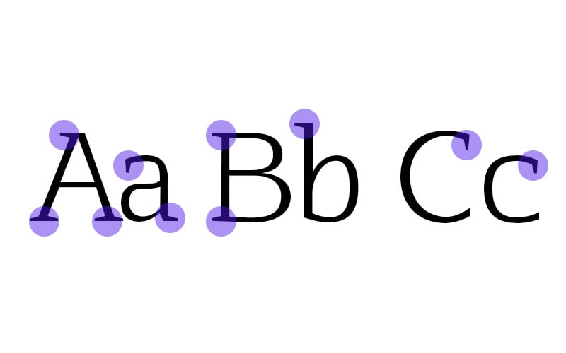
Understanding the differences between these two typographic categories will help you decide which is right for you.
Serif typefaces are the older of the two. They feel more traditional or formal than their counterpart. Sans serif typefaces possess a more relaxed, modern feel.
Typefaces have a storied history dating back centuries, and serifs are not the oldest; there are some older typefaces, like Blackletter. Inspired by saturated calligraphic letters of the Middle Ages, Blackletter typefaces have found modern relevance in such instances as The New York Times logo. But generally, its overly-stylized design makes it a font with limited use.
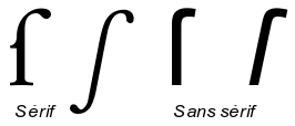
What is a serif?
Early typefaces still carry the influence of pre-movable typewriting tools. For instance, serif fonts are influenced by the chiseling of stone, which is how these early characters would have been originally produced. This practice creates little “feet” at the ends of the characters.
Serif
[in_content_ads gallery=”logos” logo=”on” title=”Need graphic design help?” subtitle=”Try Penji’s Unlimited Graphic Design and get all your branding, digital, print, and UXUI designs done in one place.” btntext=”Learn More” btnlink=”https://penji.co”]
Old-style serif (15th to 18th Century)
The serifs in this style tend to be slightly rounded, inclined, and cupped. The characters have diagonal stress as opposed to the vertical stress of later iterations. This suggests an influence from calligraphy. The characters are typically low contrast, meaning most strokes are about the same width.
Examples: Garamond. Goudy Bookletter 1911. Palatino.
Transitional serif (18th century)
As the 18th century progressed, printing practices became more refined. The typefaces created during this period are known as transitional serifs. Some defining characteristics of this style are the sharper serifs and more vertically stressed characters. Additionally, this style tends to deploy higher contrast between thick and thin strokes.
Examples: Baskerville. Times New Roman.
Modern serif (Late 18th Century)
Fonts become even more refined and more detailed as the 18th century progresses. This is due to further advances in the printing process. Characteristics include serifs that are completely straight and flat and possess completely vertical stress. The contrast is also extremely high between thick and thin strokes.
Examples: LTC Bodoni 175.
When should I use serif typefaces?
Serif typefaces make great body copy in printed scenarios. The serifs are said to increase legibility by guiding the reader’s eye from one character to the next. So, these typefaces work best for long-format text. Additionally, they possess an air of formality and traditionalism.
Sans Serif
Sans comes from the French root meaning “without”. So, sans serif quite literally means “without serifs”. These typefaces were first used in the fifth century BC, but the first printable type in this style was created by William Caslon in the 18th century. They were considered an informal style at first, but their clean, minimal, and modern look has turned sans serif fonts into incredibly versatile tools.
Grotesque (20th century)
This style was commercially popular in the early 20th century. Some common traits include medium contrast between thick and thin strokes and open aperture gaps in characters like the lowercase a and e.
Example: Akzidenz-Grotesk.
Neo Grotesque (20th century)
Neo Grotesque typefaces were the result of designers preferring clean, legible sans serifs. This led to much of the character and personality of the fonts being stripped away. Characters have uniform thicknesses with no contrast between thick and thin.
Example: Helvetica.
Humanist (20th century)
These are based on the proportions of Roman-style capitals. Some of the details of the characters possess a calligraphic style influence.
Examples: Open Sans. Cantarell.
When should I use Sans Serif Typefaces?
Many web designers prefer sans serif fonts because the clean, crisp lines are perfect for on-screen usage. If you look at most digital devices (or apps used primarily on them) you will likely find that the default typeface is sans serif. They are legible at smaller points, perfect for the wide variety of digital screens available.
Sans serifs are great options for display text, but they’re also versatile. They may be used for body text as well. As far as pairing fonts, you can typically get away with using two sans-serif fonts. The same cannot be said for serif typefaces, which tend to look clunky when paired with another serif.
For more assistance with your research into typeface, be sure to consult Penji’s learning center.


