
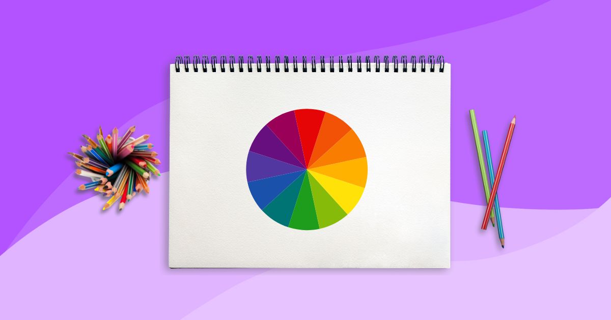
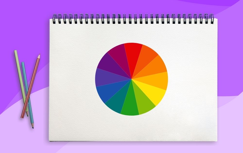
Color is a language of its own and has the power to evoke emotions, convey messages, and shape our perceptions. To facilitate a clear understanding of the interplay of colors, there’s the color wheel – a circular visual tool used in color theory to represent the relationships between different colors.
If you want to know how to use the color wheel, you’ve come to the right place! In this article, we will unravel the mysteries of this tool – that circular marvel that artists, designers, and creators wield to craft their visions.
Whether you’re an aspiring artist seeking to master the palette or a designer aiming for the right color calculations, here’s a step-by-step guide on how to use the color wheel effectively:
Step 1: Familiarize Yourself with the Color Wheel
The color wheel organizes colors in a structured manner, making it easier to select and combine colors in a visually pleasing and harmonious way.
Start by understanding color wheel theory and the basic components of the color wheel. It consists of the following:
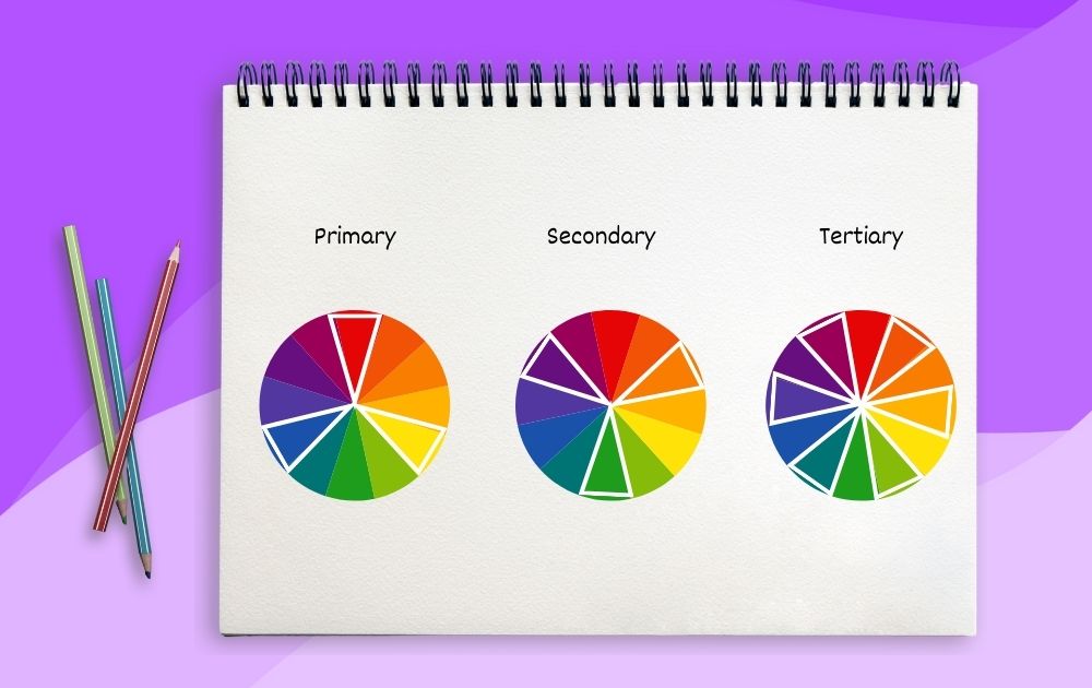
- Primary colors are the fundamental colors that cannot be created by mixing other colors together. They are essential building blocks for creating various colors through mixing – red, blue, and yellow.
- Secondary colors are created by mixing equal parts of adjacent primary colors: green (blue + yellow), orange (red + yellow), and purple (red + blue).
- Tertiary colors are created by mixing primary and adjacent secondary colors. These are red-orange (red + orange), yellow-orange (yellow + orange), yellow-green (yellow + green), blue-green (blue + green), blue-purple (blue + purple), and red-purple (red + purple).
Step 2: Identify Color Relationships
The color wheel helps you understand color relationships. Here are some of the basic color relationships to know:
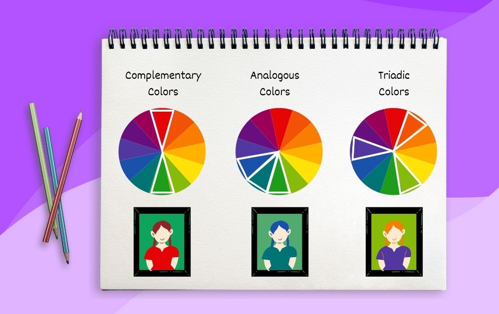
- Complementary Colors. These are pairs of colors opposite each other on the color wheel. For example, red and green, blue and orange, or yellow and purple are complementary pairs. When placed together, complementary colors create a strong contrast and can make each other appear more vibrant. You can often observe this in popular artwork and professional graphic design.
- Analogous Colors. Analogous colors are adjacent to each other on the color wheel. These colors share similar undertones and create a harmonious and unified look. Using analogous colors in a design can convey a sense of cohesion and balance. An example would be using shades of blue, blue-green, and green in composition.
- Triadic Colors. Triadic color schemes involve selecting three evenly spaced colors around the color wheel. This creates a balanced and vibrant contrast. For instance, choosing red, blue, and yellow as the primary colors of a triadic scheme can lead to dynamic and visually engaging compositions.
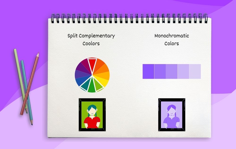
- Split-Complementary Colors. Split-complementary color schemes are a variation of complementary colors. Instead of using a single complementary color, this scheme uses the color on either side of the complement. This provides the contrast of complementary colors while offering a bit more variety and nuance in the color palette.
- Monochromatic Colors. Monochromatic color schemes are based on variations of a single color. This involves using different tints (lighter versions) and shades (darker versions) of the same color. Monochromatic schemes can be elegant and soothing, offering a sense of unity.
Step 3: Use the Color Wheel for Color Mixing
Part of learning how to use the color wheel is creating various shades by mixing colors. Applying what you learned in steps one and two will allow you to understand how to combine colors to create new ones.
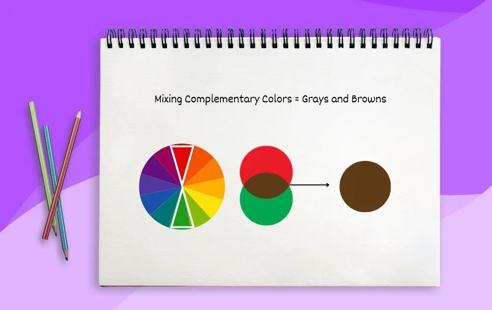
The color wheel is essential for creating neutral tones like grays and browns. Mixing complementary colors together can result in desaturated colors that are close to gray while combining complementary colors in unequal proportions can yield various shades of brown.
In addition, the color wheel can be your guide when you’re uncertain about which colors to mix to achieve a specific shade. Identify the colors you want to mix and find their position on the wheel. Determine whether they are primary, secondary, or tertiary colors, and use this knowledge to guide your mixing process.
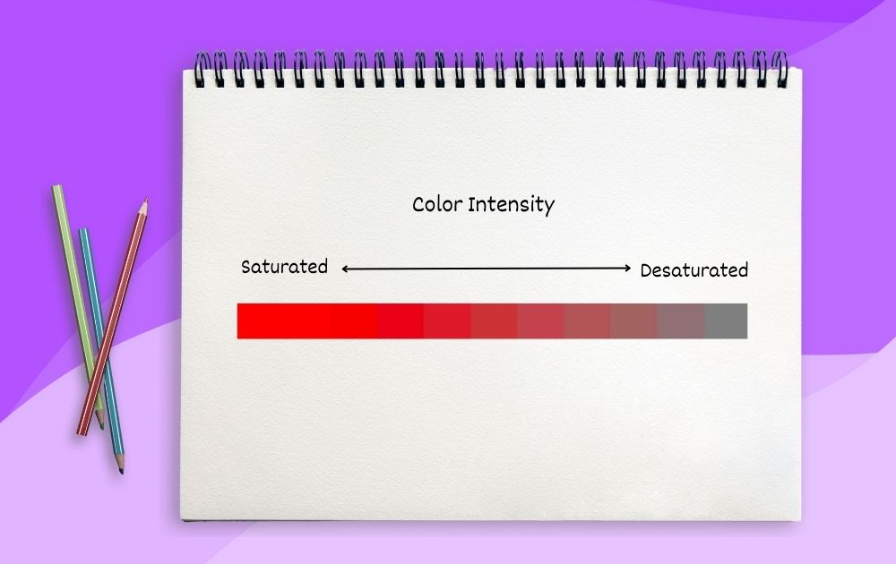
Step 4: Adjust Intensity
Intensity refers to the purity or vibrancy of a color. Highly intense or saturated colors are vivid and vibrant, while desaturated colors are more muted and subdued. The color wheel can guide you in adjusting intensity by using complementary colors or adding neutrals.
To reduce the intensity, mix a color with its complementary color. This process is called desaturation. For example, if you have a very intense red, you can desaturate it by adding a touch of green.
Step 5: Adjust Value
Value refers to the lightness or darkness of a color. The color wheel helps you adjust the value by adding white or black to a color.
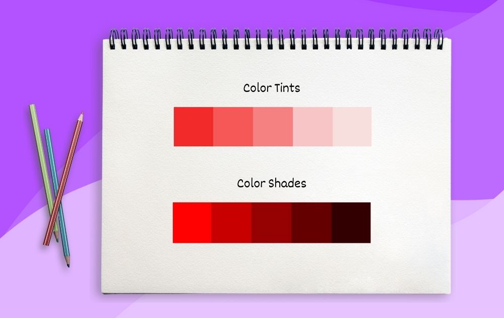
In the context of color value, tints, and shades refer to the lightness or darkness of the original color, creating a range of tones within a color palette.
- Tints. Tints are lighter versions of a color that are created by adding white. This process increases the value of the color, making it closer to white on the spectrum. Tints often have a soft and airy quality, and they can be used to create highlights, delicate touches, and pastel effects.
- Shades. Shades are darker versions of a color that are achieved by adding black. This process decreases the value of the color, making it closer to black on the spectrum. Shades are used for creating shadows, depth, and adding contrast to a composition.
Tips on How to Use the Color Wheel
Now that you know how to use the color wheel, here are a few tips on navigating colors like a master:
- Explore Color Temperature. Consider warm and cool colors for different moods. Warm colors like red and yellow evoke energy, while cool colors like blue and green create a calm atmosphere. Learn about the meaning of colors and use that knowledge to guide your work.
- Embrace Color Harmony. Harmonious color schemes, like analogous or triadic, create a pleasing visual flow in your designs, while complementary schemes add dynamic contrast.
- Master Subtle Gradients. Gradually transitioning between colors can add depth and realism to your artwork, creating a sense of light and shadow.
- Convey Depth with Aerial Perspective. Use cooler and lighter colors for distant objects to simulate depth and distance in landscapes or scenes.
Don’t have time to master the color wheel? Penji is here to help! Sign up now and get awesome designs and illustrations from the world’s top 2% talent.
About the author

Carla Deña
Carla is a journalist and content writer who produces stories for both digital and legacy media. She is passionate about creativity, innovation, and helping small businesses explore solutions that drive growth and social impact.


