


When scrolling through Facebook, you’re sure to see a confusing mixture of good and bad advertising. With an estimated 2.5 billion active users, it’s no wonder businesses flock to Facebook to promote their brands. But, as inevitable as it is to see poorly-designed ads, you’ll also find a few gems.
How do you separate the wheat from the chaff, you might ask. Penji has years of solid experience creating Facebook ad designs. Our designers can help you create the best, so read on and learn from the pros.
Why Facebook Ad Designs?
Aside from it being the most popular social media platform today, according to Buffer Marketing Library, Facebook is the best for online advertising. To answer the question, why use Facebook for your ads, it’s simple: it works.
Global Reach
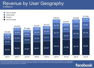
According to Facebook’s Q3 2019 report, almost half of the platform’s ad revenues come from North America. If that isn’t wide enough reach for you, let it be known that Facebook is also big in the following regions:
- India
- Indonesia
- Brazil
- Asia-Pacific
- Practically the rest of the world
If you’re thinking about your business going global, Facebook can help you with that.
Diverse Demographics
A Hootsuite study found out that Facebook’s audience consists of 57% men and 43% women. A good 19% of its users are men between the age of 25 and 34 while the 18 and 24 group comprises 15%. Women between 24 and 35 make up 13%, 18 and 24 make up the remaining 10%.
What does this mean for your business? The male-to-female ratio is relatively balanced. If your product or service is gender-specific, Facebook is still a great place to advertise. Take note of the age range in the stats above. If these are your target audience, Facebook ad designs are a must.
Maximum Engagement
Another Hootsuite report tells us that Facebook users can engage via the following ways:
- Liking
- Sharing
- Commenting
- Tagging
- Clicking ads
There are plenty of ways to spread the word around. And as what a report from Facebook confirms, 94% of its revenues come from mobile. The easier it is for people to engage.
Related Post: 11 Types of Facebook Ads And How To Use Them
1. Determine The Right Facebook Ad Format
If you’re new to Facebook advertising, the platform uses different ad formats to suit every business’s promotional needs.
In a nutshell here are the eight main ad formats:
- Photo
- Video
- Stories
- Messenger
- Carousel
- Slideshow
- Collection
- Playables
Read this article to get an in-depth understanding of what these are: Which Facebook Ad Formats to Use (With Examples)
Before going to the design drawing board, you should already be aware of the format you need. Do you have multiple products to show off? Carousel ad format may be the best. Design accordingly.
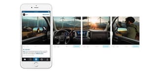
Image Source: Facebook for Business
2. Consider Ad Placement
Know beforehand the ad size you need to create. Where you place your ad matters as it could be detrimental if you get the wrong specs. Here are the most common placements on Facebook you need to know about:
- Desktop Newsfeed – lets you include more text and link descriptions, ideal for lead generation
- Desktop Right Column – cheaper but only has room for smaller images and fewer texts, ideal for retargeting; use images that are easily recognizable, fonts that are easy to read
- Mobile Newsfeed – needs a shorter and more straightforward copy, ideal for brand or product introduction
- Marketplace – users going here means they are looking to purchase, make the most of your ad by using clear photos and concise texts
- In-Stream Video – create engaging videos as these are great at engaging viewers
- Stories – more than half a million users watch Facebook stories, create attention-getting videos to maximize its benefits
- Audience Network – these are the ads placed outside of Facebook, cheaper but fewer conversions
Related Post: Setting Facebook Ad Goals for the Most Effective Campaign
3. Emphasize Your Value Proposition
Making your product, service, or brand attractive to customers is one of the primary reasons for advertising. Thus, when creating Facebook ad designs, it’s essential to make it clear to people what your brand is all about.
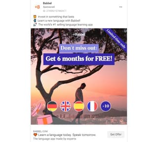
In the example above, the first thing you’ll land your eyes on is the line “Get 6 months for FREE!” Babbel’s value proposition is clearly displayed with a complementing image as background. The ad’s CTA is also short and straight to the point.
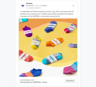
4. Include Eye-Catching and Colorful Images
First and foremost, Facebook is a social media platform. It was designed to get people to socialize and so, it’s pretty common to see a myriad of photos. To get people to notice you from the thousands competing for consumers’ attention, you have to stand out.
Crisp, clear, and colorful photos are a surefire way to do so. This is exactly what Bombas has in mind and has successfully done. It has colors, white space, and a donation drive, what’s not to like?
Pro tip: While we’re on the subject of colors, use its psychology to create more effective Facebook ad designs. If unsure, you can use your brand colors, base it on color theories, or do A/B testing to find out which colors will work best.
All in all, the right image you should use has to be the following:
- High-quality, high resolution
- Shows off your product or service clearly
- Has fewer texts
- Focused on your message
5. Use Contrast
Using contrast—light against dark, soft against hard, smooth against jagged—can do wonders for your Facebook ad designs. After all, it’s one of the seven principles of design great designers follow. This simple, yet powerful example from The New York Times shows contrast really well.
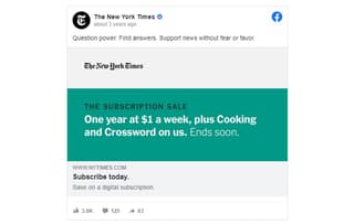
Notice how the ad successfully gained the following through the efficient use of contrasting:
- Grabs attention
- Gives a clear visual hierarchy
- Creates focus
Colors, fonts, texture, shapes, and sizes are some of the few elements you can use to give your ads the contrast it needs.
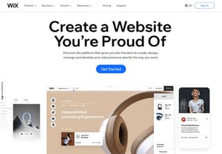
6. Have Consistency
According to Inc., consistency is the difference between success and failure. So when creating Facebook ad designs, it has to be consistent. When you decide on colors or fonts, you must use them all throughout your campaign.
This example from Wix is a good one to follow. The Facebook ad design is consistent with their website’s landing page. The two are visually united and in sync, the viewers will never wonder if they got to the right page or not.
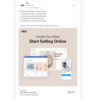
The premise of creating ads is to offer a promise to prospects. Get Offer, Learn More, Buy Now are some of these promises. When they click on your ad, they expect a continuation of it on where they are directed.
7. Mind the Details
To prevent your Facebook ad designs from looking grainy or distorted, make sure you get the sizes and aspect ratios right for videos and images. Details such as this may seem insignificant at first. But if your website, content, or layout are unattractive, 38% of people will stop engaging, according to HubSpot statistics. Check out Facebook’s guide here.
8. Appeal to the Emotions
In his book, “How Customers Think: Essential Insights into the Mind of the Market,” Harvard professor Gerald Zaltman said that emotions drive our purchasing behaviors. Capitalize on this and use emotions to lure prospects into converting into customers.
Be it happiness, FOMO, sadness, or empathy, make sure to add an emotion relative to your Facebook ad designs. With the current world situation, United’s Facebook ad designs use the eagerness to go out after being cramped in our homes.
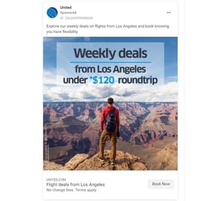
The offer in itself is a shoo-in, but the addition of the breath-taking photo seals the deal.
9. Speak to Your Audience
What makes Facebook a great platform for advertising is the option to target specific demographics. You can create ads geared towards a particular region, age, or preference. And for this, you can use graphics and images more suited to your target.
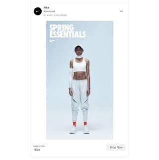
There’s probably no country in the world that doesn’t know Nike. But not every place on earth has four seasons, in this example’s case, spring. The ad targets its audience and enticing it to get new sportswear especially made for the season.
10. Show Off
Including your product photo on your Facebook ad design can be advantageous for your brand. People usually want to see it before making a commitment to buy. Show off your product and let them sell themselves. Here are a few things that could happen if you do:
- People will instantly know if they like your product or not
- If they do, they won’t hesitate to click on it
- They will see your product as a solution to a problem
- It can help build brand awareness
Leupp has done it superbly well, take a look below:
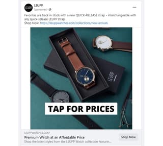
The ad from Leupp shows variants of a watch so viewers can mentally note what they want to get. Also, notice how loud the CTA is, giving the ad a sense of urgency. If, however, you don’t offer a physical product, you can still use this hack.
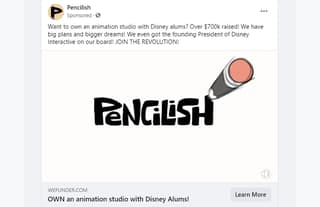
In this example, Pencilish showed off their skills in animation via a video. It also showed the works of the people on their team to assure prospects how serious they are in their business.
11. Always Go for Originality
Creating Facebook ad designs is a recurring project. As long as you’re in business and want to keep customers coming, you’ll always need ads. Stock photos can be an easy and quick way to get images, but they don’t do much for creativity and originality.
Always ensure that you use unique creatives to let people know that you’re trustworthy and reliable. It may seem expensive and laborious, but it’s really not. Penji offers unlimited graphic design services at affordable plans. Watch our demo video here to know how we can get you the Facebook ad designs you need at reasonable rates.
12. Make Your Designs Responsive
As mentioned above, a big chunk of Facebook’s revenues come from mobile. And this comes as no surprise. Using your smartphone is way more convenient than your desktop or laptop.
Make sure that your Facebook ad designs are mobile-friendly. You can start by creating videos and images vertically aligned. Think about being mobile-first, then desktop-last.
13. Keep Your Facebook Ad Designs Fresh
Ad fatigue is what happens when people get tired of seeing your ads. It’s real and is a struggle for most entrepreneurs, more so for small businesses and startups. To combat this issue, you need to constantly refresh your ads, regulate the frequency of placement, or rotate them.
Create varieties of a single ad and schedule these on different days. This allows people to see a different one every so often. Using an ad more than five times can result in ad fatigue. However, this number isn’t definitive as long as you see good ROI results.
To know the right frequency as well as many other insights, you can do a Facebook A/B testing.
Related Post: The Right (and Wrong) Ways to Do Facebook A/B Testing
Conclusion
While Facebook offers many advantages for businesses, it also needs your time, energy, and efforts. Each of these tips can help you get it right, but it’s up to you to custom-fit it to your business. And this isn’t a task that one person alone can do.
To get professional results for your Facebook ad designs, you need to go to the pros. Penji is the solution your business needs. For a fixed monthly rate, you can request as many ads as you can.
Sign up today to take advantage of great graphic design our team has to offer.


