The surge of social media platforms into advertising eminence caused some people to think that email marketing is on the decline. But if you look at data from Statista, the results are quite the opposite. As of today, there are 3.96 billion people on social media while email users amount to more than 4 billion. This only proves that email marketing is more relevant than ever.
However, captivating your target audience using email marketing entails that you create enticing email graphics. In this article, we’ll learn about creating effective email graphics and how you can use them to get optimum results. Let Penji’s experience and expertise teach you how.
When to Send Email Graphics Campaigns
According to Campaign Monitor, the average open rate of emails is 18% while the average click through rate is at a low 2.6%. This means the chances of your recipients opening your email is low. One of the best ways to go around this is to time your email campaigns.
Getting hundreds of emails a day isn’t everyone’s cup of tea. A HubSpot survey found out that 69% or respondents hit the unsubscribe button because they get “too many emails.” If you’re unsure when to send emails, below is a general guide:
You Have an Announcement to Make

Are you introducing a new product or service? Are you about to launch a podcast or a blog? Whatever the good news is about your business, let people know about it through email.
You’re Holding a Sale or Contest
A sale, contest, or promo needs proper announcing. Let everyone on your mailing list partake of this special offer by creating a specific email campaign for it.
It’s the Holidays
The holidays are the best times to connect with your customers with an email campaign. Holidays are the time of the year that people are ready to spend. With abn email, point them to your store or business.
These are but a few, it’s still up to you when’s the best time to send an email. It all depends on the nature of your business, the budget, and the objectives you have for your campaigns. Just make sure you don’t overdo it.
Pro tip: A good rule of thumb to follow is to start with one email a month. Also, add content to your email that your recipients will find valuable.
Related Post: 10 Tips That Will Make An Email Stand Out
How to Create Email Graphics
As with any marketing strategy you have in place for your business, planning is crucial. An email is composed of several elements and not just the email graphics. You need to create an outline of what goes in it before you start with the overall design.
Here are the three basic steps you need to take when creating an email campaign:
The Planning Stage
A successful email campaign is one that has the following elements:
- The Header. This is what opens your email. It is an introduction to what’s inside. This is the section where you can place your logo, tagline, or any identifying mark.
- The Headline. This is what will capture the attention of the recipient. Make sure that it’s catchy, appealing, and intriguing.
- The Body. This is where you can include all that you want recipients to know about. Make sure that it’s brief, yet informative.
- Images and Graphics. Support your email body with images or graphics that can make the message more understandable.
- Calls-to-Action. These are the buttons or links that will tell the recipients what they should do next. Make sure they are enticing and easy to follow.
- The Footer. This is where you’ll place your contact information and other pertinent details such as links to social media.
Pro tip: Don’t make the mistake of creating a single image with all the information in it and sending it as the email. These are called image-only emails and may be seen as spam emails by some email service providers.
Identify your marketing goals and plan the email campaign accordingly. This will ensure that the elements you include are the essentials and none of the fluff. Remember that the recipients’ attention spans are short, you need to get to the point as quickly as you can.
The Design Team
Once you have a good outline of your email, think about the design team. They will be the ones to execute your ideas into reality. Get the pros to do them for you as DIYing may not be the best solution.
Not only will the pros know what the appropriate sizes are for email graphics, they understand the right fonts to use. They will have good working knowledge of the layout, the colors, and other factors about email graphic design.
Ensure that the images or graphics you use are yours to avoid any infringement of copyrights. Also, stock photos may make your email look unprofessional and commonplace. Instead, get a graphic design service that can keep up with all your email graphics requirements.
Penji’s unlimited graphic design service lets you do this for a flat, monthly rate. You won’t have to hire an in-house designer or a freelancer. These can either be expensive or unreliable. Watch our demo video here to learn more about Penji.
Related Post: Improve Your Graphic Design and Marketing In 15 Easy Steps
The Email Integration
This is the part that can be tricky. But there are three easy techniques that many entrepreneurs and marketers often use. They are as follows:
CID (Content-ID)
This is probably the oldest method but is still the most widely used. The process is to attach the image to your email and reference it with an HTML tag in the email template you’re using. When the recipient opens your email, the image is embedded in it.
Inline Embedding
A much hassle-free solution is the inline embedding method. It requires that you get a base64 string of your image. This is the type of encoding scheme that embeds the image in your email using a standard HTML tag.
Linked Images
This is the process of going to a CDN (Content Delivery Network) that will host all your images. An embedded HTML tag will then access the CDN-hosted images.
These email integration methods can take up your time and energy. To make your life easier, we highly recommend getting an email marketing platform solution to send your emails for you.
Tips to Follow When Designing Your Email Graphics
Incorporate Your Brand Colors
Grab every opportunity you can get to establish brand recognition, and that includes your email graphics. Experiment with various color palettes but never forget to incorporate your own. This will help secure your spot in your customers’ minds.
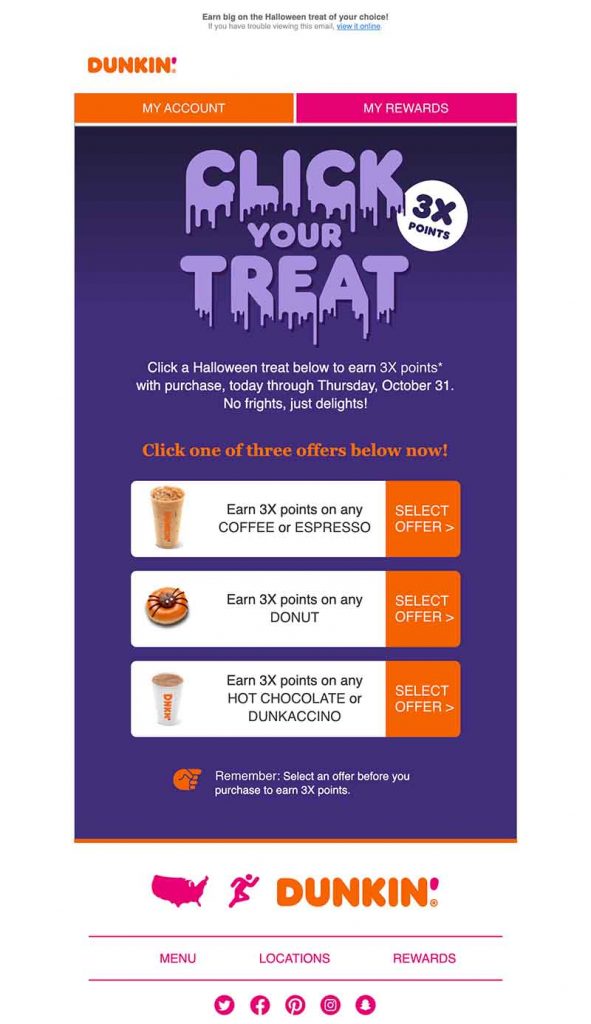
Dunkin’ sent out the email above for their Halloween offer. Although the main color they used is violet, they never veered away from their brand colors. You’ll instantly see the consistency and that spark of recognition of their brand image.
Take Note of Dimensions
Make sure that your email marketing campaign uses the standard size and dimensions. Limit the width of your email graphics to 600 to 650 pixels. The length can be varied, but the email images shouldn’t go beyond 1MB. If you can make it less, the better.
Large-sized images will take a long time to download. This may force your viewer to get bored and abandon your email. Optimize your images to make them lightweight without giving up the clarity.
Use Alt-Text Information
Include alt-text information on all your email graphics and images. This is to provide a brief info on what the image is about should downloading take a longer time. The alt-text will help the viewers decide if they want to wait for the images to download or not. Look at the image below.
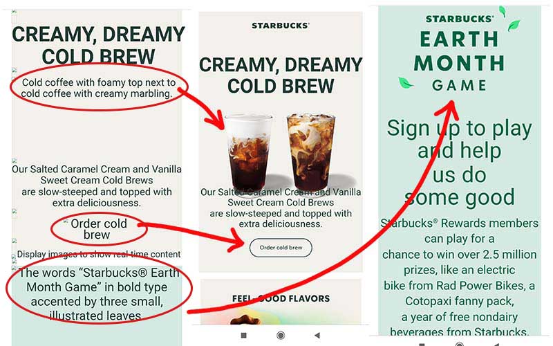
The first part is what the email looks like when downloading takes a longer time. You’ll see the alt-text info in red circles. The second and third images are what the email actually looks like when it finishes downloading.
Use High Resolution Images
Still in the topic of images, make sure that you use clear and crisp images. These can help viewers get an idea of how it is using your product and entice them to buy. As we said earlier, avoid using stock photos as this will make your email look generic and unappealing.
Create Custom Illustrations
If you find hiring a photographer for your images is out of your budget, try using custom illustrations. These can do more than what a photograph can. With custom illustrations, only your imagination will limit you.
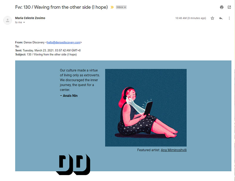
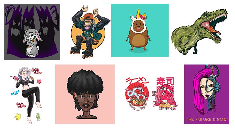
One misconception about having someone to create illustrations for you is that it’s expensive. Fortunately, Penji offers custom illustrations with our unlimited graphic design service. Check out our work samples below or click here to learn more.
Write Killer Headlines
Before recipients can look at your email graphics, you have to lure them into opening your email. According to Convince & Convert, 35% of recipients open their emails depending on the subject line alone. Don’t let your amazing email graphics go to waste by writing headlines that make people ignore the email.
Test, Test, Test
To see if your email will work the way you want it to, send them to your team members. Have them use different devices, email providers, or browsers. Create one or two versions and see what will look, work, and load better.
Related Post: Email Design Best Practices for Marketers and Small Businesses
Stunning Email Graphic Design Examples
Now to inspire you with stunning email graphics that you can learn from.
Meg Lewis
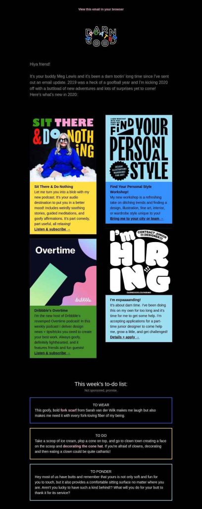
Designer, comedian, and performer Meg Lewis wants to make the world a happier place. Her website uses bright and shockingly bold colors which exudes a joyous atmosphere. Her email has a design that’s consistent with her mission.
The email layout is divided into sections that make it easier to read. You won’t drown in too much info as each detail is enclosed in a box. The black background makes everything stand out.
Off Limits

Another example of an email campaign that’s as happy as the sunshine is this one from pet care company Off Limits. The email graphics use dazzling colors much like what you’ll find in their website. The email graphics are quirky and brimming with fun, perfect for the brand image.
The text body is short and straightforward, plus the choice of bold fonts make it easy to read. The green product image and the cartoon hand that’s holding the doggo is in contrast to the yellow. This puts emphasis on what the email is about quite so well.
The Nue Co.

Promising products that are safe for people and the planet, The Nue Co. is the image of a sustainable brand. It is evident in their email as it is almost devoid of color. This gives it a clean and quiet aura that’s more than appropriate for the brand.
This email is the best example of using images that are clear and crisp. There is no longer a need to hype the product as it already shows its natural beauty.
Vacasa
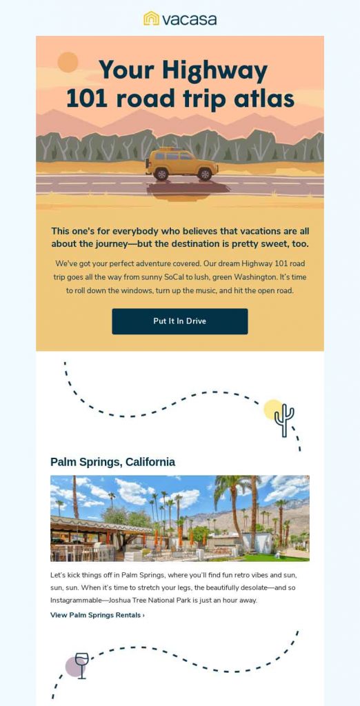
Vacation rental company Vacasa uses custom illustrations along with photos of vacation spots for their email graphics. It brings to mind road trips and the promise of new adventures. It has doodles to serve as lead-ins to give the email a natural flow.
There is more than enough white space around so as not to make the email look cluttered. The texts are short but enticing which serves only as complement to the wonderful pictures.
Final Thoughts
Designing email graphics requires special care. There are technicalities involved that can overwhelm any newbie email marketer. However, you don’t have to do it all by yourself as an affordable service is at the tips of your fingers.
Penji’s unlimited graphic design service can get you all the email graphics you need at a fixed monthly rate. Sign up today to get started with your email marketing journey.
About the author

Celeste Zosimo
Celeste is a former traditional animator and now an SEO content writer specializing in graphic design and marketing topics. When she's not writing or ranking her articles, she's being bossed around by her cat and two dogs.


