

Marketing strategies come and go, but one thing that stands the test of time is email. It’s easy to believe that it is a dying form of communication with all the better channels coming up. Statistics prove otherwise.
In this article, we’ll show you why email is still an excellent tool for growing your business. We’ll also show you why email design matters and the best practices to go about it. And of course, how Penji, an unlimited graphic design service, can make email design and layout easy to achieve.
Why Email Marketing Isn’t Dead
Email as a marketing tool isn’t dead because of the following:
Widespread Use
According to Statista, there are 3.9 billion email users in 2020. It is expected to grow bigger come 2023 when it reaches 4.3 billion users.
Strong ROI
The Direct Marketing Association (DMA) tells us that your business gets an average return of $42 for every $1 spent on email marketing.
Varied Business Growth Opportunities
GetResponse says that there is an average 82% open rate for welcome emails. Also, abandoned cart emails get 69% positive results, according to Omnisend.
And the list goes on. The point is, customers want to hear from you through emails. Your business will be missing out on a lot if you don’t leverage this effective tool.
Email Design Best Practices
Learning how powerful email is for marketing your business makes you want to jump in right away. It is indeed a marketing strategy worth investing in. However, it isn’t as simple as composing your email and sending them out.
Without the right planning, an email campaign may not work as you hope it to be. To help you get started, here are email design best practices that are worth investing in.
Related Post: Email Marketing Design Practices Worth Testing in 2021
Brand Optimization
Email design best practices start in the inbox. It’s crucial that you make efforts in creating good first impressions as this will determine if your email gets read or gets trashed. Your brand has to be distinct in your email campaigns, more so on the following:
- From Name
- From Address
- To Field
- Subject Line
Always include your brand name in the From field and an identifiable address. Also, have your recipient’s name in the To field instead of just their email address. This ensures a personalized touch while strengthening your brand identity.
The Subject Line
We created a specific category for the subject line as it is the main deciding factor in the email’s open rate. While this part isn’t related to design, we shouldn’t ignore the power it holds for our emails. Before the recipients see your email design, their eyes will fall on the subject lines first.
The following are some suggestions when writing subject lines:
- Keep it short, simple, and recognizable
- Avoid using all caps
- Don’t use spammy words such as Free, Money, or Help
- Use power words such as Introducing, Invitation, or You/Your
- Don’t use more than 65 characters
- If possible, add emojis
The Pre-header and Header
Second to the subject line in importance are the email pre-header and header. Another part of an email that isn’t design-related but also requires your attention. Here are a few things you need to look into when creating pre-headers and headers.
- Add a link to the online version of your email
- Show snippet texts or preview texts
- The Johnson Box (the box on top of the email that contains the key message)
Make sure that the content you place in these areas capture and engage the audience.
The Email Layout
Marketers may not think much about the email layout as it is a design concern. Nevertheless, it still needs careful attention. Email layout is how the email will look, the number of columns, the colors and fonts, and many other elements. Although it’s better to leave this to a designer, your input as an entrepreneur or marketer is also required.
The factors you need to know when creating the email layout:
- An ideal width of 500 to 650 pixels
- The vertical format is better than horizontal
- Use the right proportions for texts and images
- For multiple topics in one email, a table of contents is preferable
- A navigation bar is perfect for product displays
- Follow a four to five section/panel limit
- Include clear and compelling call-to-action buttons
These can all be overwhelming for a non-designer. To make email designing more manageable for you, you can go to the pros for help. Watch Penji’s demo video here to learn more about our team of professional graphic designers.
Related Post: 20 Responsive Email Newsletter Design Examples + Pro Tips
Creating a Visual Impact
Billions of emails are sent each day all over the world. For your emails to have a fighting chance against all that competition, it has to have visual impact. And to achieve that, you need graphic design and imagery to define your content clearly.
It’s essential to take note of the following:
- Always use alt-text for your images
- Don’t use background images under texts (Outlook, for one, doesn’t support this)
- Provide fallback colors
- Ensure that headers and product offers are clickable
- Use a scale of up to 599 pixels when using images for fluid emails
Remember that creating a first impression is difficult and that you only get one chance. Make sure that your efforts count and that you achieve the visual impact that you need.
Personalization
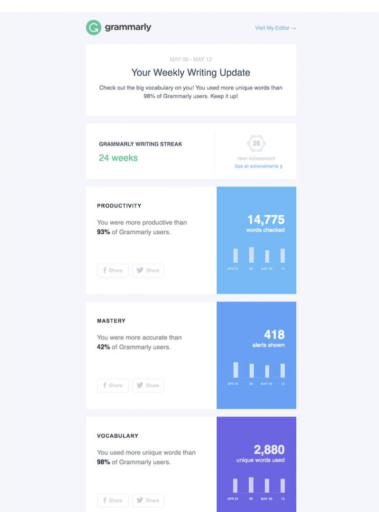
According to Experian, emails with personalization in their subject lines get opened 26% more than those that don’t. To make this email design best practice even more impactful, use personalization throughout. Include your logo, your brand colors, and other identifying assets of your brand. This way, your recipients will see that the email is made especially for them and not a product of a template.
This email example from Grammarly includes statistics on your usage of their service. Although we all know that this is automated, it still feels personalized.
Humanization
Technology has become a big part of our daily lives that the human touch seems to have vanished. The good thing is, humanization or contextual marketing is getting to be the norm. This is the strategy that is guided by specific behaviors, demographics, and conditions.
This type of marketing strategy creates content and design that are relevant or resonate with your target audience. This benefits your brand in many ways: better engagement, robust connections, and excitement each time they receive your email.
Copy and Content
The main star of the email, there are also email design best practices for your copy and content. Take note of these:
- Write your messages in short sentences and paragraphs—a maximum of twenty words in a sentence and 2 to 3 sentences in a paragraph.
- Use blocking or sectioning elements to separate one thought from another. You could use lines or colors to block copy and content for easier reading.
- Add subheadings to emphasize a particular copy.
- Use a bold typeface to accentuate words.
- Include line breaks every 50 or 60 characters to increase readability.
- Use bullet points when listing features or benefits.
- Use standard web fonts such as Arial, Courier, Times New Roman, Verdana, or Georgia.
- The ideal size for titles is 22 pixels, while the body copy is 14.
- Edit your copy to check for grammar and spelling mistakes.
Visual Hierarchy
People have a tendency to follow predictable tracks when consuming content. To play on these tendencies, we need to create a visual hierarchy in our emails. This email design best practice lets your recipients read copy and content in a way that directs them to where you want them to go.
An excellent example of this is the inverted pyramid, as shown below:
The most important details are on top, going down the bottom. Another layout for visual hierarchy is the Z pattern. This leads the eyes from left to right, going down to the right again, and so on.
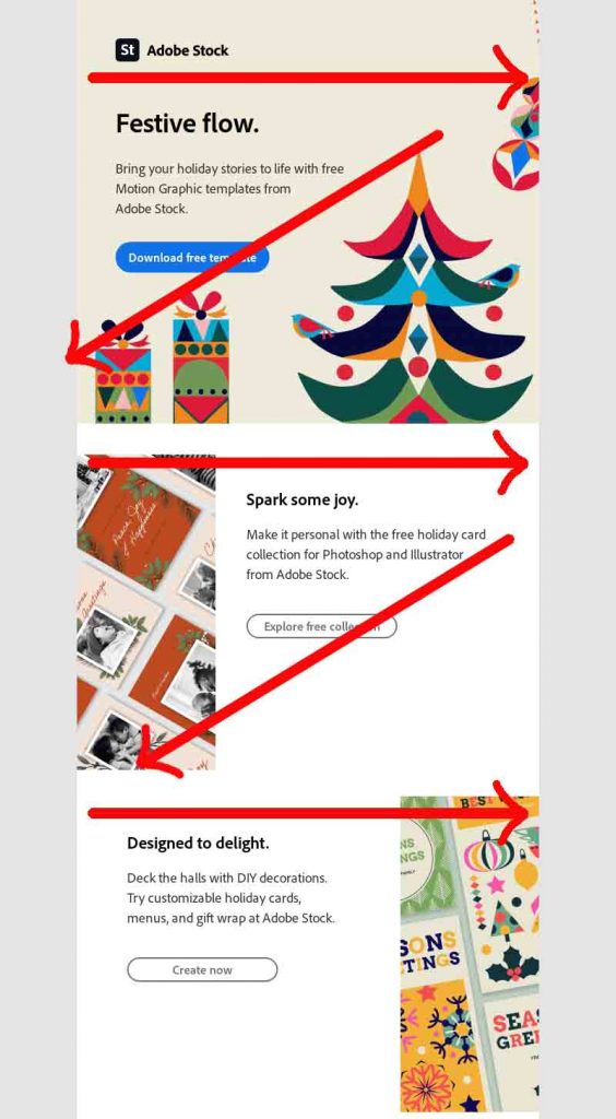
Whatever layout you go for, arrange your content in such a way that it tells a story. Use size, colors, placement, contrasts, and even fonts to establish hierarchy.
Pro tips:
- People see larger objects or fonts as having a higher value than the others.
- Elements that are on top of the email are seen as more important.
- Use contrast in essential elements such as the CTAs.
- Don’t forget to use white space.
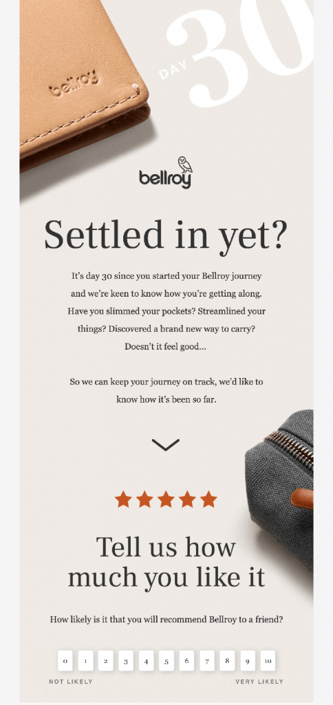
Interactive Content
A great way to make people read your email throughout is to use interactive content. This is also an excellent way to boost engagement without ever leaving the email. This allows readers to interact and get a feeling similar to a gaming experience.
This email design best practice example from Bellroy has a survey in it.
Here are some ideas you can create to get interactive email content:
- Product carousels
- Animated CTA buttons
- Rollover effects
- Add-to-cart functionality
- Surveys
Notes: You may need to learn HTML to create the list above or use an email editor for it.
Calls-To-Action
Telling readers what to do next is crucial as this will determine your email’s effectiveness. Marketing Experiments tell us that emails should accomplish the following:
- Grab attention
- Build connections
- Identify a problem
- Build interest
- Build suspense
- Transfer momentum
Your email’s CTAs are the ones responsible for transferring momentum. Your email wouldn’t be complete without them. Call-to-action buttons need attention, too. From the texts to the design, you need to craft them with care.
The Words
The success of your CTAs depends on your words. Learn More or Download Now are quite common which means, avoid them. Button blindness is real, and it is because of these overused words.
Action words are the best choices. But instead of Buy Now, which uses an action word, use Find a Deal, which is a lower-risk request.
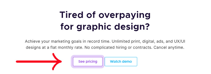
The Design
This is precisely where contrast, as mentioned above, is best used. Make sure that your CTA buttons are hard to miss by using colors that contrast the background. You can also use different techniques such as animation or using different shapes other than rectangles. Penji’s CTA has a glowing animation around it.
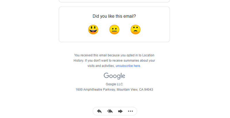
The Footer
Bringing your readers up to this point merits a congratulatory greeting. However, your work isn’t done yet. The footer needs attention, too, just like everything else in the email. Your footer has to have the following:
- Your company’s complete contact information
- A link to your website
- Your social media links, sharing links, and options to forward the email
- The unsubscribe button
This email sent by Google Maps Timeline is an excellent example of email design best practice on footers:
Related Post: Email Template Design Guide that Fits Your Brand
Email Trends
Keeping up with the trends can help you make your emails more impactful and productive. Even if your email campaigns are working, sooner or later, a redesign is in order. Don’t wait for the time that your email design and layout get stagnant.
Doing so will give your brand a dynamic image. People will see you as someone active, aggressive, lively, and never dull. Follow trends in colors, typefaces, and graphic design in general. Plus, technology is advancing: what once was unimaginable can be done now, don’t be left behind.
Great Visual Content Draws People In
Now that you know what the email design best practices are, it’s time to put them to work. Great visual content draws people in. If you want to achieve this, get the help of professional graphic designers. Penji has a team of designers ready to take on the task of creating an email design that captures your audience.
Our unlimited graphic design service allows you to have all the email designs you need at affordable prices. Here are some examples of Penji’s email designs:
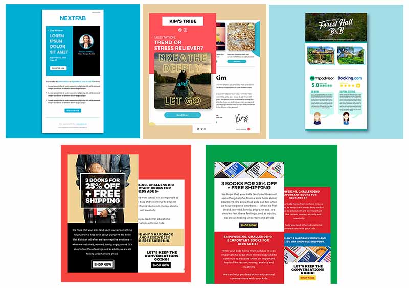
Sign up today and let ou r team create your best email designs.
Final Thoughts
Email may be an old medium for marketing, but the fact is, it’s still effective. More than any other platform, email helps brands create deeper relations with their audiences wherever they are in the world. Understanding email design best practices ensures that you’re doing everything right.
About the author

Celeste Zosimo
Celeste is a former traditional animator and now an SEO content writer specializing in graphic design and marketing topics. When she's not writing or ranking her articles, she's being bossed around by her cat and two dogs.


