
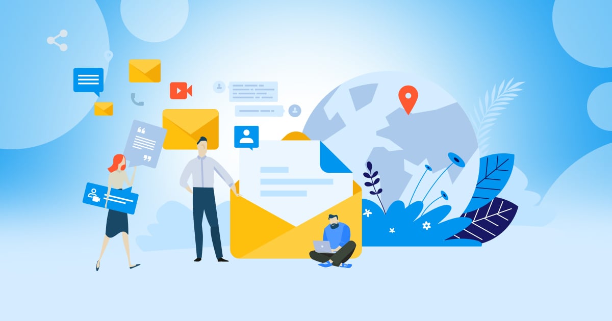
With the advent of social media and the deluge of messaging apps, you’d think that email is dead. According to SaleCycle, 73% of marketers said that the ROI of email is “Good” or “Excellent.” An OptinMonster study shows that 92% of adults use email as their online channel of communication. We could go on and on about statistics, but one thing is for sure, email marketing is far from being over.
However, around 35% of emails are left unread, says email management company Mailbird. How do you work around that dilemma? The solution is email graphic design for your newsletters. And this is where Penji can help you. Watch our demo video here to learn more, plus check out our email graphic examples at the bottom of this article.
Why Use Email Newsletters?
If giving updates and news to your customers is the only reason to use email newsletters, you’re missing out on so much. Newsletters offer a myriad of benefits, here are a few:
Boost Sales
A Convince & Convert study found out that 68% of millennials claim that promotional emails influenced their purchasing decisions. Unknown to many entrepreneurs and marketers, emails have the power to highlight a product, explain its features, and relate it to the point of sale in minutes.
Drive Website Traffic
Attracting visitors to your website is no easy feat. But if you want to make this task less challenging, use email newsletters. You can use them to invite people to visit your site. You can also give them incentives to browse around and possibly purchase.
Build Customer Connections
Social media can be a great platform to get to know your customers. But you reaching out through email newsletters makes it more personalized. You can use them to provide content that can be useful for your customers even beyond sales.
Related Post: 10 Tips That Will Make An Email Stand Out
Who Needs Them?
If you want to boost business sales, drive web traffic, and connect with customers, email newsletters are for you. The New York Times is a concrete witness to this. A study showed that their web visitors are twice more likely to become paid subscribers if they become newsletter subscribers first.
While it’s true that some companies can benefit more from it than others, generally, email newsletters are a great marketing strategy. The publishing industry has proven its effectiveness but so do these:
- E-Commerce businesses
- Retail
- Hospitality industry
- Luxury brands
- B2B and B2C companies
Email newsletters are attainable and straightforward. Even if you think your business isn’t one to benefit much from it, there’s no harm in using them. You’d be surprised to know that it offers more good than harm.
Why is Email Layout and Design Important?
Thinking of design only as an afterthought when crafting your email marketing campaign is a common mistake. Great design can improve your email content. Conveying your message and enticing recipients to take action is tied to good email layout and design.
Little do most entrepreneurs know that elements such as the number of columns, images, or CTA buttons are part of the design process. And doing it right means getting your message across clearly. It also means that good design can compel readers to take action.
In short, email layout and design get the readers’ attention to read more. Then it lets them navigate through the email the way you intend it to be. In addition, responsive design displays your content in the best way possible.
Related Post: Email Layout Guide to Improve Your Funnel’s Responsiveness
Types of Graphics that Go into Emails
The right email layout should lead the readers’ eyes towards the most crucial part of your message. For this, you can include whatever you think the email needs. But as a general rule, here are the graphics that you should have in your email layouts:
- Your logo
- Brand colors
- Your fonts
- Call-to-action buttons
- White or negative space
- Other graphics such as illustrations, images, or videos
While an all-text email can serve its purpose of informing your recipients, graphic design can give you better results. Humans are visual creatures, and we retain more information if we see data in visual forms. Make your emails resonate with readers by adding email graphics to them.
Email Graphic Examples
And now, we list the top email graphic examples to inspire you in creating the ultimate newsletter. Here they are:
Firefox
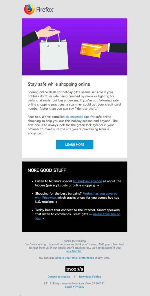
Staying safe online is everybody’s concern. Right off the bat, this email newsletter from Firefox tells us how to. The email capitalizes on the urgency of learning how we can avoid falling victims to unscrupulous people online. The imagery they used is straightforward and simple, very much like the essence of the whole email.
The “six essential tips” has a link that cleverly highlights the message even more. The email is filled with useful call-to-actions, which makes it worth reading. Plus, it offers a guarantee that their website will get a boost in traffic. Win-win.
Plum Guide

Instead of thinking hard about what email graphics to use, let your content sell itself. This newsletter from Plum Guide showcases their offerings beautifully. The email is long but never dull as it lists real estate properties that are visually appealing.
The email has an excellent structure that makes it easy to navigate through. When using photographs, make sure to add image alt texts or alt tags. This is to add context or identify the pictures quickly should the email download speeds go slow.
Resy
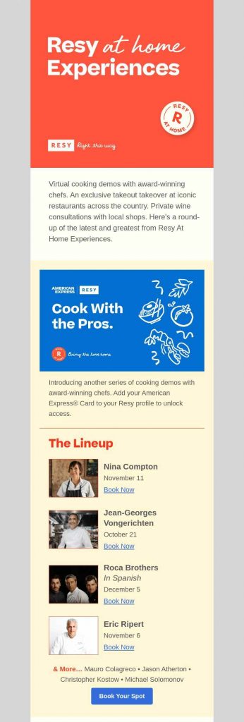
What makes this email from Resy easy to digest is how the info was divided into blocks. The blocks give the readers one piece of information at a time and remarkably lead the eyes in the right direction. The addition of colors helps with the blocking and gives it a vibrant look and feel.
This email layout style is perfect if you have multiple messages you want to send. Blocks or colors can separate information and make the emails more comfortable to read.
Cole Haan
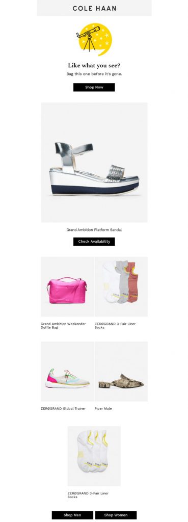
As an answer to abandoned carts, Cole Haan sent out this retargeting email. Included in the email are some of the items you can find on the website. It has presentation tables, live texts, and hover effects on a responsive design. It was designed to be viewed on any size device, which makes it accessible.
Notice how the email uses only small-size fonts, which places emphasis on the products. It has an immaculate and crisp layout with ample white space all around. Overall, an aesthetically pleasing email and one that matches the brand’s personality well.
Dense Discovery
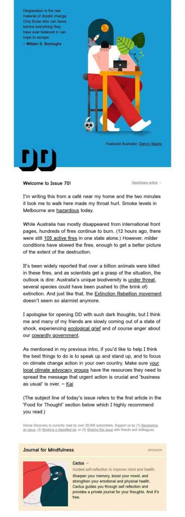
Using custom illustration is what made this email from Dense Discovery stand out. Primarily a weekly newsletter, the people behind Dense Discovery can be considered authorities on creating the ideal newsletter. The email has pictures, video links, and even a GIF which makes it information-laden.
Email newsletters from Dense Discovery are a joy to receive as going through it feels like reading a magazine. If there’s only one email graphic example you should copy, this one is it.
Tattly Temporary Tattoos
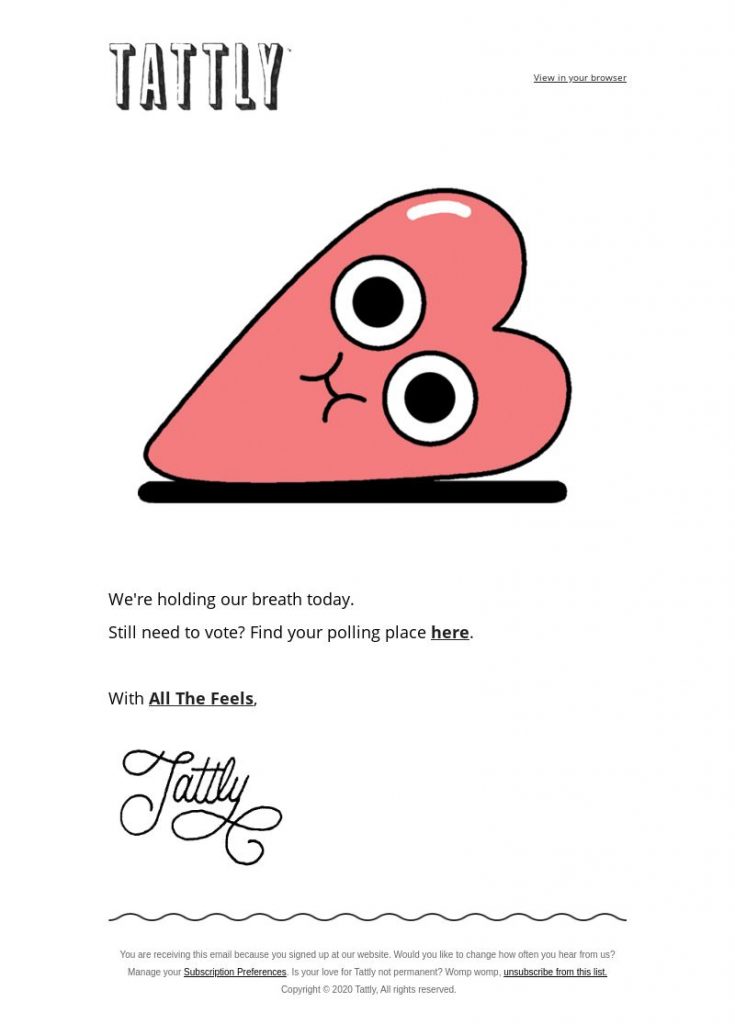
Selling temporary tattoos is what Tattly does best, but looking at their email newsletters, you’ll realize they’re multi-talented. This email is cute, quirky, and short. What’s not to love about it?
Its subject line reads, “We’re holding our breath.” and goes on to provide a link to your voting place. It’s great that it is doing a public service while reminding its customers about the brand. The illustration is typical of what the choices are for their temporary tattoos.
Tupperware
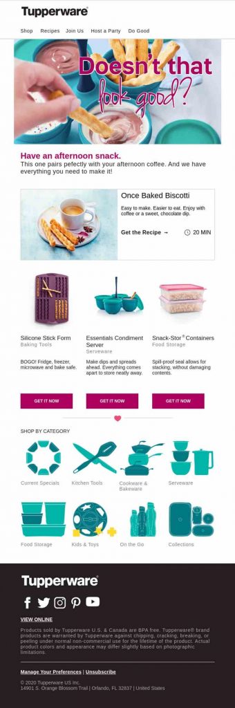
When creating an email newsletter, make sure that you focus on your customers more than your brand. Take a cue from this email from Tupperware. It shows how you can use their products and have tabs to click if you want to host a party or get recipes.
It’s evident in the email that the recipients are first and foremost in Tupperware’s mind. Even the subject line, “Don’t you deserve a treat?” makes it all about their customers. The use of high-resolution images adds to the beauty of the email.
Rock Candy Media
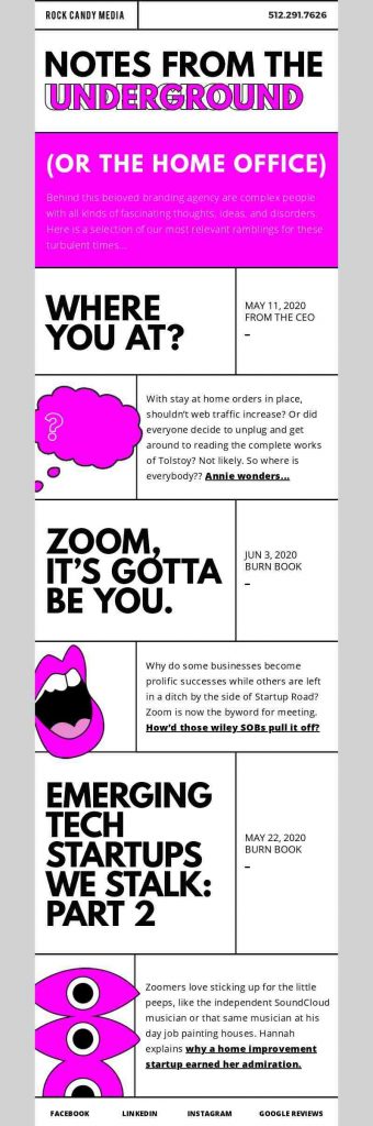
Digital marketing company Rock Candy Media uses bright colors to make their email pop. The neon pink color it used grabs the attention so well, it instantly adds a dynamic personality to the brand. Again, we see the blocking style that adds to the edgy look of the graphic email design.
The content talks about discerning nerds, but the email’s overall design and layout ooze awesomeness at a very high level. If being cool is what you want to achieve, this is the way to go. A splash of trendy colors, lively illustrations, and efficient layout make this an email worth emulating.
Dims
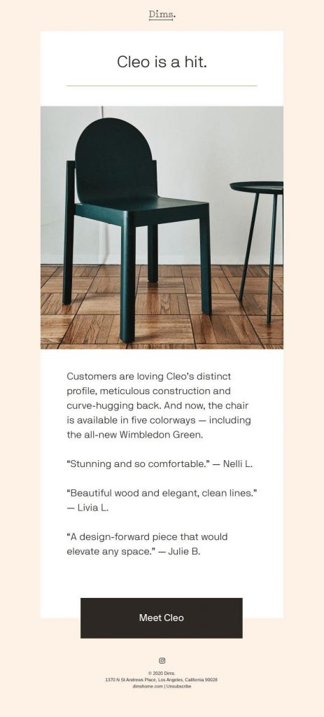
Less is definitely more, says this email from Dims, the furniture company. It has one headline, one description, one CTA but still looks amazingly good. The lone image is doing an excellent job of representing the company.
Its minimalistic approach makes it easy on the eyes as there isn’t much to distract you. The sleek design of the chair is more than enough to stand on its own. No bells and whistles are needed.
Namecheap
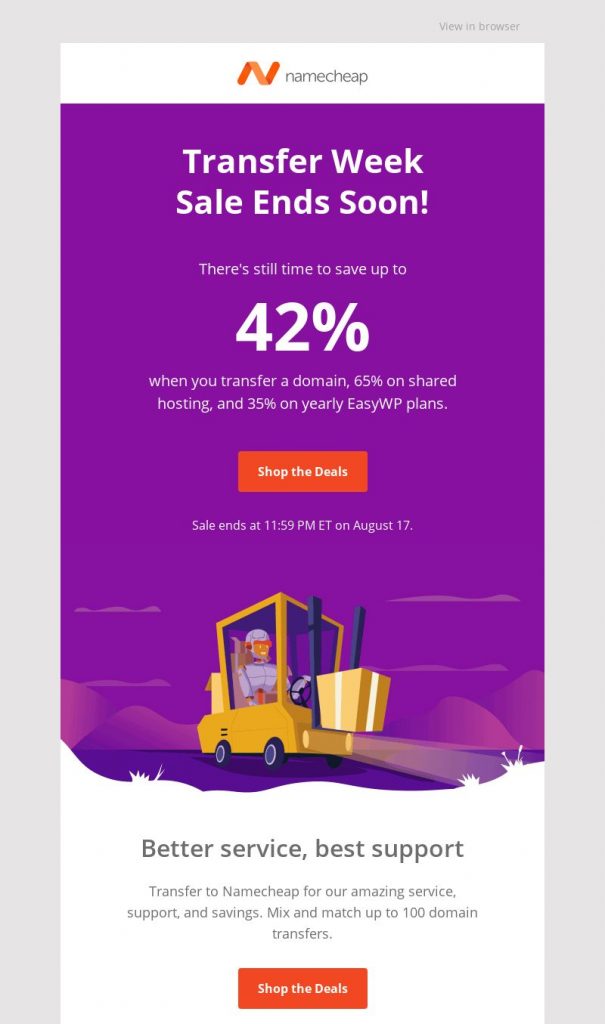
Website builder Namecheap takes advantage of the FOMO (fear of missing out) strategy with this email graphic example. The headline itself will make recipients take action as it also offers a huge discount. The colors and illustration give the email a nice blend of urgency and lightheartedness.
Its texts are down to the bare minimum, but the CTAs point you to what you should do next really well. This is solid proof that email graphics can improve the content and get the message across better.
Related Post: High-Performing Email Campaign Design Examples (+ Email Checklist)
Designing Email Graphics
When creating an email newsletter, you need to consider a multitude of factors: the colors, number of columns, the font types, the layout, and of course, the images. There could be more, but these are the basics.
If these seem overwhelming, there is a solution. Penji is an unlimited graphic design service that provides you affordable email graphics. You can send requests for as many email graphics as you can at a flat, monthly rate.
Our plans get you not just email graphics but many other visual assets. We make logos, web and app designs, social media graphics, and many others. You won’t be tied down with a contract. You can unsubscribe any time you wish. Watch our demo video here to learn more.
Final Thoughts
Having the ultimate newsletter takes considerable effort. There are plenty of things you need to learn and understand. But don’t let that get in the way of having a great one. Help is here in the form of an unlimited graphic design service, Penji.
Our professional graphic designers can whip up the most suitable email graphics for your brand. Sign up today to make your first design request.
About the author

Celeste Zosimo
Celeste is a former traditional animator and now an SEO content writer specializing in graphic design and marketing topics. When she's not writing or ranking her articles, she's being bossed around by her cat and two dogs.


