

Email marketing is undoubtedly one of the most vital strategies to grow a brand in the age of the information superhighway. If you’re still hesitant to take on the challenge, just think of the 306.4 billion emails sent and received every day in 2020. This number is only expected to rise to more than 361.6 billion daily emails in 2024. Given these figures, piecing together your email marketing design today means giving your brand the boost it needs to thrive in the next few years.
For instance, many of our clients here at Penji regularly request email design graphics that make a mark. They know just how crucial excellent design is when speaking to their audience, and they want to make the most out of every tool in their arsenal to establish trust and brand loyalty. In this article, we’re counting down 18 email design templates collected at Really Good Emails to inspire your campaign this 2021. Take a look at each design and see what elements you can adopt to give your email marketing strategy a shot in the arm.
1. Consider Visual Texture
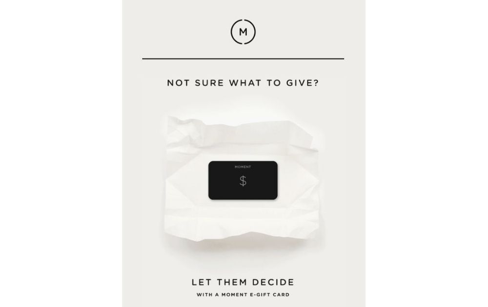
Image Credit: Moment Inc
Add a dose of visual interest to your emails by including texture that grabs viewers’ attention. For instance, this email from Moment features a gift card sitting on top of white wrapping paper.
The palette and typography may be simple, but the image texture really pops out! But despite making the email look more interesting, the texture doesn’t distract from the star of the email, which is the gift card.
Takeaway: Play around with texture, shading, and shadows to give depth to your image.
2. Experiment with a Monochrome Palette
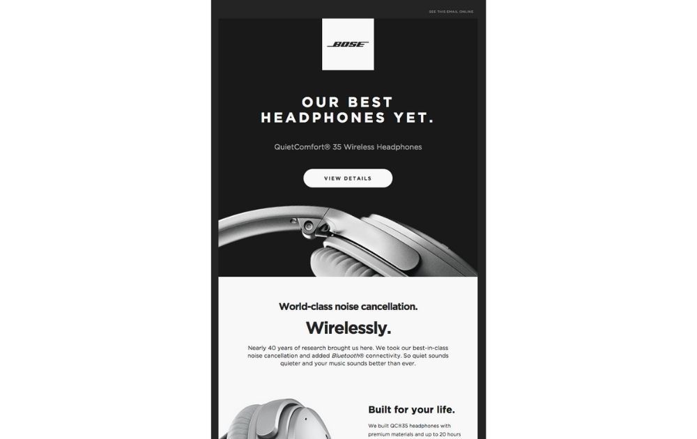
Image Credit: BOSE
The color palette is a huge part of email marketing design, for sure. However, a lack thereof can also work just as well.
Just take a look at this email from Bose. The black, gray, and white tones may be simple, but the layout and visual details of the product make for a stunning image.
Takeaway: You don’t have to make every email an explosion of colors. Sometimes, a monochromatic look can direct more attention to the product or service you’re promoting.
3. Use Visual Dividers
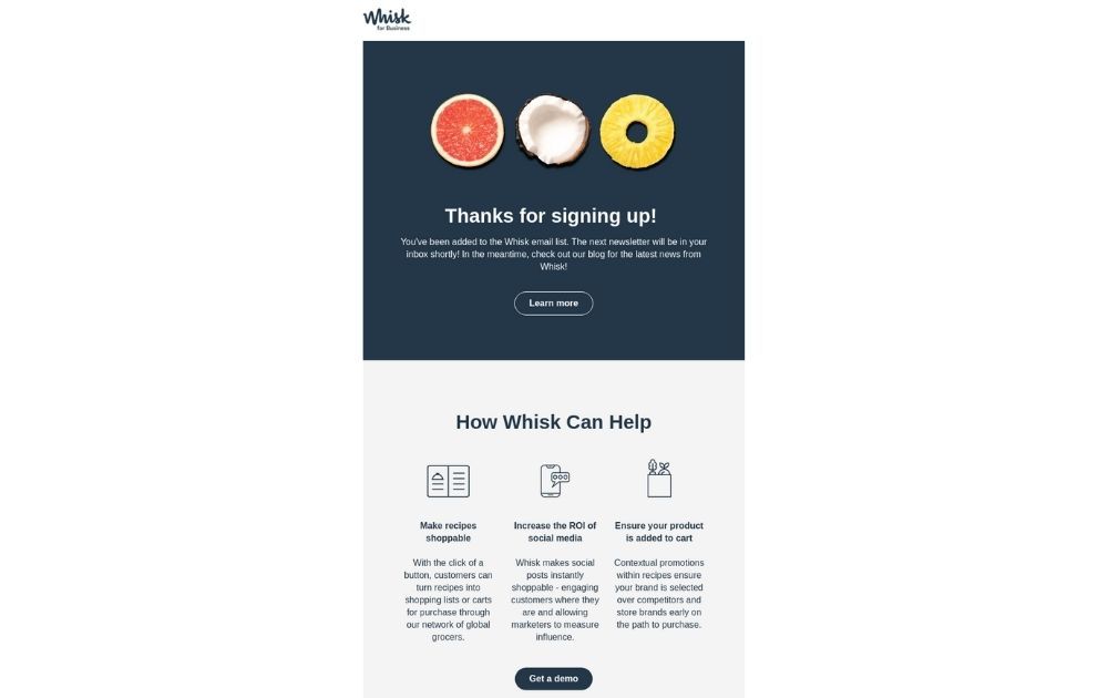
Image Credit: Whisk
There may be times when a single email may have more than one message. For example, this email from Whisk welcomes the recipient and thanks them for signing up to the email list. But aside from that, the email also works to educate the reader about what the brand can do for them.
The email made use of color blocks to separate one section from another. As a result, it delivered both messages smoothly without overwhelming the viewer.
Takeaway: Organize your email design into sections to guide your viewers’ eyes to each part of the image.
4. Less is More
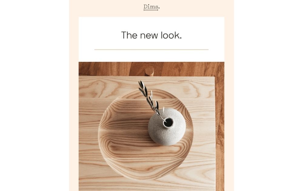
Image Credit: Dims
When it comes to executing the best email marketing ideas, less is more. After all, we need to deal with shorter attention spans in this day and age, and simplifying content for the audience is vital.
Take this email from Dims, for example. The above-the-fold shows one image – a light grey vase on a wooden tray atop a table, with the wood flooring visible below. It’s simple, elegant, and makes you want to stare at it for a long time.
Takeaway: Let your audience focus on one element at a time. This way, you’ll steer them clear of info overload and will have better chances of catching their interest.
5. A Marriage of Copy and Visuals
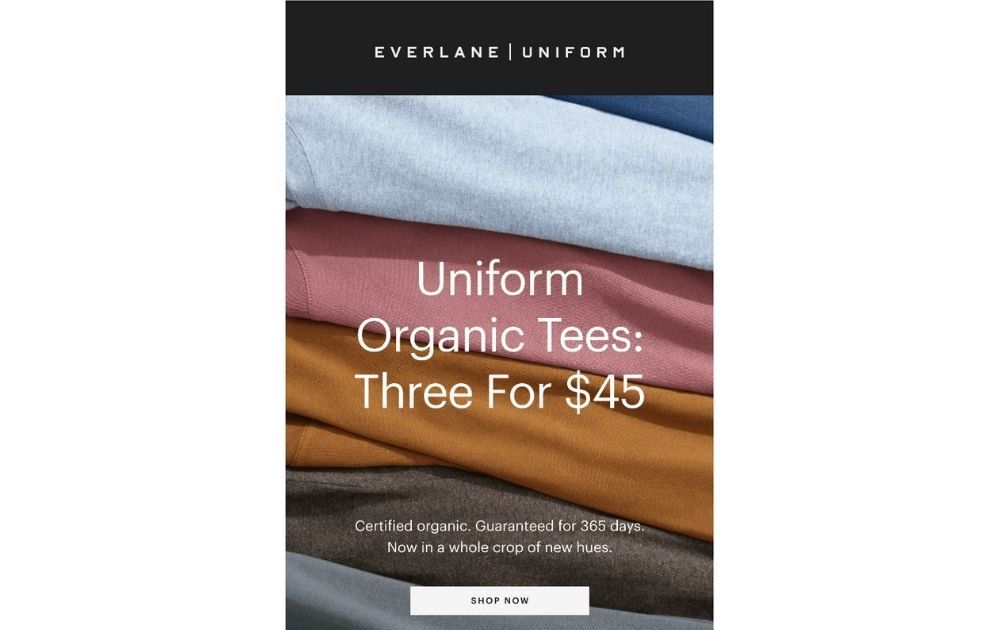
Image Credit: Everlane
Here’s how many marketers create an email: they write the copy, choose a stock photo that looks relevant enough, and hit send. However, it’s always best if your copy and visuals meld perfectly – it creates a more powerful message.
Fortunately, it doesn’t take a lot to make it work. For instance, the copy in this Everlane email says “Three for $45,” and the text directly goes over three different colors of garments layered together.
Takeaway: Pay close attention to tying your copy and visuals together. Whether you’re using beautiful photos or book illustrations as email images, make sure that it works to complement your copy and vice versa.
6. Consider Infographics
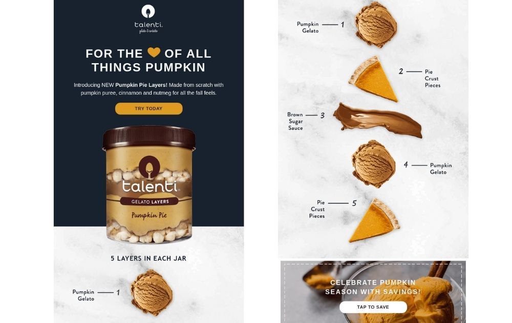
Image Credit: Talenti
If you find yourself in a situation where you need to explain something complex to your audience, go for infographics.
For example, this email from Talenti wanted to inform the readers about the layers that go into every jar. However, merely enumerating the components would be boring and textbookish. So, they decided to explain the layers using a vertical line of beautiful visuals.
Takeaway: Infographics are an excellent way to explain a concept in a more exciting medium.
Related Post: Effective Email Header Design Best Practices (with Examples)
7. Spin Tradition
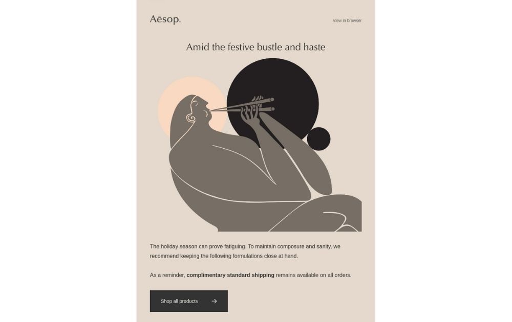
Image Credit: Aesop
Holiday emails don’t necessarily mean you need to throw a melange of green, red, and white onto your readers’ inbox. In fact, you can give tradition a little twist and break away from all the imagery festooned with gifts, string lights, and snow.
This email from Aesop focused on how their skincare products can be a self-care regimen during a stressful season.
Takeaway: Fight the urge to use traditional email marketing design templates. Instead, find the unique role your brand plays and build your campaign from that.
8. Photo + Illustration
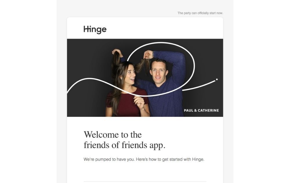
Image Credit: Hinge
This email from Hinge makes you look twice – is it an actual photo or an illustration? These types of blended visuals spark interest. And when it comes to any marketing effort, keeping your audience’s attention longer is always a good thing.
Takeaway: Make your email look eye-catching by blending photos and illustration in a seamless design.
9. Neat and Organized is the Way to Go
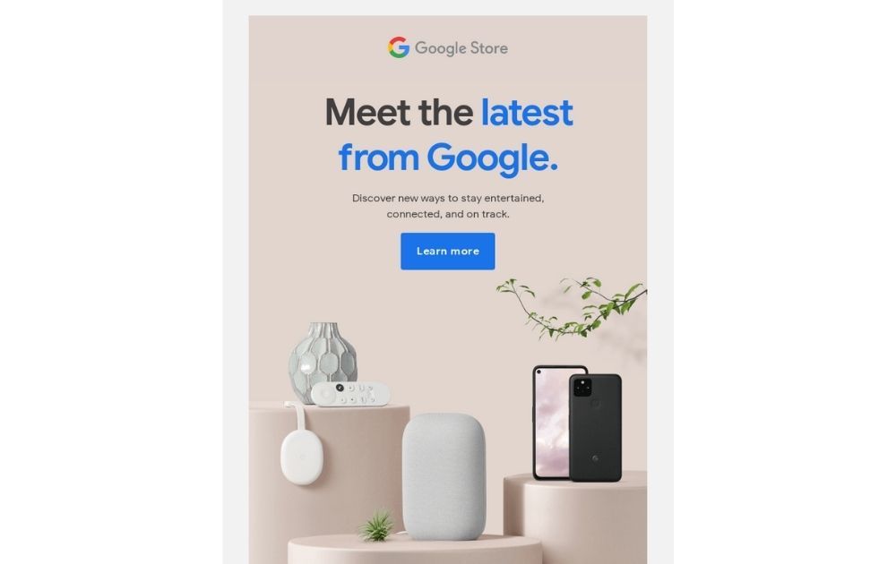
Image Credit: Google Store
One of the most common amateur mistakes when it comes to design is trying to fill the entire page with images. However, that’s not a good practice to do if you want to direct attention to your message.
If you need to promote more than one product, make sure to organize them into a neat layout with ample space in between each component.
Takeaway: The best email designs use negative space to give the image and text allowance to breathe.
10. Keep it Short
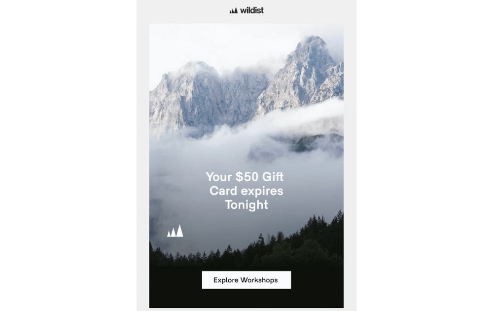
Image Credit: Wildist
When it comes to email marketing design and any other marketing visual for that matter, the shorter the copy, the better.
Take a cue from this email from Wildist. The copy has eight words in total and that already includes the text on the call to action button. Instead of bombarding the readers with a slew of words, the design lets the beautiful photo do all the talking.
Takeaway: Keep your copy short and straight to the point. Most email readers don’t have all day to read a big chunk of text anyway, so it’s best to get your message across efficiently.
11. Minimalist Never Goes Out of Style
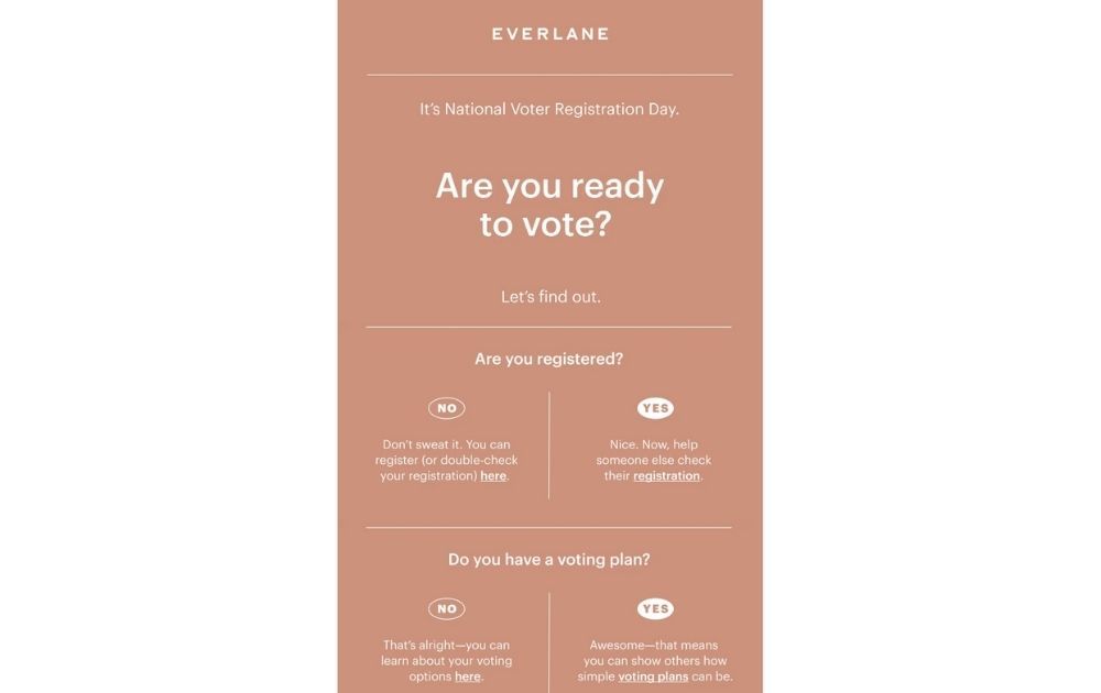
Image Credit: Everlane
One obvious quality of an image made by a pro email marketing designer is that it doesn’t overwhelm the eyes. Just take a look at this minimalist email by Everlane for National Voter Registration Day. The design is super basic – a sans serif typeface over a uni-colored background and unadorned, thin lines.
Takeaway: When in doubt, keep it simple. You wouldn’t want to ride design trends only to look like you’re trying too hard.
12. Go Dark
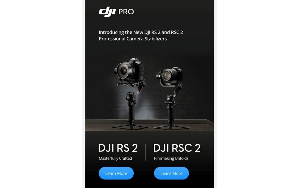
Image Credit: DJI
A survey conducted by Google Germany Developer Advocate for the Web at Thomas Steiner found that 82.7 percent of respondents said they use Dark Mode.
In this light, a dark palette may contribute to the best email designs for fans of Dark Mode. For example, this email from DJI Pro uses dark hues that make the light CTA button pop.
Takeaway: A dark palette can make your email easier on the eyes, especially for readers who use Dark Mode. And for those who don’t, the email will offer their eyes a much-needed rest from the bright LED panel.
Related Post: High-Performing Email Campaign Design Examples (+Email Checklist)
13. Gear the CTA Button for Success
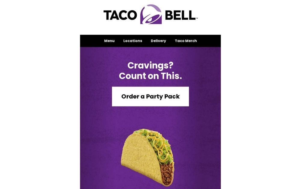
Image Credit: Taco Bell
The call-to-action button is a mainstay of email design templates. It might be a small and humble part, but it’s one of the most crucial components of an email.
This promo announcement from Taco Bell, for instance, cleverly uses a white button against the dark background. It also places the button high on top of the design, with a text that seems to offer a solution.
Takeaway: Take the time to give your CTA button a lot of thought. Make sure that all its elements – from the text and color to its placement – all harmonize to invite your reader to click.
14. Choose the Color Palette Carefully
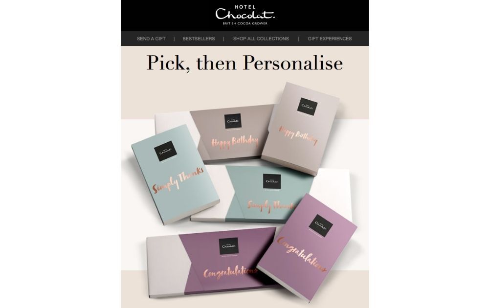
Image Credit: Image Chocolat
Nailing the color palette can be the secret to sending really good emails. Take a look at this email from Hotel Chocolat, for instance. The background complements the color of the product boxes, making for a beautiful and elegant image.
Takeaway: Choose a palette that will let your products shine their best.
15. Personalize Whenever You Could
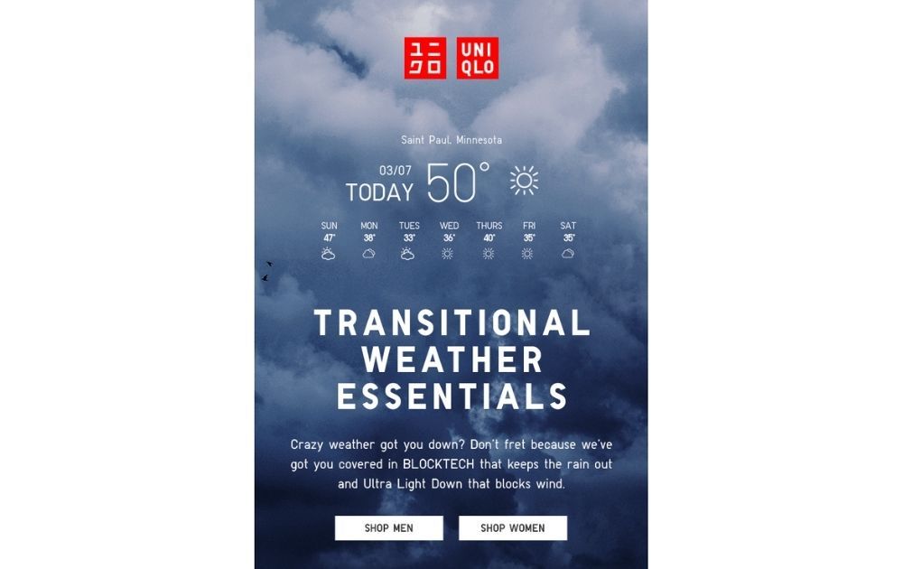
Image Credit: Uniqlo
A generic email marketing design can appear “spammy” and instantly turn people off. To avoid this, aim to customize your emails to appear more personalized.
For example, this email from Uniqlo customized the content according to geographical locations. As a result, the email seemed relevant and helpful to the reader, rather than looking like they just want to close a sale.
Takeaway: Personalize your emails through segmentation to make each piece seem tailor-fit for the recipient.
16. Offer Options
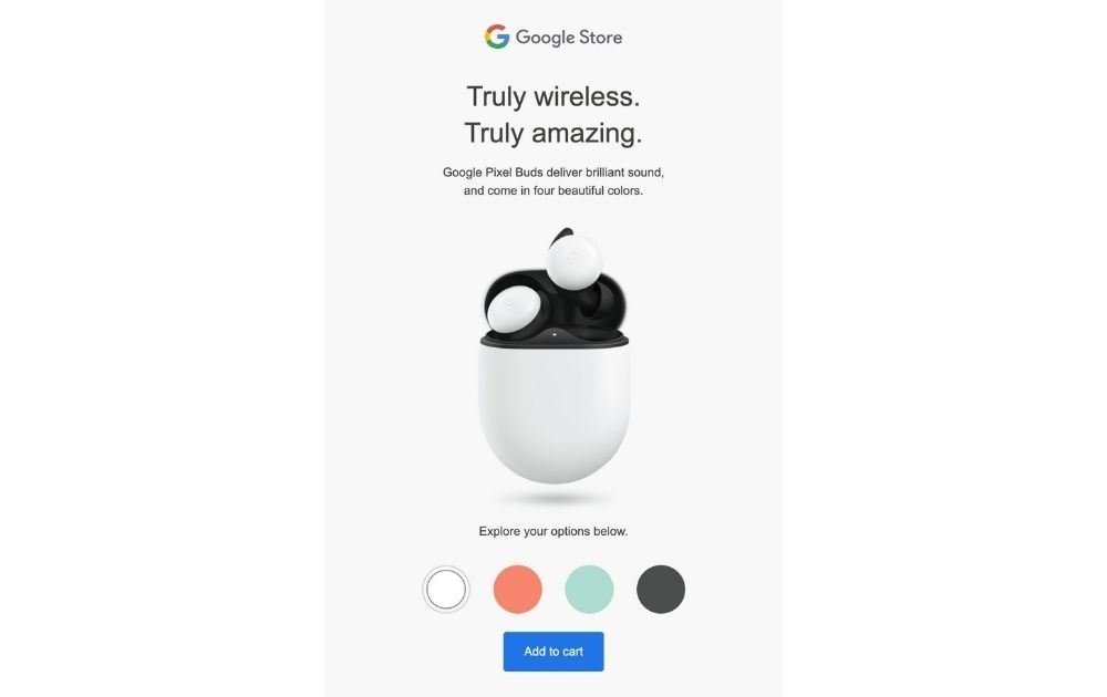
Image Credit: Google Store
Consumers love options. From sizes and varieties to colors and features, offering your audience options is surely a great idea. Take this email from Google Store, for example.
The email allows users to change the color of the product by clicking on the palette below. And cleverly so, once they find a hue they love, they can proceed to the CTA button that says “add to cart.”
Takeaway: Improve your audiences’ experience by designing your email to offer quick options. This way, you’re encouraging your readers to imagine themselves using the product and hopefully persuade them to slide down the sales funnel.
17. Keep it Interactive
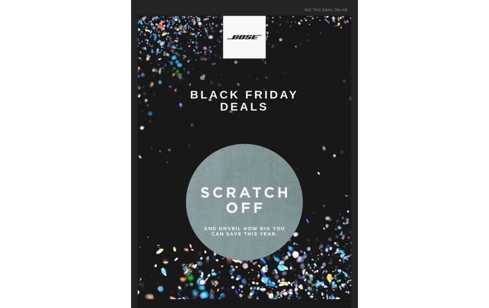
Image Credit: BOSE
If you want active engagement from your readers, don’t treat them as passive audiences. One way to encourage action from your recipients is to make your emails as interactive as possible.
For instance, this email from bose asks readers to “scratch-off” the silver part of the email, reminiscent of an old-school scratch card. It might not seem like much, but it surely earns brownie points with readers.
Takeaway: Interactive emails make your readers feel empowered. As a result, they engage better with your brand.
18. Responsive Design All the Way
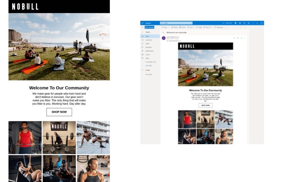
Image Credit: NOBULL
Data from Statista tells us that by the third quarter of 2020, 50 percent of website traffic came from mobile. That said, if you’re only designing your emails for mobile, then you could be alienating the other half of your audience.
Fortunately, there’s a simple solution to this issue: responsive design. Just take a look at this email from Nobull. It looks just as great on mobile as on desktop.
Takeaway: Email marketing design size is crucial in enabling your audience to view the message in the most optimum way possible. Making sure that you have a responsive design can help boost your campaign’s effectiveness across audience segments.
Conclusion
There you have it – email marketing design practices that will make it big in 2021. Hopefully, knowing the trends in email marketing can help gear your campaign for success. But remember: applying these design ideas is only half the job. The other half lies with reviewing your analytics and getting to know your audience to build campaigns that connect better with the recipients.
If you need help crafting creative email templates as you focus on other aspects of your campaign, give us a holler here at Penji! We offer unlimited designs and revisions at a flat monthly rate, so you won’t have to spend a small fortune.
We offer a turnaround time of 24 to 48 hours so you can stay on top of your campaign schedule. Best of all, we have the top 2 percent of designers, so you can rest assured that we’ve got the creative chops. Are you excited yet? Try any of our packages risk-free for 15 days and see why our clients love us to bits.
About the author

Carla Deña
Carla is a journalist and content writer who produces stories for both digital and legacy media. She is passionate about creativity, innovation, and helping small businesses explore solutions that drive growth and social impact.
Table of Contents
- 1. Consider Visual Texture
- 2. Experiment with a Monochrome Palette
- 3. Use Visual Dividers
- 4. Less is More
- 5. A Marriage of Copy and Visuals
- 6. Consider Infographics
- 7. Spin Tradition
- 8. Photo + Illustration
- 9. Neat and Organized is the Way to Go
- 10. Keep it Short
- 11. Minimalist Never Goes Out of Style
- 12. Go Dark
- 13. Gear the CTA Button for Success
- 14. Choose the Color Palette Carefully
- 15. Personalize Whenever You Could
- 16. Offer Options
- 17. Keep it Interactive
- 18. Responsive Design All the Way
- Conclusion


