
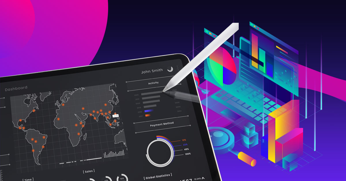
For some people, there’s nothing more engaging than a well-organized table of in-depth data. For the rest of us, there’s data visualization.
Data visualization empowers businesses by condensing vital information into an exciting visual format. It became especially en vogue during the height of COVID-19. Who among us didn’t compulsively check out maps and line charts of new cases?
While data visualizations are a great way to stay informed, they can also be a great help for your business. Here are 15 different data visualization examples to inspire you.
What is data visualization?
Data visualization is fairly self-explanatory. People usually think of data as referring to numbers and statistics, but any collected facts can be considered data. Data visualization is all about making those facts easy to digest using graphic design.
What’s the difference between a data visualization and an infographic?
There’s a lot of overlap between data visualization and infographics. Most infographics include some kind of data visualization, but the term is a little more specific.
Any chart, graph, map, timeline, etc. that conveys data is a kind of data visualization. An infographic, on the other hand, is a single design meant to convey a particular message through data and information. They often include multiple charts alongside text and images.
What can data visualization do for your business?

Sometimes abbreviated as “data viz,” data visualization has huge implications for business. Making your audience feel informed is a great way to build trust. It’s easy to glaze over at a collection of facts and figures, but data viz can make the important info stick in your head.
Below, you’ll find 15 examples of how data visualization can help your business. These include analyzing consumer trends, assessing risks, tracking progress, learning from mistakes, and much more.
[in_content_ads gallery=”logos” logo=”on” title=”Need graphic design help?” subtitle=”Try Penji’s Unlimited Graphic Design and get all your branding, digital, print, and UXUI designs done in one place.” btntext=”Learn More” btnlink=”https://penji.co”]
15 best data visualization examples
All of these data visualization examples were prepared by the expert designers at Penji.
Example #1 — Introducing your brand
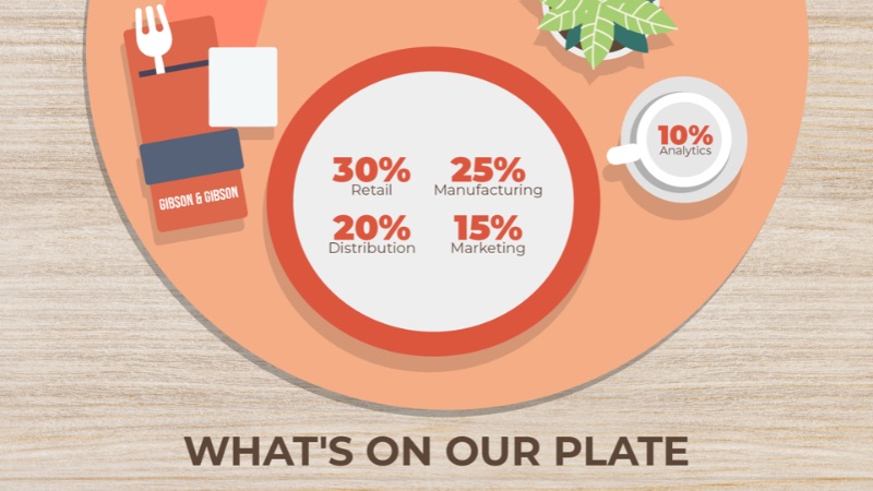
When your business is growing, you often have to condense your pitch into a bite-sized package. If you’re pitching to investors, courting leads, or welcoming new employees on board, stylish visualizations of data can help you stand out.
In the above example, data viz is used to describe the breakdown of a company’s operations. It can also be used to portray your company’s size, scale, budget, and any other info you want to share with your audience.
Example #2 — Quarterly reports
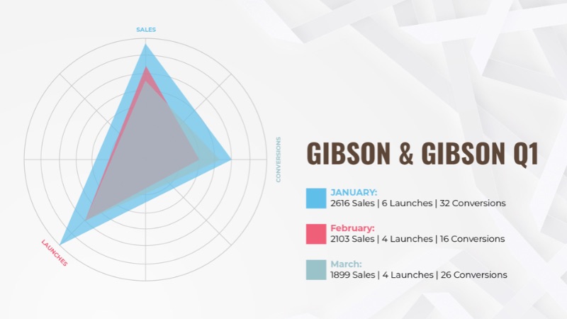
Quarterly financial reports are a requirement for publicly-traded companies, but they can also be an opportunity. Giving investors and team members an update on how the company is doing is crucial for moving forward.
Here, a radar triangle is used to compare a few different data points for growth. The company has seen a decline over the quarter, but has made some promising growth in the latest month.
This chart imparts an important lesson: don’t sugarcoat your data. Displaying your company’s pitfalls is just as important as showcasing success if you want to continue to grow.
Example #3 — Analyzing consumer trends
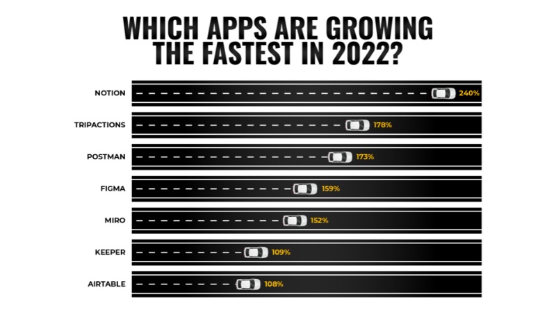
No matter what industry you’re in, you need to stay on top of your customer base. It’s the reason most modern brands are heavily invested in social media. The more connected you are with your customers, the more likely they are to feel positive about your company.
Data visualizations can use visual metaphors to help convey their message in an instant. Here, we spiced up a simple bar graph with cars on a racetrack, conveying the forward momentum these apps have.
Example #4 — Understanding studies
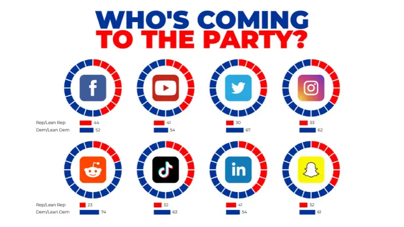
One of the most common uses of data visualization is to make sense of findings from studies and polls. Graphic design can help put studies into context, giving weight to what the numbers on the page actually mean.
In this case, Pew Research data is visualized in semi-pie charts to show the breakdown in party affiliation among US social media users. As you can see, users of these 8 major social media platforms tend to disproportionately lean Democratic, with Facebook being the closest to a proportional balance and Reddit being the furthest.
For businesses, analyzing study data can be the first step towards making changes. A social network might use this data to inform policy changes. Are Republicans being turned away from the platform, or are they just less likely to use new social media in general?
Example #5 — News
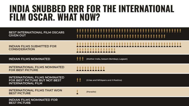
Just like studies, news can sometimes present information that needs to be put in context. What does this story mean for your industry? Has it happened before, and if so, what was the fallout? All these questions and more can be answered through data visualization.
The above data visualization example uses recent news in the film industry. India neglected to submit RRR, a fan favorite film, as its candidate for the 2023 Best International Film Oscar. This graphic gives you an idea of the film’s uphill battle.
Every business should be keeping up to date with the latest news in their industry. Data viz can help you make sense of what the news really means for your company.
Example #6 — Education
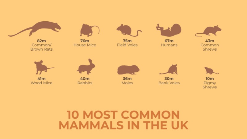
Making data easy to digest has obvious benefits for education. A visual aid can help people of all ages learn new concepts more quickly and remember them for longer.
The above graphic displays the 10 most common mammals in the UK. The data presented may seem random, but these figures can be useful for conservation organizations and pest control alike.
You can use data visualizations like these to help raise the overall knowledge level of your team. If you work in tech, graphic design can help teach your sales and marketing team about the nitty gritty. For a law firm, you can share important legal tips and local laws with your clients. The possibilities are endless.
Example #7 — Improving workplace culture

Every employer has an interest in keeping their employees safe and satisfied. Data visualization is one of the tools you can use to share resources with your team.
The above example deals with burnout. It’s a problem most of us have faced at one point or another, and one that can cause long-term issues if you don’t address it. This graphic may help team members recognize when they’re feeling burnt out and develop a healthier work-life balance.
Example #8 — Launching a new product
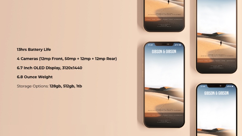
A product launch is one of the classic use cases for data visualization. Especially in tech, you need to convey how superior your product is on a technical level without boring your audience.
Slick graphic design can make or break your product launch, whether you use stylish charts or carefully-created text. If you’ve ever seen Apple announce a new phone, you’ve noticed how effortlessly they convey features like camera size, battery life, weight, and storage options. Even outside of tech, well-displayed data can make a product launch more exciting.
Example #9 — Going green
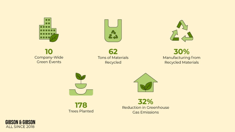
Nowadays, everyone is looking to make an environmental impact. Sustainable brands are getting bigger and established names are always looking to reduce their carbon footprint.
How can data visualization help? In this example, cute visuals are used to help showcase a company’s progress with their recent green initiatives. On top of charting the course for green initiatives, data viz can condense the latest scientific findings on the state of Earth’s climate and keep your team up to date on the latest.
Example #10 — Entertainment
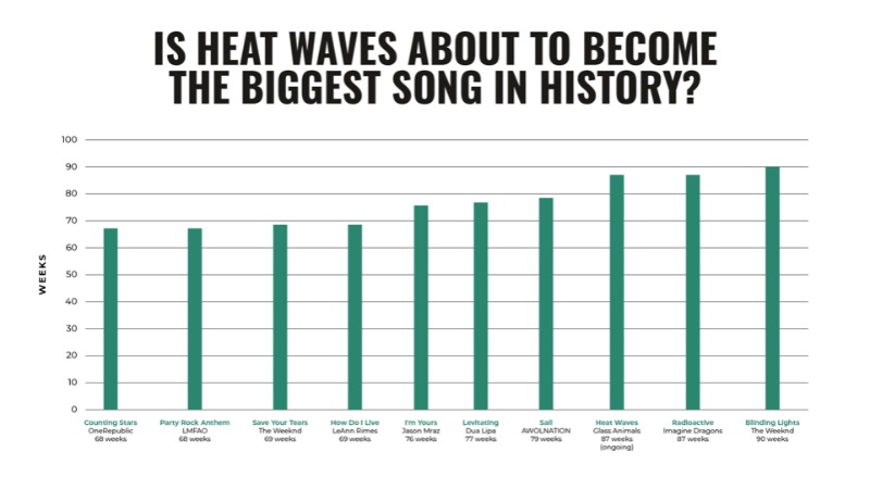
Not every data visualization example needs to be serious. Entertainment is an important part of building a strong workplace culture—and attracting new customers.
The above bar chart offers a new perspective on pop culture, specifically music. It shows the Glass Animals track “Heat Waves,” released unassumingly in 2020, in the heat of its record-breaking Hot 100 run. (Note: this chart was created before Glass Animals actually broke the record.)
Even if you work in the music industry, this data probably isn’t all that important for your business. But it’s an engaging piece of information that can spark conversations and create a more friendly workplace environment.
Example #11 — Assessing risks
As these previous data visualization examples have shown, data viz can help entertain, inspire, and excite. Just as importantly, it can save you from repeating mistakes and help you prepare for emergencies.
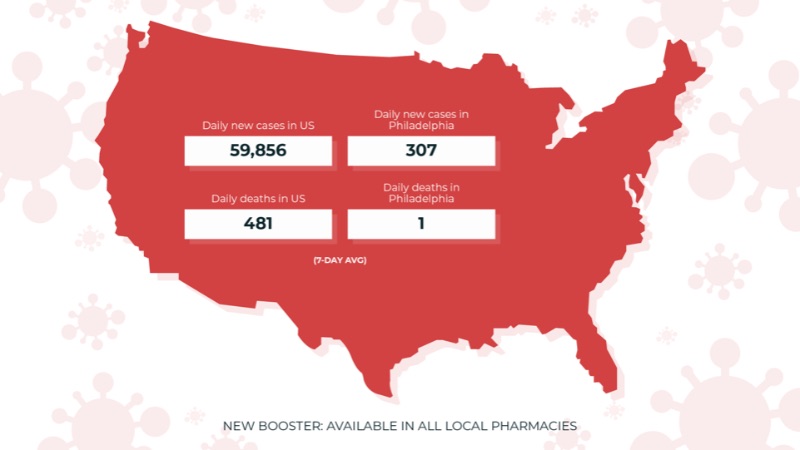
The COVID-19 pandemic has brought risk assessment back into focus for many companies. Even today, a single infection can threaten to upend your business operations. For an in-person business, assessing community risks and understanding data is vital.
Economic conditions, war, and other external events can have a huge impact on your business. Be sure to keep track of these risk factors so you can weather any storm you come across.
Example #12 — History
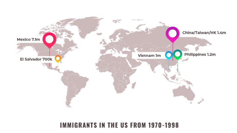
What’s that old saying about those who don’t learn from history? Data visualization from history can have advantages for education and entertainment, but it can also inform your business practices.
This map visualization of countries of origin for US immigrants from 1970-98 might seem like random trivia. But for a company that deals in immigration or targets an audience of immigrants, this history can help inform your present-day solutions. Where are these immigrants now? How and why have these figures changed since 1998?
Even if it’s not directly relevant for your team, being knowledgeable about history related to your industry helps you get a leg up on the competition.
Example #13 — Learning from mistakes
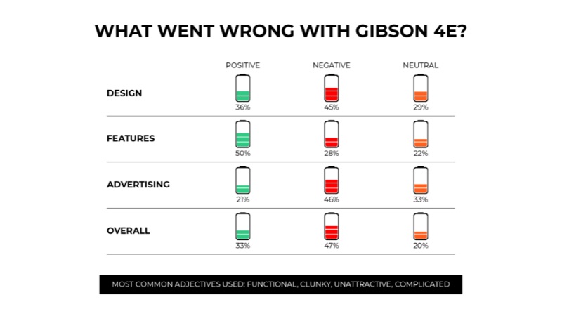
Not every product launch, ad campaign, or business maneuver will be a success. When something doesn’t connect with the public, the worst thing you can do is pretend it never happened. Once again, data visualization can help.
Our example looks at the public response to a new phone rollout. The polling data indicates that people were somewhat impressed with the phone’s features, but found it both poorly designed and poorly marketed. Synthesizing the important data makes it easier to assess exactly what needs to be fixed.
Example #14 — Tracking progress
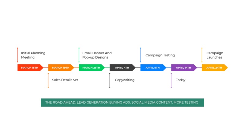
If you’re launching a large-scale project like a product rollout or ad campaign, it’s important to make sure your whole team is on the same page. With data visualization, you can combine different responsibilities into an easy-to-follow format.
Here, the timeline of a holiday sales campaign is presented in a simple, colorful format. You can see how much progress has been made as well as what work must be done in the remaining time period. This is a seamless way to streamline communication between teams.
Example #15 — Engaging new customers
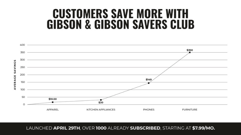
These data visualization examples can keep your team entertained, informed, and aware. But a striking design can catch customers’ attention, and enticing facts can reel them in.
In this case, a simple line graph illustrates the savings shoppers can earn with a Savers Club card. Cleverly, the savings are presented by average dollar value, creating a sensation of growth even though the percentage saved may be the same.
When creating data visualizations for customers, be sure to include only data that’s relevant to them—and that sets you apart from competitors.
Get unlimited data visualizations with Penji
These data visualization examples may cover different subjects, but they were all created in just one week by one of Penji’s expert graphic designers.
Penji is an unlimited graphic design service. For a simple monthly fee, you can get as many data visualizations as you need, as well as posters, merch, social media graphics, web design, and so much more. Check out our pricing page for more information.


