
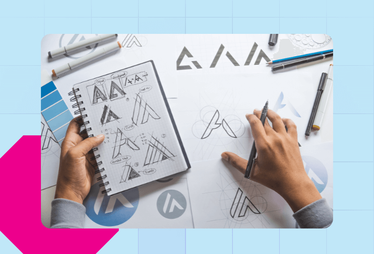
A common misconception about logo graphic design is that it is quick, simple, and easy. You just need to mix your favorite fonts, symbols, and colors to get a good-looking emblem for your brand. However, if you ask a seasoned entrepreneur, they’ll tell you the process is quite the opposite. It requires careful thought and planning.
Whether you’re planning to get a new logo or thinking of a redesign, these logo graphic design tips will help give your brand a boost.
Why the Need for Logo Graphic Design Tips?
Your logo goes beyond being your company symbol. It is the face of your brand. It’s what gives your business the visual identity that your customers and prospects can recognize instantly. It’s what will make your business stand out in the crowded market.
A well-crafted logo builds trust, projects professionalism, and creates lasting impressions. Startups and established businesses can benefit from a logo that sets the tone for branding while communicating your values at a glance. It’s what most people see about you, and when done right, it can be the most memorable part of your branding.
1) Take no chances
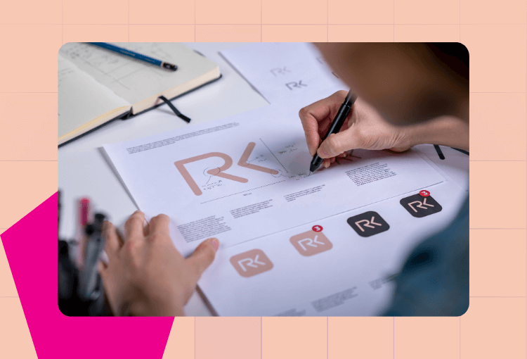
Let’s dive right in with the all-important first step. If you’re not a graphic designer, don’t design your logo. Sure, there are free tools on the market that can empower you to design logos. But while anyone can bang a quick project out in Canva or Pixlr, logos are serious business.
Your logo is the face of your business. It gives customers and passersby a first impression. Just like a person, a brand’s first impression can carry red flags that turn customers away. Anything from a poor design to an unprofessional font can seal your fate.
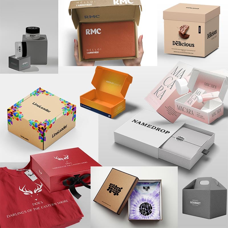
This is why it’s always important to hire a professional graphic designer. You may seek out freelancers to design a single project, but if you’re a company that regularly needs design work, you might prefer getting the help of a logo design service. Either way, Penji’s got your back.
Whether you’re a pro or working with a team, these next tips will help make your design pop.
Unique graphic design logos from the experts
Let Penji design your logos in 1-2 days


2) Know your logo’s audience

For any graphic design project, whether you’re creating or commissioning it, your first thought should be “who is this for?” For business designs such as logos, the answer should be obvious. A logo’s goal is to portray a brand’s image in a way that attracts customers.
The group you’re angling for may depend on what kinds of people would be interested in your service. For instance, an IaaS tool geared toward tech-savvy pros may look for an understated, technical logo. On the other hand, if that company is launching a SaaS product to reach a broader audience, they’ll want a more accessible logo.
Develop a strong idea of who your company wants to target. Their age, their interests, and their communities. You can design a logo that looks stunning, but it’ll land like a lead balloon if it doesn’t appeal to the crowd.
3) Find your graphic design inspiration
Once you’ve found your target audience, consider other companies that target the same audience. Above, we have a smattering of car company logos. Most of them are flat, shiny, and metallic, designed to look perfect on a car’s grille.
Still, we see some variation. Slimmer logos convey sleek luxury, while more rounded logos have a friendly appeal. Generally, pared-down metallic logos indicate modern utility, while colorful, ornate logos call to tradition.
Look to logos in your industry. How can you stand side-by-side with those logos while still standing out? The goal is to create something that feels distinctive, but not out-of-place.
4) Select your logo design style
Most logos can be broken down into three groups: text-based, symbol-based, and hybrid.
Beyond those three categories, there’s a lot of variation in how logos look. Graphic designers take inspiration from a variety of art styles, from cubism to art deco, to find the right look for their brands.
Today, the trend in logos is toward minimalism. Flat, simple, sans-serif logos are in vogue, partially thanks to an increased emphasis on mobile screen friendliness.
There are still reasons to create a logo that’s high-concept, especially if you want to convey nostalgia or tradition. You can also find a lot of variety in a minimal logo, as seen involved. Unique color schemes, fonts, and design styles can set you apart, as can this next tip.
5) Incorporate your brand identity
If you’re designing a first-time logo for a new brand, you may be starting from scratch with brand identity. In most cases, however, you’ll have some elements to work off of.
Think about your brand’s associated colors, fonts, and styles. Beyond that, consider the fundamentals of your brand. A natural, conscious brand may turn to earth tones and rustic designs. A fun product for a younger audience might seek out neon colors and cartoony symbols.
Think of your logo as the bellwether for your entire brand. What kind of brand will you be?
6) Make it memorable
Ensure that your design isn’t only leaning on one element to stand out. This can be done subtly; you don’t need to rely on cartoon characters or shock value to leave an impression (unless you happen to produce children’s cereal). You just need to combine all the elements that make your brand unique.
Are you more accessible than other brands in your field? More refined, faster, friendlier? Even with simple text-based logos, subtle font, typeface, and style differences can convey more than you might expect.
MasterCard’s iconic red and yellow Venn diagram is meant to convey the convergence of the East and West through spending power. To the average consumer, however, they’re just the only brand with a red and yellow Venn diagram for a logo.
7) Design your logo to stand out
This point might seem to contradict the earlier one about looking at other logos in your industry, but the truth lies somewhere in between. While you don’t want your car emblem to look like a cereal mascot, you also don’t want it to look too much like Toyota.
The distinctive features of your logo reflect the distinctive features of your company. That can include using unconventional typography, unique art styles, or an unusual color scheme.
Be sure to see if any prominent brands have already had the same idea. If you run a fintech company, and you create a red and blue logo with a white silhouette in the middle, you might be pleased with your graphic design work. A search, however, may remind you that the NBA has already used that concept.
This isn’t to say the fact that a similar logo can be found should turn you away. Just keep an eye on very well-known logo designs, especially in your industry.
8) Get creative

Creativity is what sets great logos apart from the rest. The NBA logo doesn’t have a basketball on it (okay, technically it does, but it’s not emphasized). The MasterCard logo doesn’t directly signify money. To speak in absolutes, literal logos are your worst enemy.
If you saw a paint supply company with a paintbrush on its logo, you might notice it. But with time, all you’d remember is that it was… a paint supply company.
Now, if you saw a paint supply company with, for example, an eggplant on its logo, you’d be intrigued. You wouldn’t just remember some paint supply company; you’d remember it’s that paint supply company.
9) Create a few designs
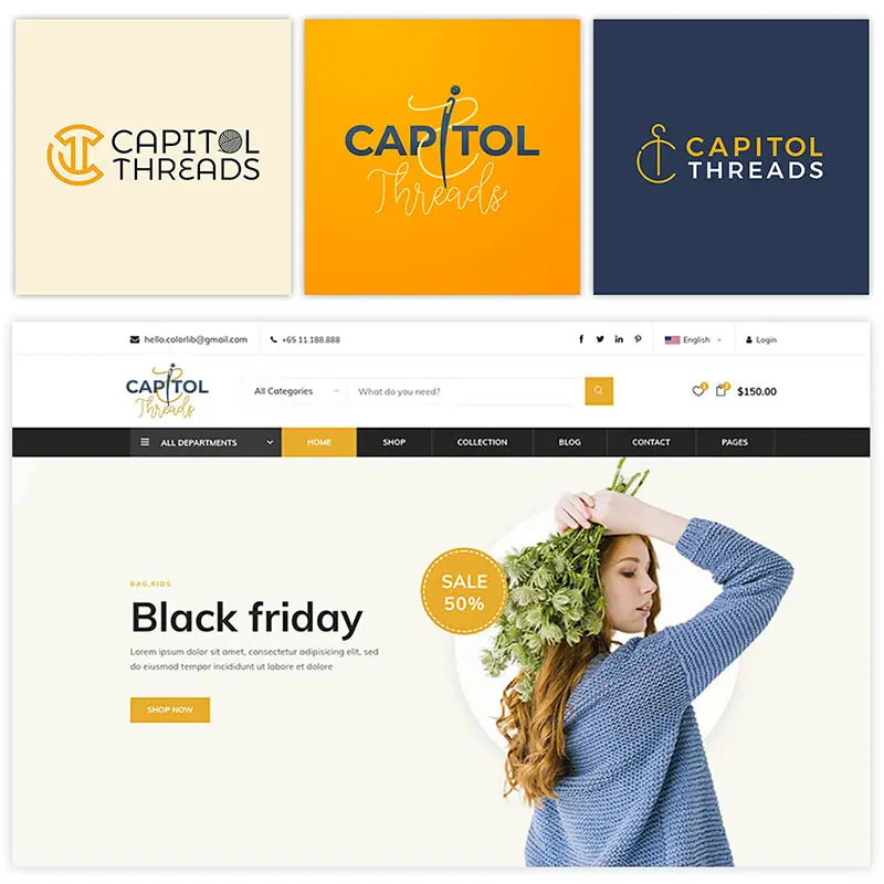
If you’re a freelance graphic designer, some clients may be frustrated if you hand them multiple different logos. Most people, however, like to keep their options open. At the very least, you shouldn’t fully commit to one design before you’ve seen a few.
Looking at the above examples, you can see how the same concepts and design principles can be applied to a variety of logos. Major enterprises often go through hundreds of candidates in order to find a logo that satisfies all their needs.
How do symbols interact with text? What’s the overall shape and style of your logo? You can start to notice these subtle nuances once you compare and contrast different designs. Even if you don’t find a favorite, having a few options is a helpful exercise.
10) Get a second opinion
Okay, you’ve made your designs. End of article, right?
Well, believe it or not, it’s possible to follow all these expert tips and still not be confident in your logo graphic design. The fact is, you can never be fully objective about your own work, which is why you need to get by with a little help from your friends.
Other designers can help nitpick the finer details, but people without design experience can be just as insightful. Not everyone will know the design principles at play, but those who don’t can help you answer the only important question: does it work?
After that, you can feel free to get a third or fourth opinion as well. Don’t neglect deadlines, but take advantage of the opportunity to get feedback.
11) Don’t push your logo out before it’s ready
Even plenty of feedback can’t save you from an accidental logo fiasco.
Gap famously tried and failed to redesign its logo back in 2010. Their attempt at a fresh look had all the design principles behind it. It was slick, modern, and cleverly recalled the original iconography. And people hated it.
Sometimes graphic design know-how is just one piece of the puzzle. I don’t doubt that many, many people saw and approved this design before it went out, but it was a disaster, and the effort to reverse the change in just six days likely cost a fortune.
As the old saying goes, there’s no accounting for taste. You won’t truly know how general audiences respond to a logo, especially a rebrand until it’s out there. Still, take steps today to accept diverse feedback and hear as many voices as you can before you send it out.
12) Accept feedback from the general public
You can sit around learning about design principles all day, but eventually, your design will go public. It’s okay to take a victory lap, but remember, this is your chance to get the most important feedback of all.
Marketers have several tools at their disposal to gauge public feedback before their work goes live, such as A/B testing. Targeting focus groups can give you the best feedback from the groups you actually want to target.
One of the first places to look for general audience feedback on your logo graphic design is memes. Memes can be a double-edged sword for brands, increasing awareness at the potential expense of reputation.
Conclusion
Trends change. A logo may be iconic, but it can never be permanent. For designers, general public response can give you lessons to apply to your next logo graphic design project. For businesses, seeing what the public latches onto will help save you from disaster the next time you need a new logo.
Ready to get started on your next logo? Work with the certified graphic design pros at Penji.
About the author

Table of Contents
- Why the Need for Logo Graphic Design Tips?
- 1) Take no chances
- 2) Know your logo’s audience
- 3) Find your graphic design inspiration
- 4) Select your logo design style
- 5) Incorporate your brand identity
- 6) Make it memorable
- 7) Design your logo to stand out
- 8) Get creative
- 9) Create a few designs
- 10) Get a second opinion
- 11) Don’t push your logo out before it’s ready
- 12) Accept feedback from the general public
- Conclusion


