


Unknown to many, designing logos isn’t just about piecing together shapes, letters, and colors to a brand name. It’s precious time and effort allocated to careful planning and thoughtful research. It’s crucial that you get your logo design right because, according to studies, logos are the number one source of brand recognition.
Our experience at Penji tells us that contemporary logos are some of the most requested designs, and for good reason. They are relevant, fresh, and stylish, perfect for businesses that want to project a vibrant and dynamic personality.
What Is a Contemporary Logo?
Among the different types of logos, why choose a contemporary design? Before we find out, let’s understand what a contemporary logo is. Contemporary logo design is the genre that is identified by simplicity, clean lines, and delicate sophistication.
Contemporary logos are modern, sleek, fresh, and minimalistic. It is a good blend of classic and trendy. Thanks to the increased use of white space, it has an open-space feel, as well as reduced colors and somewhat flattened elements.
Why a Contemporary Logo?
Looking at the evolution of some company logos, you’ll notice how they became more straightforward over time. This is evident in businesses that have been around for quite some time. Take, for example, Pepsi in the image below of its logos from different years.
Notice how it became less complex and became as simple as it is today. There are two reasons why this is happening, and why you should opt for a contemporary logo, too.
- A less complex logo design means less information for the customer to process. This allows you to communicate your brand quickly and allows customers to recognize it quickly.
- Today, logos have to fulfill many different roles. Small and large formats, from iPhones to billboards, are all things your brand has to keep in mind.
Contemporary logos that add elegance to your brand
Create your contemporary logo in 1-2 days
What Makes a Contemporary Logo Great?
Above are two of the primary reasons that more and more companies are going contemporary with their logos. But a quality contemporary logo can have even more benefits. Your design should do the following:
- Tell your brand story effectively
- Make your brand stand out
- Speak to your target market
- Build authority and brand trust
- Convey the right message
The examples below check off all the boxes for a stunning contemporary logo design.
30 Contemporary Logo Designs to Inspire You
And now, our list of contemporary logos that fully embody their brand image. We included both big names and small businesses, including a few by our expert designers at Penji.
Pallavi Kale Interiors
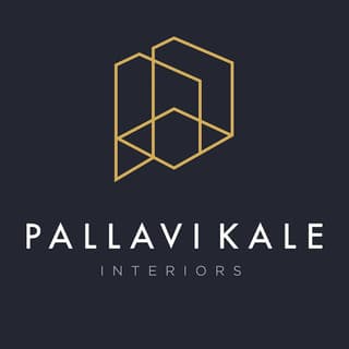
Clean and sleek lines are the signature of contemporary design. The logo example above is one perfect example of this. Its simplicity and choice of colors exude elegance and sophistication. These traits are a perfect fit for the interior design company.
Contemporist Dog

Selling finely crafted premium dog products, Contemporist Dog has a logo that is a model of minimalism. The logo creates the silhouette of a dog using simple triangles. The font is suitable as it has a touch of cuteness and sweet charm.
Digital Swan
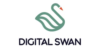
Marketing agency Digital Swan has a logo that’s straightforward. It’s in the shape of a swan with a triangle as its beak. The emphasis on the triangle represents the creatives as part of their team.
Endor Forest

A family-run business specializing in camping equipment, Endor Forest’s logo suits its image quite well. It is cleverly designed using the company’s initial letters in the shape of a pine tree. The colors are perfect as well since green is the color most associated with nature.
YHD Architectural Drafting

With the letters in bold fonts and some thin lines that connect them, YHD’s logo is an excellent example of a contemporary design. It screams “home design team” so loud, it’s hard not to notice. The logo reminds us of the scaffolding that we often see home builders use.
Robinhood

A bycocket was the hat in fashion in Medieval England, but now, it’s most associated with the heroic outlaw Robin Hood. The investing app Robinhood adapted the feather in his cap and used it on its logo, making a unique contemporary logo that suits its brand. The color green is also fitting as it is the color of money and nature, both descriptive of the brand name.
Skief Labs
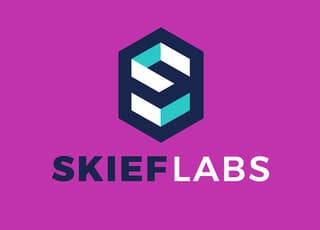
Data marketing strategist Skief Labs is based in Switzerland but got its logo from Penji. If you look at its website, you’ll notice its vibrant personality, which is also evident in its logo. It uses the letter S-shaped in blocks that give it a 3D appeal.
Wine Line

This logo of a wine bottle in a cellar is an obvious choice for the Wine Line brand. From the tip of the bottle to the edge of the last “e”, this logo forms a straight line, conveying both quality and composure.
Andalusia Tourism

A beautiful and scenic region in Spain, Andalusia uses a colorful logo for its tourism website. As colors evoke emotions, this contemporary logo expresses life and vibrancy. You can feel the excitement and anticipation that goes with exploring a new place. This logo shows that contemporary design doesn’t have to be bland or simplistic.
The Verge
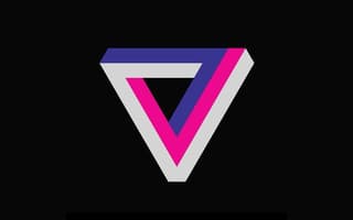
Media and news company The Verge has an interesting logo. It uses colors that are bright and eye-catching but with a commanding, brutalist edge. It uses a black background that effectively brings the logo into the forefront, as a news provider should be.
Young Wear
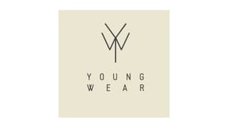
A clever play on the letters Y and W, this logo from Young Wear is an excellent example of minimalism. The logo is easily recognizable and memorable, ensuring that you’ll look twice at this brand when shopping for kids’ clothing.
CoinMarketCap

If you’re into cryptocurrencies, chances are you’ve heard of the website CoinMarketCap. Its logo is a scribbled M inside a C, simple yet appropriate for the brand. It has no colors or any other fancy elements, just a logo descriptive of what the website is all about—providing info.
Coffee Dream

A specialty coffee shop in the Philippines, Coffee Dream’s logo is pure and uncomplicated. You can see the shape of a cup from a bird’s eye view, plus a cute cloud image over it to represent the dream part of the brand. The sky-blue color combination is clean, yet unique. The choice of font also contributes to the cute and youthful image they project.
Vespa

The Vespa logo uses a hand-written font in a diagonal placement. Notice how the letter V was made to curve, resembling scooter handles. The logo gives a classic brand a more modern touch, as it mixes cursive letters with bold, simple shapes and colors.
Harvard Business Review

The Harvard Business Review logo is an excellent example of simplicity in its rawest form. It has balance and symmetry in the simplified shield inspired by the Harvard Business School logo. Plus, the black and white color scheme signifies both authority and sophistication. All these are characteristics that you’ll find in the brand.
Boco Tea
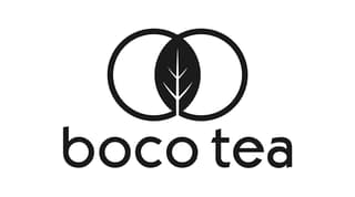
From Colorado, Boco Tea is a loose-leaf tea company owned by twin brothers. The contemporary logo uses only black against a white background. It has a tea leaf in the middle of two circles, presumably to depict the twin owners. It includes the brand name in a font with circular strokes that add to the logo’s appeal.
Parabola
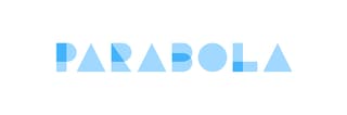
A computer software company, Parabola provides businesses with automation tools for repetitive tasks. They give non-coders the building blocks to create complex data flows. Its logo shows this effectively. It uses overlapping shapes to spell the brand name and a blue-and-white color scheme.
X – The Moonshot Factory
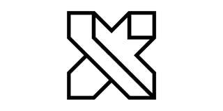
A technology company founded by Google, X – The Moonshot Factory has a logo worthy of its space in this list. It is an X in block form using very few lines and black and white colors. It is simple, and easily identifiable, making it perfectly suited for the company it represents.
Island of Focus
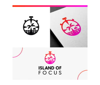
This contemporary logo is suitable for a travel agency or any business related to providing tour and travel services. It features a circle reminiscent of a stopwatch with an icon of a palm tree with an island and ocean waves. It uses bright colors that add life and vibrancy to the design.
Milked
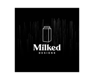
Another simplistic logo design created by Penji’s talented designers is this one for a design agency. The Milked Designs logo features a milk carton amidst straight lines going downward. The black background brings out the white outline which seems very basic but is impactful.
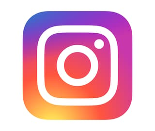
The Instagram logo has undergone several changes since the brand’s introduction. The original design was based on an instant camera which is indicative of the company’s main purpose which is photograph sharing. It uses color gradients of bright purple, orange, yellow, and pink that reflect the brand’s dynamic brand identity.
TimeSheet

This creative logo for a time-tracking app is modern, sleek, and visually captivating. The TimeSheet logo uses simple lines, plain colors, and a cleverly designed icon. This is an excellent example of a scalable logo as it will look good whether placed on a small business card or a large poster.
Ratio
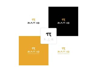
From the works of Penji designers comes this Ratio logo which is suitable for a variety of businesses. Its versatility is superb that you can use this design for a tech company, a fashion retail store, or a logo for an app. The color combination is unique and the fonts give the design a futuristic appeal.
Brand Pharaohs
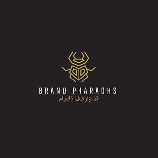
Giving off Middle Eastern vibes, this exotic yet modern logo oozes class and sophistication. It has a quiet appeal to it but is still poignant and stunning. This is the perfect inspiration for brands that want to convey an image of elegance. The colors are subdued adding a bit of mystery to the design.
Tinder
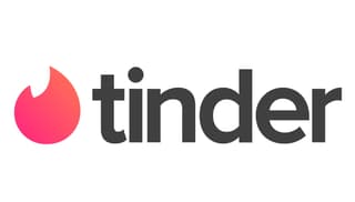
Subtle and fiery with ultra-modern feels, the Tinder logo is an eclectic mix of emotions and characteristics. It conveys movement, passion, and excitement befitting the brand really well. This logo is designed primarily for use on mobile devices, so simplicity is crucial, as it has to be easily recognizable even in tight spaces.
Manifest Agents
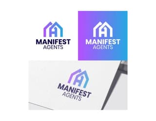
This logo designed for a real estate agency is an excellent example of simplicity. The Manifest Agents logo features an icon with interlocking letters M and A, crafted to make it look like a group of houses. The gradient colors provide a sense of movement and dynamism which is essential to the company’s nature of business.
Strategic Pause
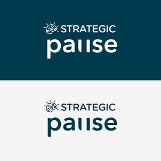
If you’re looking for a consultancy, planning, and other related business logo, this logo created for Strategic Pause is an excellent example. The colors give off professional and trustworthy vibes while the custom-made fonts convey innovation and authority. The addition of the brain icon adds a sense of dependability and competence vital to a business that provides expert analysis.
Uber
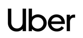
You can look to Uber for a truly contemporary design for a logo. The world’s top taxi app needs no complex design to show its uncomplicated service process. The logo is simple, effective, and recognizable using only its brand name. It has plenty of white space that gives the company a trustworthy and robust personality.
Firm Sur Capital Venture
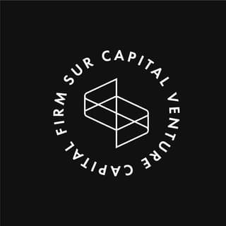
From the portfolio of Penji designs comes this contemporary logo created for Firm Sur Capital Venture. The black-and-white color combination exudes professionalism, authority, and reliability, traits essential to businesses of this nature. The choice of fonts is superb as it has no frills which effectively conveys a straightforward brand personality. If you’re looking for inspiration for an authoritative logo design, this is it.
BreadBlock Bakery
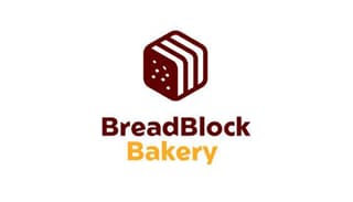
This sleek and modern logo design created for BreadBlock Bakery is an excellent example of simple elegance. It features an image of a block of bread in a unique color combination that truly stands out. It uses a basic typography tweaked to add a touch of customization that’s perfect for differentiating the brand.
Get a Professional Contemporary Logo Design with Penji
Logos primarily show people what your brand is about. Contemporary design may be simple, but it can still convey all the ins and outs of your brand. However, it takes a professional designer to make a minimalist logo that’s tailored to your brand.
Let Penji assist you in creating a contemporary logo that will speak to your target audience clearly. Our professional designers have the skills and qualifications to do it. All you need is to sign up here to get them started.


