

Ah, promotional graphics – the silent yet boisterous heroes of marketing!
When done right, they can elevate your brand to celestial heights.
But when they miss the mark? Well, they land themselves a spot in our lighthearted roundup of “13 Promotional Graphics You Should NEVER Use in 2023!”
From fonts that took a walk on the wild side to images that, let’s say, grew an extra limb or two, we’ve compiled a list that’s sure to tickle your funny bone and, fingers crossed, offer some sage advice for your future design endeavors.
What are promotional graphics?
Promotional graphics are visual assets used to promote a brand, product, or service.
These visual content materials range from digital ads and social media posts to posters, brochures, packaging, and outdoor ads. The purpose of promotional graphics is to create a memorable and impactful impression on the target audience. And, in doing so, enjoy increased brand awareness, engagement, and, ultimately, sales. Unfortunately, the following brands probably won’t be reaping any of those benefits.
Here are nine graphic design examples showing bad design principles that you can laugh at, learn from, and never, ever copy.
1. Distorted Face
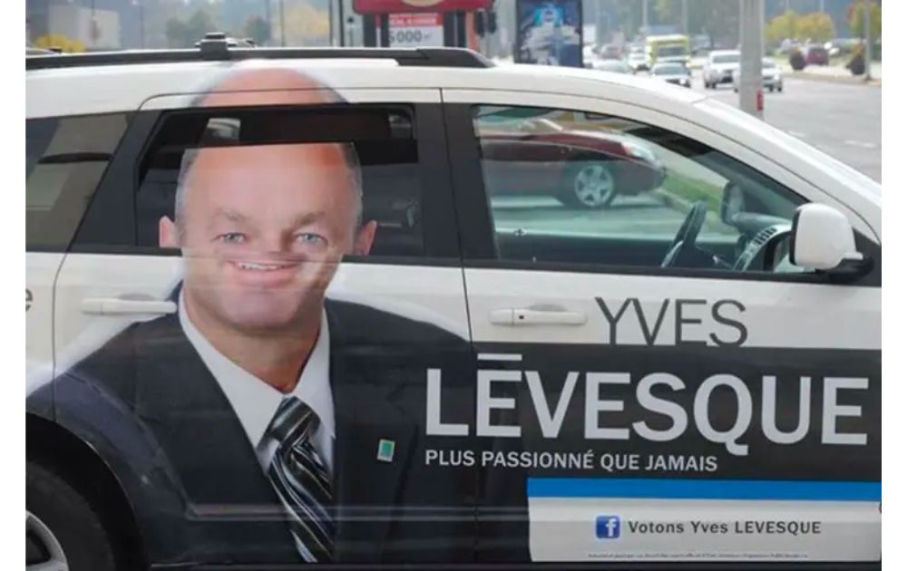
Image Credit: Reddit
First on the list of visual content examples is this car wrap promotional graphics for Canadian politician Yves Lévesque.
At first glance, the ad looks okay – until the back passenger opens the window. When the window rolls down, Lévesque’s eyes and nose go down to his mouth, making Lévesque’s face look distorted. Definitely not a good look!
Design Tip:
- Design the graphic with its practical use in mind. When using a graphic for outdoor advertising, tailor design principles to doors, windows, and other moving parts.
2. Half-Screen Website
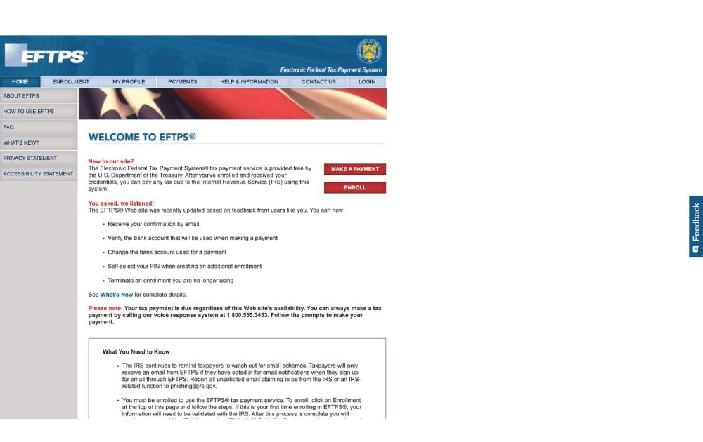
Good visual content makes the most out of the given physical or digital space.
This website design for Electronic Federal Tax Payment System (EFTPS) seems to have missed that point. As seen in the image, the content is crammed within about half of the screen.
The other half is empty – an awful waste of space.
Design Tip:
- Go for clean and responsive design principles and a website template that adapts to screen size. Better yet, get customized website designs from our professional graphic designers.
3. Don’t Kill the Author
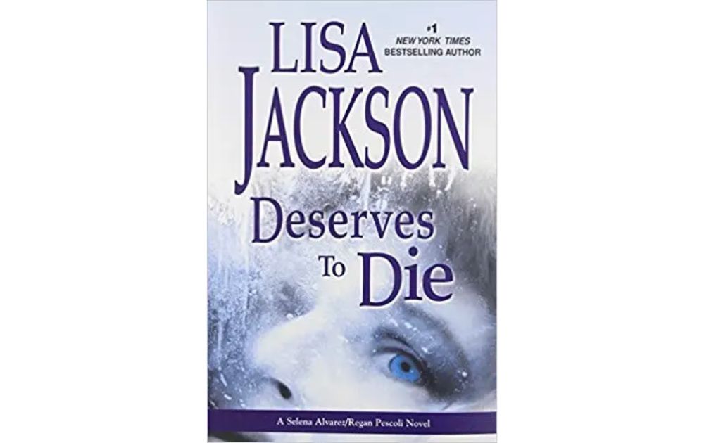
Image Credit: Goodreads
Lisa Jackson is a bestselling author – and certainly doesn’t deserve what the book cover suggests!
Jackson’s books more or less have the same template: Left to Die, Chosen to Die, Born to Die, Afraid to Die, and so on. For this particular edition, however, two elements contributed to a distressing cover – a faulty layout and a lack of contrast in chosen fonts.
Design Tip:
- During layout, ensure that the text reads right so you won’t form unintended phrases or sentences. You can also seek help from seasoned designers with experience in book illustrations and other visual content.
4. Stuck in the 2000s
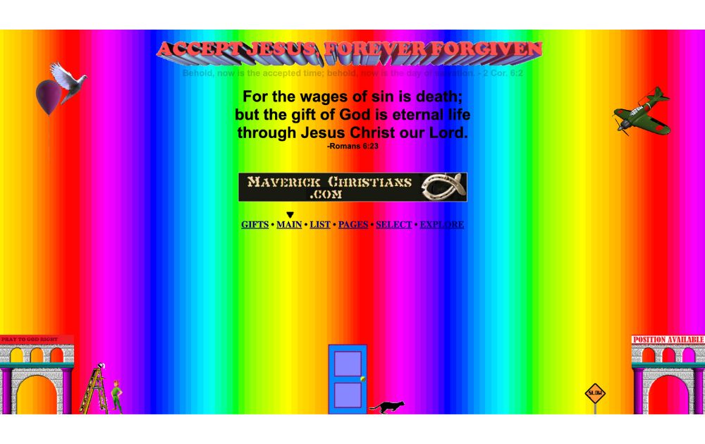
Image Credit: Oliver Marketing
This may seem like a made-up image to illustrate an overwhelming digital design.
But it’s an actual website for a religious organization, and you can check it out for yourself. Religious convictions aside, this design can benefit from a more minimalist approach. The designer had a spree when choosing colors, vector design, and font styles.
Design Tip:
- What may have been an acceptable design two decades ago may be intolerable now. Visit the websites of competitors or similar organizations and learn how they implement their online presence, visual branding, and digital marketing.
5. Wh– What?
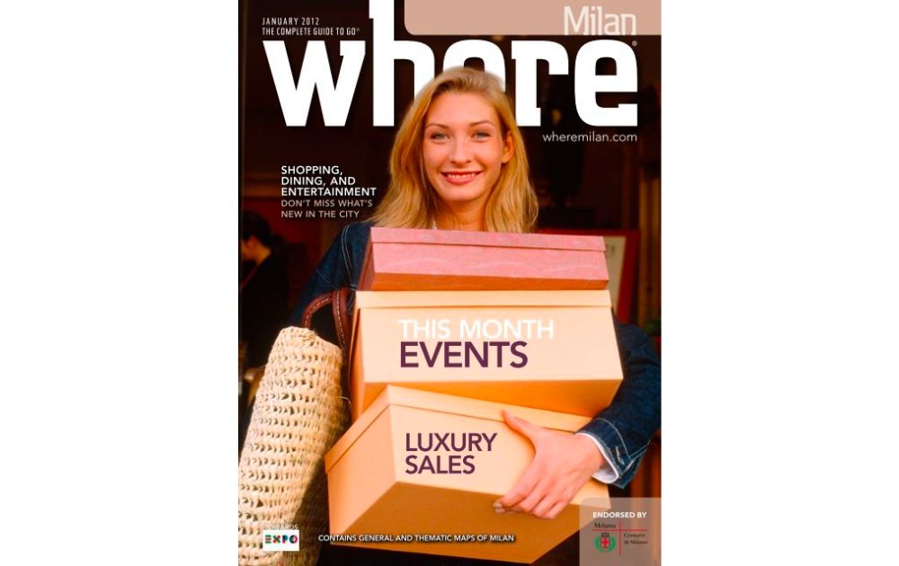
Image Credit: Buzzfeed
Read the title of the magazine out loud.
It’s actually Where, but don’t feel bad if you got it wrong because a lot of people do. In this January 2012 issue, the layout designer covered the lower half of the letter “e” with the model’s head, making the whole word open to unwholesome interpretation. Take note of this example if digital newsletters are a part of your promotional tactics.
Design Tip:
- Again, this example shows how crucial layout is. Before publishing, double-check the design and read the text to ensure they can’t be misinterpreted. If you’re superimposing images over a letter, don’t cover the part that differentiates that letter from other letters.
6. Cluttered Classifieds
Image Credit: UserReport
Aren’t classified ads supposed to consist of many elements anyway?
Right. But it shouldn’t look as overwhelming as this classified ads website. As seen in the image, it’s difficult to even know where to start, much less digest the information presented. This example shows what sets professional designs apart from amateur designs.
Design Tip:
- Use a simple grid layout when combining various visual content together on a page. By doing so, you can guide the viewers’ eyes from one element to the next without overwhelming them.
7. Accidental Venn Diagram
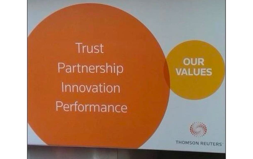
Image Credit: Reddit
Even a reputable organization like Thompson Reuters can sometimes slip in terms of graphic design.
This design accidentally appeared like a Venn Diagram. And if viewed as such, it says there’s a tiny overlap between Thompson Reuters’ values and trust, partnership, innovation, and performance.
Design Tip:
- It’s easy to miss a bad design decision when you’re constantly working too close to your subject. After finishing a design, relax or work on something else for a few hours. Then come back to your design with fresh eyes. Better yet, show your work to others so they can share a new perspective on the design.
8. Garlic Mayo Car Cleaner?
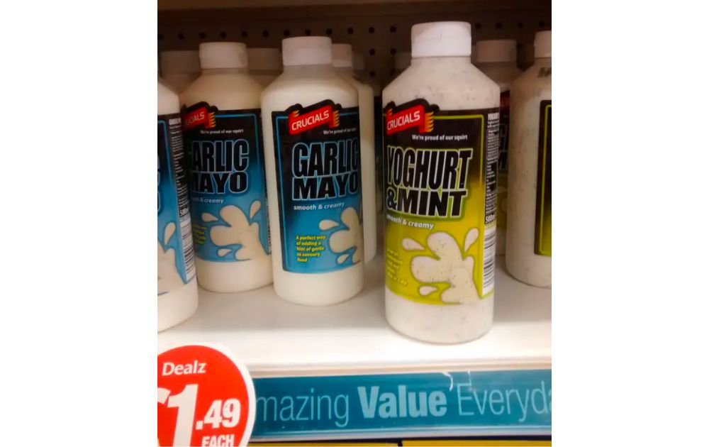
Image Credit: Reddit
You’ll probably be confused when you see these promotional graphics examples on the grocery aisle.
The bottle and graphic design make the product look like a car cleaner. However, the items are – who might have guessed – salad dressing! If you don’t look twice and read the text, you might end up smearing yogurt and mint all over your car.
Design Tip:
- Though you’ll want to produce packaging designs that push the envelope and foster visual identity, it’s crucial to keep design principles within industry standards. Otherwise, you’ll confuse prospects instead of attracting them.
9. Worrisome Design
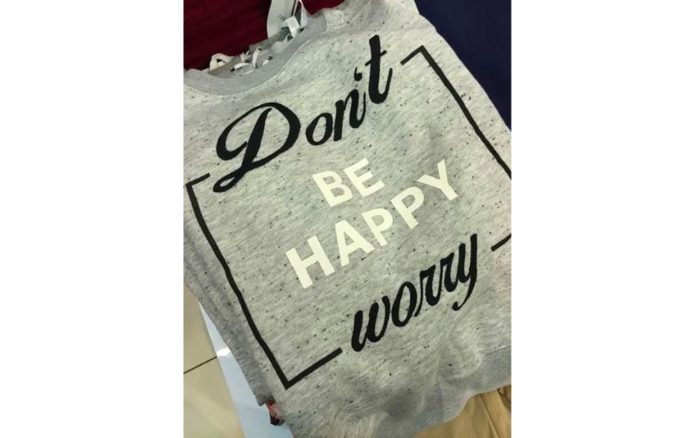
Image Credit: Reddit
If you have a mental healthcare business and you’re looking for promotional ideas, you can include inspirational shirts on your list.
But certainly not this example! Instead of a positive quote, the layout and design make the text on the shirt read, “Don’t be happy worry.” That’s surely not a line to live by!
Design Tip:
- Don’t let a creative design go in the way of expressing your message. Prioritize readability over aesthetics; otherwise, the latter won’t be of any use.
The key takeaway? Simple: plan your promotional graphics thoughtfully and carefully before executing. If you’re unsure how to do it right, seek help from the pros, and you’ll be on the safe side.
10. Uhmm… What Lights?
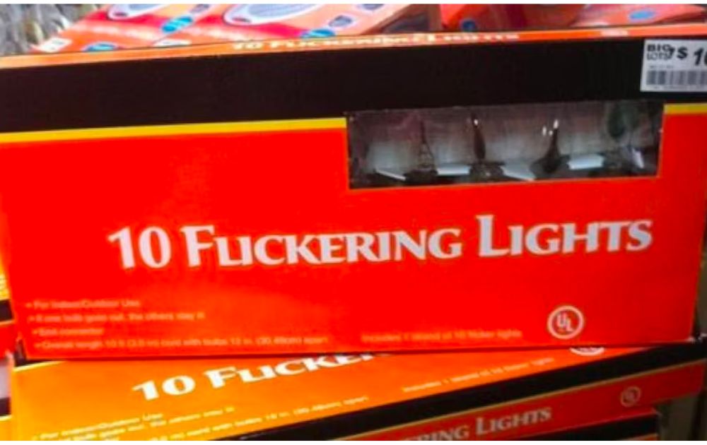
Image Credit: Reddit
Ever had a “lost in translation” moment with fonts? This decorative lights box sure did.
Intended to say “flickering” lights, it hilariously reads as something else because of a font faux pas. Talk about a lighting situation that’s sure to raise some eyebrows!
Design Tip:
- Choosing a font is like choosing an outfit for a date – make sure it communicates what you intend! And maybe, just maybe, get a second opinion before you step out.
11. Get Your Math Right
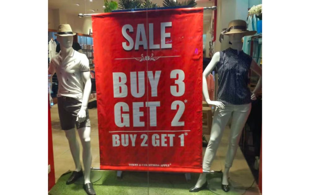
Image Credit: Reddit
Math can be hard, but this sale signage took confusion to a new level.
Buy 3 Get 2* Buy 2 Get 1* – sounds like a riddle wrapped in a mystery inside an enigma.
Design Tip:
- When offering deals, clarity is key. And if math’s not your strong suit, there’s always a calculator. Or a friend who passed math class.
12. Creepy Holiday Sign
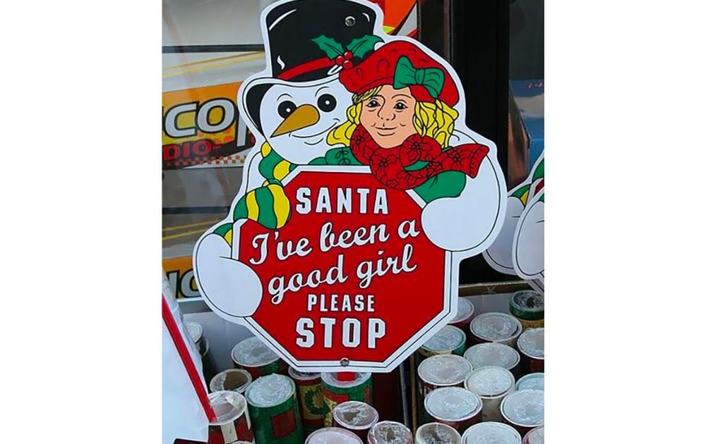
Image Credit: Reddit
Santa’s coming to town, but this sign might send him running in the opposite direction.
Meant to be a cheerful holiday sign, it reads more like a twisted horror movie. And those illustrated characters? They’ve seen things.
Design Tip:
- Spacing matters, folks. Unless you’re aiming for a Halloween-Christmas crossover event, always double-check your layout. The creepy illustrations also emphasize the need for professional graphic design that applies expert design principles.
13. Count the Limbs
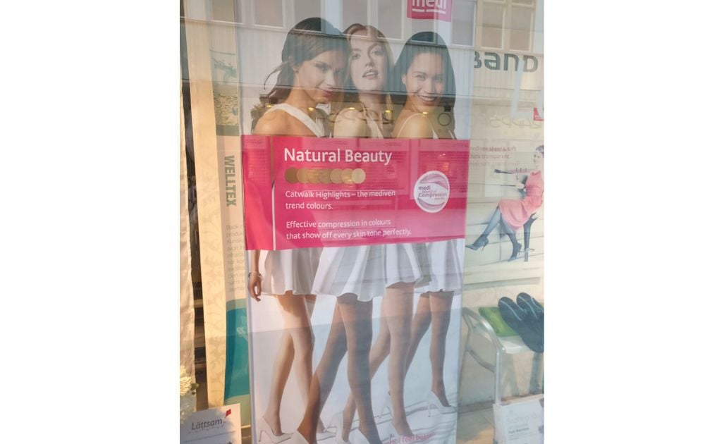
Image Credit: Reddit
Who knew compression socks could be a many-legged mystery?
This ad showcases three torsos but a baffling four pairs of legs. It’s either a designer’s oversight or a secret society of octo-humans.
Design Tip:
- Aside from branding and visual identity, accuracy is key when promoting a product. Unless you’re selling to an audience from a galaxy far, far away, it’s best to stick to the usual human anatomy.
Penji to the Rescue
We’ve had our laughs and learned some valuable lessons from these promotional graphic misadventures. But remember, design is a dynamic realm, and what’s trendy today might be tomorrow’s faux pas. That’s where Penji steps in!
Through our global design team, businesses can get unlimited promotional graphics on demand. With its intuitive design interface and AI-powered matching system, Penji makes it easy to create high-quality graphics for any purpose. Whether you need logos, flyers, brochures, digital marketing videos, or other visual identity assets for audience engagement, Penji has you covered with its wide selection of templates and customizations.
Plus, its affordable plans make it a great choice for businesses of all sizes. So, if you’re looking to get unlimited promotional graphics quickly and easily, learn more about us here!
About the author

Carla Deña
Carla is a journalist and content writer who produces stories for both digital and legacy media. She is passionate about creativity, innovation, and helping small businesses explore solutions that drive growth and social impact.
Table of Contents
- What are promotional graphics?
- 1. Distorted Face
- 2. Half-Screen Website
- 3. Don’t Kill the Author
- 4. Stuck in the 2000s
- 5. Wh– What?
- 6. Cluttered Classifieds
- 7. Accidental Venn Diagram
- 8. Garlic Mayo Car Cleaner?
- 9. Worrisome Design
- 10. Uhmm… What Lights?
- 11. Get Your Math Right
- 12. Creepy Holiday Sign
- 13. Count the Limbs
- Penji to the Rescue


