
Have you ever seen a graphic design and know right away that something’s off about it? If your answer is yes, then that’s a good sign. That means you have the visual intuition to spot bad design, which is one of the first steps to appreciate and produce a good design.
But here’s the lowdown – detecting bad design could be a lot trickier when you’re creating the graphic yourself. For instance, many of our clients here at Penji turn to us for professional visuals created by designers steeped in training and actual experience. They know just how crucial it is to produce graphics that paint the brand in the best light. In the same vein, they realize how an amateur-looking design can make an awesome brand look cheap and shabby real quick.
What’s a Bad Design, Anyway?
It’s tricky to come up with a fixed bad design definition. But to get a good grasp, it’s best that we start with what proper graphic design should look like.
According to the American Institute of Graphic Arts (AIGA), the traditional role of design is to improve the appearance as well as the function of messages and information. In addition to that, it uses graphic elements to construct messages that enable viewers to think.
In short, a good design allows viewers to absorb info using the best practices. Bad design, on the other hand, stems from not applying basic design principles. As a result, the visuals don’t help the viewer digest the info in the most painless way possible.
Bad Design Examples and How to Correct Them
The best way to know what visuals to avoid is to look at bad graphic design examples. That said, there are a few ones we’ve found online and why they don’t work.
However, let’s not stop at merely pointing out the flaws. Let’s also discuss lessons learned so you won’t find yourself in the same sticky situation.
1. Salad Dressing or Car Cleaner?
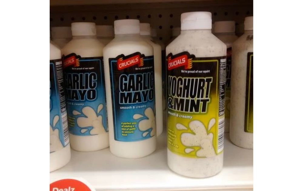
Image Credit: UCreative
Here’s an example of bad design in daily life, mainly what you might find in a grocery aisle. The bottles and the label look more like car cleaning products instead of salad dressing.
Lesson learned: Be aware of industry practices. It pays to be unique, but not too much, that it makes your product look like something else.
2. Ceramic Slugs
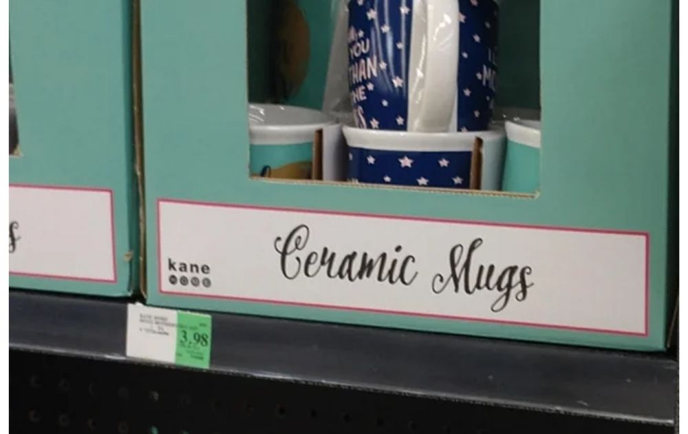
Image Credit: Reddit
Here’s an example of a pretty font that turned into a bad design art label. The letter “M” of the typeface looks more like “Sl,” completely changing the meaning of the text.
Lesson learned: Just because a typeface looks beautiful doesn’t mean it will look good on all your copies.
3. Jumbled Words
Image Credit: Reddit
The Redditor who submitted this photo says they don’t even know how to read the text.
Lesson learned: Proper layout is key if you want a design that your viewers can understand.
4. Misplaced Words
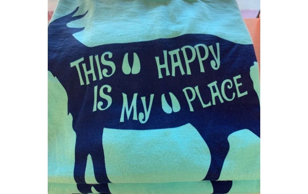
Image Credit: Reddit
It’s easy to read the text as “This happy is my place.”
Lesson learned: The viewers’ natural instinct is to digest the visual from left to right.
5. A Melange of Letters
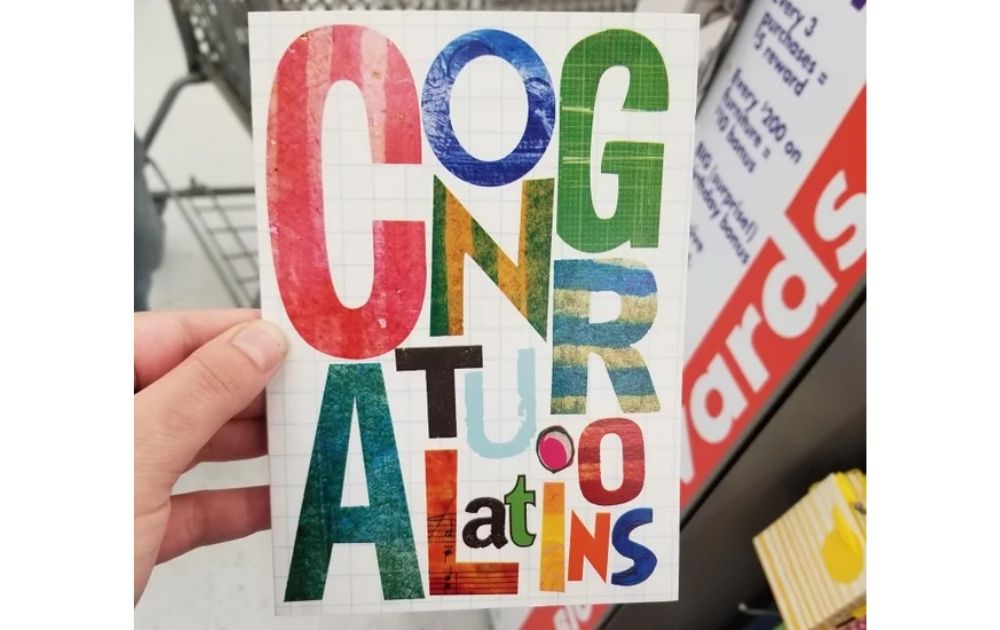
Image Credit: Reddit
Reading this card is more of a puzzle than a delight.
Lesson learned: It doesn’t hurt to be creative, but don’t make your viewers suffer to appreciate the design.
6. Weird Highlights
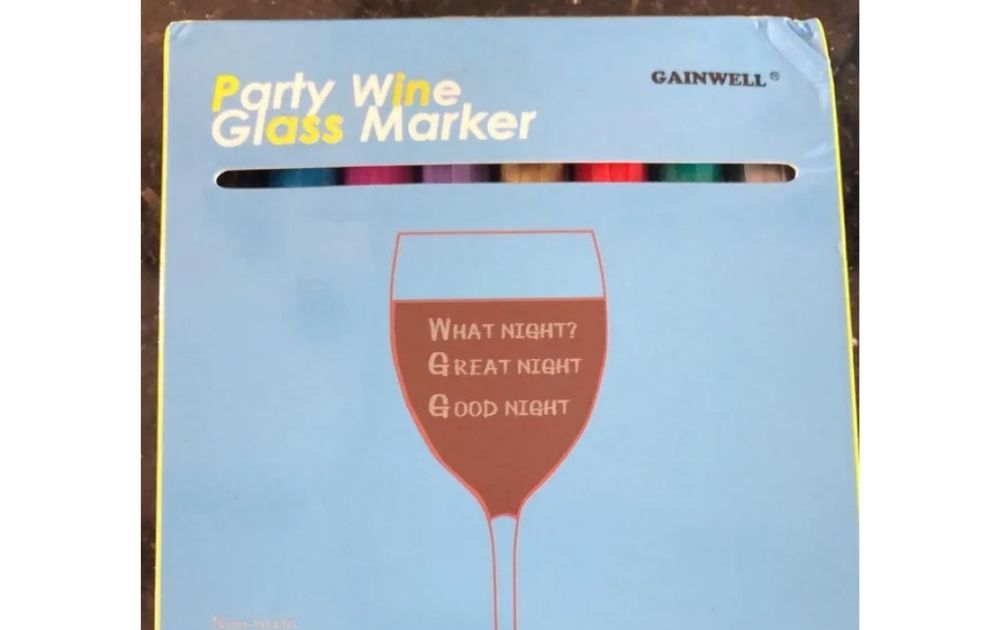
Image Credit: Reddit
Read the highlighted letters on Party Glass Wine Maker.
Lesson learned: Okay, we’re not entirely sure if this is a case of bad design or a joke lost in context! Either way, make sure you don’t give a message you don’t intend by not paying attention to highlighted letters.
7. Wet Clothes Allowed
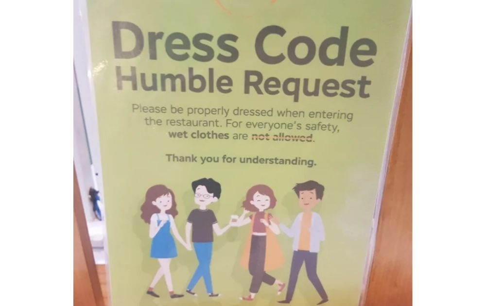
Image Credit: Reddit
It’s not clear whether wet clothes are allowed or not because of the overstrike.
Lesson learned: Overstrikes can add humor to posters. However, if it would only make your message confusing, do away with it.
8. Black Kids Sale
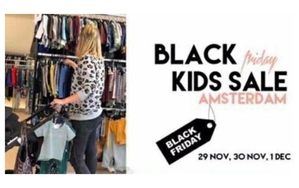
Image Credit: Reddit
This is a case of bad design due to a wrong choice of typefaces.
Lesson learned: You can surely use different fonts on your poster. However, it’s crucial to note that texts written in the same typeface tend to stick out together, so be careful with that.
How to Spot a Good Graphic Design Service
The next question is: how can we avoid design disasters just like the ones mentioned above? If you don’t have the time to learn the ropes of graphic design, hiring a designer is the best option.
Whether you opt to hire an in-house designer, a freelance designer, or get an unlimited graphic design service like Penji, here are the factors you need to look at to ensure that you don’t end up with a bad design:
- Diverse portfolio. Some designers specialize in digital illustrations, while others thrive in commercial products like product packaging design. That said, it’s best to choose a designer who knows how to do various types of designs. Unlimited graphic design services excel in this area because they have a team composed of designers with different specializations.
- Practical turnaround time. Good design should be paired with perfect timing for the best results. The design service should offer a turnaround time that would let you stay in control of your campaign schedule.
- Good communication. There will always be a difference in design perspective between you and your designer. That said, it’s vital to have good communication with your contractor to ensure that you see eye-to-eye regarding the project details.
- Pleasing results. Last but not least, good graphic design should produce equally good results. This includes improved traction, more social media reactions, and better engagement. In addition to that, designs should also encourage better website traffic, lead generation, and sales rates.
The Bottomline
To be able to stay away from bad design, you need to know how it looks. More importantly, you should be able to pin down what element needs improvement. Otherwise, you’d just be committing the same design faux pas over and over again.
Yes, content is vital, but you must also pay attention to form. After all, it’s hard to appreciate a really delicious cheeseburger if it’s served on a messy plate.
The great news is, you don’t have to be a design expert in offering awesome visuals to your audience. We, at Penji, can do the design heavy-lifting for you! We have the top 2 percent of designers, and you can rest assured that our skilled and experienced artists will pull out all the stops to present your brand in the best light.
Here are some of the layout designs we’ve done in the past:
We offer unlimited graphic design at a flat monthly rate. Whether you need book illustrations or a vintage logo design, just tell us what you need, and we’ve got it covered.
Sign up now by clicking this link to enjoy 15% off the first month of any plan. And the best part? You can try any of our packages risk-free for 15 days.
Note: All examples used in this blog were compiled from submissions in the subreddit Crappy Design on Reddit.
About the author

Carla Deña
Carla is a journalist and content writer who produces stories for both digital and legacy media. She is passionate about creativity, innovation, and helping small businesses explore solutions that drive growth and social impact.


