

Is your business in the health industry? Is your health institution in need of better branding? You’re in luck, as Penji released this list of our best health logos to serve as your inspiration!
All of the logos below were designed by our team of trained graphic designers. If you’re looking to put your graphic design production on autopilot, our designers can do the same for you.
What Makes a Good Health Logo?
Many health institutions, facilities, or organizations have similar-looking logos. Some of them would use an illustration or icon of a person. Others would add a cross to their logo. And in some instances, there would be hearts. But what makes a GOOD health logo, and how can you stand out from the crowd?
Logo Style
When it comes to logo design, you have different styles like wordmark, lettermark, character/mascot, abstract, pictorial, or combination mark. But which style would suit your health institution or facility? It’s up to you! Most would go with a professional look by sticking to a wordmark. However, some institutions might use a combination of abstract or pictorial marks that integrates their branding and presents and delivers a coherent message.
Logo Color
Color – Green and blue are the most commonly used colors in health logos because of their meanings. Green represents HEALTH, while blue projects stability, reliability, and trust. But how can you differentiate your business without drowning in the seas of blue and green? You can mix green with complementary colors like pink, yellow, or purple. How about blue? Orange, yellow, and red pair well with it.
Logo Symbol
Although wordmarks can make your logo simple, they may not help you get noticed by your target audience. That’s why you’ll see many crosses, hearts, and people as symbols. But if you want to add those to your logo, how can you make them unique to yours?
Font Style
Most health logos use either sans serif or serif fonts. Most institutions or facilities would use big block letters for sans serif fonts. Meanwhile, serif fonts would usually be for medical practices or older institutions.
Top 10 Health Logos
1. Blue Oak Home Care
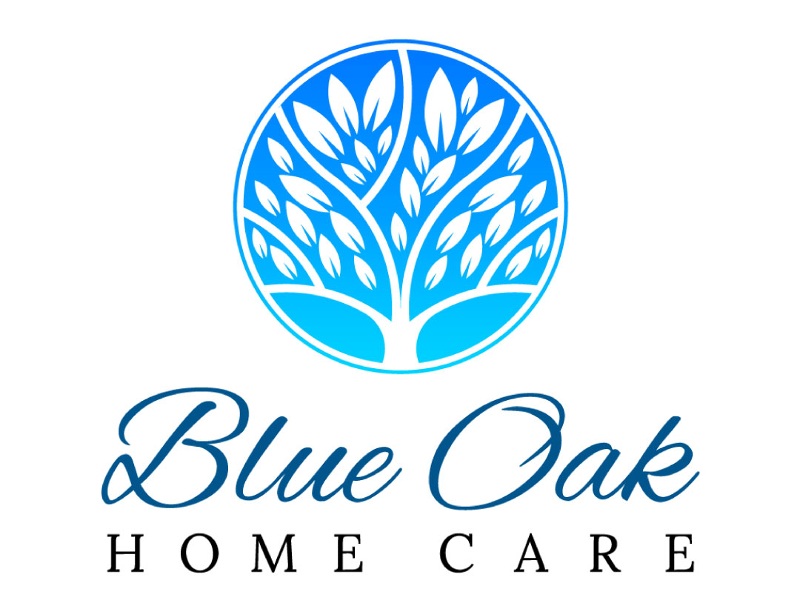
If your organization or institution is about caring for the elderly, use this logo for Blue Oak Home Care as inspiration. As mentioned above, blue is associated with reliability and trust. And if you want families to entrust their elders to your facility, adding a blue motif will make them feel safe and trust you. Plus, the added circle logo gives an approachable vibe, making older adults feel welcome.
Health logos that give credibility to your brand
Create your health logo in just 1-2 days
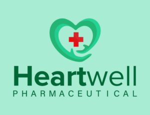


2. Heartwell

Another way for patients or their loved ones to trust your organization or facility is by using green in your logos. This health logo will draw you in because of how noticeable the green is. It uses two different symbols, both of which are seen in most health logos, the heart and the cross. But one symbol gives Heartwell a unique look: the arms. The arms create the heart symbolizing the care they put when tending to their patients.
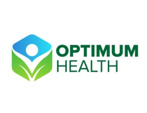
3. Optimum Health

If you need logo inspiration for your health company, check out this logo for Optimum Health. Like all other logos in this list, they use green and blue motifs. However, they use a cube logo to make them different from the rest of the pack. It appears there are leaves and a human shape in the cube logo, representing how they prioritize their patients’ health through nutrition.
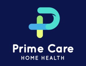
4. Prime Care Home Health

Modern doesn’t mean it should be marketed only to the youth. You don’t want to have an outdated logo that would turn away your target audience. Prime Care Home Health shows us that you can have a modern logo that can still appeal to your target demographic. The p acts as a lettermark of their business name.
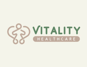
5. Vitality Healthcare

Vitality Healthcare uses a reimagined heart logo with a person at the core. It shows that at the heart of their facility or institution, they aim to care for people. Plus, you can see they also use a green and brown motif. It’s a rare combination in logo design. However, it works because green represents health, while brown symbolizes security, reliability, and dependency.
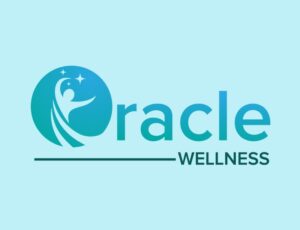
6. Oracle Wellness

Character logos are rare in most health logos. But this one in Oracle Wellness shows us that it’s okay to use that logotype. In the logo, it appears there’s a dancing figure. It may represent that anyone who comes to Oracle Wellness may feel alive when getting wellness treatments from their company.
7. Arcana Health and Wellness
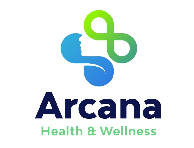
If you want a unique health logo for your company, check out this logo for Arcana Health and Wellness. Their logo has different symbols, such as the number eight or infinity sign, a woman’s silhouette, and what appears to be a leaf. Their logo symbolizes different parts of the practice or services they offer in their facility.
8. Southwell Therapeutics
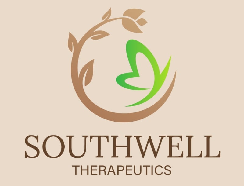
Here’s another health logo that uses color meaning. The shape in the Southwell Therapeutics logo resembles a moon, a symbol of feminine energy. As you can see, there’s even a flower and butterfly, demonstrating that women are their target audience.
9. Holistics Health Advisors
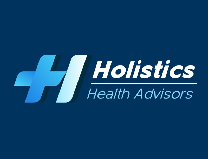
Movement is rarely seen in health logos. But this one for Holistics Health Advisors wants us to know that their advisors are always on the go and want to help you move forward in good health. They also use a cross logo, adding a horizontal line to represent the business name.
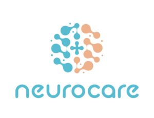
10. Neurocare
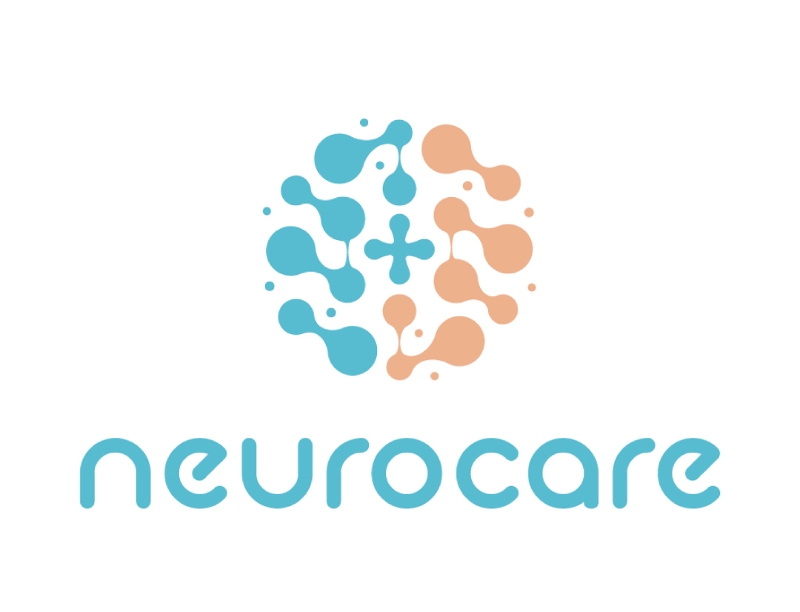
If you want a relevant and unique health logo, check out the design for Neurocare. If you look closely, their logo looks like a brain, associated with the word “neuro.” Instead of using pink, the perceived color of the brain, they use blue and soft orange. Both are complementary colors. Plus, there’s a softness to the shape of their logo, which may signify the care they put into helping their patients.
How to Make a Health Logo?
1. Know What Your Brand Represents
Logo design is a long process from ideation to launch. On average, it takes weeks or months to design a logo. But you can speed this process when you determine what your brand should represent and what elements it should include.
If working with designers, some will require design inspiration or your brand’s back story to make your logo unique to your business! Note that the designers will take liberties. Or, they could create one that’s not based on your requirements. But that’s because designers have another vision in mind that would best suit your overall brand.
2. Gather What You Need
Once you have identified what your brand represents, it’s time to browse the elements you’ll need to create your logo. Typically, you need the following assets:
- Fonts
- Colors
- Imagery or illustration
Imagery or illustration isn’t necessary, but it would be if you want a pictorial, abstract, or combination logo.
You need the right fonts for your logo. Fontspace, 1001 Fonts, and Fontest are three websites where you can get fonts without attribution.
Meanwhile, some colors are trademarked, but you can find color combinations from sites like Coolors and Color Hunt to get the best color palettes.
3. Use a Graphic Design Software
Once you have determined what your health logo should include, it’s time to create one using a graphic design software. You don’t need experience in using Photoshop or Illustrator to make a logo from scratch. For example, you can use graphic design apps like Canva or Adobe Express to get you started.
These two graphic design apps have logo templates or elements you can search to help you create health logos without a subscription! However, it’s recommended to create an original logo design to ensure that you have a custom logo meant for your brand.
4. Get Feedback
Before launching a logo, feedback is necessary to ensure that it’s the best image to symbolize your brand. Having extra pairs of eyes to view your logo before it goes public will give you an idea of how it appears to various stakeholders. Plus, you’ll know if the logo is unique to your brand or if it could be a rip-off of another logo that reminds them of another brand or business.
5. Make the Final Touches
Once you have feedback from objective people, put the finishing touches on your health logo. From there, you can launch the logo on digital platforms or print. This way, your target audience is aware of your brand or business once you have that brand-new logo to show off! Plus, you have a unique image that will help you stand out from the crowd.
Should You Use an AI Logo Designer for Your Health Logo?
Using an AI logo designer is much more convenient than creating one from scratch because you can fill out a prompt and let a machine take care of the design. However, working with a professional logo designer is still the best option when creating designs. Although AI can generate designs based on your preferences, the logo might not be original or customized to your brand.
An AI logo designer is great to use IF you need design inspiration. From there, your designer can work on improving the design and tailoring it to your brand.
How to get unlimited graphics – including logos!
Getting a logo is easy, but finding the right designer can be challenging. How do you know if you’ll like it? What if they get it wrong? What if they’re inexperienced?
Penji has solved this problem by offering unlimited graphic design (including unlimited revisions). Whether you need a logo, social media posts, business card designs, or anything else, Penji has the design power to make it happen. Within 24-48 hours, we’ll get a draft of your custom design back to you.
The journey all starts by subscribing to Penji. And we have good news! Don’t forget to enter this code: BRANDNEWLOGO15 to get a 15% discount right off the bat.
About the author

Katrina Pascual
Katrina is a content writer specializing in graphic design, marketing, social media, and technology. In her spare time, she writes monthly personal blogs to practice her craft.
Table of Contents
- What Makes a Good Health Logo?
- Top 10 Health Logos
- 1. Blue Oak Home Care
- 2. Heartwell
- 3. Optimum Health
- 4. Prime Care Home Health
- 5. Vitality Healthcare
- 6. Oracle Wellness
- 7. Arcana Health and Wellness
- 8. Southwell Therapeutics
- 9. Holistics Health Advisors
- 10. Neurocare
- How to Make a Health Logo?
- 1. Know What Your Brand Represents
- 2. Gather What You Need
- 3. Use a Graphic Design Software
- 4. Get Feedback
- 5. Make the Final Touches
- Should You Use an AI Logo Designer for Your Health Logo?
- How to get unlimited graphics – including logos!


