
Are you thinking of using a cube logo for your business? If your answer is yes, you’ve come to the right placIs the cube the best shape to symbolize your brand? It creates dimension and makes your logo appear unique. If you’re sticking to this shape, check out how a cube logo will help your brand stand out. Our Penji designers made these fantastic logos! Also, scroll down to know limited-time offers when you sign up for Penji or request designs from us!
1. Go Monochrome
Not all monochromatic images must be black and white. You can still go monochrome by using one color, particularly if black and white is not the best representation for your company. To generate subtle contrasts in your logo, utilize several tones of the same color.
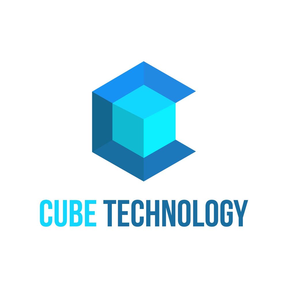
This tech company’s cube logo achieved a clean and solid brand identification with a monochromatic look. It effectively utilizes various shades of blue, which is an appropriate color for those seeking a sense of assurance and trustworthiness, according to The Psychology of Colors in Marketing and Branding.
2. Add Motion to Your Design
In the digital branding market, a static logo placed in the background of a completed design is often insufficient. You must take into account whether your logo is animation-ready and if it is intended for use in digital applications. Whether you employ animation on your logo or simply an illustration that suggests movement, a sense of motion almost always attracts more attention than a static image. But a word of caution: use just enough action to draw attention without being distracting.
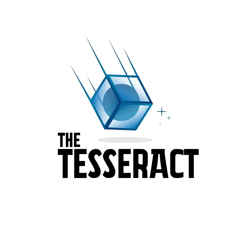
Consider The Tesseract’s cube logo. Even in a static application, it implies motion and creates an impact. What more if you add animation to it?
3. Go with the Obvious

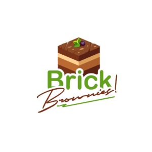
So, Brick Brownies is your name, right? Have you given a brick-shaped brownie some thought? Often, things are really that simple. If your name is something tangible, make that thing your logo. Don’t be afraid to make the obvious choice. For instance, Apple’s logo is an apple for a reason.
Just a reminder: be careful not to overdo it literally unless your brand allows it. In contrast to a production restaurant or ice cream shop, law firms, for instance, demand a level of seriousness.
Do you need a cube logo?
Browse designers on our Marketplace


4. Negative Space Matters

Never underestimate the impact of negative space. Most logo designs focus on shapes and colors, but a great designer knows how to utilize the negative space to his advantage.
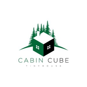
Negative space, or the area surrounding images, can be used inventively, especially for brands aiming for minimalism. For instance, in this cube logo design for a tiny house contractor, only one color (dark green) is used throughout the logo. However, the designer was able to showcase an entire house structure and even set the woodsy cabin vibe with the clever use of negative space.
5. Experiment with Techniques

To design a logo that is even more distinctive, combine two or more techniques rather than sticking to just one.
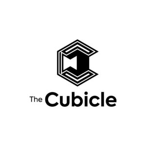
For instance, the complex design of this cube logo for The Cubicle was achieved by utilizing negative space, a hidden image, and a black and white monochromatic palette. If you take a close inspection, you will notice that it resembles an office cubicle, and at the same time, it forms the letter “C.” Now that’s a good design.
6. Create a Hidden Image

Placing a hidden image within an image is a fun and exciting method to engage your audience. It tickles their mind and makes your brand memorable.
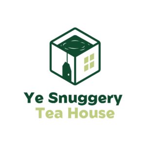
This custom logo design for Ye Snuggery Tea House is an excellent example of this technique. At first, it appears to be an open house with windows, but a closer look reveals a second image of a brewing tea bag.
7. Balance is Key

A well-balanced logo tells your customers that your business is set on a sturdy foundation that stands the test of time.
You can tell when a design is balanced. It appears to be solid and sharp. That said, combining positive and negative space in composition requires careful thought so that no single part overpowers the others. It all comes together to form a unified whole.
Ensure your logo appears about the same on both sides of an invisible line drawn through the center of your suggested design, just like in this cube logo design for Medhub.
8. Understand Your Colors
Before using colors in your design, it is helpful to have a basic understanding of them. An effectively selected color for a logo can inherently increase the value of that brand. A study published in the Interactive Effects of Colors and Products on Perceptions of Brand Logo Appropriateness found that when consumers are aware of the position businesses are trying to take, they judge colors that support those viewpoints to be more relevant.
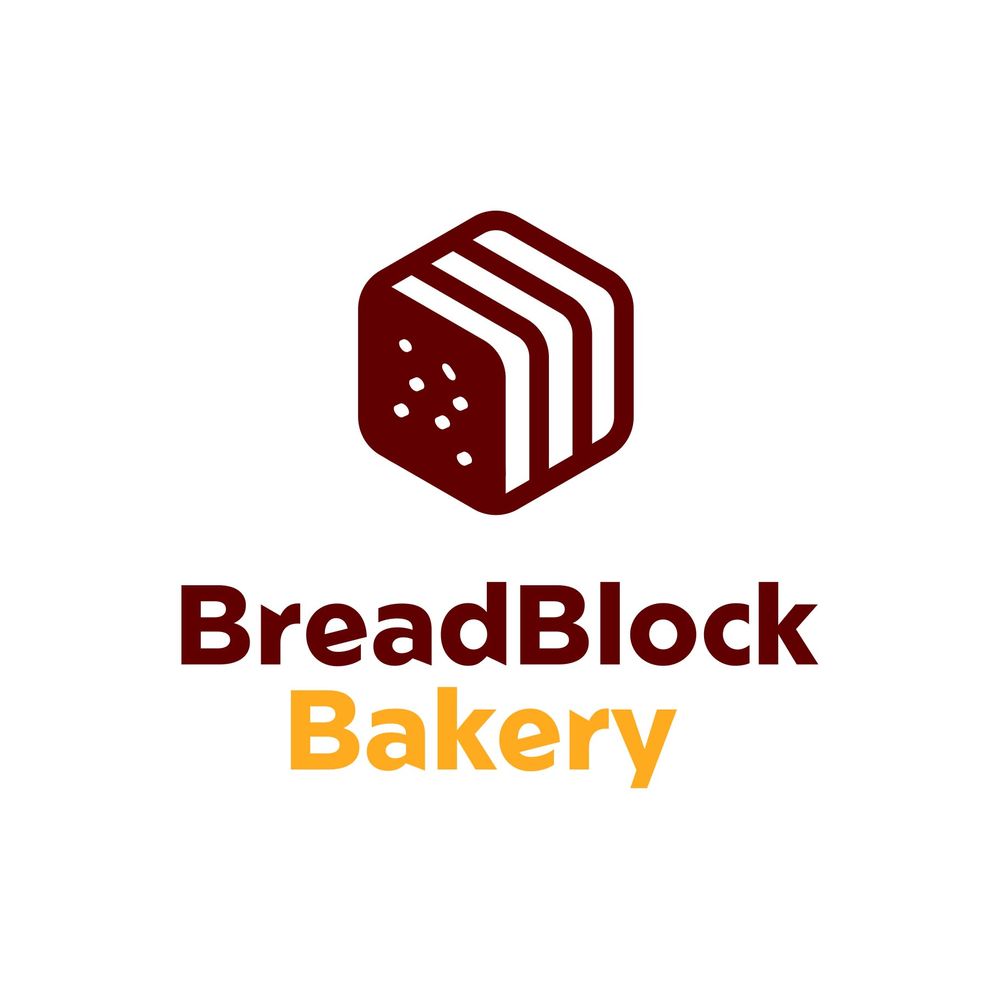
For example, the Bread Block Bakery’s logo design had red and orange hues. Orange symbolizes affordability and good value in marketing, whereas red is known to whet the appetite. Both colors are appropriate for the company’s intended message.
9. There’s Power in Simplicity
Memorable and cool logos are simple and clutter-free, giving readers an instantaneous and distinct feeling of your brand. Simplicity and minimalism have a greater impact than an overly embellished design. Keep in mind that logos might lose their finer details when they are utilized in several situations and on various platforms.
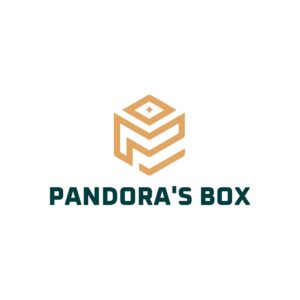
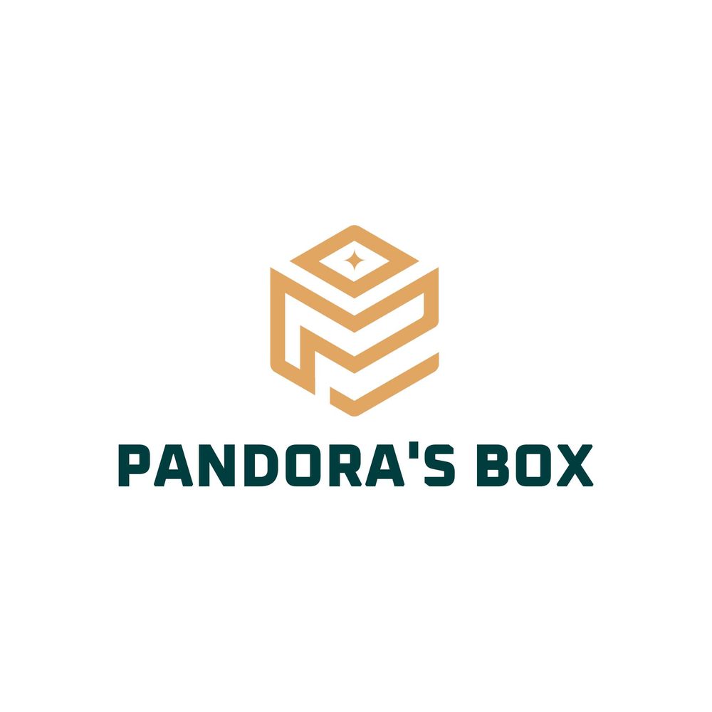
A great logo will have a handful of distinguishable components that are all essential to the message you want to convey. Remove any elements that don’t add to the message of your brand, as in this Pandora’s box cube logo, free from unnecessary design clutter.
10. Paint Words with Pictures

Since a logo serves as a symbolic image of your brand, there is no need to describe what you do. Simply show it. Use straightforward icons to convey your identity.
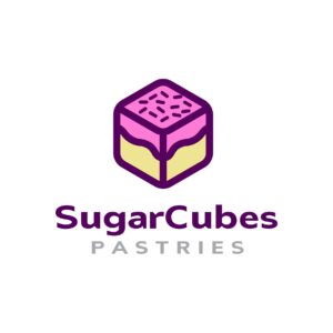
Here, the cube logo displays a cake, establishing the brand’s offerings and encouraging customers to try the product.
Creating a Compelling Cube Logo
Though cube logos make for interesting brand marks (if done well, that is), it can be challenging to pull off. For one, you need to be able to incorporate the cube’s 3D element into your visual asset. One wrong measurement or line placement and the cube will look off.
Fortunately, Penji is here to help you design your logo! Our Penji designers will ensure they’ll create a logo you’ll love. Plus, you can rely on their expertise to ensure your logo is 100% compelling!
Subscribe to Penji here and use this voucher LOGODESIGN15 to get a discount on your first month! Also, you can browse our new Marketplace to get one-off designs for your one-time projects!
About the author

Carla Deña
Carla is a journalist and content writer who produces stories for both digital and legacy media. She is passionate about creativity, innovation, and helping small businesses explore solutions that drive growth and social impact.


