

Circles are one of the most popular shapes in a logo. A circle signifies femininity, continuity, security, and friendliness. And if you want this shape in your logo, let Penji work on your circle logo! Check out the circle logos our designers created. Plus, here’s how else Penji can help with your branding! Also, scroll down for a 15% discount on your first month’s subscription!
1. Rhino Project
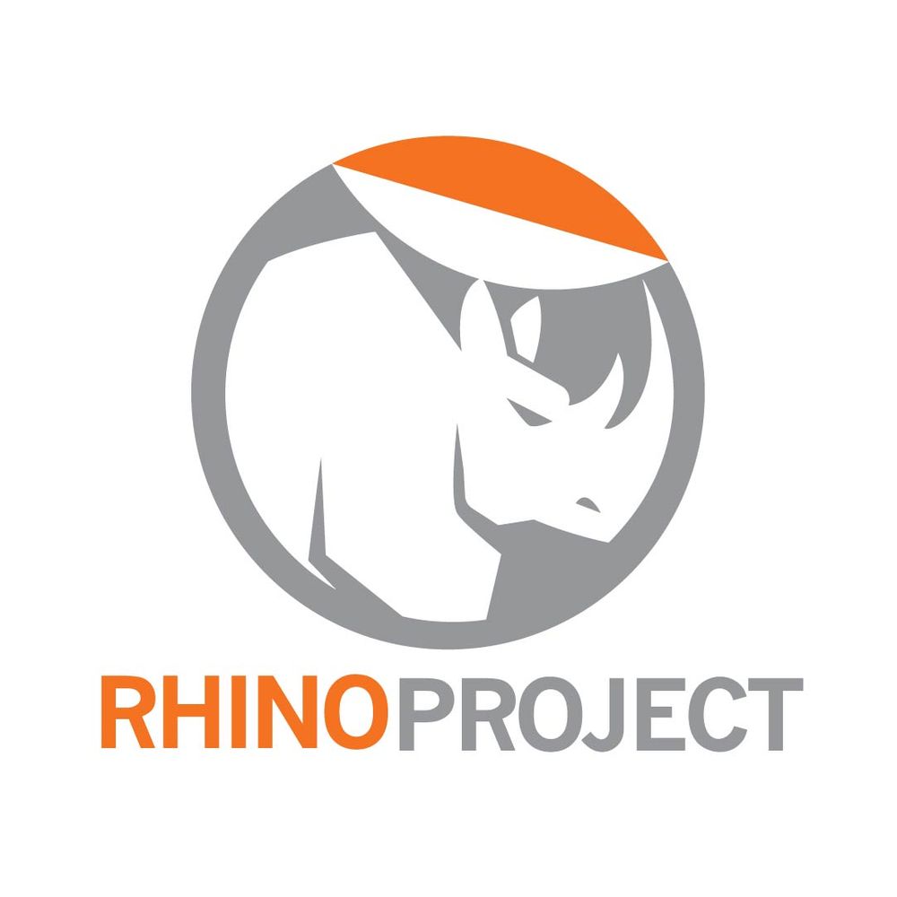
This printing company dons a circle logo that features a rhino in the middle. The play on white space is a unique way to give this logo design visual interest. The subtle grey color is appealing as it balances the vibrant orange in the text and the patch above the rhino.
As you can see, the overall design seemingly looks like a circular sticker detached at the top. It indicates it’s about to be peeled, which paints a picture of what customers do once they get their printed materials.
2. Luther’s Gym
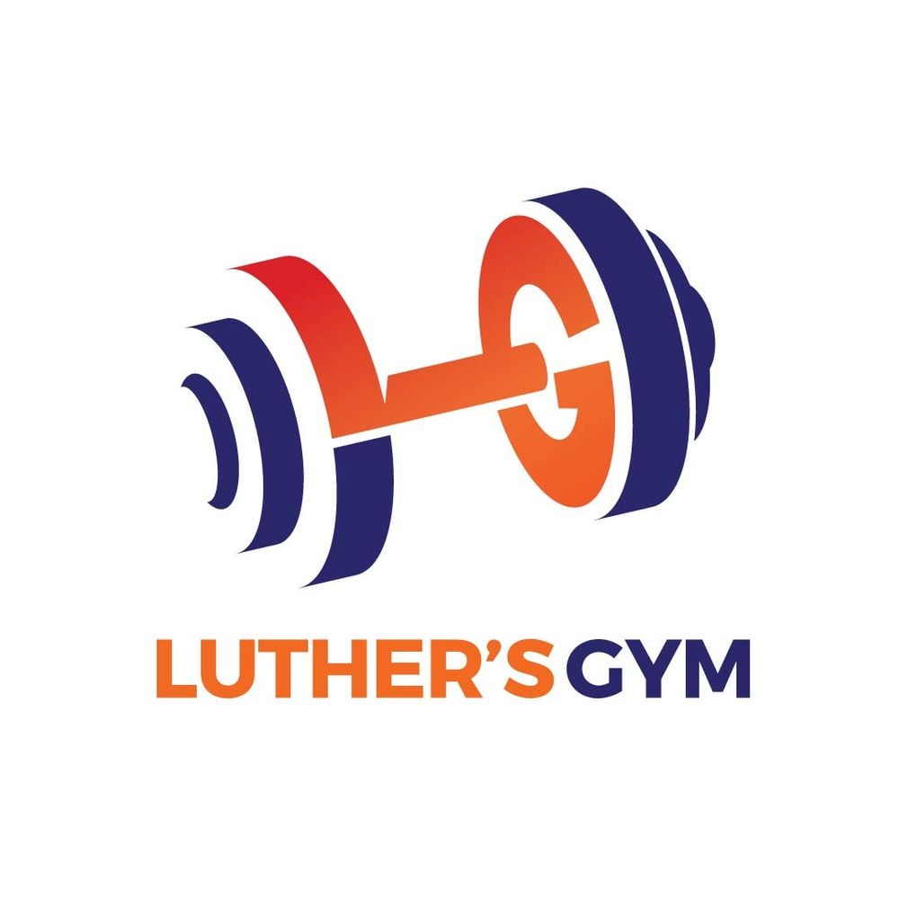
Luther’s Gym’s logo is a well-thought-out logo that has all the elements of a good design. It’s simple, relevant, versatile, and unique. You’ll see that it’s a symbol of a dumbbell, an excellent way to represent strength and exercise.
However, the designer put an exciting twist by integrating the letters “L” and “G” in the barbell. Plus, the negative space also does a bang-up job of creating distinction and clarity in the logo.
3. Nelson’s Vodka
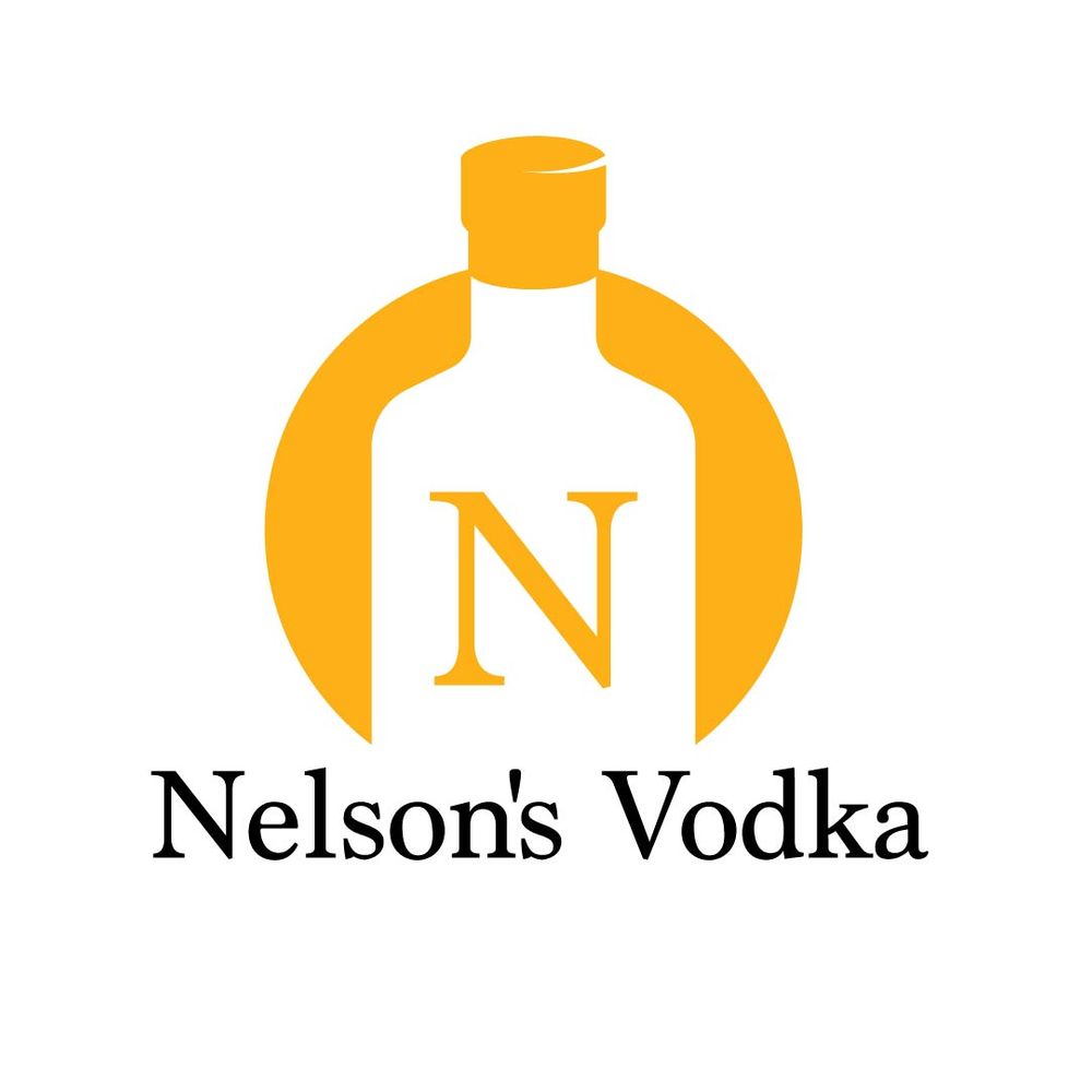
Nelson’s Vodka is a company that sells, you guessed it, vodkas. The logo is simple, which showcases a vodka bottle in the middle against an orange background. In color psychology, orange evokes feelings of confidence, and sociability, which appeals to target audiences.
The serif font also emanates an air of authority, apt for this beverage company that has been operating for years.
4. DIY Cakes
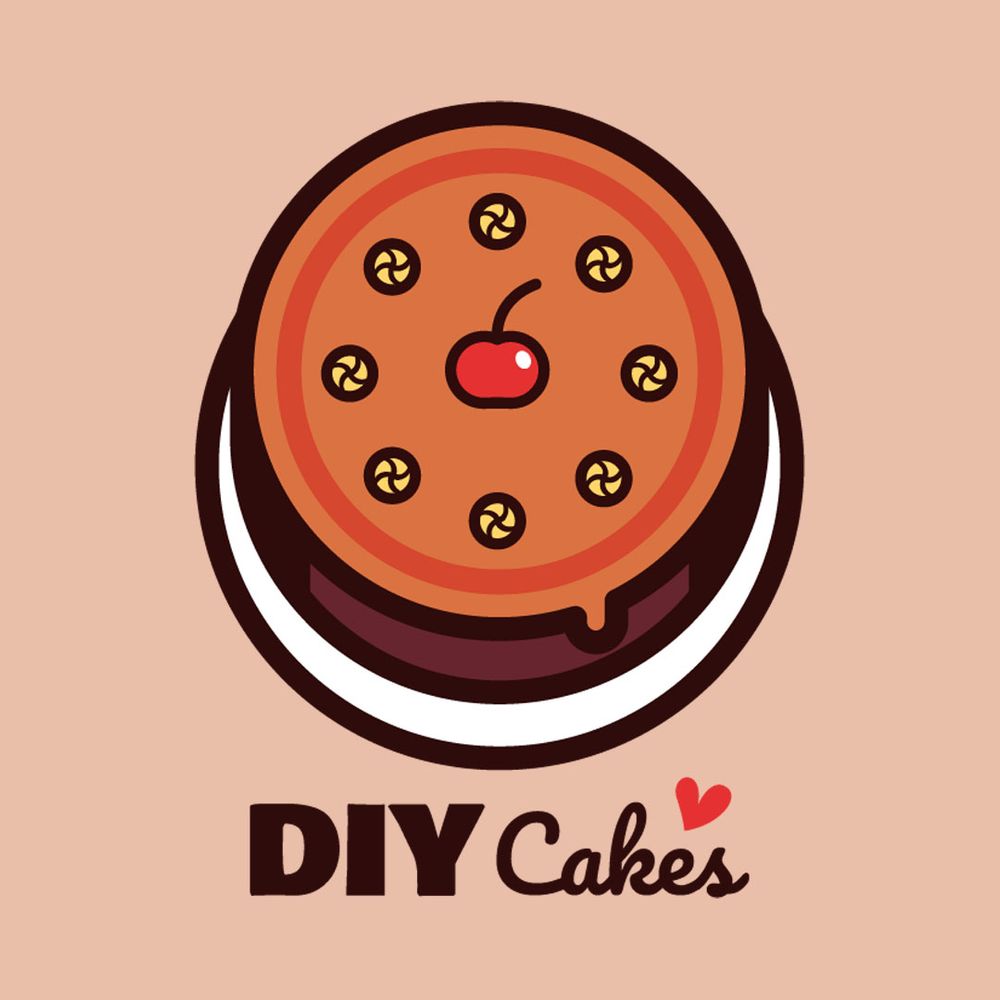
Showcase your product and feature it in your circle logo! This DIY Cakes logo is apt for the company’s offer, which is cakes. The font choice looks modern and casual, akin to the company’s branding and personality. DIY is primarily fun and enjoyable, and the logo depicts just that.
The circular cake is also the cherry on top (pun intended). Even an illustration of a cake could already connect your brand to your target consumers.
Do you want a circle logo?
Hire a logo designer here
5. Kenny’s Burgers
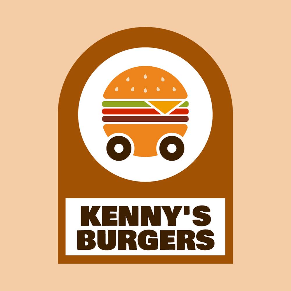
Kenny’s Burgers is a food truck company that sells burgers, fries, and milkshakes. The circle logo is aesthetically pleasing, showing a burger on wheels in the middle. Although this logo has several design elements, the structure is laid out neatly, so the eyes scan the logo in the proper direction.
The white circle creates a distinction between the burger and the background. Also, the wheels on the burger indicate what kind of company they are. The bold text amidst a white rectangular background is also legible from afar, making this a scalable design.
6. Pointless Corp
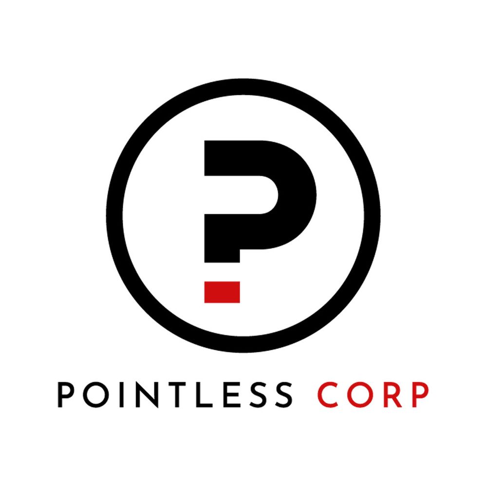
Pointless Corp is a travel agency that uses a lettermark for its circle logo. It’s a simple logo that dons an abstract letter “P” in the middle. The letter is also reminiscent of a question mark, which indicates the company can answer any questions or uncertainty their customers have about their trip.
7. YoMaMa Baby
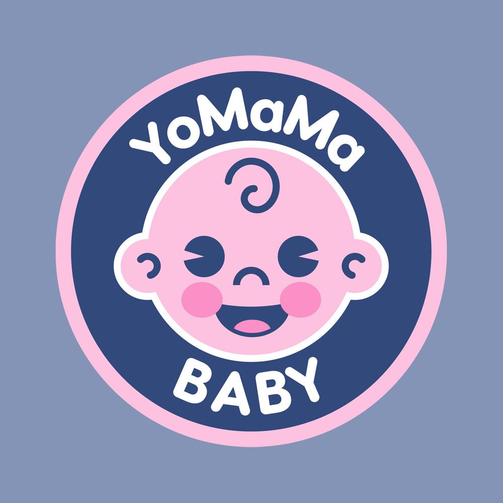
YoMaMa Baby is a company that sells baby products, and you’ll instantly comprehend this the moment you land your eyes on their logo. The pastel color is an indication of the company’s fun branding. It’s an excellent way to connect with customers who are looking for items for their young ones.
8. Wok This Way
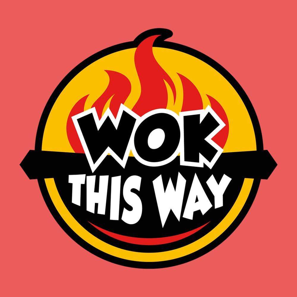
This is a company that belongs in the food and beverage sector. Wok This Way serves consumers noodles that are cooked in a wok and prepared right in front of you. The experience is what makes this company stands out.
The overall circular logo design is eye-catching with bright red, yellow, black, and white colors. The colors are combined to give every design component a chance to showcase its role in the logo. The big wok with the fire in the background doesn’t seem to dominate the brand name.
9. Jo’s Artworks
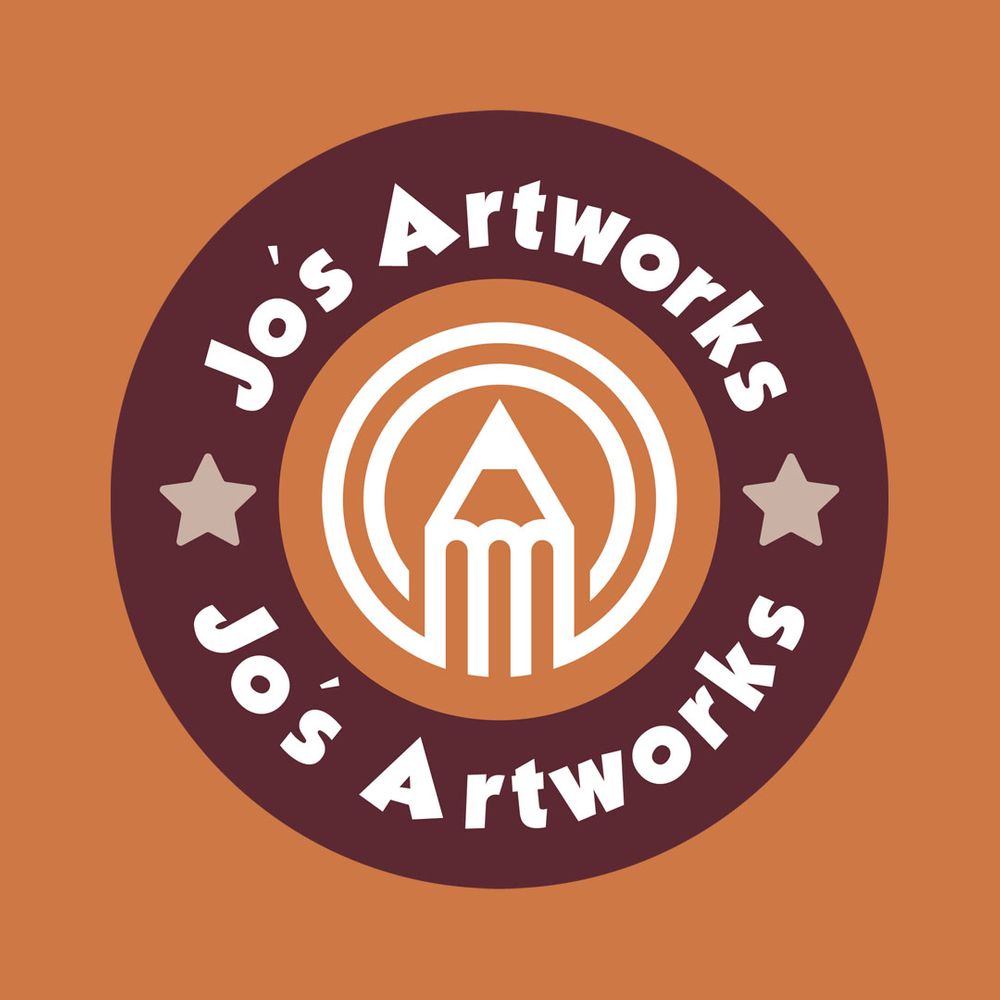
The logo speaks a lot about the brand of a creative company such as Jo’s Artworks. It features a pencil in the middle, which depicts drawings, creations, and art. The bolded white text at the top and bottom is also legible enough, so it’s the first thing viewers see when they look at the logo.
The stars are also a great way to rest the eyes from everything that’s going on in this logo. Overall, the design is visually appealing and suitable for a creative company.
10. Akini’s Potato Crisps
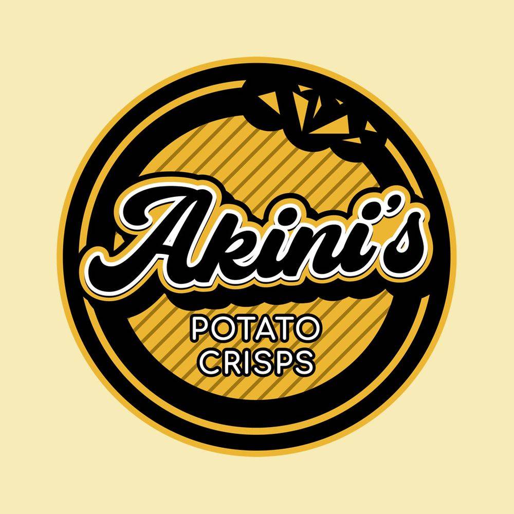
Akini’s Potato Crisps is an online store that sells homemade potato crisps that are healthier than those sold commercially. The yellow color evokes happiness, which is how people feel when eating comfort food like junk food.
The typography is beautiful as the combination of the bold script font and simple sans serif font stands out.
What Should Be in a Good Circle Logo?
Working with a circle logo means you’ll only have limited space, which can sometimes contribute to cramming all elements in. A circle logo should be:
- Simple that allows viewers to understand what the brand offers
- Relevant to the company’s products, services, and brand identity
- Versatile enough for any marketing material
- Timeless, so the logo stands the test of time
- Unique, so it beats the heck out of its competitors
Do you want to see how Penji can create a circle logo for your company? Sign up here and submit your first-ever request! Plus, you also get a 15% discount on your first month when you subscribe! In addition, explore our new Marketplace to get one-off designs for your brand!


