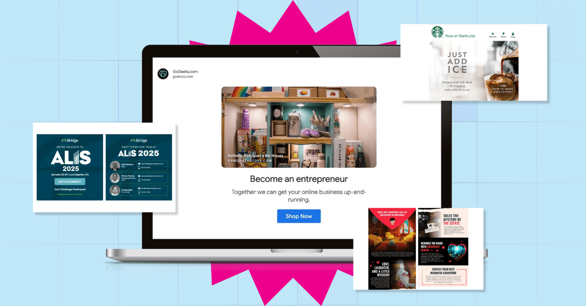
Email marketing is an innovative way to connect with your subscribers. Marketers and designers have integrated their version of email campaigns in order to create brand loyalty. But, in order for subscribers to be interested in clicking on your email campaign, your email designs have to be compelling.
In 2024, email marketing revenue was projected to surpass $9.5 billion—a testament to its unmatched effectiveness. Few, if any, marketing channels can rival email’s impressive return on investment, making it a go-to strategy for businesses of all sizes.
In this article, we’ll unpack the basics of email designs, the types of emails to send for your marketing campaign, and tips for creating the best email design. Plus, check out some examples and email design services to inspire you. Let’s dive right in!
Table of Contents
- Why is Email Design Important in Email Marketing?
- Email Design Tips
- Types of Marketing Emails
- The Bottom Line
Why is Design Important in Email Marketing?
The best email design isn’t just about aesthetics—it’s a powerful tool that influences engagement, conversions, and brand perception.
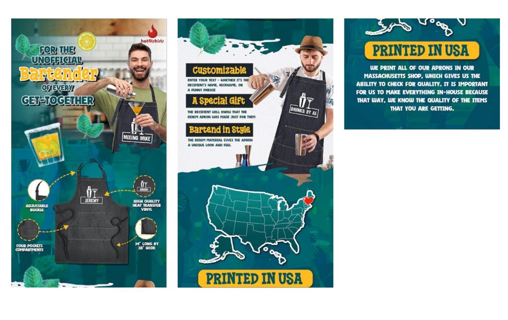
With inboxes flooded daily, knowing how to design an email or having a professional do it for you can mean the difference between a click-through or a delete. Without a doubt, investing in email design services and having a good grasp on making an email standout ensures your messages are optimized for results.
Here’s why email designs matter in marketing:
- Boosts Open and Click Rates – Visually appealing email marketing graphics with clear structure and compelling CTAs encourages readers to take action.
- Enhances Brand Consistency – Well-designed emails by reputable email design services reinforce your brand identity through colors, fonts, and layout, making your business instantly recognizable.
- Drives Conversions and Sales – An effective design guides subscribers toward your desired action, whether it’s making a purchase, signing up, or downloading content.
- Reduces Unsubscribes and Spam Complaints – Professionally designed emails that provide value and maintain aesthetic balance keep subscribers interested and reduce opt-outs.
Email Design Tips
Before you know which types of emails you could send for your email marketing campaigns, here are some design tips to get you started.
1. Keep it Simple
Simplicity is the key to win over an audience. Less is sometimes more, according to design experts. It is effortless for consumers to interpret, easy on the eyes, and is more likely to attract a broader audience. Do not distract your viewers with a complex design that is hard to decode. Allow the focus to be on your message and brand. Design is only there to enhance your message, it’s not supposed to be the center of attention.
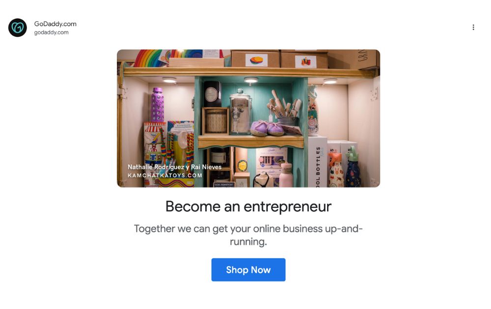
Here’s an example that falls under simple email graphics examples. GoDaddy’s minimalist email design is quite minimalist, with one image, a headline, copy, and a call-to-action button. Though this format is similar to the usual free email templates, it has a sense of simplicity that allows readers to focus on the message.
2. Consider Adding Animation
Most people have a full mailbox, awaiting them are mundane, poorly designed automated emails. Do not be the email that gets skipped over and ignored, simply because you blend in with other emails. In order to be interesting, have animations within your email. Animations are a fun email design inspiration that can be very useful for getting a lot of views.
Content is the most important aspect of an email. Make sure that your subscribers will be interested in what you have to offer. Animations will make the email appear less serious and more welcoming to consumers. It can look like a friendly and fun company to have around.
3. Make It Legible
A visually stunning email won’t drive results if your audience struggles to read it. Prioritize clear fonts, proper spacing, and high contrast between text and background to enhance readability. Stick to simple, web-safe fonts like Arial, Roboto, or Open Sans, and avoid overly decorative styles that can strain the eyes—especially on mobile devices.
4. Focus On Color
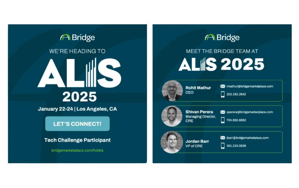
Color is a powerful tool in email design—it directs attention, reinforces branding, and influences emotions. Using a cohesive color scheme helps create a visually appealing and easy-to-navigate layout. Contrast is key; ensuring text stands out from the background improves readability and makes calls-to-action more noticeable.

For instance, the design above effectively uses a bold color palette to draw attention to key information. The mix of blue, orange, and white creates a professional and trustworthy look while ensuring contrast for readability. The strategic color choices help guide the viewer’s eye through the message seamlessly.
When designing emails, using free AI email generator tools can help brands maintain consistency in color schemes and optimize for engagement. Leveraging AI email writing tools can also ensure that the visuals and copy align with a brand’s tone and marketing goals.
Types of Marketing Emails
If you’re thinking of implementing an email marketing campaign, here are the three basic marketing emails you can send to your leads or subscribers.
1. Promotion
Email is another channel where you can promote your products or services. According to My Emma, marketers like promoting through email because of the ROI it yields. Added to that, Litmus found that the ROI is $42 per every $1 spent on email marketing campaigns. So, you shouldn’t disregard the power of email marketing.
Here are the four common promotional marketing campaigns for email:
Product Promotion
If you have a business product, you can showcase your new products or even current products with email design. This is a great email design inspiration to show off your brand. For example, seasonal themed designs should be marketed in your email. Consumers tend to follow a theme. So, when you create products aligned to modern trends or the upcoming seasons, there is no faster way to inform people than through a subtle email. You can also use an email outreach program to help.
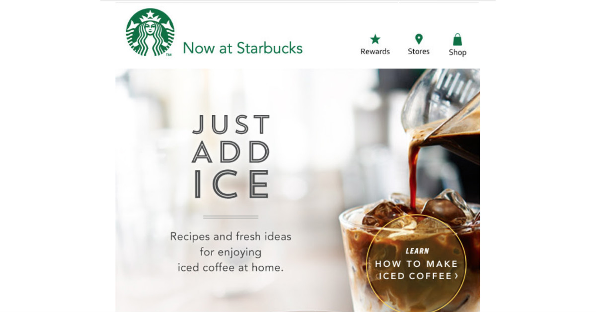
Marketing email from Starbucks
Starbucks sends email campaigns to their subscribers regularly to either update them on the new coffee inventions or to simply learn basic barista tricks. The email above promotes their own product, as well as provide quality content for their subscribers to use.
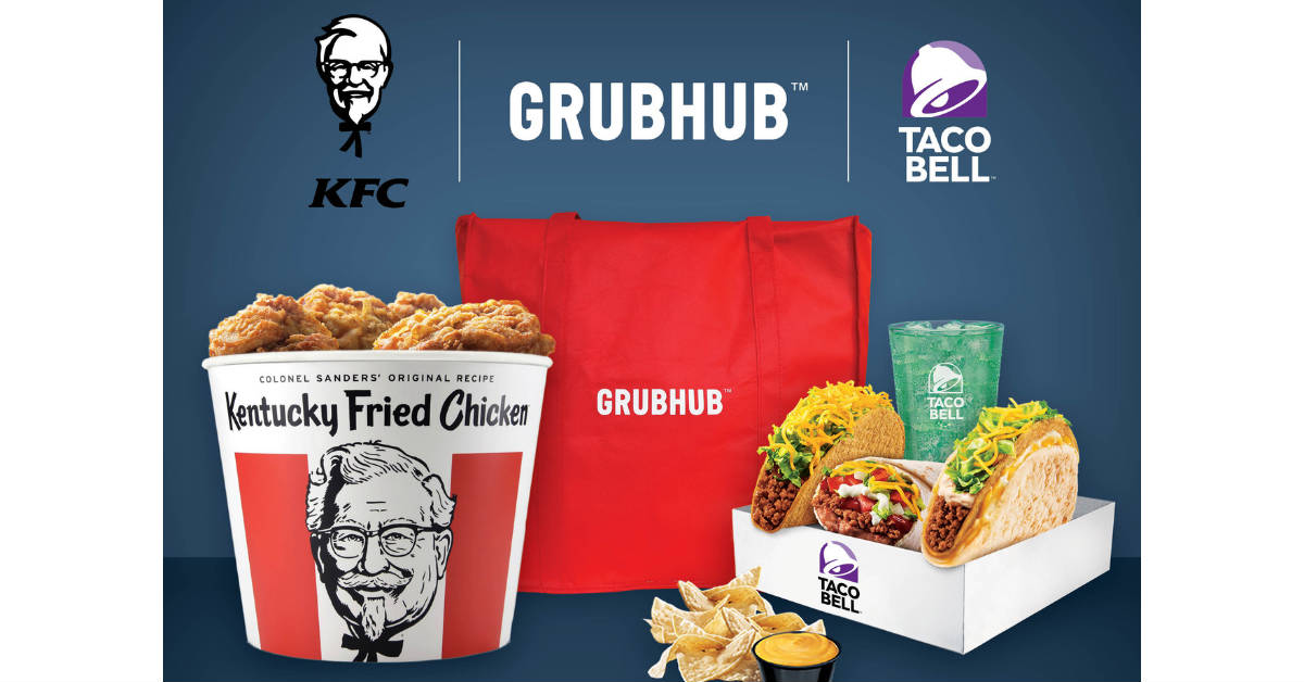
Marketing email from Grubhub
Grubhub showcases the food companies that they work with and can deliver for. They entice their subscribers with the images in order to promote their delivery service.
Holiday Promotion
The holidays are one of the most important times to market. Consumers are more likely to impulsively buy products during the holidays. When you promote the holiday and get into the spirit of the season, it radiates into a positive impression. During the holidays, people tend to gravitate towards any form of design or product that embodies that spirit.
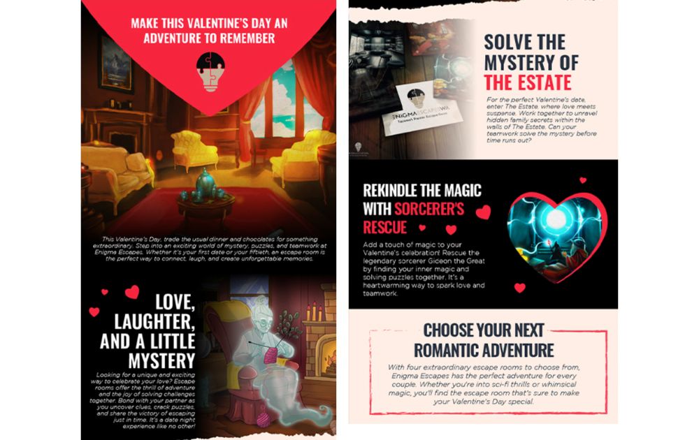
Deals
A common component of ecommerce email automation campaigns, a promotional deals email highlights exclusive discounts, limited-time offers, or bundle deals to drive immediate purchases. These emails often use compelling visuals, urgency-driven language, and clear CTAs to entice recipients to take advantage of the offer.
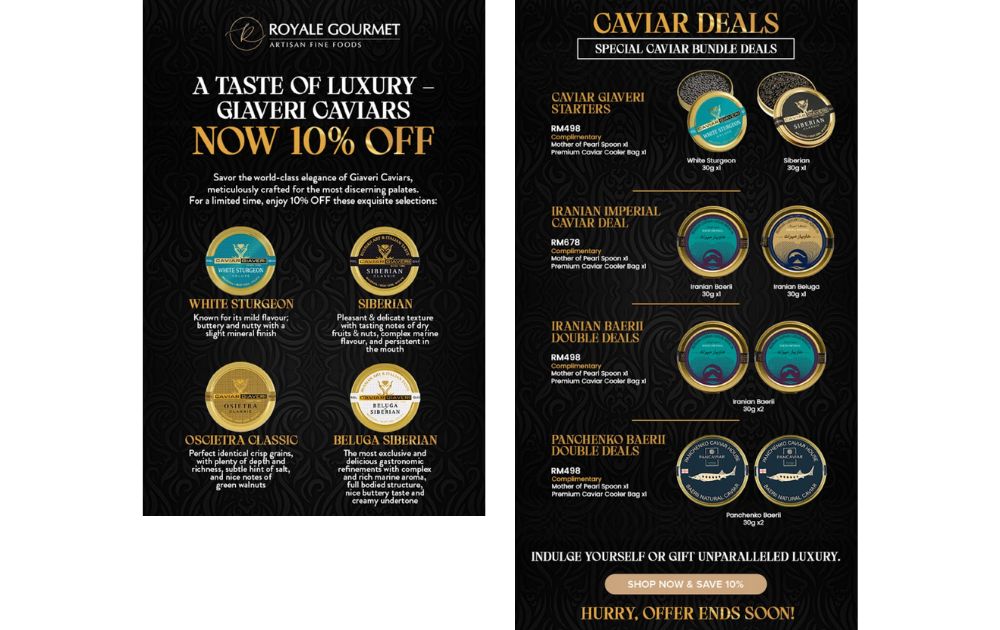
For example, the email direct marketing design above effectively conveys exclusivity and urgency through its elegant black and gold theme, reinforcing the high-end branding of Royale Gourmet. The “Now 10% Off” message is prominently displayed to capture immediate attention, while the detailed descriptions of each caviar variety add a gourmet appeal.
Although the design is an important feature in email design. The font that you pick should be legible enough for your subscribers to read. It goes without saying that you need to be extra considerate with legibility during email announcements, invitations, and other informative news.
And that is why you need to entrust email designs to professionals. Penji‘s graphic desingers belong in the top two percent in the industry. That said, they know how to make your typography designs stand out from the noise.
2. Newsletter
Newsletters are a cost-effective way to maintain regular contact with your subscribers. It is a subtle and indirect way of promoting your brand, as well as provide quality content. These emails provide valuable insights, promotions, or industry trends, making them an effective tool for building customer relationships and driving repeat engagement.
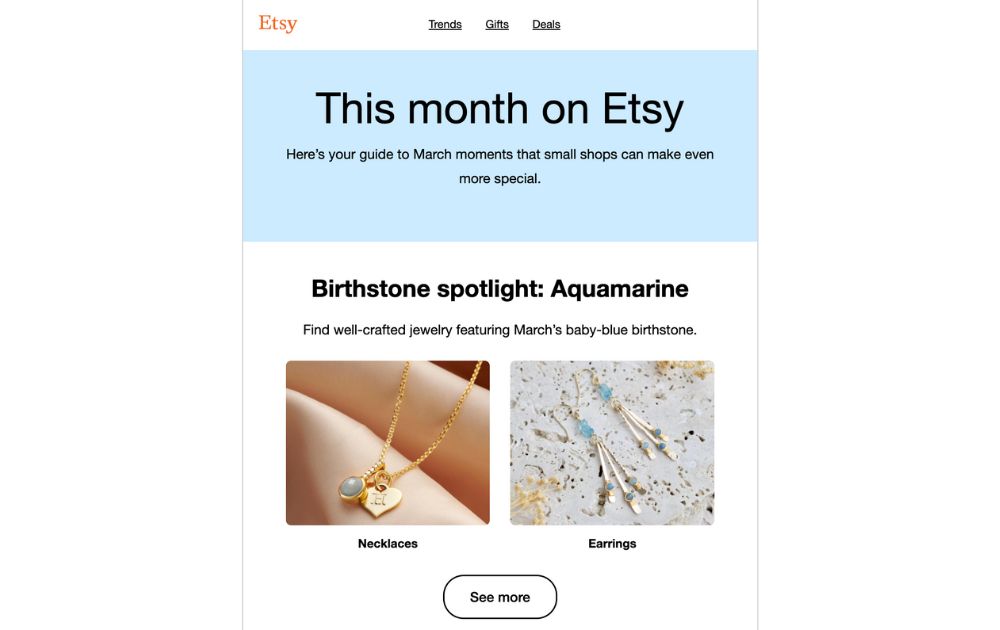
This Etsy newsletter is structured as a monthly update, featuring a curated selection of products based on seasonal themes. The clean and minimalist layout, with a pastel blue header and high-quality images, keeps the focus on the featured birthstone jewelry for March.
For businesses looking to optimize their email strategy, using a guide to AI email marketing tools can streamline content creation, automate personalization, and improve engagement rates. When choosing an email marketing platform, brands may compare Shopify Email vs. Mailchimp, evaluating factors like pricing, automation, and ease of use to determine the best fit for their marketing needs.
3. Gifts or Freebies
Make your emails seem exclusive. When a new visitor or lead signs up for emails, you can give them discounts or freebies. This way, they might consider buying a product or availing of a service from you. Who knows, they might end up adding something on their cart after sign-up. In most instances, companies would add discounts or gifts on their Welcome emails or referrals.
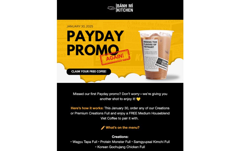
The Bánh Mì Kitchen payday promo email above is one of the email design examples that banks on the audience’s excitement over a freebie. It grabs attention with bold typography, high-contrast colors, and a clear CTA to claim a free coffee. In addition, the playful use of the “AGAIN!” stamp adds excitement, reinforcing the limited-time nature of the offer.
The Bottom Line
Email marketing remains one of the most powerful ways to:
- Engage customers
- Build brand loyalty
- Drive sales
However, great content needs great design to maximize its impact. From promotional emails to newsletters and exclusive freebies, email designs done well ensure that your message gets noticed and acted upon.
If you’re looking for professional, high-quality graphic design services, Penji’s unlimited graphic design services can help you create stunning, conversion-driven emails tailored to your brand. Watch a short demo and see how Penji can do the design heavy-lifting for you.
About the author

Ginny Nguyen
Ginny is a Marketing Assistant and Content Writer focused on technology, innovation, and business.

