
Contrary to many business owners’ beliefs that email is dying, it is still a powerful strategy, especially this new year. Sometimes, you might need some help from an eCommerce email marketing agency to achieve this. If you plan on using it, make sure to create email marketing graphics that grab attention. Here are Penji’s best to inspire you:
1. Pulp & Press
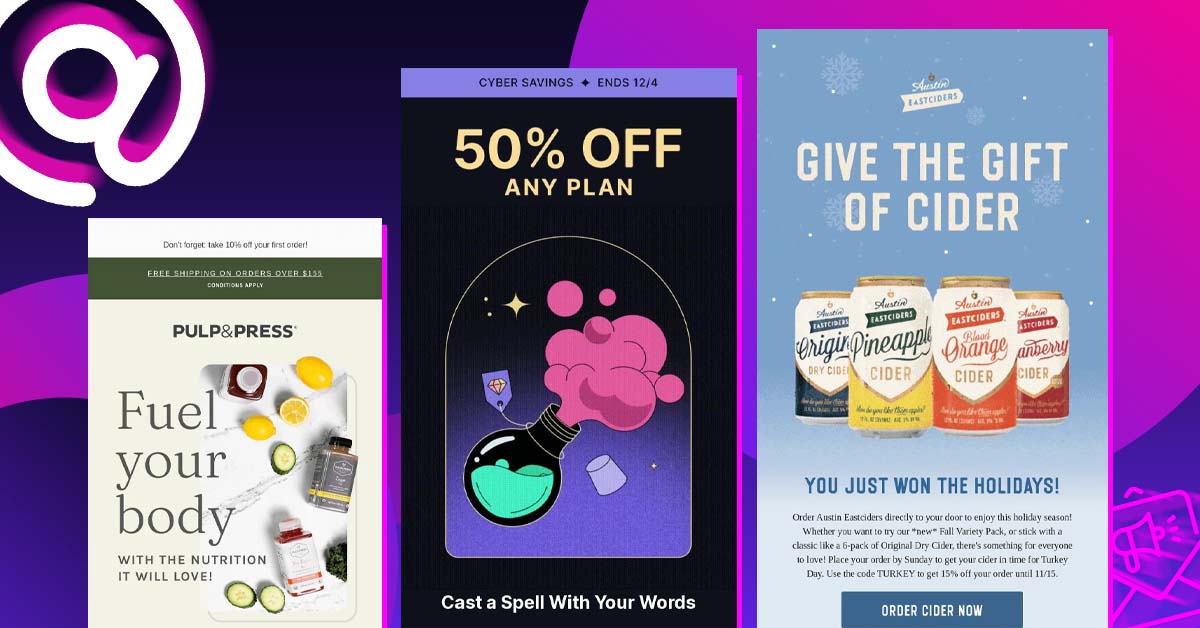
This email sent by Pulp & Press is truly noteworthy. When you visit their website, you’ll see a harmonious look as the email has the same vibes. It has a refreshing ambiance that aligns with the brand personality. Once you open the email, you’ll be greeted by clear images of their products.
As a company that sells cold-pressed juices, clarity and freshness come first. This is evident in the email and all their marketing materials. Having a tied-down look, a simple layout, and wonderful product photos are email design traits you should aim for.
2. Camp Epic
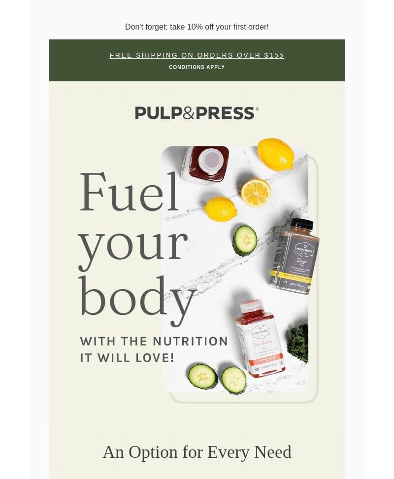
Custom illustrations can do wonders that photographs can’t even come close to. In this email marketing graphic from Epic!, they focused on the book covers filled with illustrations. The covers are great in attracting attention as they as placed one after another, offering diversity and plenty of options.
Plus, the colorful layout and additional illustrations on the top and bottom give the email a friendly and warm feel. This is a company that knows its target audience so well that they know exactly what to include in its designs.
Need email graphics that help you convert?
Get unlimited custom designs with Penji


3. Grammarly
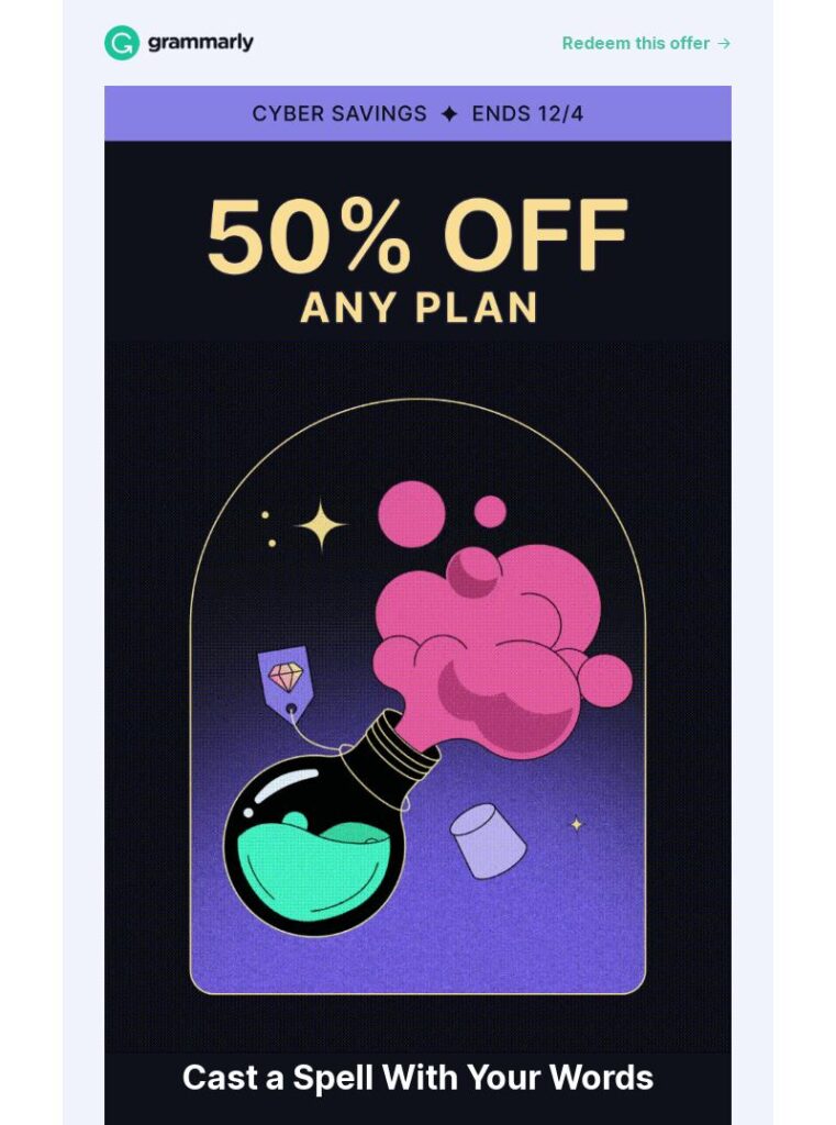
Without much ado, Grammarly offered a massive discount on its email design. This is the first thing their recipients will see, precisely what you want your emails to do. With so many emails people get in a day, you don’t want to waste their time and risk getting your email junked.
Once the reader has gotten over the bomb of a discount, they are entertained with colorful and eye-catching email marketing graphics. In this case, the illustration of a potion bottle being opened. The key takeaway here is to present your message first, then add embellishments to emphasize it.
4. Austin Eastciders
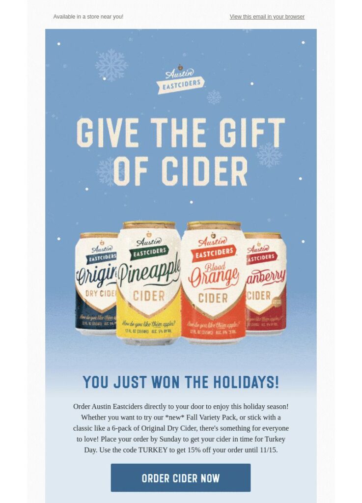
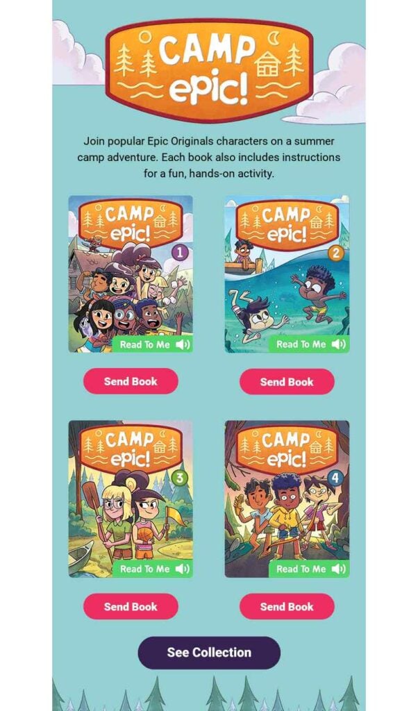
This email marketing graphic design from Austin Eastciders is so beautiful, you’d think twice about deleting it. It is bursting with colors you can almost taste the drinks. The background and overall design are festive, perfect for the holidays.
While you can see some design elements around the product image, it is not overcrowded. Even the font type they used is simple. They did this to avoid cluttering which can overwhelm the reader, and discard the email immediately. Always note that you have a very short time to have them read your message, make every second count.
5. ECC New Zealand
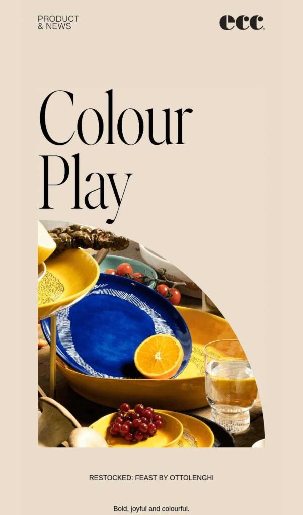
Using a different shape for a frame is a great way to add uniqueness to your email graphics. This one from ECC New Zealand uses a semi-circle to present its products. While it may seem small, think of it as a teaser that aims to hook you into clicking through to their website.
This is an excellent way to lure visitors to your site and have them browse and, ultimately, purchase. This home and furnishing brand has a beautifully designed website that transcends into their email correspondence. Another email design technique you should be copying.
6. Out of the Valley

What better way to tell your customers the beauty of your products is by showing them. This Out of the Valley email added a photo of one of their products in a setting where the reader can see how it is used. The recipient can easily imagine themselves in an Out of the Valley cabin with this fantastic image.
The email also features many of its other products, but the most crucial photo was this one. It was taken with a full cinematic drama because the company understands that in an email, this is where the readers’ eyes will linger the most.
7. Djusie
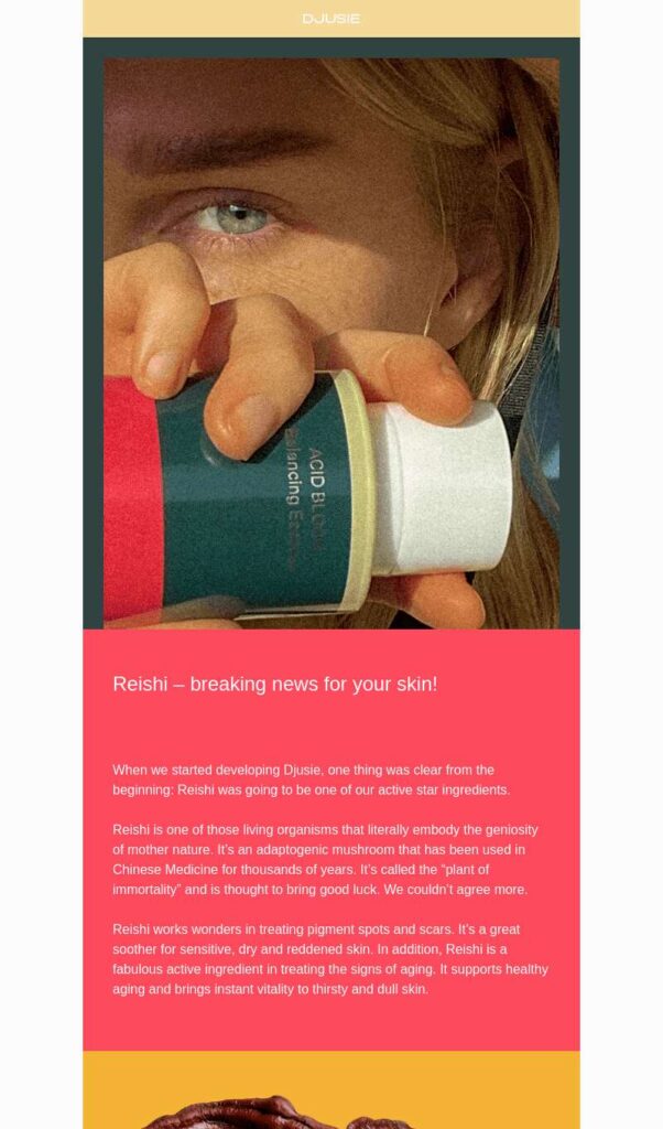
According to House Beautiful, the color trends for 2023 will focus on the bright and bold. It’s safe to assume that this will be the same for fashion, graphic design, and anything requiring colors. So, for your next year’s email marketing graphics, do as Djusie did with theirs, an email filled to the brim with vibrant colors!
This email design example is compartmentalized using different colors for each section. The layout leads the eyes to where it needs to be, making it easy to follow the message.
8. National Geographic
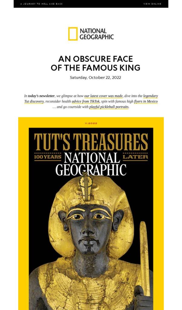
If you really want to grab attention, try this strategy National Geographic did: they added shock value to the email. They used the front page of their magazine to show King Tut and his treasures. The image is bordering on fascinating and creepy, and you have no other choice than to read what they have to say.
This is a genuinely excellent idea you can copy. Getting your readers interested can be difficult, but a big and clear image upfront can create the impact you need. No more need for any other design elements, the mere sight of a dead king is enough to get the readers’ attention.
9. Buoy
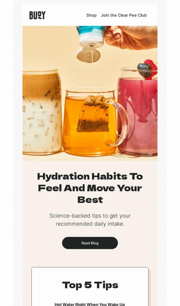
Use your email as a display room for your products. This is what Buoy did when they lined up a few of their hydrating drinks in a beautiful row. Then add more value to the email by offering a link to their blog, which tells readers how to hydrate.
When you provide value to your email, your recipients will look forward to getting them. While graphic design can pull your readers in, an email that gives them tips is highly appreciated.
10. Ashley & Co

Scent company Ashley & Co knows what to do with their email graphics: make them look as good as they smell. The layout offers plenty of white space, which gives it an airy and calming atmosphere. This is the perfect look to go for, as the email design matches the brand personality quite well.
The use of white or negative space makes the email easy on the eyes. All you need to do is determine which part you need the readers’ eyes to focus on and highlight that area.
Helpful tips when creating your email marketing graphics:
- Keep them simple: Every day, we are bombarded with dozens, if not hundreds, of email marketing materials. You need to create ones that will stand out and are interesting enough to get opened. Avoid visual clutter using a clean layout, a single focal point, and no excessive text overlays.
- Use high-quality images: Always choose images that are of high resolution. Avoid blurry or pixelated photos, as these will make you look unprofessional.
- Add your personal touch: When possible, customize your email marketing graphics with user data or dynamic elements. This will connect you with your recipients on a deeper emotional level and increase the email’s relevance to them.
- Add clear call-to-actions: Always tell your recipients what to do next by adding clear call-to-action buttons or instructions. Lead them to your desired actions by using attention-grabbing buttons that lead to your website or to make a purchase.
- Do A/B testing: To create email marketing graphics that get you the results you want, do A/B testing on various images, layouts, colors, and fonts. This way, you’ll get a good grasp of what works and what doesn’t.
Final Thoughts
This list of the best email marketing graphics includes tips on creating your own. You can then start the new year right with beautiful emails that stand out. If you need help with design, you can always count on Penji. Click on this link to get our designers started.
About the author

Celeste Zosimo
Celeste is a former traditional animator and now an SEO content writer specializing in graphic design and marketing topics. When she's not writing or ranking her articles, she's being bossed around by her cat and two dogs.


