
A pentagon is known for conveying strength and stability, among many positive characteristics, thanks to its mesmerizing symmetry. If you’re looking to build a strong and resilient brand, a pentagon logo design is what you need. Below are 11 examples crafted by Penji’s team of pro logo designers.
Penji offers unlimited designs or one-off logos. Scroll down below for a special 15 percent discount!
1. Hamlin & McGill

This logo for a made-up law firm, Hamlin & McGill, would do well with a pentagon shape. It has five equal sides, which project equality and fairness. The color choice of yellow adds a warm touch that prevents the logo from looking stiff and dull. The pillar image represents strength and power suitable for a legal company.
Fantastic pentagon logos perfect for your brand
Get your pentagon logos in 1 to 2 days from professional graphic designers

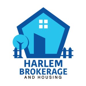


2. Harlem Brokerage and Housing
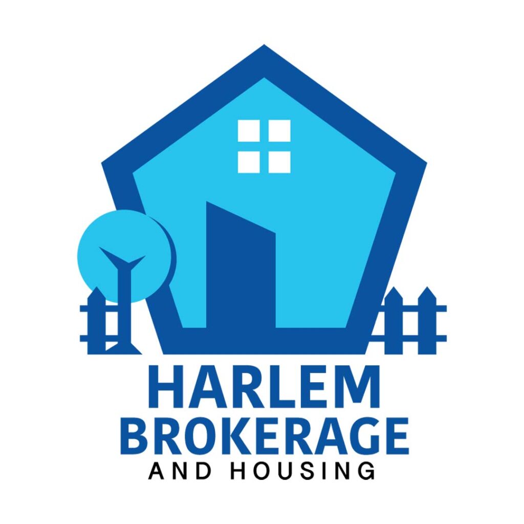
With a cleverly-designed pentagon logo, Harlem Brokerage and Housing uses a house shape complete with a tree and fence. The overall design gives a comforting appeal that’s perfect for a housing company. The use of blue is very appropriate as it symbolizes trust, intelligence, and calmness.
3. First Order
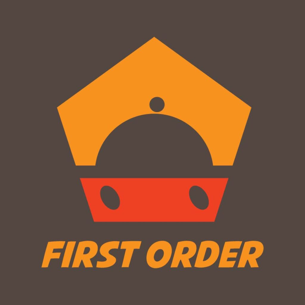
If you’re in the restaurant business, this logo designed for First Order is worth noting. A food cover is encased in a pentagon with what seems to be wheels to denote speedy delivery. The use of the colors brown and orange are suitable for this business as it connotes warmth, friendliness, and hospitality.
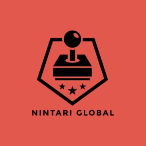
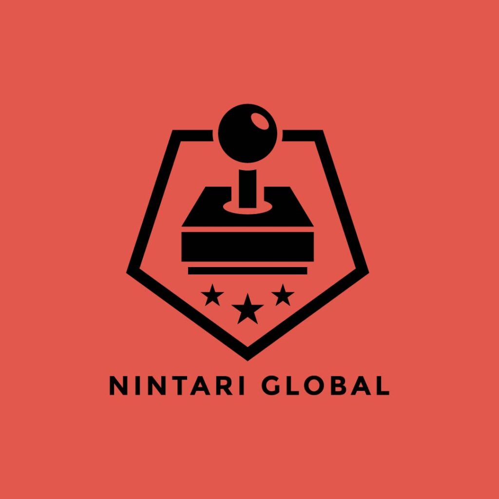
4. Nintari Global
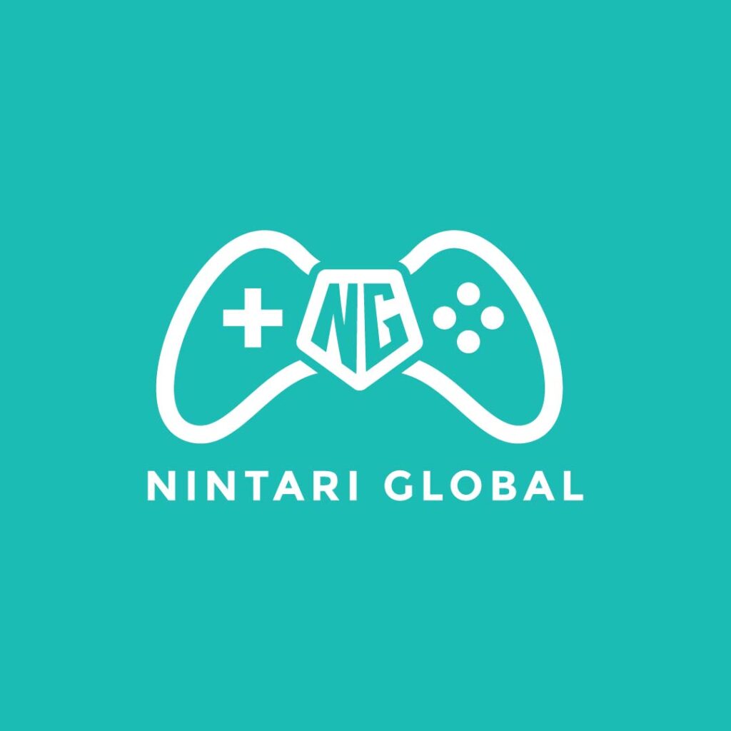
Placed in the middle of the image as part of a gaming controller, this Nintari Global logo uses the pentagon shape freshly and sharply. Its design and color speak directly to its intended market, the young adults. It has details that do not make the design look cluttered but clearly tell viewers what the brand is about. This is it if you want to know what a functional logo design looks like.
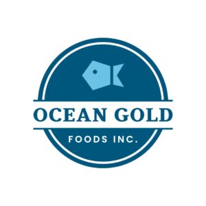
5. Ocean Gold Foods, Inc.
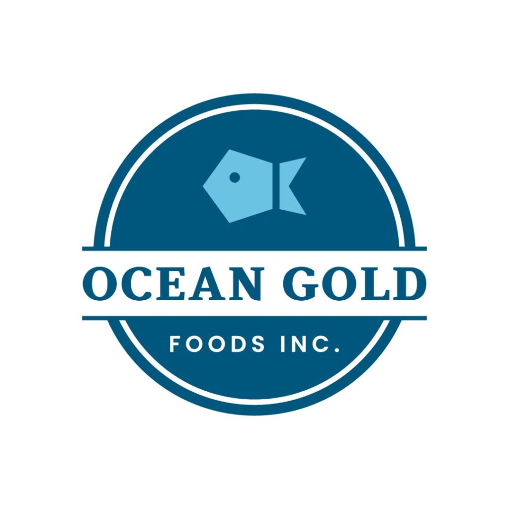
At first glance, you won’t easily see where the pentagon is in this Ocean Gold Foods, Inc. logo. Upon closer inspection, the round logo has a cute fish in the shape of a pentagon. It uses blue as its primary color to associate the brand with the ocean, which helps illustrate freshness. The font pairing is commendable as it emphasizes the brand name and adds interest to the design.
6. Nintari Global
This different version of the Nintari Global brand has a more businesslike atmosphere. Like the one above, it also has a game controller but uses orange instead. While the one before has a playful appeal, this version is more suitable for corporate materials such as business cards, letterheads, and email designs. The dark orange color adds to its professional approach and gives it a more serious tone.
7. Shield Protection Services

Whether in the protection industry for people or data, this Shield Protection Services logo design is a good inspiration. It uses a pentagon shape with a keyhole in the middle to give viewers a sense of what the brand does. It uses multiple colors, the primary being the color violet, which is commonly associated with power and strength. The font is a simple type without serifs and has rounded edges to avoid being too stiff-looking.
8. Red Ribbon Corp
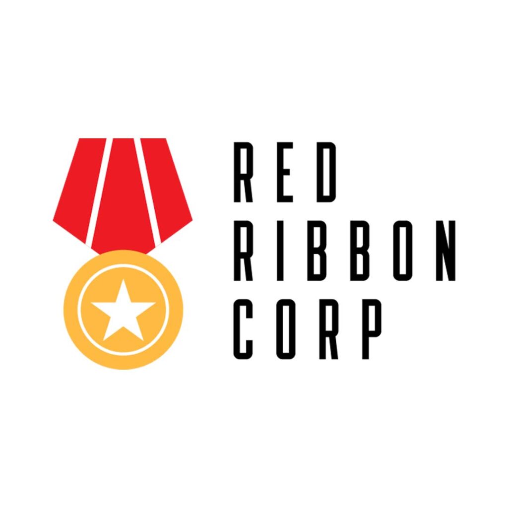
As its name suggests, Red Ribbon Corp’s logo uses a ribbon with a gold medal and a star on it. Its pure simplicity places emphasis on its promise of high-quality services or products. Of course, the logo would have the color red in it, but the gold perfectly boosts the design to be more exciting and eye-catching. The designer chose black for the font type, which adds an element of sophistication to this pentagon logo.
9. St. Vito Medical Center
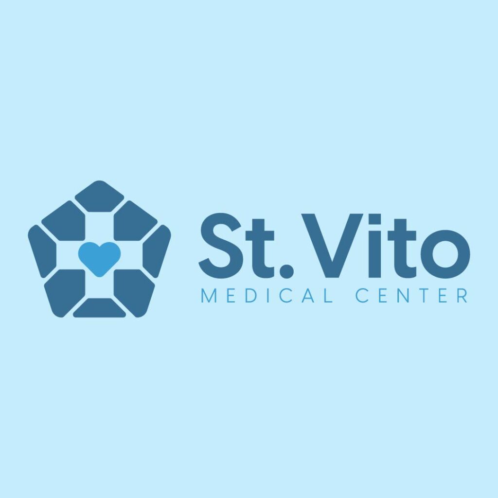
The health and wellness industry requires a clean and crisp logo design to project an image of sterility and competence. In the case of the logo designed for St. Vito Medical Center, the designers had this in mind. The logo has minimal details, uses a subdued shade of blue, and has a very straightforward font choice. The design has a heart in the middle of the pentagon logo to show the company’s concern for its patients.
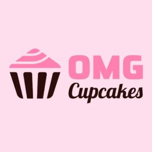
10. OMG Cupcakes
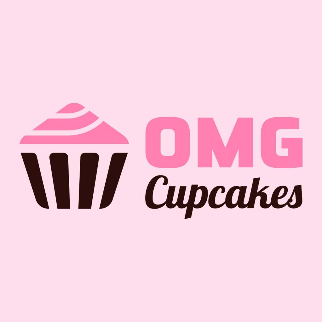
You’d never think that a cupcake can fit in a pentagon, but here it is, OMG Cupcakes uses it in a quirky way. This is a highly scalable design and would look good in any size branding material. You can use it for company signage, posters, business cards, social media graphics, and many other branding assets.
11. Sir Tony Skates
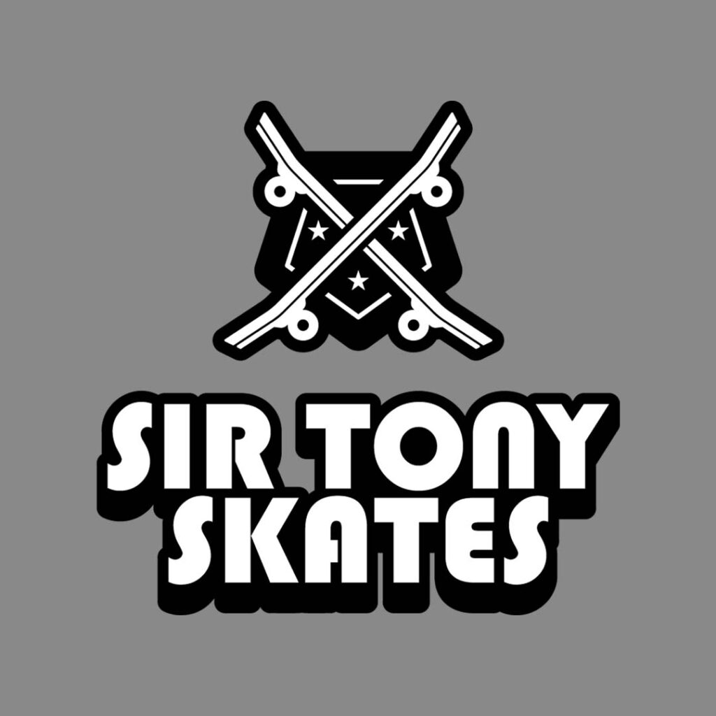
A pentagon shape beautifully juxtaposed with skateboards and some starts, the Sir Tony Skates logo packs quite the punch. Its big and bold font choice adds power and impact to the black and grey color combination. This design blends sports, danger, and excitement quite well, making it perfect for t-shirts, stickers, and other items relating to skateboarding.
Examples of Famous Pentagon Logos
To show the versatility of pentagon in logos, below are five examples of well-known brands that have harnessed the power of this fantastic shape:
Chrysler
Sleek and modern, the Chrysler logo is made up of two elements: the pentagon and the silver Pentastar. While the focal point of the design is the star, the first thing you’ll notice is the pentagon shape that holds it. Like the brand, this logo design is a work of subtlety and symbolism, sophistication and elegance. All these characteristics make the emblem an excellent representation of the automotive giant.
While the brand has already opted for a new logo, this one still commands huge associations with it. It still evokes Chrysler’s inherent power and stability.
The US Department of Defense
Popularly known as The Pentagon, thanks to its pentagon logo, the US Department of Defense’s logo is recognizable the world over. It is an influential and iconic design that embodies the organization’s many messages. This includes strength, stability, precision, unity, collaboration, protection, and many more.
The pentagon’s sturdy and symmetrical shape makes it a perfect choice to represent the department’s unwavering commitment to national security. It is a symbol of resilience, preparedness, coordinated efforts, strategic thinking, and innovation, among many others.
Lille Olympique
LOSC, or Lille Olympique Sporting Club, is a professional football club based in Lille, Hauts-de-France. It has gone through several redesigns, but the current one uses the pentagon as its main feature. And rightly so, as the shape conveys a variety of characteristics that are ideal for a sports club. It showcases stability, determination, strength, focus, cohesion, aspirations, and ambitions.
To add to the logo design’s power is the image of a Dogue de Flandre, a dog breed known for its courage, loyalty, and fighting spirit. It sits within the pentagon with the club’s name proudly displayed underneath.
Volcom
With bold lines and a dynamic silhouette, the Volcom logo is a recognizable fixture in the action sports and streetwear industry. While it is not a perfect geometric pentagon, it still is a unique and impactful symbol for the fashion brand. The pentagon, with its five sturdy sides, is a natural symbol of strength.
This aligns completely with Volcom’s brand image, one that’s built on the foundation of action sports such as skateboarding, snowboarding, and surfing, to name a few. These activities demand physical prowess and mental resilience, and when paired with great clothing, can beat any competition hands down.
National Women’s Soccer League
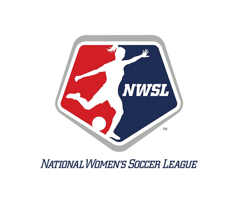
As with the other pentagon logos in this list, the National Women’s Soccer League (NWSL) logo packs a powerful punch. This is an excellent representation of the athletes that compose this energetic league. Again, it is not a strict geometric pentagon, but it still conveys empowerment, unity, teamwork, diversity, and inclusion.
This logo also showcases the league’s dynamic play, passion, aspirations, and excellence. It is a symbol that rallies its fans, inspires young minds, and tells the world of soccer’s bright, diverse, and powerful future.
Why You Need Penji to Create Your Pentagon Logo
While there is an abundance of logo makers online, nothing beats a logo design made by a professional. Freelance job marketplaces can also be a good resource for designers, but it is quite an uphill task. You need to find the right designer for the job, and to achieve that, there are many things you need to consider.
Also, you have to look at hundreds of portfolios and resumes to get the best one for the job. You will also vet and interview them, which could take too much of your time and energy.
This is the biggest reason you should work with Penji for your pentagon logo. Our designers have the creativity, experience, and skills to help you get many design assets at affordable rates. All you need to do is submit a design brief of what you need, and our designers will take care of the rest.
Final Thoughts
A pentagon logo that effectively makes consumers remember your brand is just a tap away. Instead of poring over the right colors and fonts to use for your logo, work with us at Penji. Watch our demo video here to learn more about what we do, or better yet, tap here to subscribe.
However, if you need just one pentagon-inspired logo, we offer one-off designs too! Browse our new Marketplace here.
About the author

Celeste Zosimo
Celeste is a former traditional animator and now an SEO content writer specializing in graphic design and marketing topics. When she's not writing or ranking her articles, she's being bossed around by her cat and two dogs.
Table of Contents
- 1. Hamlin & McGill
- 2. Harlem Brokerage and Housing
- 3. First Order
- 4. Nintari Global
- 5. Ocean Gold Foods, Inc.
- 6. Nintari Global
- 7. Shield Protection Services
- 8. Red Ribbon Corp
- 9. St. Vito Medical Center
- 10. OMG Cupcakes
- 11. Sir Tony Skates
- Examples of Famous Pentagon Logos
- Chrysler
- The US Department of Defense
- Lille Olympique
- Volcom
- National Women’s Soccer League
- Why You Need Penji to Create Your Pentagon Logo
- Final Thoughts


