
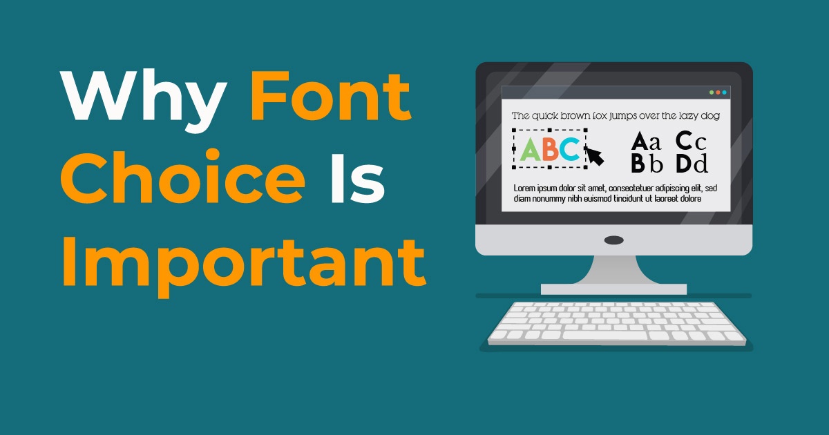
Fonts are great. There are probably few people who have not sat down at a computer and simply played with font choice just to see what looked best. There are so many font choices, that it can sometimes be hard to choose the perfect one. But is font choice really all that important? It absolutely is! The ways words are presented can have a profound effect on how they are perceived by the reader. But, that’s not all. Take a look at some excellent reasons why font choice is important.
Meanwhile, if you want to get designs with fonts that match your messaging and brand, have Penji do that for you. Our professional and reliable Penji designers know how to produce a design that’s engaging and compelling. You could even specify the type of font you want on the design. This way, the designer can craft a design based on messaging and font style. Check out what our designers produced for our clients.
Fonts do More Than Transmit Words
Of course, when you are typing words on your computer, your ultimate goal is to transmit an idea to the people who will be reading them. The font you choose can have a profound effect on the people reading the words you type. So, the perceived meaning can change drastically depending on the font choice. Shapes are multi-sensory, meaning they affect more than one of your senses and can easily elicit emotions, even before we read the word. In fact, we react to font types every day, even when we are not aware of it. In fact, fonts can subconsciously tell us where to go and what to buy.
Font-Driven Perceptions

Believe it or not, research on fonts has been going on for more than 100 years! Although much of the data remains scientifically unproven, there are without a doubt, some sound conclusions that any logically-thinking person can make. For example, fonts that have a formal look, such as Helvetica, are taken more seriously than other fonts. When different people read the same material in that font, the information is generally believed and there are fewer disagreements among the readers. On the other hand, a more whimsical font, such as Comic Sans, has the opposite effect. The same material was not treated as seriously and there tends to be more disagreements about the content.
Serif vs. Non-Serif Fonts
In the age-old debate about fonts, the topic of serif and non-serif fonts always seems to arise. Serif fonts are those that include a small line at the end of a stroke or letter. Non-serif fonts are those that do not include the extra line. It seems that many people have strong opinions about which type of font is better. The debate is often attributed to the legibility of each type of font. Several studies have concluded that serif fonts do not help to guide the eyes of the reader and they do not improve any cognitive identification of a letter. Sans-Serif fonts do not cause eye fatigue and they also do not have any display advantages on modern computer screens. So, despite strong opinions toward one or the other, there is no research to back the promotion of one over the other.
Why do Fonts Matter?
Fonts provide both a practical and aesthetic function. Also, certain fonts work better in certain applications than others do. The fonts you choose will tell present and potential customers a lot about your brand. If you have a business that is more formal and corporate-oriented, such as a law firm, you want to choose a more traditional, formal-looking font. However, if your business is more cheerful in nature, such as hosting kids’ birthday parties, you should use a whimsical font such as comic sans. Keep in mind that some fonts elicit a more trusting feeling than others do. You want to make sure you pick a font that does not turn customers away.
Picking the Right Font for Your Business

Picking the right font can be crucial to the success of your business. Here are some tips for choosing the perfect font.
- Decide which characteristics you want your brand to convey. What are the most important qualities of your brand? And what is your brand’s personality? Or what does your business stand for? Once you answer these questions, you will know the direction you want to go.
- Make sure your font style aligns with your brand’s character. Pick a font that exudes the same personality as your business. Whether your business is elegant and refined, whimsical, formal or family-oriented, there is a font that represents what you want to convey.
- Make sure your fonts are readable. Of course, you want people to be able to read anything you put into print. So, choosing the right font is essential. Some fonts have letters and/or numbers that look strikingly similar, which can be confusing to readers. If you are looking for a good font to use, experiment a little bit and make sure all of the letters and numbers are distinguishable before you make your final choice.
[in_content_ads gallery="Marketing" logo="off" title="Create smart, effective campaigns efficiently" subtitle="Meet your conversion goals using visuals that stand out" btntext="I need this!" btnlink="https://penji.co/pricing/?affiliate=J2O5AB8RAR3386837"]
Although it is seemingly a minor choice to make in comparison to everything else you need to decide for your business, picking the right font can have a tremendous effect on it. Before you make your final decision, make sure you try a few options and make sure the one you choose conveys the right message for your brand and is clearly readable. Keeping these factors in mind will help you make the perfect choice.
*insert after “Why do Fonts Matter”
Font Selection Tips
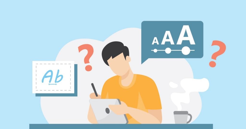
Before choosing a suitable font for your business branding, we need to know how to select the “perfect” typeface. After learning the importance of fonts, you might be thinking about how to start your font selection. It’s always hard to decide whether a font will help your branding improve or sabotage it. Here are helpful tips that will help your decision process.
#1 Safe Typefaces
Every font designer has some amazingly quirky typefaces that are used for special occasions. However, if you’re in collaboration with a designer to create a font for yourself, opt for a safe font. A safe font includes typefaces that look clean and are easy on the eyes. In the first place, the priority in choosing a font is its legibility. Even if you managed to create a unique typeface with your designer, it’s no use if no one can read it.
It’s better to go for the “safe” choice rather than an unreadable typeface. Don’t choose a distracting typeface that will fail to communicate the design’s overall goal. So if your audience spends more than an extra four seconds to understand what is written, that’s a failure. As a result, your design or business will be disregarded.
Here’s a list of safe sans-serif fonts you might want to start with:
- Arial
- Impact
- Lucida
- Grande
- Tahoma
- Verdana
- Helvetica
On the other hand, if you prefer serif typefaces more, here are a few examples:
- Georgia
- Platino
- Times New Roman
The fonts mentioned above are widely available to the public. It’s also known as web “safe” fonts.
#2 The 5 Type Family
To choose a suitable font, you must know the five families of a typeface. The following are the five classifications of typefaces used in almost 80% of content and writing. Take note that this is not a comprehensive list of typeface classification. However, it’s enough to help you decide what font to use in your business.
Geometric Sans-Serif
Geometric Sans is a mixture of three different groups:
- Geometric
- Realist
- Grotesk
This type of family is based on solid geometric form. The letters of Geometric Sans are often uniform in terms of width and focus. It has a “less is more” style in its font design.
Font Description:
- Clear
- Objective
- Modern
- Universal
Typeface Examples:
- Helvetica
- Univers
- Futura
- Avant-Garde
- Gotham
Humanist Sans-Serif
Humanist Sans is more on the clean and modern side of font style. It looks similar to handwriting. As much as possible, the typeface is designed to be simple and thinner.
Font Description:
- Modern
- More “human.”
- It gives off an empathetic feeling.
Typeface Examples:
- Gill Sans
- Frutiger
- Myriad
- Optima
- Verdana
Old Style Serif
The Old Style font family is known for its little contrast between thin and thick strokes. Its letters always tilt to the left.
Font Description:
- Classic
- Traditional
- Readable
Typeface Examples:
- Jenson
- Bembo
- Palatino
- Garamond
Transitional and Modern Serif
The Transitional and Modern Serif font family was created between the mid and late 18th century. It emerged as a result of an experiment in creating letterforms more geometric and sharp.
Font Description:
- Strong
- Stylish
- Dynamic
Transitional Serif Typeface Examples:
- Times New Roman
- Baskerville
Modern Serif Typeface Examples:
- Bodoni
- Didot
Slab Serifs
In recent years, the Slab Serifs font family has become more popular. The stroke of this typeface has a solid rectangle block stuck on its ends.
Font Description:
- Urban or Rural
- It stands out
- Unusual
Typeface Examples:
- Clarendon
- Rockwell
- Courier
- Lubalin Graph
- Archer
#3 Compare and Contrast
If you’re selecting fonts, you need to pick styles that have a strong contrast. On average, you’ll only need one typeface to use in your business. However, it’s possible to mix multiple typefaces in your designs to make a message stand out.
So if you’re choosing multiple typefaces, you need to make sure they have a contrasting difference. Here is a helpful rule of thumb when selecting font styles:
- The font comes from the same period.
- Similar stroke weight or height.
- The same designer created the font.
#4 Use “Unique” Fonts Sparingly
Other than a great pair of multiple typefaces to emphasize messages, there’s always an urge to use quirky fonts. Let’s say you managed to pick typefaces that look great together, but you want a more eye-catching design. Usually, such fonts are used as titles or headers. They also have a different font size from the rest. However, it would be best if you still considered its legibility.
How Fonts Can Help Your Business
If you’re still not convinced of the power of good font choices, here are 5 ways they can help your business:
It can grab your target market’s attention.
As mentioned earlier, fonts can evoke emotions and moods. The perfect font choice can set the tone for all your marketing strategies and project the mood or feeling that you’re aiming to send.
It creates a hierarchy.
Your content can be easily understood just by the layout of the fonts. Your reader will see what’s most important when you use different sizes and types of fonts. This will also make way for a good flow of information that’s easy on the viewers’ eyes.
It creates audience recall.
Especially when you use typography that’s customized for you, people will remember you with it and recognize you easily from your competition.
It makes for better readability.
Careless use of typography can result in cramped or cluttered presentations. People will most likely ignore you when the content is hard to read.
It creates consistency.
When used all over your marketing campaigns, fonts can give that professional and consistent look for a more harmonious design. It unifies your overall marketing strategies to make it more memorable.
How to Request Designs on the Penji Platform
Once you sign up and subscribe to a Penji plan, you can go on the Penji platform and request your first design. Here’s how to do it.
1. Create a Project
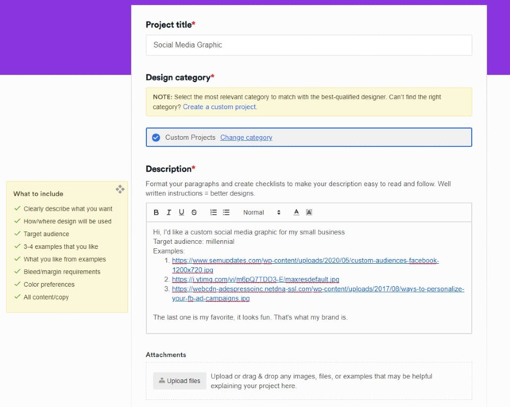
On the dashboard, click New Project.
Before you provide your design brief, please write a Project title and choose a design type from the Design category. If you can’t see the design you want to request, click Create a Custom Project.
From there, you can finally write your design brief on the Description. Make sure that you follow the What to Include guidelines as well. This way, your designer will know how to produce the design you need.
Don’t forget to click Create project once done.
2. Connect with a Designer
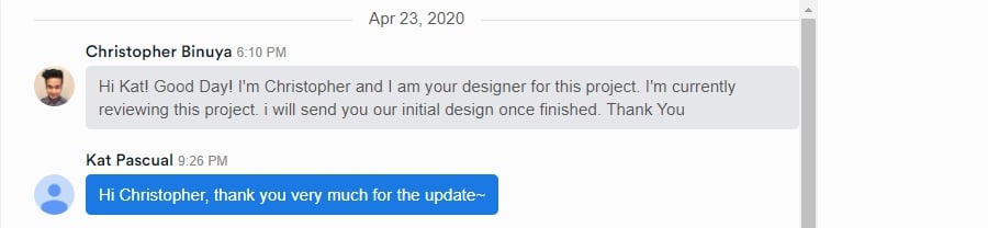
Many brands love Penji because it eliminates the hiring process. You won’t have to find a designer, reducing your time in getting designs. This way, you get your designs in half the time. You won’t have to use DIY graphic design services either. The designers know how to produce professional and compelling designs for your company.
Once Penji assigns you with a designer, you can expect to get the first draft within 24 to 48 hours.
3. Review the Design
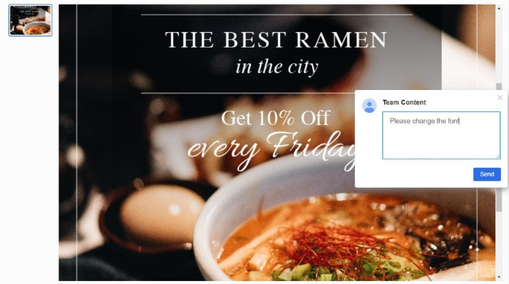
When you receive the design, you can review it. Here’s where the unlimited revisions feature comes in handy.
Use the revision tool so that you could point out areas that need improvement. This way, your designer knows how to edit the design based on your preferences.
4. Download the Design
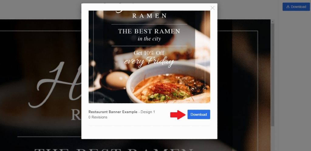
Do you love the design you received? Download the design on the Penji platform in two clicks. Click Download, and the files are all yours! You can go back to the Penji platform anytime when you need it. Penji stores your files on a cloud and access it anytime and anywhere.
Plus, make sure to click Mark as Complete so you can request more designs.
Use the Best Fonts for All Your Designs
Convey your message through engaging designs. Let your voice be heard by selecting the most suitable fonts. Penji can help you attain your design goals.
Get started on a Penji subscription today. Plans start at $369/mo with the Pro plan. But if you want full access to all design requests, sign up for the Team plan for only $499/mo. You can maximize the plan by requesting illustrations and website designs. Plus, create new projects for your other design needs. Sign up now and try the Penji platform for free for 15 days.


