

In the past few months, we’ve noticed an influx of isometric design requests from our graphic design clients, and for good reason. This design style is captivating and makes objects appear as if they are popping off the page. No matter what industry you’re in or what images you need, using an isometric style will give your content a polished look. In this article, we’ll break down what makes this technique so popular for brands that need marketing materials.
What Is Isometric Design?
Isometric design is a facet of graphic design. It pertains to a unique way of presenting visuals by drawing three-dimensional objects in two-dimensional planes. Simply put, isometric designs show an object from a bird’s eye angle.
Isometric graphics are increasingly common in custom illustrations. Entrepreneurs and marketers use these illustrations to attract more prospects and demonstrate what they do. Studies show custom images increase engagement and conversions significantly, so what do you have to lose?
Isometric designs are clean and simple. This type of design works for branding and marketing because the smooth 3D shapes add depth and visual interest.
Professional graphic designers integrate shadows on isometric objects. These objects are created on a two-dimensional screen, but they appear three-dimensional thanks to the lines and angles used.
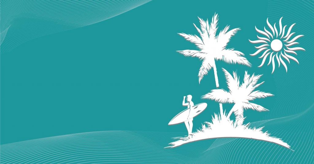
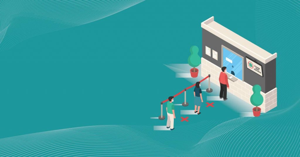
What are some examples of isometric illustration?
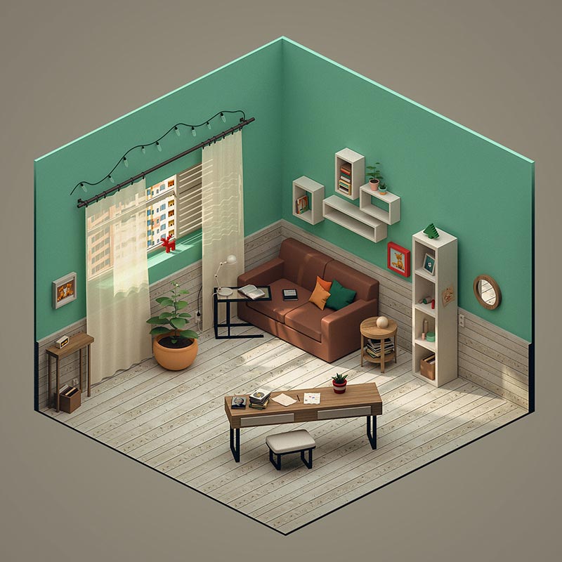
As you can see, this illustration shows the images from overhead. Also, the objects are being shown from one corner. The axes are set out from this specific corner angle but we can still see everything clearly.
Here’s a more technical definition of isometric design: The objects are created by starting a vertical line along with two defined points. These points should be at a 30-degree angle.
What’s the difference between isometric and 2D design?
Before isometric design came flat designs, and these are simpler approaches to conveying information via visuals. However, flat designs don’t have depth, unlike isometric designs.
There are no unnecessary details in flat designs. Flat graphics are typically clean, two-dimensional objects with crisp lines, shapes, and edges. They also feature an open space without any distracting elements in its surroundings.
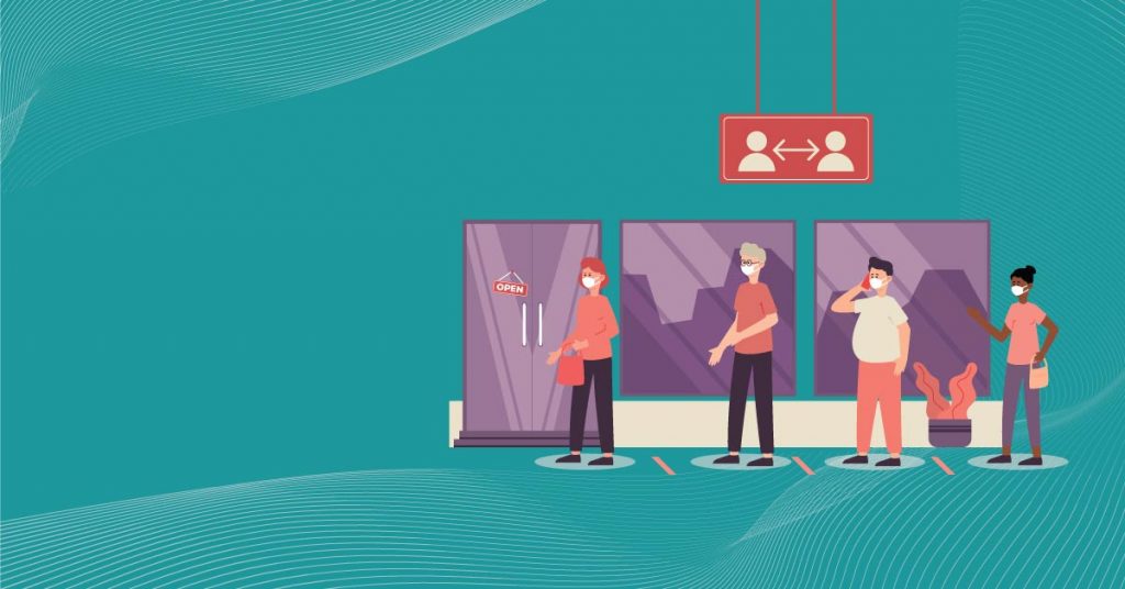
Example of a flat design:
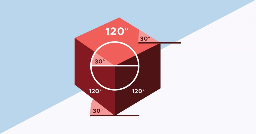
Notice the simplicity of this kind of design. On the other hand, isometric means equal measure. This means all the object’s axes should come together at a point with a 120-degree angle. And this also means that isometric objects have equal and accurate measurements.
The rule of thumb in isometric objects is that all horizontal lines remain at a 30-degree angle. All vertical lines should maintain their position.
Example of a flat cube design vs an isometric cube design:
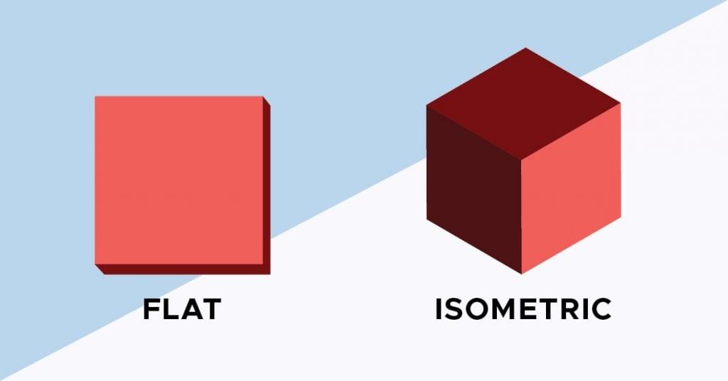
Overall, the isometric design creates visual interest due to its realism and depth. And this is the reason why so many people prefer this type of design today.
What are the 3 rules of isometric drawing?
To reiterate, lets look at the three core things isometric drawings require.
1. Parallel lines don’t converge.
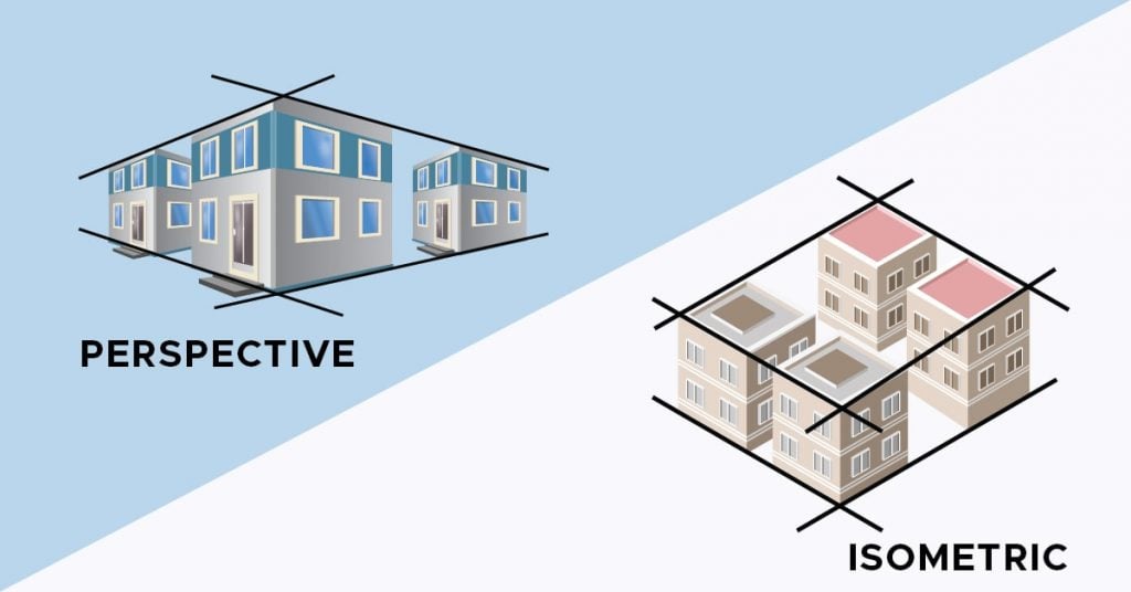
Humans have a natural way of looking at objects, and this is called perspective in graphic design. The parallel lines in a perspective design meet at a vanishing point. In isometric objects, however, the parallel lines never converge. That’s because all the axes’ angles are equal.
To understand more about non-converging lines, here are two objects in perspective and isometric designs as shown in the illustration above.
2. The 120-degree rule
One of the reasons why people choose isometric illustrations over flat ones is due to their whimsical nature. And to achieve a quirky yet realistic outcome, the object’s x, y, and z axes should be at a 12-degree angle. Also, the horizontal lines should be at a 30-degree angle from their converging point.
3. Isometric designs are minimalist.

Because isometric design displays several angles, it can be confusing if you put in many various elements. That being said, it’s best to keep isometric graphics simple, getting rid of unnecessary clutter. You want to keep the elements as minimal as possible while still portraying the imagery’s message. Plus, you want to keep the colors vibrant yet subdued.
Related Post: 23 Minimalist Website Designs That Will Make You Consider a Redesign
What can you do with an isometric design?
Although using this trend in your branding and marketing assets sounds good, do a bit of research before jumping on the bandwagon. Here are some of the ways you can apply isometric visuals:
1. Isometric Logos
The great thing about isometric design is it’s memorable. Flat logo designs can be eye-catching. However, you can be limited when you’re dealing with flat designs. On the flip side, use an isometric logo if you want your logo to pop.
Create a clever and stylish logo using an isometric style. You can play with your logo designs as much as you can. Plus, this type of style will also bring your logo to life. Here’s an example of an isometric logo design versus a flat logo design.
2. Isometric Icons


Isometric illustrations also started in iconography. Icon illustrations are extremely useful in your company websites and business apps. Icons make it easier for users to navigate throughout your site and app. The disadvantage of flat icons is that they’re not distinct from the other design elements. These icons tend to blend in with the background.
Using isometric icon illustrations, however, means users can quickly see where they need to click. In addition, since the icons seem to protrude from the background, they’re more apparent.
3. Landing Page Design
Another popular way brands use isometric illustrations is also landing pages. Marketers create landing pages to increase their conversions. Compared to ordinary web pages, landing pages have one purpose — converting leads. Therefore, the overall structure and design must be free from distractions, with only the essential components.
Visuals are one of the most crucial elements of a landing page. For users to read the copy and click on the call to action, you need to hook them through compelling imagery. And this is where isometric illustrations come into play.
4. Hero Images

Hero images are banner images that are placed at the top of your website. These are typically larger than the usual website design elements. These images are also displayed front and center, in full width.
Users see hero images first the moment they land on your website. And this is why hero images should capture attention instantly. Isometric hero images are more playful than using stock photos. With the right colors and imagery, your website can be geared for conversion.
Related Post: Illustrations for Websites: The Best Free and Paid Options
5. Maps
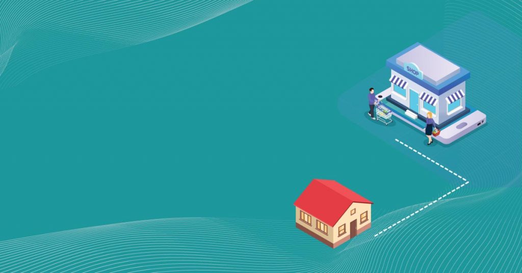
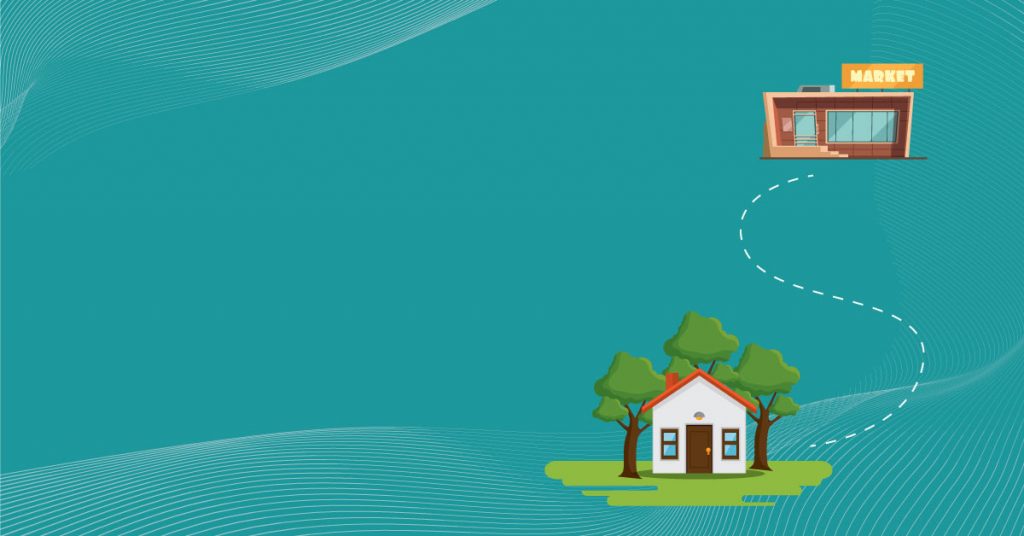
You can also apply isometric design on maps. Isometric map designs are more realistic than flat ones. They give users better visualization due to their angled axis. Because they appear in 3D, isometric maps are better if you want to emphasize a building, street, or people. Overall, using isometric maps can convey directions better.
6. Infographics
Infographics should be part and parcel of your content marketing strategy. Plus, infographics are excellent for summarizing a complex topic into easily digestible chunks of information. The only drawback when using infographics is designers might tend to cram everything into one canvas.
The overall design can look cluttered and confusing for the readers. When you use isometric illustrations and icons for your infographics, it can make every element distinguished. They add perception and depth to the elements, which makes them easier to follow.
7. Typography
Simple lettering and typography also work with isometric design. They offer more visual interest and a playful style. The simplicity of the lettering can be livelier and more recognizable when presented in 3D. Also, isometric typography is more interesting to view from all angles. Check out these two examples of flat and isometric typography.
Why use isometric graphics in branding and marketing?
If you’re still not utilizing isometric designs for your business design needs, then it’s high time you should. Here’s why:
1. Emphasizes every detail
Use isometric illustrations if you want to emphasize all details of your design. For example, if you want users to process the data from the top, sides, or front, then the isometric style helps you achieve that.
2. Offers a simple yet creative approach
If you want to keep your icons, illustrations, or designs minimalist and creative, isometric design is the key! This design technique should always be kept simple to avoid a confusing outcome. However, simplicity doesn’t always relate to bland designs. Use isometric design to keep designs recognizable yet straightforward as it creates more visual appeal.
3. Conveys message clearly
Another benefit of using isometric imagery is it conveys your message clearly. For instance, if you’re distributing infographics for marketing, your materials can offer more understandable information.
4. Presents products from all angles
If you’re showcasing your products front and center, better use isometric designs to present them in the best light. Due to angled features, users can see some internal or hidden parts of your product. This way, they won’t see a flat image that shows only the top or front part of your product. This can be excellent on your website’s product pages or during business presentations.
5. Is modern
Without a doubt, isometric graphics are a trend in 2023. And it will be for the coming years as this style presents your visuals more distinctly. In addition, isometric designs are more refreshing and modern, allowing newly established brands to make their branding assets stand out. So if you’re a contemporary brand with a younger audience demographic, isometric visuals keep your brand updated.
Is isometric design suitable for your brand?
Every brand has unique needs. If you like this design trend, it’s easy to use it to promote your offers. But it’s important to have a concrete design plan. Without this, isometric designs can look too generic, causing you to blend in with your competition.
Try not to overwhelm users with too many complex isometric icons or illustrations. It’s best to stick to a few color palettes, so your design doesn’t come out as over-the-top.
If you can’t be bothered to DIY design or try to find a reliable a freelancer, Penji has your back. Our professional graphic designers know how to maintain minimalism yet keep the overall visual appealing. Try out Penji’s seamless process by signing up for a 15-day money-back guarantee. Cancel anytime without worrying about fees.
Our quality designs, efficient process, fast turnaround, and affordable service means our clients rarely cancel. So here’s 15 percent off your first month to get you started. Sign up now and experience hassle-free graphic design.
About the author

Table of Contents
- What Is Isometric Design?
- What are some examples of isometric illustration?
- What’s the difference between isometric and 2D design?
- Example of a flat design:
- Example of a flat cube design vs an isometric cube design:
- What are the 3 rules of isometric drawing?
- What can you do with an isometric design?
- 1. Isometric Logos
- 2. Isometric Icons
- 3. Landing Page Design
- 4. Hero Images
- 5. Maps
- 6. Infographics
- 7. Typography
- Why use isometric graphics in branding and marketing?
- 1. Emphasizes every detail
- 2. Offers a simple yet creative approach
- 3. Conveys message clearly
- 4. Presents products from all angles
- 5. Is modern
- Is isometric design suitable for your brand?


