
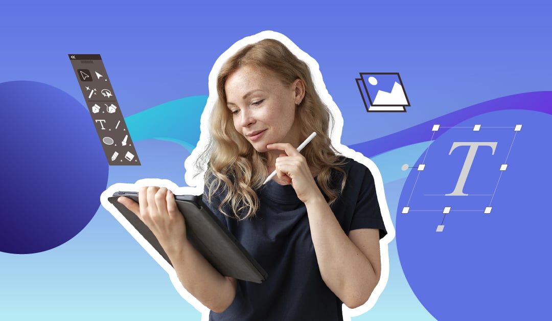
Have you ever wondered why some designs captivate your audience’s attention while others fall flat? The answer may lie in the subtle art of typography. Like any craft, mastering design requires a solid understanding of the guidelines. Here are nine rules of typography that all graphic designers should know.
1) Understand kerning.

Kerning fine-tunes the space between characters to produce a streamlined, unified pairing. All fonts come preset with a certain amount of space between characters. In the case of monospaced typefaces, like Courier New, this space will be even throughout all characters.
But for most typefaces, there’s some degree of contrast between the weight of each character and the space between them. Micro-adjustments between these characters are necessary for design.
2) Limit your fonts.
It’s an honest mistake for newbies to make. You think using various fonts and styles will help you in your design journey. But the truth is that most great work is the product of some degree of self-restriction.
Working within preset perimeters can help you refine a project more efficiently and quicker, satisfying yourself (and your clients).
It’s easy to get caught up with too many options at your disposal, and you find that you lose creative control. Do yourself a favor and limit yourself to a healthy handful of typefaces.
Need expert graphic designers?
Meet the world's top 2% talents only here at Penji!


3) Utilize visual hierarchy.
A decent grasp of visual hierarchy is going to be key when designing anything from websites to print advertisements. Typographic hierarchy is a system that uses typography to show users where to look for certain information, often drawing them to the most important text first.
We can use several tools to create a neat and orderly visual hierarchy in our work.
4) Practice smart pairing.

When creating a visual hierarchy, you’ll likely find it greatly beneficial to utilize the right font pairings. And while you may be eager to choose your two favorite fonts, it’s important to understand how they work together and the natural order they create.
A good method for stretching the versatility of typefaces is utilizing superfamilies. A superfamily is a set of fonts that are crafted to work together in harmony. These fonts are related by their sharing of certain characteristics.
5) Avoid stretching fonts.
Foundries and type designers invest a ton of time into meticulously crafting the letterforms of their typefaces. It’s essential to keep that in mind when stretching your text. Typically, when stretching typefaces, it’s to make the text taller or wider.
Some typefaces will include fonts in their family that do so without distorting the letterforms.
In some cases, variants of the typeface offer these naturally higher or broader forms. Conduct research into typefaces that achieve these results organically, and you can refine your repertoire even further.
6) Use negative space.
White space is not empty space. That can’t be stressed enough. Knowing when not to apply something is just as important as knowing when and how to. This can help you bring out important aspects of your design that might otherwise be buried in a more busy layout. Don’t be afraid to hold back in the right instance. This, of course, takes a skillful eye.
7) Avoid gimmicks.
Design fads come and go. What’s cool today may not hold up tomorrow. As a rule of thumb, you should avoid trends that risk your project falling flat as soon as the next fad comes along.
8) Use the right tools.
Having the right tools at your disposal is key. Utilizing the right list of programs that can assist you in your design journey will help you grow as an artist, satisfy your clients, and build your portfolio. You’re likely familiar with Adobe In-Design, and for good reason. It’s the industry standard.
If you’re starting out and don’t want to splurge on the cost of Adobe’s program, check out these free alternatives. They won’t get you all the way there, but they’re fantastic for beginners just looking to get their feet wet:
Scribus. Available for Windows, macOS, and various GNU/Linux distributions. It has an extensive layout program, though its range of functions isn’t quite as developed as In-Design.
Affinity Publisher. Affinity Publisher works with Windows and Mac and offers a free, feature-rich alternative to In Design. It also possesses a similar interface to In Design for those familiar with its layout.
VivaDesigner. This application offers both desktop and web versions. The free version is easily accessible but operates in a limited capacity. But there is a full-range version for purchase!
9) Be inspired.
Above all, be inspired. Keeping your ear to the wall will help you stay up to date on design trends and keep you open to the inspiration you need to create consistent, beautiful work.
Typography in Graphic Design: Use Cases
Logo
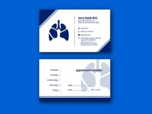
If you have a lettermark, wordmark, or combination logo, typography is also essential in these logo types. It’s important to talk to your graphic designer about the typeface you use and how you can apply that typeface to your logo. This way, it will look clear and readable anywhere.
Graphic designers will use your brand’s custom typeface. From there, they use that typeface in an arrangement that will make your logo look good. However, if it’s a combination logo, the graphic designer will use the typeface and create a coherent logo design with the object (e.g., character, illustration, shape, icon).
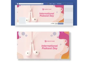
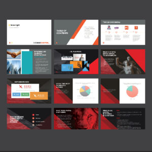
Posters
One of the most popular use cases of typography in graphic design is posters. Since posters are usually printed, graphic designers use large fonts to present the title or headline. This will capture one’s attention. From there, they add the other text, images, graphics, icons, shapes, and colors to complete the poster design. Additionally, they apply graphic design principles like white space and visual hierarchy to make it compelling!
Advertisements
Graphic designers use the same principles when designing posters to advertisements. However, designers ensure that ad designs are engaging through typography rules or other graphic design principles. For example, billboard designs usually feature a person or product. Then, that billboard will have large text and a call to action.
Websites and Apps
Websites and apps can be complicated, even for a typography designer. After all, one has to consider the headers, texts, whitespace, and visual hierarchy to make a modern website. However, a web designer with typography experience can select the typefaces and fonts needed to craft a coherent website. Additionally, they have to consider other elements that all of these elements work together. The same principle applies to apps, too. However, apps will use smaller fonts that’s still readable even when viewed on any smartphone.
Magazines
Graphic designers may also work on editorial design work like books and magazines. Designers will work on the cover and content. On the cover page of a magazine, they need to put the masthead on the top. Then, they need to add the cover lines and integrate the image so that the main image isn’t concealed from the cover lines. Inside the magazine, they also have to use graphic design principles to ensure that you can read content seamlessly as you flip the pages.
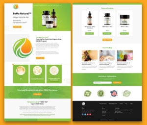
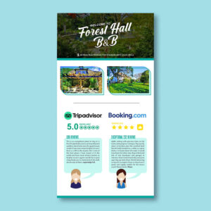
Packaging and Labels
The final popular use case of typography in graphic design is packaging and labels. For instance, if a graphic designer is tasked with creating skin-care product packaging designs, the client should inform the graphic designer to emphasize some ingredients. This will let the customer know that these ingredients exist.
At the same time, it could be an ingredient that improves one’s skin. Additionally, since some packaging designs have limited space, typography designers know how to create variety in text sizes. This helps customers understand the importance of several pieces of information about the product.
Get Custom Typography from Penji
Do you need any typography-related tasks along with other graphic design work? Penji can most certainly help you. You can submit a design brief for your typography and graphic design projects on our platform. Once submitted, our designers will work on your typography design within 1 to 2 days. You can review the submitted design and see if it works for you. If you’re all good with the design, you can request another typography design or project!
If you want to see this in action, watch a demo and see if Penji is the right graphic design service for you!


