
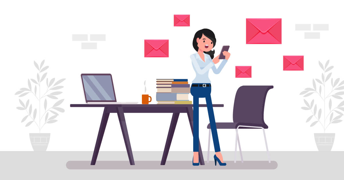
Sending your prospects and current customers email newsletters takes you a step closer to your goals. Whether your goal is to increase sales, educate customers, or boost following, email newsletters are an effective method. However, it’s tricky to succeed in email marketing. And this is why creating the most attention-grabbing email newsletter design is the main ingredient in email advertising.
Most marketers would think that doing the email design themselves can save them money. Unfortunately, it only does the opposite. Poor email designs don’t get read, wasting their time and effort. So if you need help with your email newsletter designs, subscribe to Penji.
Penji is an on-demand design service that offers unlimited designs in exchange for flat monthly rates. The company doesn’t only do email designs. Penji experts also create logos, branding designs, online ads, print ads, and more. Check out the list of some of their design projects here.
Meanwhile, take a leaf from these 20 best email newsletter design examples for your next email marketing campaign.
Related Post: 14 Expert Email Design Ideas You Need to Apply
1. Contrasting colors
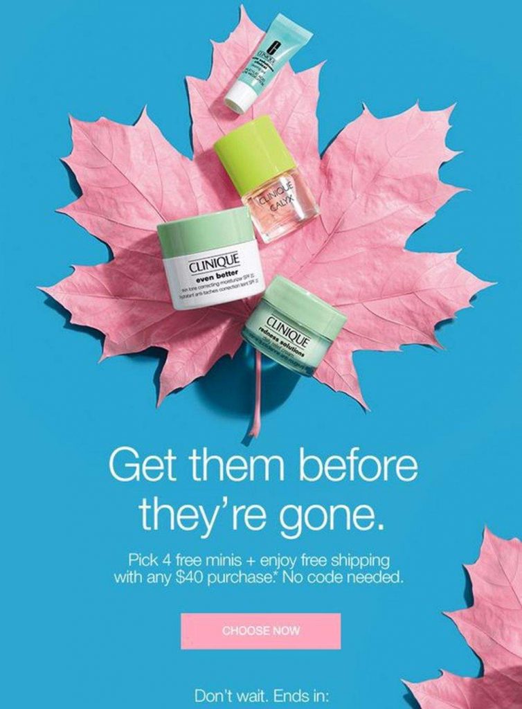
Clinique always has a way of making their email newsletter design eye-candy, and this is an example. The caption is what lures readers first due to the fear of missing out when their products sell out. Plus, the images of the products on top of cool, contrasting colors are a perfect complement to the headline.
Pro Tip: Play with contrasting colors to make your offers stand out. Clinique’s blue and pink colors work well with this simple email newsletter.
2. Mobile-friendly
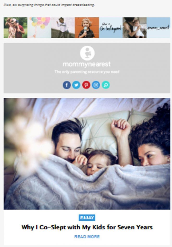
Mommy Nearest is a source for all your parenting tips. When you’re sending educational guides and tips to customers, make sure the content isn’t cluttered. One reason why readers would immediately ditch your email is due to haphazard layout. Also, if you’re not optimizing your email for mobile, then readers wouldn’t be interested in reading the content. But Mommy Nearest’s email is built for mobile. The stories are stacked to make it easy for readers to scroll and click whichever interests them.
Pro Tip: Always ensure that your email newsletter design is mobile-friendly. Make images and layout suitable for smaller screens to cater to readers who are on the go.
3. Straightforward offer
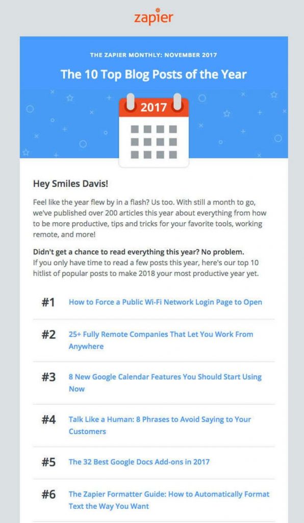
When sending email newsletters, avoid beating around the bush. Zapier’s email is pretty straightforward. The caption says it all, “The Top 10 Blog Posts of the Year.” Underneath is a numbered list of, guess what? The top 10 blog posts of the year!
Pro Tip: The only way readers would continue reading your email instead of deleting it is to tell them what the email is all about. Be straightforward with your email intent by clearly saying it in the headline and subheadline.
4. Branding consistency
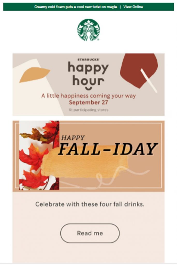
Branding consistency is essential to instill brand recognition and loyalty. When creating email designs, make sure to give your designers your complete brand style guide. This is to ensure that they instill your logos, colors, icons, and more just like this Starbucks email.
Pro Tip: Showcase your logo front and center to instill memorability. Readers who are exposed to your branding assets often will remember your brand more.
Related Post: Here’s Why Design and Branding MUST Go Together
5. Good content

Good email content is hard to come by these days. Most marketers neglect presenting their offers with good content. REI’s email is an example of stellar design and content. By promoting their products and complementing them with good copy, it’s easy to persuade readers. Also, this email is a perfect example of targeting. The products are exclusively for runners.
Pro Tip: Segmenting your email list can help you create good content. When you know who the readers are, it’s easier to create persuasive copy.
6. Friendly tone
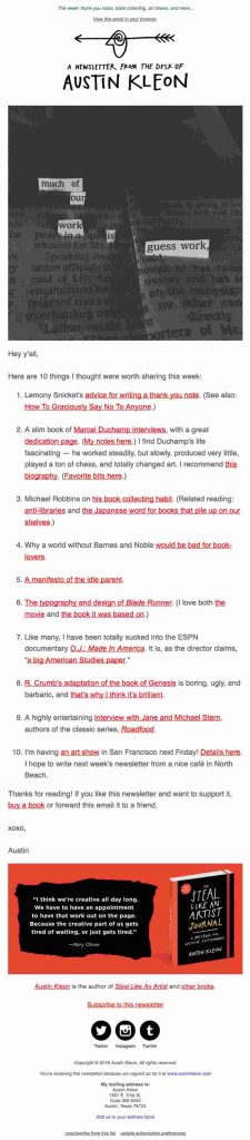
People don’t like being sold to. More recipients would want to open and read emails with a casual and friendly tone than one with a sales-pitchy tone. Whether you’re offering a product or educating your readers, try to talk to them as if you’re a human. This Austin Kleon email newsletter seems like it’s talking to you personally.
Pro Tip: Avoid an overly promotional email tone. Make the overall tone and visuals casual and friendly to prevent intimidating the readers.
7. Creative layout
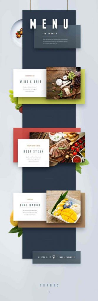
Structure is one crucial element of your email newsletter. It makes your email easily digestible. When thinking of your email layout, ensure that you present your offers in a unique way. Avoid presenting them in a dull, vertical set-up. As much as possible, use grids, blocks, shapes, or lines to segment various offers just like this example.
Pro Tip: Always be creative with your email newsletter layout. Think about how you can make your design captivating by segmenting each offer and using different colors. In this example, the blue binds the offers together, creating a linear set-up. However, the various colors behind each block are a nice way to present each delectable dish.
8. Video integration
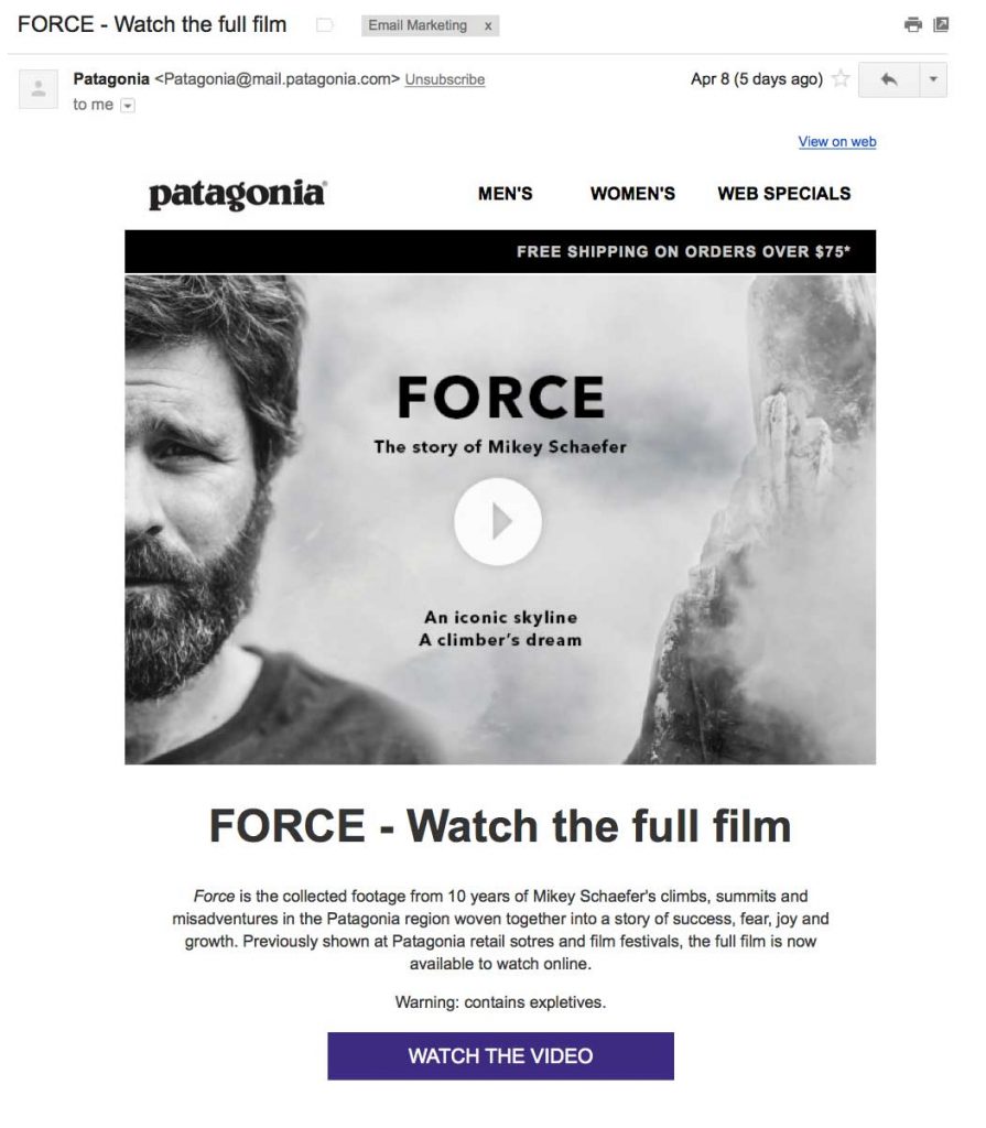
Video marketing is still relevant today due to readers’ declining attention span. Videos can explain complex ideas into easily understandable ones. Videos are also great for entertainment as you can create movie clips and integrate humor into it. Here’s an example of a sustainable brand Patagonia, wherein they embed the video of their recent movie Force.
Pro Tip: Whether you’re promoting a new product or service, videos can better communicate with your target audience. Use videos to avoid sending long-form email content that nobody wants to read.
9. Simplicity
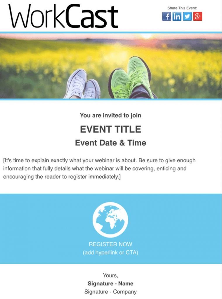
Make your email newsletter design simple and direct to the point. This is the only way to create an uncluttered email that recipients would want to read. This email newsletter template of an event invitation is an excellent example. The caption is pretty direct, which says “You are invited to join.” Then underneath is the event name, date, and time.
Pro Tip: Make your email design simple. This example is a good balance between visuals and copy. The white space makes the email easy to scroll too.
Related Post: Email Template Design Guide that Fits Your Brand
10. Countdown timer
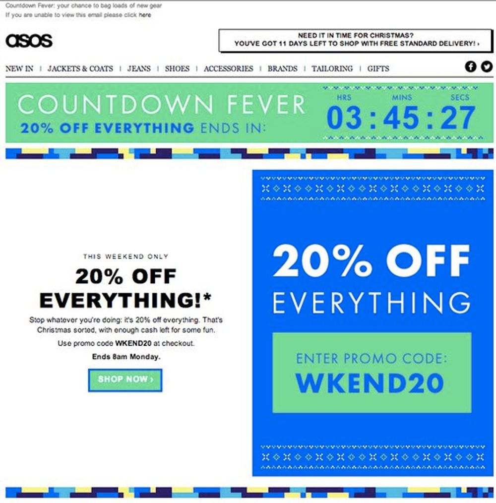
Creating a sense of urgency in your emails is another way to make readers take action. For instance, this ASOS email offers discounts on everything. However, it also includes a countdown timer on the email header that shows when the offer ends. The huge and bold fonts are also eye-catching.
Pro Tip: If you want to persuade readers to act immediately, include a countdown timer on your email. However, make sure that your offers are also enticing.
11. Personalization
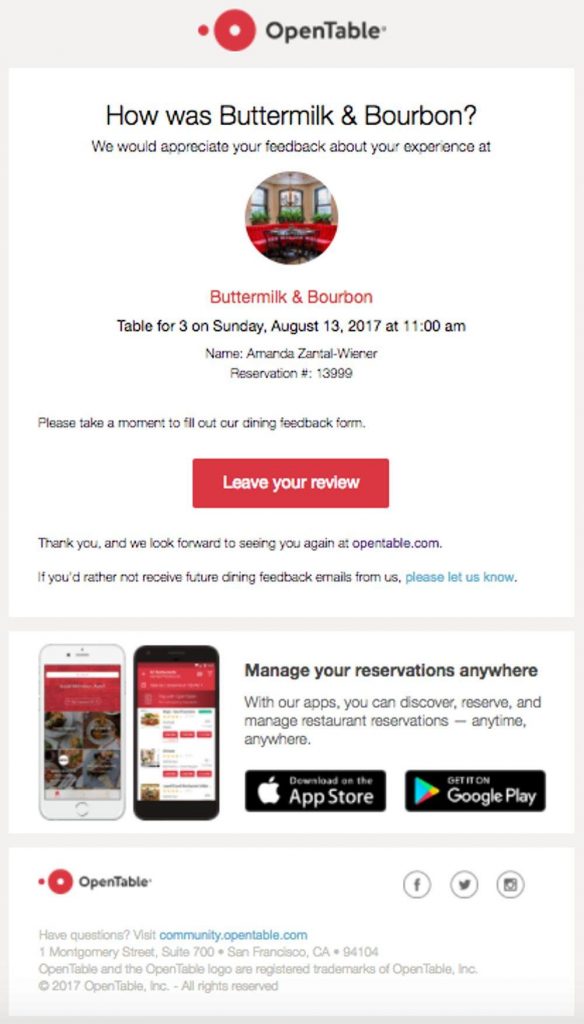
Email marketing allows you to personalize your offers through analytics. By using aggregated user information, you can include a personal touch just like this OpenTable email. It asks the recipients a direct question asking how their last meal order was. Nothing can get more personalized than that!
Pro Tip: Make personalization a key element in your email newsletter design. That way, it boosts more engagement from users.
12. Animation
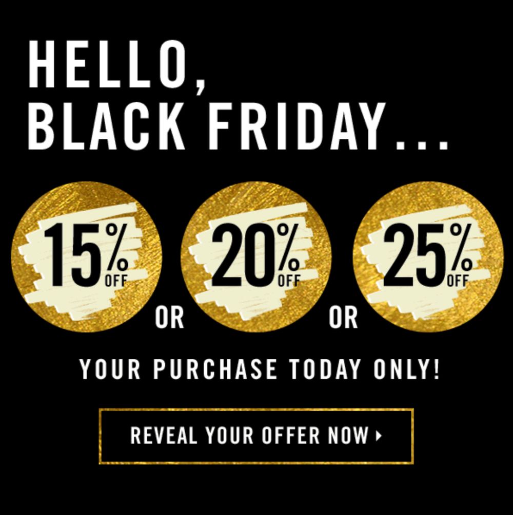
Animations can capture user attention because they’re fun and unique. Some email marketers go as far as creating a short story using GIFs or animations. However, Forever 21 kept theirs simple. It’s a scratch field that shows three various discounts customers can get during Black Friday.
Pro Tip: Integrate fun GIFs or animations to break the monotony of texts and visuals. Don’t be afraid to explore email newsletter designs by thinking outside the box.
13. Storytelling
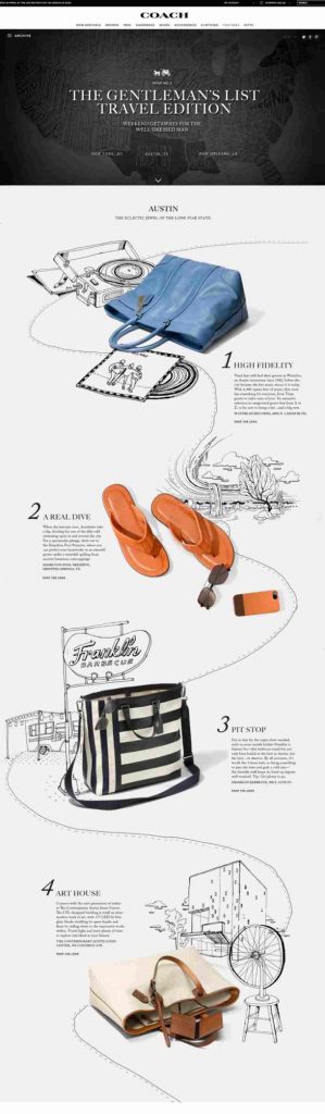
Coach created a “Travel Edition” email for their audience, while showcasing their products front and center. The overall design and layout is clean and chic, perfectly emanating the brand’s personality. However, the most significant element in this email is the storytelling that goes into it. The pencil sketches and copy about the different places in Austin, Texas is uniquely creative.
Pro Tip: Readers would want to read or hear about good stories. Therefore, integrate a bit of storytelling on your email newsletters to hook your audience.
14. Flat illustrations
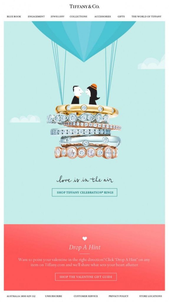
Aside from photography, videos, and graphic design, illustrations can be a nice touch to your email newsletter. Illustrations convey messages clearly. Also, illustrations are captivating, which make it perfect for email designs. Here’s an example of an artistic flat illustration from Tiffany & Co. It features two lovers on a hot air balloon with a pile of bracelets as the balloon’s base.
Pro Tip: Include illustrations on your emails to make the design stand out. Ensure to use the proper colors and techniques when creating illustrations. Communicate with your designers to achieve design cohesion.
15. Benefits
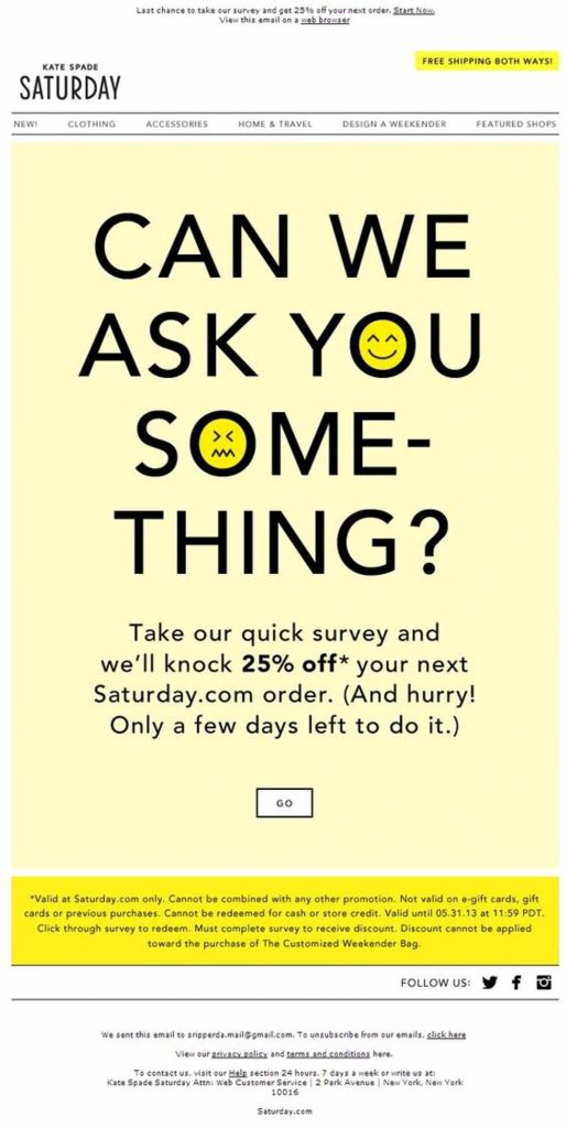
Email surveys are also an excellent way to know what your customers think. Unfortunately, not all recipients want to engage because it’s simply not worth their time. But Kate Spade did it differently. The caption alone is captivating and says, “Can we ask you something?” Then the company offers a 25-percent discount for customers who take the quick survey.
Pro Tip: Always create your emails with the recipients in mind. Readers will always want an email offer that benefits them. So offer incentives, vouchers, or discounts if you want your readers to engage with you.
16. Welcoming tone
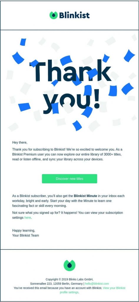
Sending a “Thank You” email also creates a feeling of importance within your target audience. Always keep in mind that Thank You emails should be kept concise though. This Blinklist email shows that the company just wanted to show their gratitude to their new customers through the caption. Also the email has a very welcoming tone, fitting for new Blinklist subscribers.
Pro Tip: When sending Thank You emails, make sure you show your gratitude by sounding welcoming. Also, explain why you’re writing the email right off the bat through your heading.
17. Color blocks
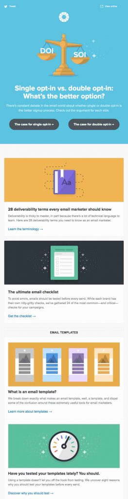
Using bright colors can accentuate different offers on your email. Using color blocks can divide various sections on your email, making it skimmable. This Litmus email newsletter design is interesting through the use of color blocks. The email contains different articles with corresponding calls to action.
Pro Tip: Don’t be boring when it comes to email design and colors. Make your emails bold by choosing bright colors or cute pastel ones. However, avoid a cluttered design by using color blocks.
18. Call to action
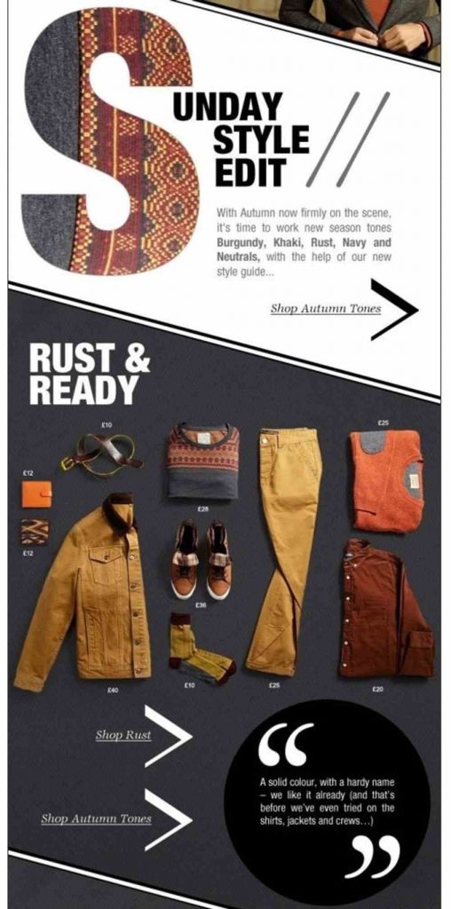
Without a call to action, your email won’t help you achieve your goals. While calls to action are the key to take the users further down the sales funnel, marketers sometimes fail at call-to-action buttons. One way to make your CTA buttons stick out is by giving it a contrasting color. However, this email did it differently. The three calls to action are italicized and underlined. Also, by putting a chevron beside every call to action, users can easily identify what to do next.
Pro Tip: Make sure your call-to-action buttons stand out by making them the most distinct element on your email. Experiment with the CTA copy as well and integrate humor instead of sticking to cliche CTA copy.
19. Direct offer
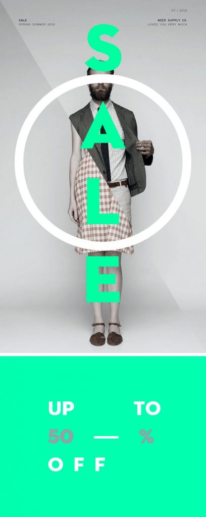
Recipients don’t have time to read through long-form email content. If you’re inviting them for a huge sale, then do just that. This Need Supply email is a perfect example of unorthodox design and direct offer. The unusual image of a half man and half woman behind the huge SALE text in a bright green color is peculiarly interesting.
Pro Tip: When creating your email newsletter design, make sure that you explain your offer directly. Visuals are crucial to catch user attention, but make your copy stand out as well by keeping fonts bold and heavy.
20. Compelling headline
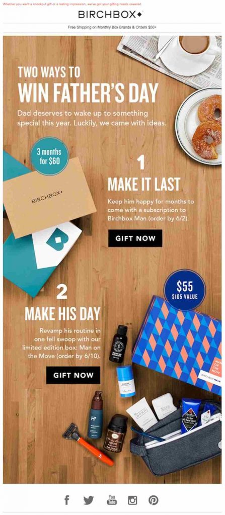
Once you get recipients to click on your email, the next part is to make them scrutinize the rest of the content. And you can achieve this by writing a compelling email headline. An example of a compelling headline is this Birchbox email that says, “Two Ways to Win Father’s Day.” This is perfect for people who are looking for ways to tug at their father’s heartstrings.
Pro Tip: Never create half-baked headlines. Make sure that you lure readers after the first five seconds of opening your email through a well-thought-out headline.
Conclusion
Now that you know what makes a killer email newsletter design, wow your audience with yours. If you want to gain the most ROI from email marketing, make sure to entrust the designing to experts like Penji.
Here are some of Penji’s email design portfolios:
Check out Penji’s affordable monthly rates and sign up for a 15-day money-back guarantee to experience a hassle-free design process.
About the author

Table of Contents
- 1. Contrasting colors
- 2. Mobile-friendly
- 3. Straightforward offer
- 4. Branding consistency
- 5. Good content
- 6. Friendly tone
- 7. Creative layout
- 8. Video integration
- 9. Simplicity
- 10. Countdown timer
- 11. Personalization
- 12. Animation
- 13. Storytelling
- 14. Flat illustrations
- 15. Benefits
- 16. Welcoming tone
- 17. Color blocks
- 18. Call to action
- 19. Direct offer
- 20. Compelling headline
- Conclusion


