An email newsletter is all about content and value with minimal selling. But what makes an email newsletter design good? The last thing you want is someone unsubscribing or worse…marking your email as spam. Once you find your target audience and compile emails to send your newsletter to, it’s time to create a great email design! Penji can help you with this. Our unlimited graphic design service ensures that you get the best email designs and many other design assets you’ll need.
The average person has an attention span of 8 seconds. If you try to cram too much information or design elements into one email, it will probably go ignored. Great email design is straightforward and gets the message out quickly. Additionally, email design benefits businesses by engaging subscribers and customers to take action. There’s no standard for great email design. However, if you follow standard principles sprinkled with your branding, you get loyal subscribers and customers. Here are some quick tips to remember:
- Don’t put copy in blocks of text
- Add call-to-action buttons
- Use compelling images
- Integrate branding colors and fonts to maintain consistency
- Put your logo at the top of the email design
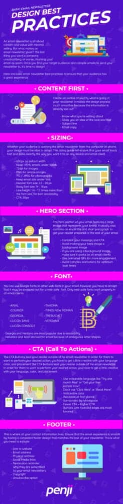
Here are basic email newsletter design best practices to ensure that your audience has a great experience.
Content First
Create an outline of exactly what is going in your newsletter. It makes the design process much smoother because the information is already laid out. Great email design has information that is easily consumable at first glance.
Having the content ready first will give the designer an idea of how it should look and feel. The subject line should dictate exactly what is in the email itself. Your copy should be short and contain a clear call to action. The designer will be able to break down the email into sections and create a highly convertible campaign.
Sizing
Whether your audience is opening the email newsletter from the computer or phone, your design must be able to adapt. This sizing guide will ensure that your email loads fast and look exactly the way you want it to on any device and email client.
- 600px as default width
- Keep HTML emails under 100kb
- 72dpi for images
- PNG for simple images, JPG / JPEG for photographs
- Keep email size under 1mb
- Header font-size: 22 – 28 px.
- Body font size: 14 – 18 px.
- Line height: 1.4 – 1.5 times more than the font size, for best readability.
- CTA: 50px
By using the dimensions above, you’re ensuring that your email newsletter appears as it should, regardless of the device used to view it.
Hero Section
The hero section of your email features a large image that represents your brand. It usually contains an email title and short paragraph to get your reader prepared for the rest of your email. Just like the rest of your content, it should be easily consumable by the viewer. Add a call to action that leads them to your website, sign-up page, blog, social media platform, etc.
The hero image is the first main graphic that your viewer will see and is meant to show what your email is all about. Make it count! It’s recommended to avoid making your hero image a background image. But, if you do, check to make sure it works on all email clients.
Fonts
Choosing the correct font to use can emphasize the look and feel that you’re going for in your email newsletter design. Not only does it make the email look good, but it can also even bring out emotions. Always test your fonts. If you’re choosing a web font, you want to make sure it is supported in all email clients, or it will be replaced with their default font.
There is a list of commonly used fonts that look great and works throughout most, if not all, email clients. Work these fonts into your email newsletter design to ensure that it is cohesive throughout every email client. You can use Google fonts or other web fonts in your email, however, you have to accept that it may be swapped out for a web-safe (email-safe) safe if it’s not compatible. Only web-safe fonts work properly in all email clients.
- Arial
- Courier
- Georgia
- Lucinda Sans
- Lucinda Console
- Tahoma
- Times New Roman
- Trebuchet
- Verdana
- Georgia and Verdana are most popular due to readability
- Helvetica and Arial are bad for email because of ambiguous letter shapes
CTA (Call To Actions)
The CTA buttons lead your reader outside of the email newsletter. In order for them to want to perform your desired action, you have to get a little creative with your language, color, and placement. Also, the fewer CTA buttons you have, the higher your CTR (click-through rate) will be.
Great email design has verbiage that is readable at first glance. Use actionable language like “Try one month free” or “Get your free sample now”. Don’t use “Click Here” or “Read More”. It’s unoriginal and overdone. Your viewers will be unfazed and will not feel compelled to click.
Visually, the button should stand out from the rest of the content in your email newsletter design. The color should pop and be extremely noticeable. Make sure it is surrounded by whitespace. If the area around the button is too busy, it may get overlooked. Buttons with rounded edges are most favored, so work them into your email newsletter design.
Footer
The footer is the first place your viewer will go to look for more information. It’s where they will find fine print and additional details about your company. To ensure you have a great email design, customize and format the text so it doesn’t look too cluttered. And of course, optimize it for mobile.
This is where all your contact information lives. Ensure that the email experience is smooth by having a consistent footer design that matches the rest of your newsletter. This is what you need to include:
- Link to website
- Email address
- Physical address
- Social Media links
- Permission reminder: why they are subscribed to your email newsletters
- Copyright
- Unsubscribe option
How Can You Get Great Email Design from Penji?
As a graphic design service, Penji offers email design to help you reach your email marketing goals. When you subscribe to Penji, you will get a custom email design for your brand. To get this, you must provide Penji with all the information so our designers can craft a compelling email.
Ensure that you provide your logo, copy, and images. Penji will take care of the rest. You can also offer reference designs so our designers know how to tailor the email to your brand. Once you get a great email design, you can request more and send more emails to your subscribers regularly! That’s one of the perks of subscribing to Penji! As a graphic design service, you can request as many designs as you need for a flat fee! And if you need to see what Penji offers, watch a demo here!