Choosing a font style is a big deal. If it’s too small or too hard to read, visitors will leave your site. If it’s too large or all the fonts on your website are basic, your site will look unprofessional. The key is to pick a font that’s easy to read but also packs a punch and provides some insight into your brand’s personality. In this post, we’ll explore some of the easiest fonts to read so you have some font choices for your website.
What’s the easiest font to read?
Different industries can be nuanced in the way consumers interact with their ad designs, websites, and the typefaces used for them. A web designer for a landscaping company will likely find that they can’t rely on the typographic conventions of, say, restaurant menus. But also, it’s possible they might!
There’s no exact science, and professional opinions can vary. Conducting user research and testing with a broad range of real users can help you understand which typeface works best for you. But, this article will provide us with criteria for what typically produces a good, legible font.
A healthy differentiation between letter shapes.
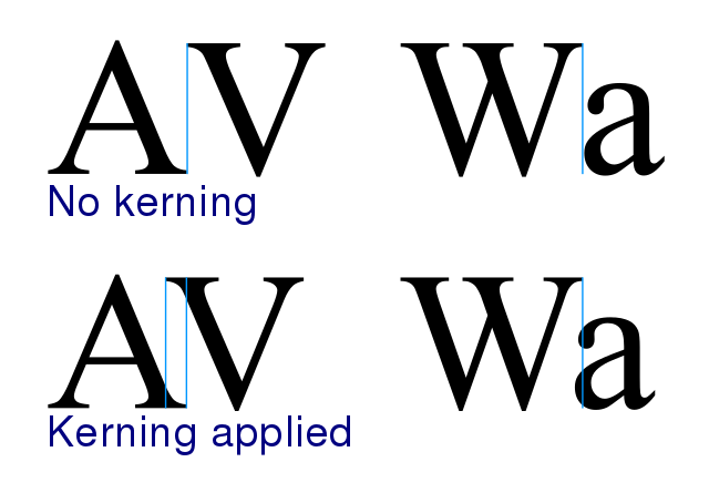
This might be obvious, but it’s worth stressing. Being able to tell the difference between characters is essential to the effectiveness of the typeface. Let’s discuss two important components of typefaces: kerning and tracking.

- Kerning refers to the amount of space between individual letters. This is typically used for singular words in a logo or headline setting. Fonts come with default kerning; each different weight or style will necessitate a different default kerning. But knowing how to properly adjust kerning can keep your content from appearing awkward, clunky, or lazy. All of which should be the subject of severe avoidance on the part of any graphic designer, professional or aspiring.

- Tracking adjusts the spacing between the letters evenly across the entire word. This is particularly helpful when you’re working with heavier weights that require larger average spacing between letters. Certain fonts will naturally seem closer together, and tracking can help you adjust this, increasing legibility.
[in_content_ads gallery=”logos” logo=”on” title=”Need graphic design help?” subtitle=”Try Penji’s Unlimited Graphic Design and get all your branding, digital, print, and UXUI designs done in one place.” btntext=”Learn More” btnlink=”https://penji.co”]
Font weight matters.
The decorative, script or overly narrow fonts can decrease legibility. This is bad if the text you’ve written is, in fact, for the purpose of being read. But this doesn’t mean you need to coat your website in bold typefaces. An understanding of typographic hierarchy will assist you in how properly coordinating your font weights can create a coherent, visually pleasing design.
Serif or sans?
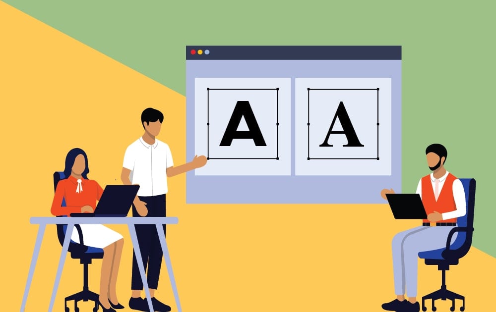
A longstanding typographic myth claims serif fonts improve legibility in print situations, while sans serifs are better suited for the digital screen. There is some truth to this. The serifs can increase readability in larger bodies of text due to the guidance of the “feet” leading the eye from one character to the next. But this myth is rooted in the days when computer screens were not yet able to neatly render the serifs, making them less legible. Additionally, sans serifs have clean, crisp lines that typically make them the easiest fonts to read on screens. But this isn’t always a given.
As a graphic design team, we use a lot of different fonts depending on the project – some wacky and unconventional, others toned-down and professional. For simple situations, the options below are some of the easiest to read fonts.

Georgia

Georgia was designed by Microsoft with low-res screens in mind. For this reason, it’s one of the easiest fonts to read in on-screen situations. But, it’s a serif font. So it contains those little embellishments at the ends of each character. Still, Georgia is an excellent font for website design.
Helvetica

Helvetica is the benchmark sans for a reason. It’s a modern classic with impeccable readability and a large superfamily to work with. It’s sleek.
Quicksand

You need to anticipate that many, if not most, people will ingest your design through the use of a smartphone, tablet, or some other digital avenue. So it’s no surprise that many purveyors of smartphones and tablets are designing new typefaces to accommodate this trend. Google developed this sans serif purely for the purpose of being readable on small screens. So it obviously makes the list of easiest fonts to read.
Futura

Some fonts are inexplicitly versatile. Futura is one of those fonts. Conjuring the Bauhaus spirit of the early 20th Century, Futura showed up on the scene looking incredibly contemporary. Today, it looks just as modern as ever.
Karla

Montserrat

Montserrat is a good choice for creating a clean, simple-looking web design. It has more discernable character than Helvetica or Arial but remains one of the easiest fonts to read.
Times New Roman

Many of us have come to see Times New Roman as the default typeface. For print and web documents. Despite having a small x-height, it’s still one of the more readable fonts.
Tahoma

Tahoma is a humanist sans seif. Much like the other fonts on this list, it was made for on-screen accessibility. In fact, Tahoma was the default font across all of Windows 2000 and XP. Its strength is as a menu and interface typeface.
Opens Sans

Open Sans is notable for its kerning (one of our rules of typography). Its natural spacing makes this typeface one of the easiest fonts to read. According to Google, Open Sans is “optimized for print, web, and mobile interfaces, and has excellent legibility characteristics in its letterforms.”
Looking for a designer to effectively wield the right fonts for your next project? Check out Penji’s work today.
Old-style serif (15th to 18th Century)
The serifs in this style tend to be slightly rounded, inclined, and cupped. The characters have diagonal stress as opposed to the vertical stress of later iterations. This suggests an influence from calligraphy. The characters are typically low contrast, meaning most strokes are about the same width.
Examples: Garamond. Goudy Bookletter 1911. Palatino.
Transitional serif (18th century)
As the 18th century progressed, printing practices became more refined. The typefaces created during this period are known as transitional serifs. Some defining characteristics of this style are the sharper serifs and more vertically stressed characters. Additionally, this style tends to deploy higher contrast between thick and thin strokes.
Examples: Baskerville. Times New Roman.
Modern serif (Late 18th Century)
Fonts become even more refined and more detailed as the 18th century progresses. This is due to further advances in the printing process. Characteristics include serifs that are completely straight and flat and possess completely vertical stress. The contrast is also extremely high between thick and thin strokes.
Examples: LTC Bodoni 175.
When should I use serif typefaces?
Serif typefaces make great body copy in printed scenarios. The serifs are said to increase legibility by guiding the reader’s eye from one character to the next. So, these typefaces work best for long-format text. Additionally, they possess an air of formality and traditionalism.
Sans Serif

Sans comes from the French root meaning “without”. So, sans serif quite literally means “without serifs.” These typefaces were first used in the fifth century BC, but the first printable type in this style was created by William Caslon in the 18th century. They were considered an informal style at first, but their clean, minimal, and modern look has turned sans serif fonts into incredibly versatile tools.
Grotesque (20th century)
This style was commercially popular in the early 20th century. Some common traits include medium contrast between thick and thin strokes and open aperture gaps in characters like the lowercase a and e.
Example: Akzidenz-Grotesk.
Neo Grotesque (20th century)
Neo Grotesque typefaces were the result of designers preferring clean, legible sans serifs. This led to much of the character and personality of the fonts being stripped away. Characters have uniform thicknesses with no contrast between thick and thin.
Example: Helvetica.
Humanist (20th century)
These are based on the proportions of Roman-style capitals. Some of the details of the characters possess a calligraphic style influence.
Examples: Open Sans. Cantarell.
When should I use Sans Serif Typefaces?
Many web designers prefer sans serif fonts because the clean, crisp lines are perfect for on-screen usage. If you look at most digital devices (or apps used primarily on them) you will likely find that the default typeface is sans serif. They are legible at smaller points, perfect for the wide variety of digital screens available.
Sans serifs are great options for display text, but they’re also versatile. They may be used for body text as well. As far as pairing fonts, you can typically get away with using two sans-serif fonts. The same cannot be said for serif typefaces, which tend to look clunky when paired with another serif.
Get hands-on design help with Penji
Typography is an essential part of any design project. It can be difficult to get right, especially when you don’t have the time or interest. That’s why we offer unlimited graphic design so you never have to think of tedious design decisions.
Our graphic designers create the perfect typefaces and layouts for your projects, ensuring that your designs are eye-catching and professional. All you have to do? Submit a design request!
About the author
Table of Contents
- What’s the easiest font to read?
- A healthy differentiation between letter shapes.
- Font weight matters.
- Serif or sans?
- Georgia
- Helvetica
- Quicksand
- Futura
- Karla
- Montserrat
- Times New Roman
- Tahoma
- Opens Sans
- When should I use serif typefaces?
- Sans Serif
- When should I use Sans Serif Typefaces?
- Get hands-on design help with Penji


