
Generally, we like to see typefaces as being split into two main categories. In one corner, offering tradition, elegance, and soft, curving strokes, we have the serif typeface. Serifs are noted for their legibility; the serif guides the eye from one character to the next.
On the other side, exuding charm with stark, geometric lines and a simplistic style, stands the sans serif. Originally dubbed “grotesque” due to its crude form, the sans serif is now synonymous with modernism. It’s been co-opted by every medium from the chic fashion magazine to the highway road sign.
Is typography still developing?

Serifs typically possess a more ornate letterform. Sans serifs are the sleek, artsy alternative. Of course, this isn’t always the full story.
The joy of any art—whether conventionalists cop to it or not— is in bending the rules. The more rules are broken, the more fertile the scene. And typography has its fair share of rule-breaking.
For instance, many modern sans serifs employ high-contrast letterforms and diagonal stresses to achieve the elegance of a serif style without the flowing feet.
But there are some rigid lines in typography—and perhaps sans serif typefaces get stuck with the bulk of it. While designers put themselves to the task of creating new, fresh approaches to an old medium (and often with tremendous results), the letterforms are bound to their shapely confines.
This is a necessary result of the minimal features included in the sans serif style.
[in_content_ads gallery=”logos” logo=”on” title=”Need graphic design help?” subtitle=”Try Penji’s Unlimited Graphic Design and get all your branding, digital, print, and UXUI designs done in one place.” btntext=”Learn More” btnlink=”https://penji.co”]
What’s in a serif?

But this is a restriction you just don’t see with the serif style. Extra material means more ways of expressing it. And there are a number of ways throughout history that type designers have achieved this expression. One such way is by altering the serif itself.
There’s no real consensus on how many serif styles there are, and as type continues to develop, there will surely be additions. But here are eleven of the most common serif types you’ll find.
Types of Serifs
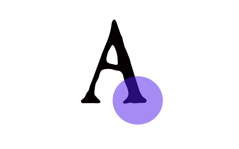
Gothic

The gothic serif style is often found on Blackletter typefaces. They tend to vary in style, but are typically bilateral, with one side appearing stumpy and the other extending much higher.
Examples: Old English, Fette Fraktur, Enzian
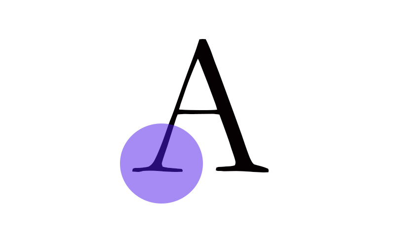
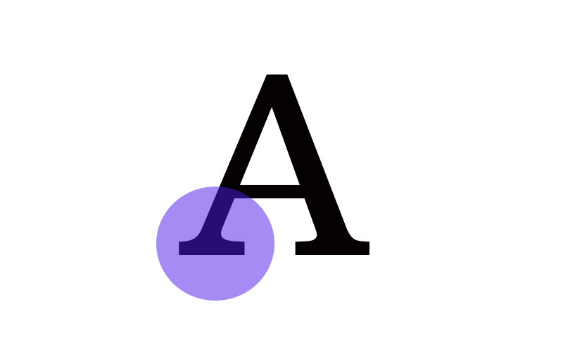
Glyphic
The glyphic serif is derived from chiseled roman lettering, a practice that produced an indentation at the end of each stoke. The serifs tend to be triangular and tapered on one end.
Examples: Trajan Pro, Saturnia, Epigraph.
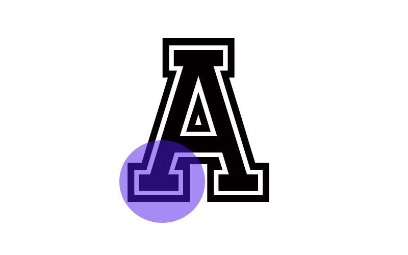
Bracketed
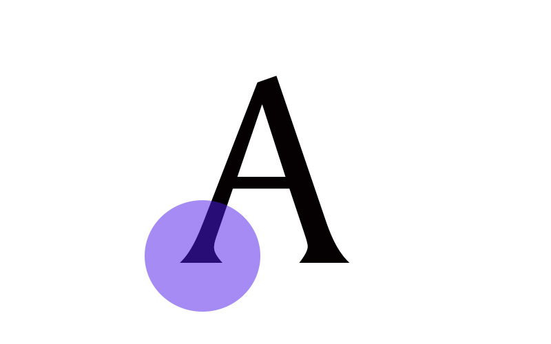
Typically considered to be a subsection of glyphic serifs, the primary difference is in the serifs’ sharpness. With traditional glyphic serifs, you’ll see blunt edges. But with bracketed serifs, the edges tend to be sharper.
Examples: Amerigo, Silk Serif, Madley
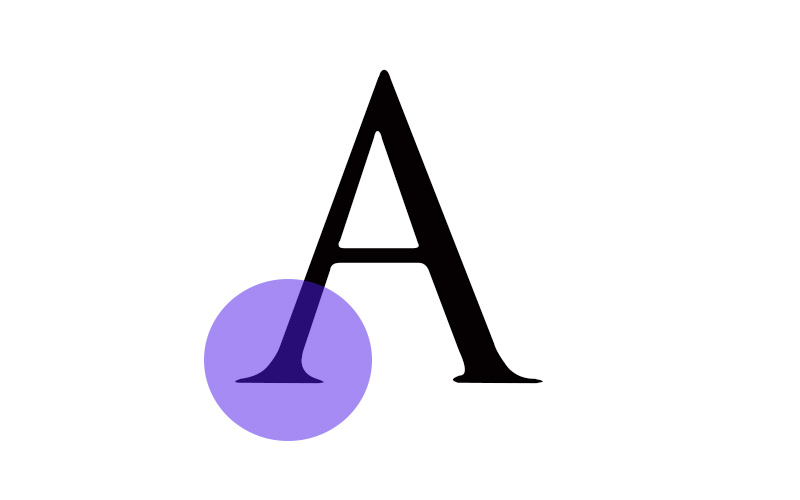
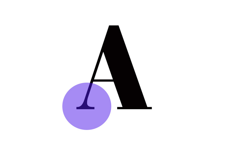
Oldstyle
One of the most commonly seen types of serifs is Oldstyle. Oldstyle serifs possess traditional, triangular edges, and emulate a calligraphic style. The exact shape can vary, however, ranging from more rounded forms to angular structures.
Examples: Plantin, Garamond, Erato
Wedge
The wedge serif is a more recent development. They can be quite complex as well, often featuring rounded edges and unusual shapes, such as Amman Serif Pro and Caslon Antique.
Hairline
As the name suggests, hairline serifs tend to be very fine. They’re typically unbracketed (without rounded edges), but some typefaces employ a bracketed hairline serif. These serifs can be seen on many notable typefaces, such as Didot. The hairline style has a more modern feel, as the thin serifs add a sense of high contrast.
Examples: Didot, Bauer Bodoni, Compass Next
Slab (Unbracketed)
There are two types of slab serifs. The first and most common type is the unbracketed slab serif. These serifs are straight, flat, and often geometric in nature.
Slab (Bracketed)
The second type of slab serif is the bracketed form, which is notable for its round, tapered upper edge.
Tuscan
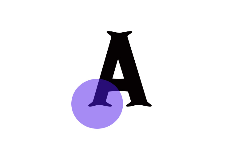
The Tuscan serif style is a quirky style with ends that split evenly from the middle. You won’t see Tuscan serifs terribly often, but you’ll know one when you see one. It adds a western or olde-tyme flair to the text it’s applied to.


