

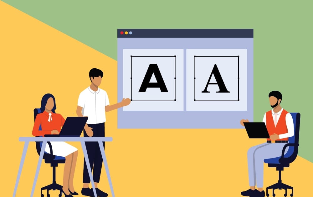
Website designers are tasked with managing a lot of text-heavy material. Keeping a website design that’s full of content from appearing as a jumbled mess can be a heavy venture. Especially when each piece is expressing an idea of varying importance. There’s a science to it.
It’s called typographic hierarchy.
What is hierarchy?
Typographic hierarchy is a system that uses typography — size, font, and layout — to create a hierarchy that shows users where to look for certain information.
A poorly designed webpage will overwhelm its visitors. Without a clear hierarchy, people won’t know which information to direct their attention to first. This is bad news, especially if these visitors are potential customers.
When potential customers arrive on your website’s landing page, they’re going to want clear direction.
How to create a visual hierarchy
There are a number of tools we can use to create a neat and orderly visual hierarchy in our work. This article will provide some concepts sure to help you create a stimulating, visually pleasing webpage for your company.
[in_content_ads gallery=”logos” logo=”on” title=”Need graphic design help?” subtitle=”Try Penji’s Unlimited Graphic Design and get all your branding, digital, print, and UXUI designs done in one place.” btntext=”Learn More” btnlink=”https://penji.co”]
Contrast
Finding fonts that work well together and build a cohesive identity is key. Even more so when you need to account for hierarchy. While choosing typefaces that work well together is truly an art unto itself, a lot of type foundries have done the labor for you in the creation of superfamilies. Superfamilies include a multitude of stylistic varieties for the same typeface.
Different superfamilies offer different amounts of fonts. Let’s look at GT America, a typeface developed by Grilli Type. GT America is a classic, low-contrast grotesque typeface. But its family is vast, providing designers with a huge palette of complementary fonts to choose from. This specimen below shows the fonts offered within the superfamily.
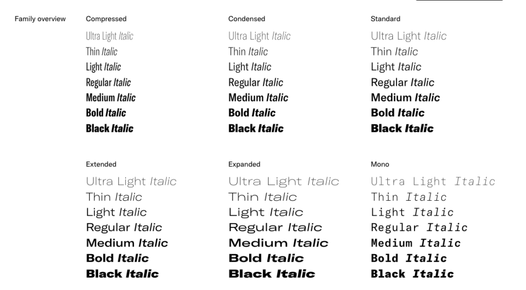
One example of how we can create a hierarchy using one superfamily is by choosing the bold or black style for display text—something of great importance then—use a thin or light style for body copy or pieces of lesser importance.
Without adjusting scale or color, you can create an easily discernible difference in importance, guiding the reader’s eye from one piece of information to another.
Scale

Another way to create a typographic hierarchy is by using scale. Generally, people gravitate toward the largest block first.
Let’s use the Penji website as an example.
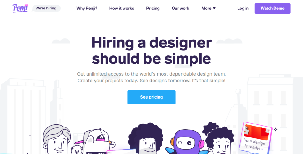
The website utilizes a T-shaped format. Your eyes are drawn to the bold, low modulation typeface placed in the middle of the page. It’s a clear priority. Not only is it a high-contrast situation — with the black text against the off-white backdrop — but it’s several points larger than any other text on the page.
“Hiring a designer should be simple,” it reads.
Why is this the priority? Because it taps directly into the psyche of a potential customer.
The eyes glide downward reading the secondary text, treated in a more neutral color just barely peaking out against the off-white backdrop. This is followed by a bold, blue button with the text “see pricing” written in negative space. Then, finally, we see a graphic sitting at the bottom, designed in the classic Penji style.
Once you’ve digested these in this order, your eyes will naturally move upward to the menu of tabs lining the uppermost verticle section of the landing page. Clear, easily digestible verbiage helps the onlooker quickly discern what every possible button entails. No guesswork!
Space
Let’s take a moment to briefly pay homage to early 2000s amateur web design. It’s been a while since I’ve stumbled upon this kind of site, but those of us old enough to remember will never forget. A lot of these sites have been erased or redesigned. However, I was able to find a good example still lurking around the deepest depths of the web.
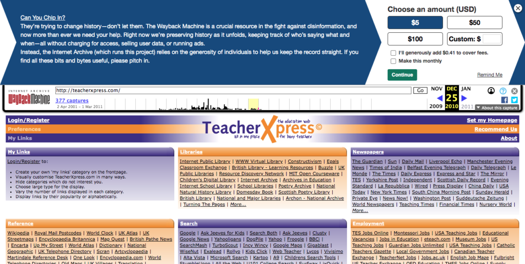
The little beauty pictured above is the landing spot for Teacher Xpress.
The most obvious crime is its usage of space. It’s too busy. You’re lost in a cacophony of small text, links, and poorly coordinated colors. There’s no clear typographic hierarchy. Besides its logo (which is also terribly designed) you don’t have a sense of where you are or what’s most important. As a result, you’re likely to feel overwhelmed.
So, what lesson can we learn from Teacher Xpress? Not every bit of space needs to be filled. Overly busy landing pages reek of unprofessionalism, giving an immediate bad impression to its viewer.
Space is one of your biggest tools when designing a quality website, as exemplified in the web pages below.
Conclusion
Your webpage is foundational to your business. And your landing page is like your business card. But, even more so. Your landing page not only greets your customer and provides them with a first impression, but it’s likely the way potential customers will interface with your company. So, it’s best to have a professional at the reigns when it comes to web design. But following these tips will help any would-be designer get the best out of their work!


