


Helvetica is one of the most popular typefaces. It’s been used just about everywhere, from big-name car manufacturers to the NYC subway. Inspired by the 19th-century typeface, Akzidens Grotesk, Helvetica (or Nue Haas Grotesk, as it was originally titled) has become the benchmark sans serif.
Maybe you’re looking for a free lookalike. Or possibly you’re interested in a slightly quirky take on an old classic. Whichever camp you fall into, it’s helpful to have a host of alternatives in your repertoire. There are a number of fonts similar to Helvetica to serve this purpose.
This list will compile 9 typefaces that evoke Helvetica’s essence. We’ll be splitting them up into three categories:
Most Similar
3 typefaces that look about as similar to Helvetica as possible to the original.
TeX Gyre Heros
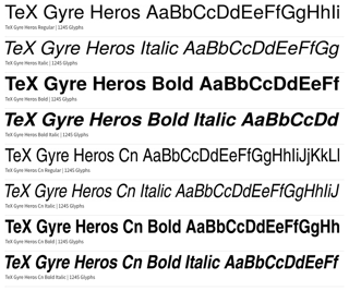
Designed by Boguslaw Jackowski and Janusz Nowacki and published by GUST e-foundry. This typeface offers a family of sans serif fonts. It’s actually based on Nimbus Sans, which is inspired by Helvetica.
TeX Gyre Hero offers two weights: standard and condensed. Within each of these weights, you have the choice between regular, bold, italic, and bold italic. This is your best free alternative if you’re in the market for a Helvetica twin.
Where to find it: fontsquirrel.com
Roboto
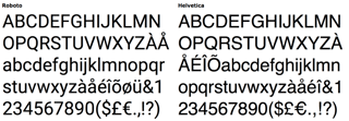
Perhaps most well-known for being an Andriod default typeface, Roboto makes for a great Helvetica alternative. It’s open-source and entirely free to use. It isn’t an exact match, however.
The characters are generally less rounded, and slightly thinner. The typeface is manually delta-hinted for superior rendering on computer monitors.
Where to find it: fonts.adobe.com
Arimo
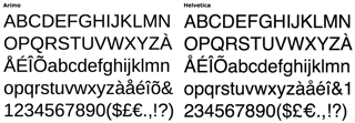
This typeface might be more comparable to Arial, but Arial has been trying to emulate Helvetica since its inception. Anyway, If you’re looking to avoid the default look, Arimo offers you some interesting aesthetic changes to both Helvetica and Arial.
Where to find it: fonts.adobe.com
Best New Take
3 typefaces that offer the most effective updates to the original.
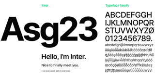
Inter
Inter showed up in 2017, designed with the expressed intent of being more legible on computer screens. Created by Rasmus Anderson (who was Spotify’s first designer back in 2006), Inter is an excellent choice for those looking for a Helvetica-like typeface with modern consciousness.
With a tall x-height to aid readability and several OpenType features, Inter is effective and has few limits.
Where to find it: fonts.google.com
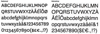
National
While paying homage to the classic sans serif, National provides a unique approach to its letterform. It has a more rounded look, which lends itself to a more contemporary, whimsical quality.
However, it doesn’t cross any lines and ultimately rests well in any professional context. Designer Kris Sowersby won the Certificate of Excellence from the Type Designers Club in 2008 for his work on National.
Where to find it: klim.co.nz
Noirden Sans
With six weights and an oblique option, Noirden Sans executes a contemporary update to Helvetica. The adherence to the classic Swiss Style makes this typeface perfect for modern branding.
Available in Bold Oblique, Bold, Extra Light Oblique, Extra Light, Light Oblique, Light, Regular Oblique, Regular, Semi Bold Oblique, Semi Bold, Thin Oblique & Thin.
Where to find it: creativemarket.com
Most Quirky
3 typefaces that maintain the intent of Helvetica but with an eccentric twist.
FF Bau
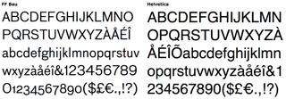
Designed by Christian Schwartz in 2002 and published by FontFont, FF Bau offers a similar feel to Helvetica but has some unique additions, such as thinner letterforms. This typeface supports eighty-two languages and offers eight weights, including Regular, Medium, Bold, and Super. Additionally, an italic style was added in 2004.
Where to find it: myfonts.com
ARS Maquette
ARS Maquette was developed by Angus R. Shamal and released through ARS Type in 2001. But this typeface is versatile, and it’s not just a good alternative to Helvetica. It also conjures sensations of Gotham and Proxima Nova.
Where to find it: fontshop.com
Coolvetica
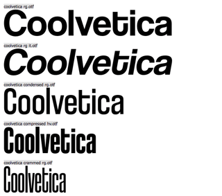
This typeface merges the modern eloquence of Helvetica with ’70s-inspired custom lettering. It’s set with tight kerning and eccentric flairs. Coolvetica came about at a time when Helvetica was at its peak in popularity. As a result, it found its way onto a number of storefronts and promotional material.
Where to find it: dafont.com
Interested in finding the right designer for your logo or brand? Check out Penji and get unlimited access to the world’s most dependable design team. Create your projects today. See your designs tomorrow.


