

If you think building a website is easy, then you obviously haven’t tried making one yet. Along with selecting the right layout and color palette to reflect your brand, it’s also crucial to choose the right font for website. After all, stats cited by TIME magazine tell us that the average time spent on a website is only 15 seconds. Yup, that short!
Here at Penji, many of our clients ask us to create website designs that would encourage visitors to stay for much longer. They know how an amateur-looking website can make their bounce rate fly off the charts, and that’s never a good thing. And without a doubt, website font plays a key part and should never be taken for granted.
If you’re researching what font to use for website or landing pages, you’ve come to the right place. In this article, we’ll talk about:
- What web-safe fonts are
- Best web font options you can choose from
- Tips on choosing the right font
- How to know what fonts your competitors are using on their website
- BONUS: Where to get the best web designs to go with the font that you choose
What are Web-Safe Fonts?
Before we dive deep into font options, let’s discuss web-safe fonts and why it’s important to use them on your website. In the most basic sense, HTML and CSS fonts are those that are stored universally across devices. That means your website will look the same no matter who views it and what fonts are installed on their mobile or laptop.
So, what happens when you choose a random font that’s not web-safe? Well, the look of your website will vary depending on the device. In general, each device will display your website text using a font already installed in it. And when your website doesn’t look across all devices, your branding could suffer.
In addition to having a uniform look, choosing an appropriate font for website allows for search engine optimization (SEO) benefits. How? Simple – because they’re already locally stored in the device, loading the website takes a shorter time.
This, in turn, encourages visitors to stay and check out your website, thus reducing the bounce rate.
Related Post: Best Fonts for Logos That Won’t Make Your Brand Look Cheap
Web-Safe Fonts to Choose From
Here are fonts for website options you may want to explore. Take note that each font exudes a certain personality, depending on other design elements you use them with. That said, it’s best to consider the font choice as part of your overall website design plan.
Sans Serif
Arial
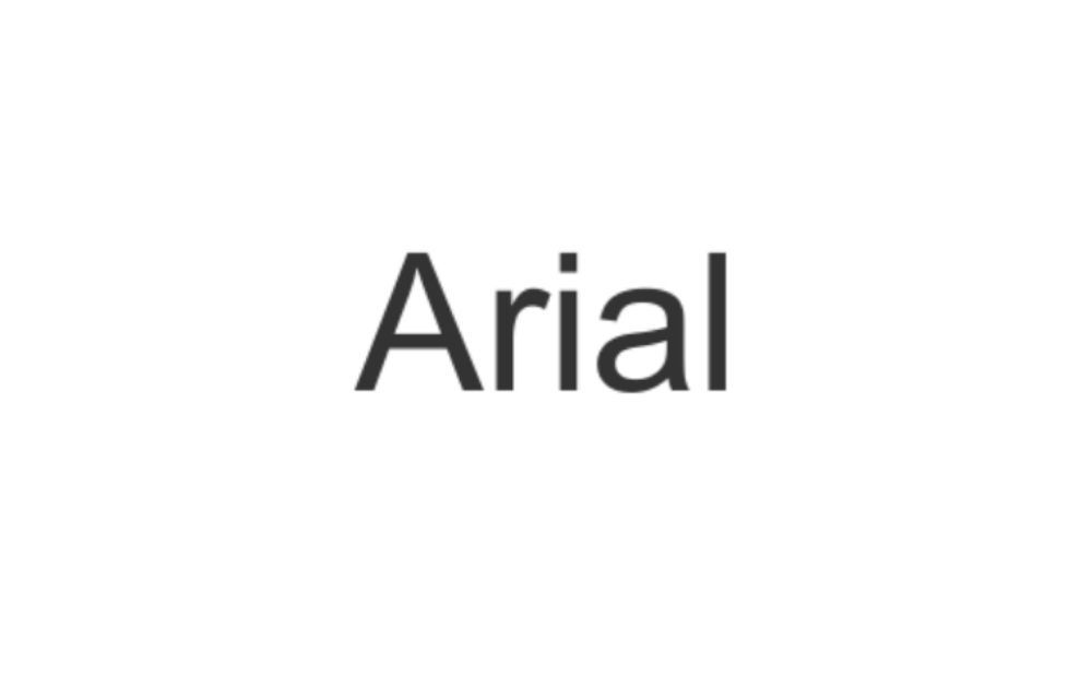
For most websites, Arial is the go-to option. After all, it’s clean, simple, and it does the job. In fact, you might have noticed that it’s the default font when you use Google Docs. That said, it’s hard to go wrong with this classic choice.
Arial Narrow
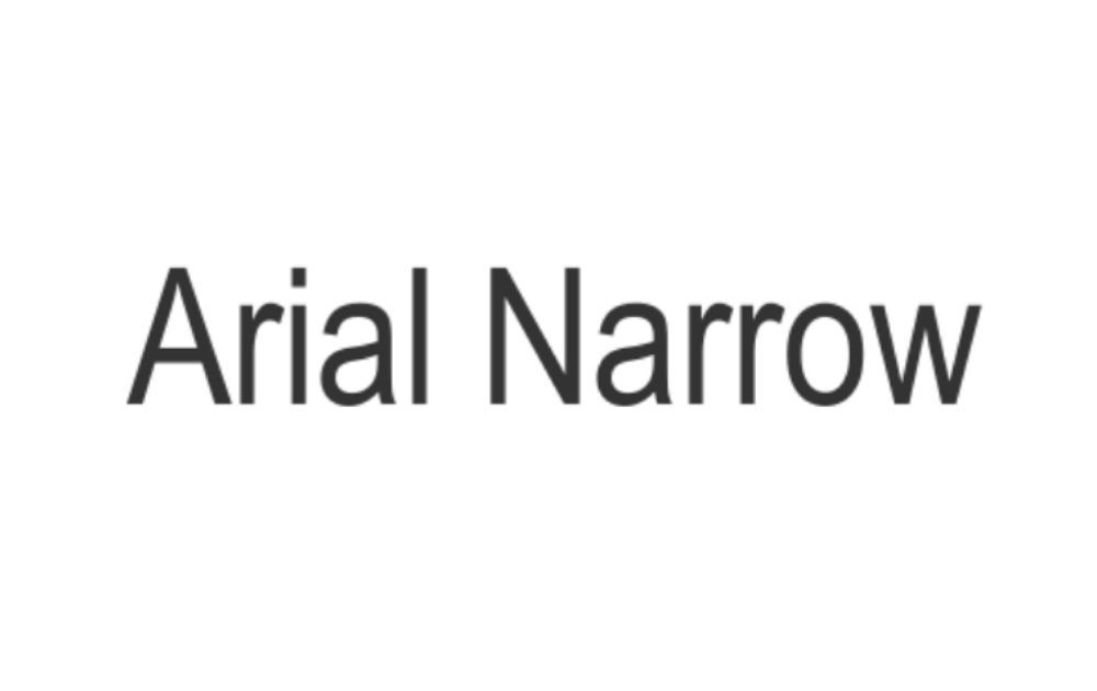
If you want a narrower option while staying within a classic choice, Arial Narrow is a great choice. For one, it’s simple enough not to overwhelm the eyes. In addition to that, it offers a space economy if that’s something that’s crucial to your website.
Arial Black
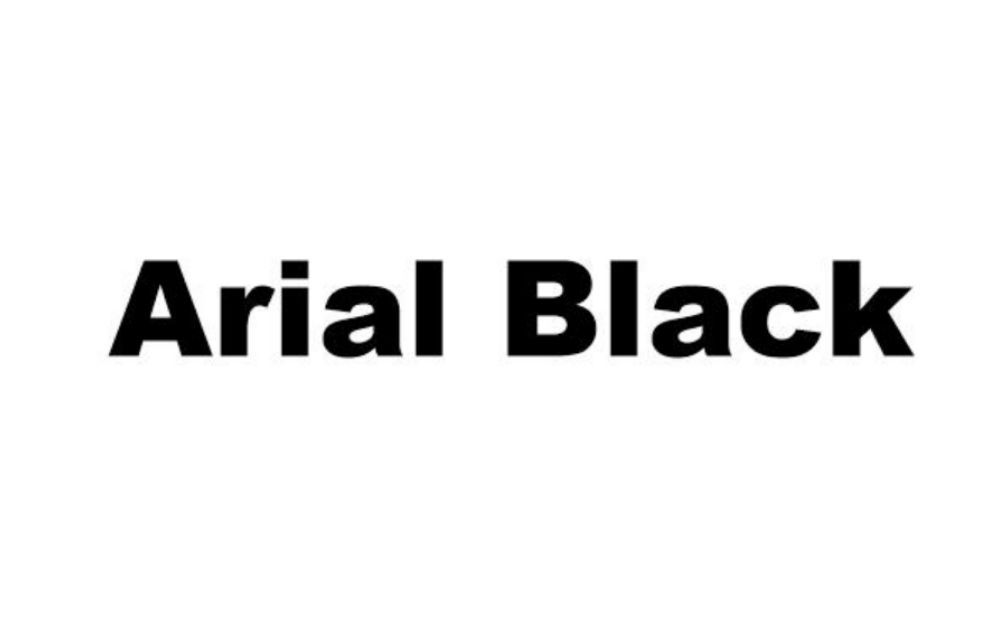
Another option from the Arial font family, many argue that Arial Black is the best font for website header. That said, it’s crucial to reiterate that using this font for the website body isn’t ideal. Keep its use limited to headings and subheadings, and you’ll be good to go.
Helvetica
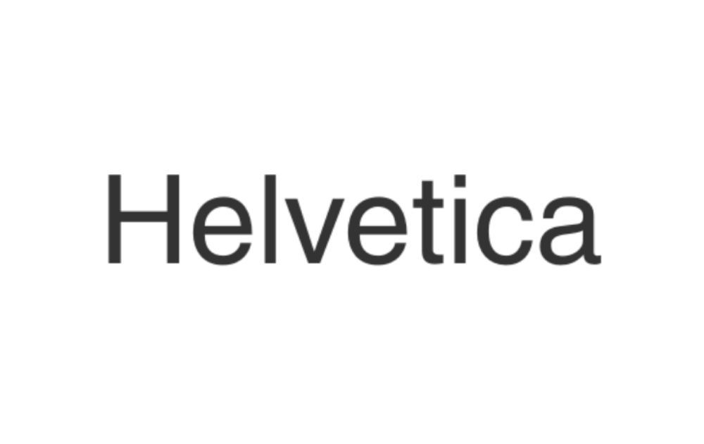
Here’s an open secret in the graphic design world: Helvetica is almost every designer’s go-to font. In fact, there’s a 2007 feature-length docu-film about graphic design titled Helvetica, which, as you’ve might have guessed, centers around this font. Yup, when it comes to font popularity, Helvetica is literally a celebrity!
That said, it’s not surprising that this option comes high on top of the list of best fonts for logos. But what exactly makes this font a favorite among graphic designers? Simple – it’s neutral enough to blend with other elements in the visual.
Impact

Impact is another one of those Google fonts designed for headlines. Unfortunately, it’s not ideal for website body use; otherwise, you’ll have huge chunks of dark text all over the page. But used exclusively for headings and subheadings, this font indeed makes an impact.
Verdana
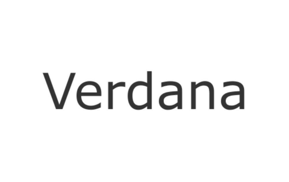
If you’re looking for a font for website option that has a human depth to it, you may want to check out Verdana. This is a “humanist” sans-serif typeface, which means the presence of the hand characterizes it. For one, it has an overall organic structure that hints at handwriting while keeping a neat and orderly appearance.
Tahoma
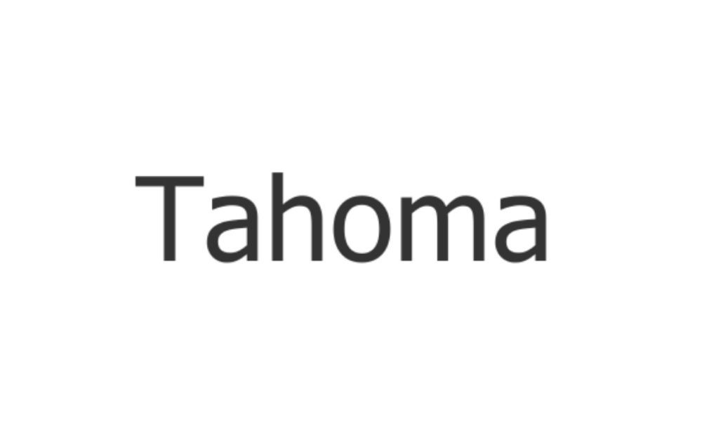
Also under the humanist sans-serif typeface category is Tahoma. This font was designed by Matthew Carter for Microsoft. In fact, it was a standard font included in the initial release of Windows 95. This font is a bit similar to Verdana but features smaller counters and a narrower body.
Trebuchet
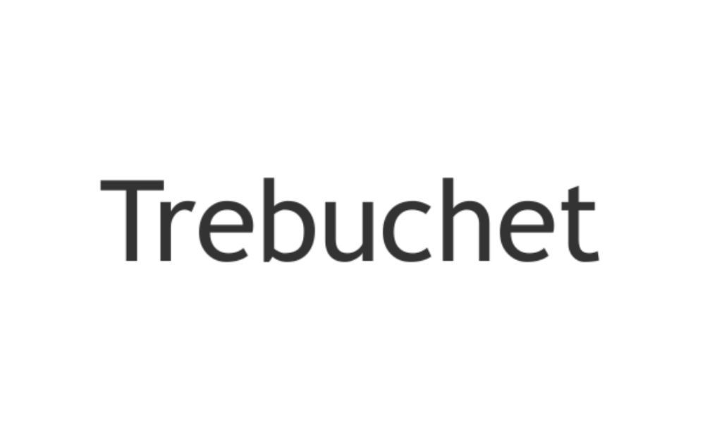
Designed by Vincent Connare for Microsoft Corporation in 1996, Trebuchet is also a humanist font. You can’t go wrong with Trebuchet, as it’s one of the most popular body text fonts on websites.
Comic Sans MS
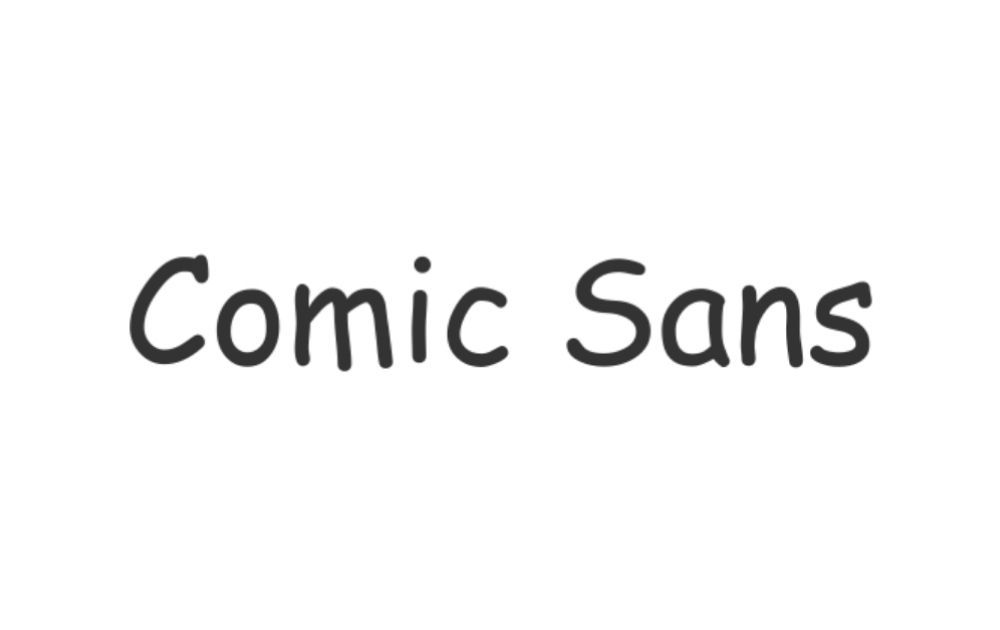
Yes, I know! This is one of those dated fonts that could make a website look like it caught the Y2K bug. But hear me out first on why this font made it to our list.
A study by the Times Educational Supplement (TES) suggests that this font is suitable for dyslexic students and is a good option to use to model handwriting for kids. They also found Comic Sans to be aesthetically pleasing to some children. So, if you’re building a website for education or with children as your target audience, then at least consider this option.
Serif
Times New Roman
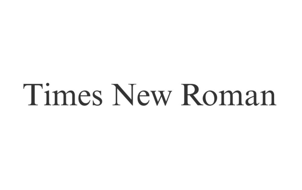
If you’re going for a professional look, Times New Roman is always a good choice. This is the font used by many newspapers and news websites, and it’s also the main font for Windows apps and devices.
Times
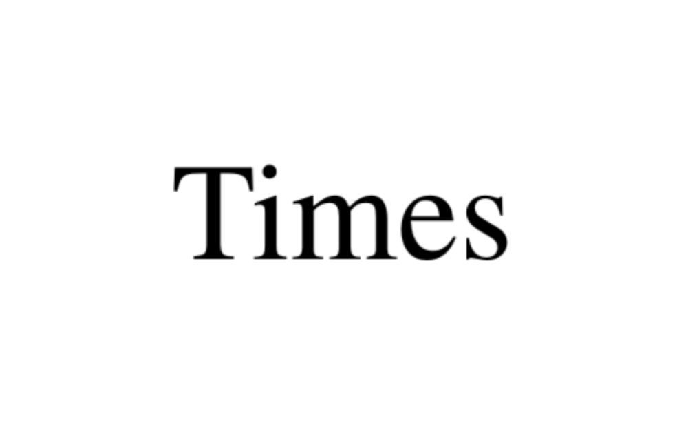
Some might mistake Times New Roman and Times for each other, and understandably so. But no matter how minuscule the difference is, it’s there. For one, Times New Roman is a monotype; Times, on the other hand, is a linotype. There are also subtle differences in their terminals and serifs as well as in their special characters.
Perpetua
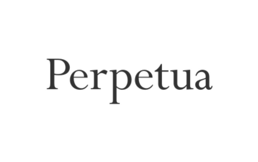
When it comes to serif fonts, Perpetua is an oldie but a goodie. This font has a crisp design and was made by English stonemason and sculptor Eric Gill at the request of Stanley Morison in 1929.
Georgia
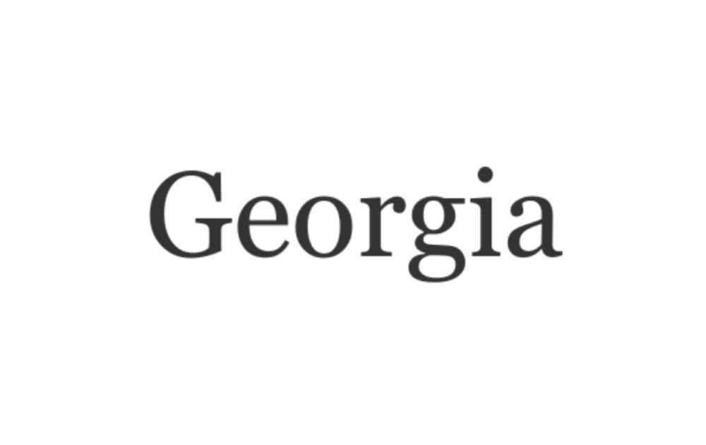
Georgia is another good option to consider if you’re looking for a serif font that’s easy on the eyes. In fact, The New York Times has changed its main font from Times New Roman to Georgia because the latter is “a little wider and which many people find easier to read.”
Palatino
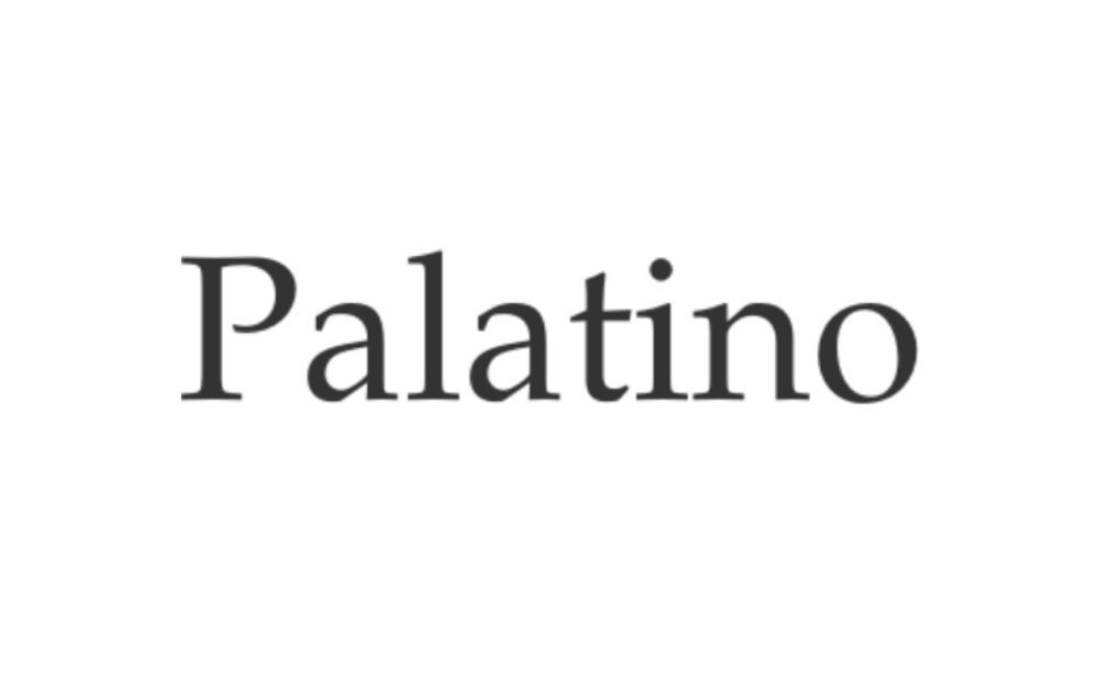
This font was named after Giambattista Palatino, a 16th-century Italian master of calligraphy. That being said, the font reflects the humanist type styles of the Italian Renaissance but still manages to be one of the best clean fonts for websites.
Garamond
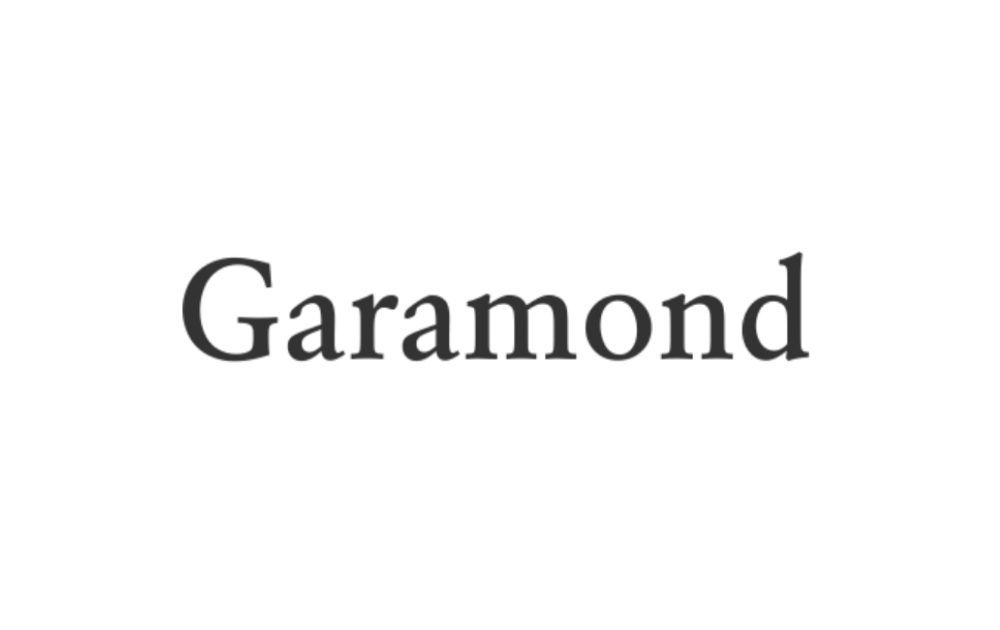
Like Palatino, this font was named after a typography OG – Claude Garamond, a Parisian engraver in the 16th century. Today’s digital version is Monotype Garamond, based on the work of a 1920s French type designer.
Despite its old-school charm, however, some designers are not a fan. Anti-Garamond designers say this font has a low x-height (which literally pertains to the height of the letter “x”).
Related Post: Coffee Shop Fonts That are the Perfect Blend of Delicious and Captivating
Tips on Choosing the Right Font
The examples given above look great, alright, but how does one pick the best of the best? Here are a few factors to consider to make the right choice.
Brand Identity
I’ve mentioned this earlier, and I’ll mention it again. After all, what is a website for if not to advance the brand forward and help build a more reputable venture? That said, it’s vital to consider which font can best reflect your brand identity. In addition to that, you may also need to measure fonts against the other design elements in your website. This may include your logos, illustrations, signature shapes, and other visual assets.
Serif or Sans Serif?
The next question is, should you use a serif or a sans serif font? In general, sans serif fonts are ideal for text within the website body. Serif fonts, on the other hand, are ideal for bigger visuals or print. However, that doesn’t mean you can’t use serif fonts on your website altogether. In fact, you can use serif fonts for headers and other decorative accents.
Readability
Whether you’re using a serif or a sans serif font, it needs to meet one requirement – it must be readable without much effort from the visitor. After all, the average bounce website stay of 15 seconds is short enough as it is. You don’t need to give your visitors yet another reason to hit the back button any faster.
Number of Fonts
Though it might be tempting to pick several fonts on your shortlist to use on your website, hold your horses. Remember: using more fonts than necessary may do more harm than good. Unless you want to overwhelm your visitors, stick to two fonts, three at the most.
Font Combination
Aside from the number of fonts on your website, you also need to pay attention to which font styles you can combine. As a rule of thumb, you shouldn’t use two different fonts that are too similar to each other. Instead, try to combine fonts that have enough contrast when placed against each other.
Spying on Other Websites
Researching website fonts might lead you to check out other websites to get inspiration or simply to spy on competitors. Don’t worry – it’s not a crime!
Here are simple steps on how to know what font a certain website uses.
Step 1
Open the website you’re using as inspiration (or spying on).
Step 2
Right-click anywhere on the page and select inspect. It could be the header, menu, footer, body, or any other part of the page.
Step 3
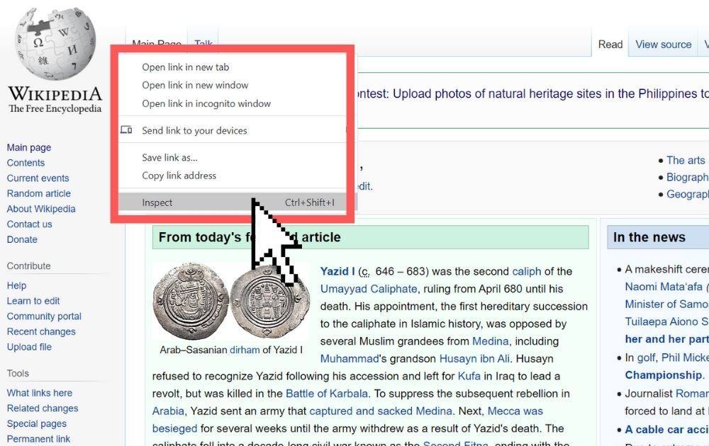
Alternatively, you can also use Ctrl+Shift+I for Windows or Cmd+Shift+I for Mac. An inspect window will appear on your screen.
Step 4
Click on a specific website element you want to know more about and click inspect.
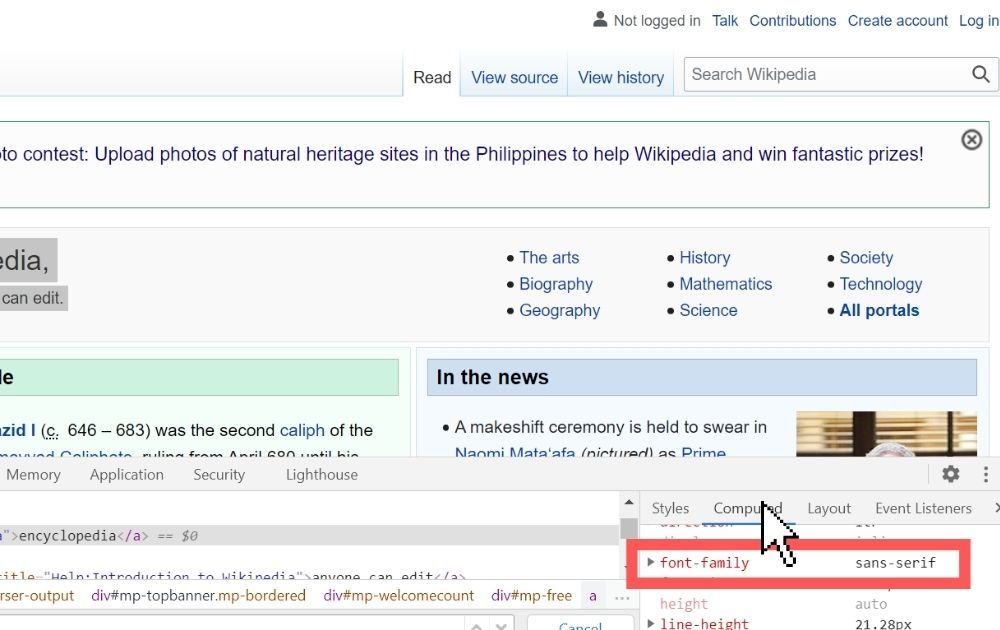
Step 5
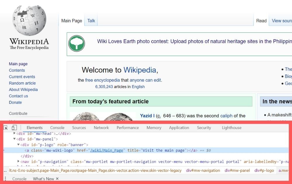
Go to the computed tab and look for the font-family element. There you’ll find the font used for the element you selected.
Sounds easy, right? Try it for yourself and take note of your favorite websites’ fonts. But what if you want to know what font is used for a specific image, let’s say an ad? Well, there are also tools for that. For instance, online resources like What Font Is, and Fontspring’s Matcherator can help analyze the file and tell you what font best matches the one on the image.
The Bottomline
As seen from the font styles above, when it comes to web fonts, simple is best. You need to get your brand story and content forward, and you don’t want any design element to compete with that – not even your font style. If anything, the font should complement the brand identity and message voice.
Aside from choosing the best font for your website, it’s crucial that you have the best website design. If you’re looking for a reliable designer for your website, Penji is here to the rescue. Because we offer unlimited graphic design at a flat monthly rate, you can have all the designs you want without spending an arm and a leg.
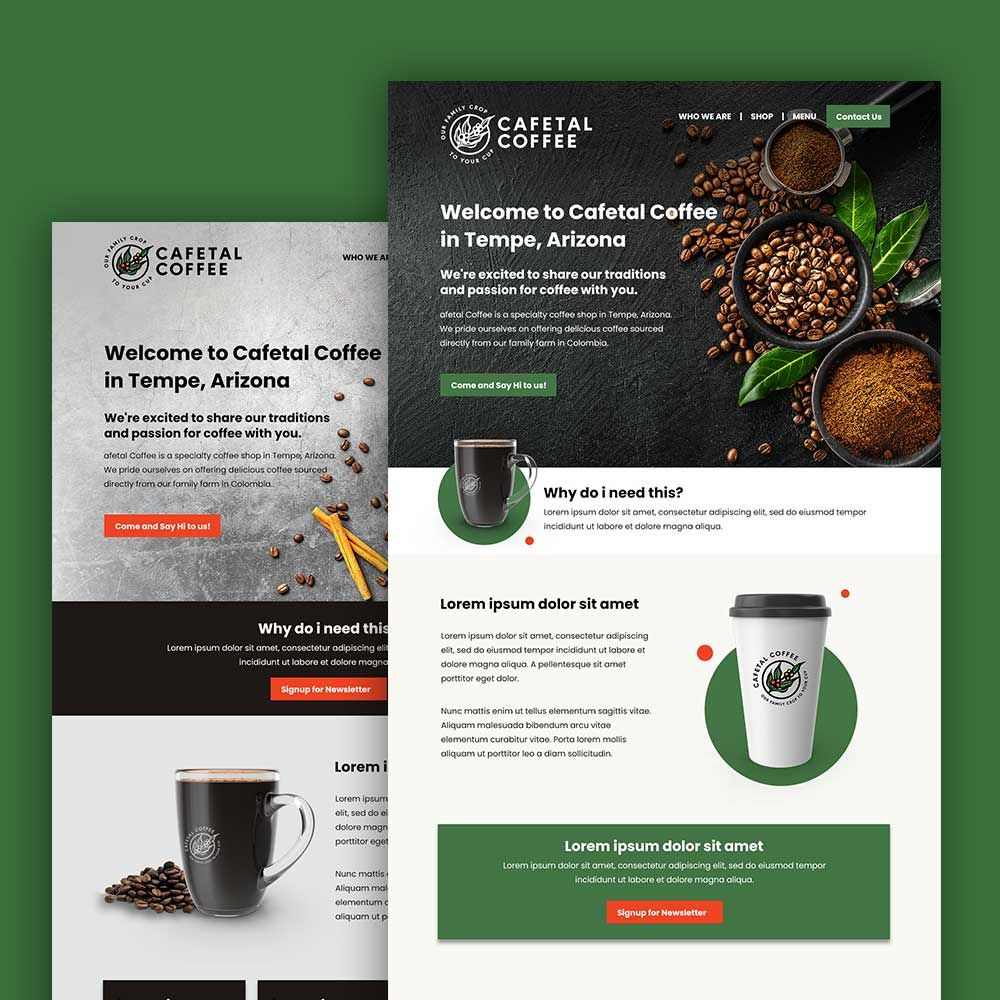
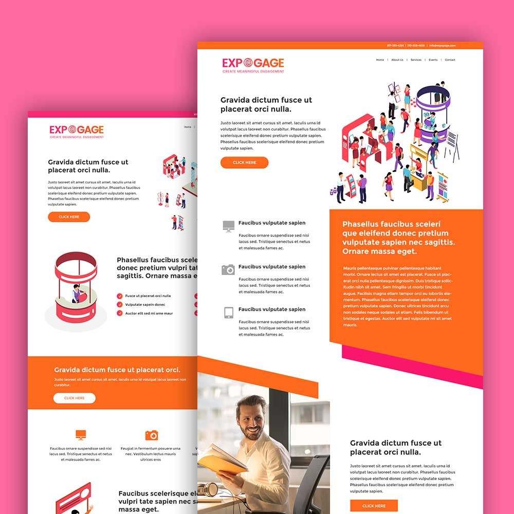
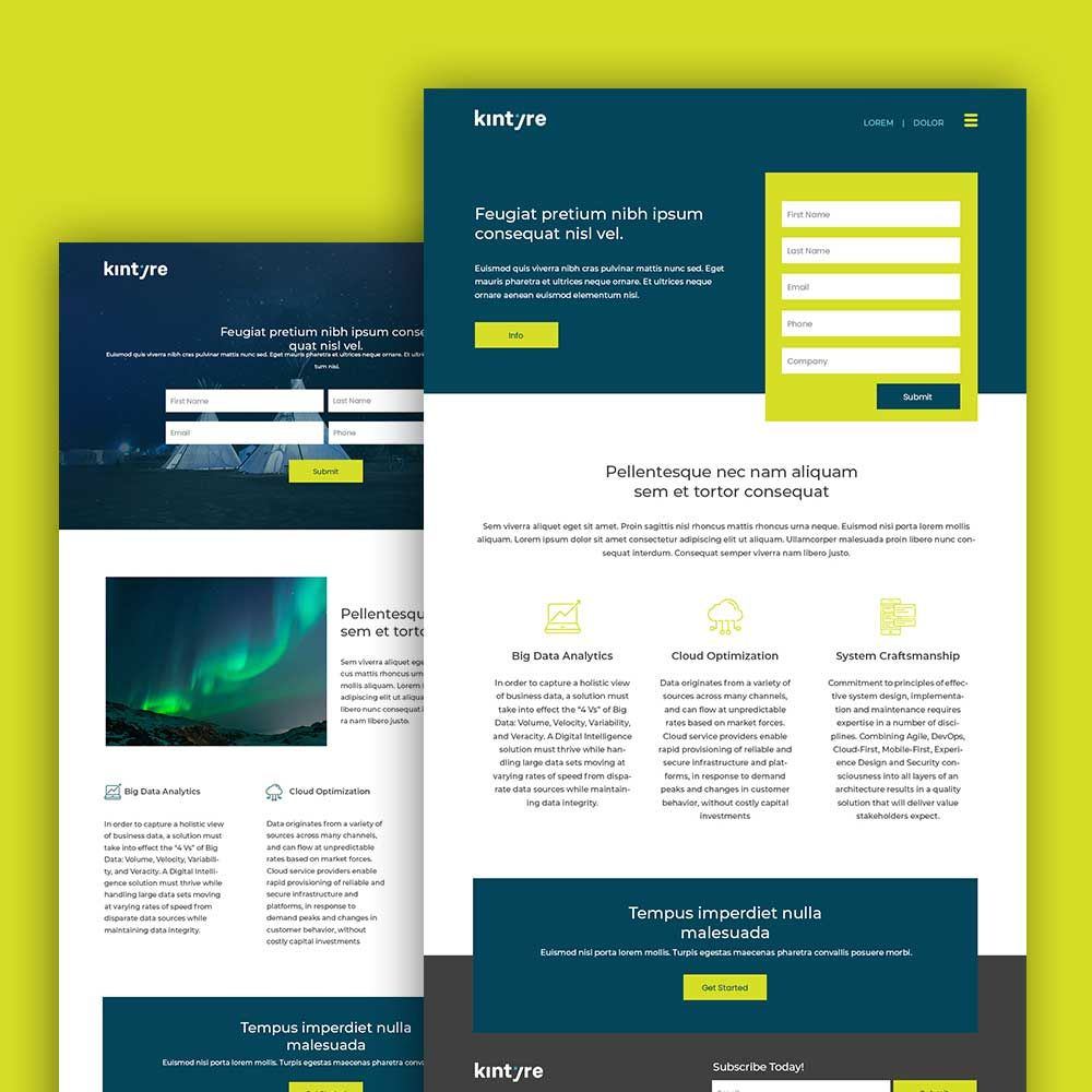
Check out some of the websites we’ve designed in the past:
We have the top 2 percent of designers, so your website design will be in good hands. Get unlimited designs now and enjoy 15% off the first month of any plan. You can try any of our packages risk-free for 15 days, so there’s nothing to lose and everything to gain.
About the author

Carla Deña
Carla is a journalist and content writer who produces stories for both digital and legacy media. She is passionate about creativity, innovation, and helping small businesses explore solutions that drive growth and social impact.


