


A brand style guide is a must-have for building your brand. Top businesses use this guide to keep their branding consistent and recognizable. But if you need examples of how to make a brand style guide, we have 15 of the best ones!
What is a Brand Style Guide
It provides the guidelines as to how the brand would look. It also specifies some aspects like typography and color to logos or packaging and other brand-related elements. That leads us to why you need it.
Why Is A Brand Style Guide Important?
A brand style guide is a necessity for any big brand. Would a small business need one, too? Our answer is yes. Even if a brand style guide is essential for most prominent brands, small businesses could use this for internal purposes. It doesn’t have to be an elaborate and comprehensive document, especially when developing a brand. You can even outsource this work to a brand designer. Here’s why you still need a brand style guide.
Align Internally
As your small business grows, a brand style guide will help new employees understand your brand better. Even if you have the logo background, brand identity, and company values, it will still make a big difference in how your employees identify with your brand.
Maintain Consistent Branding
As your employees peruse your branding guidelines, they will further understand how to maintain your branding across different channels and platforms. For instance, when one of your employees creates a social media post, they can refer to the brand style guide and know what the guidelines are.
Communicate the Brand to Customers or Clients
The final reason a brand guideline is essential to any business is its value in communicating the brand to your customers. This should serve as a way to understand on how your customers will perceive the brand. Plus, it’s a way for them to connect with your brand!
Why Startups Need It
You might ask yourself, “why does my startup need a brand style guide?” Simple. You want to ensure that you have a brand identity as you operate that startup.
One of the main reasons for having one is that you’ll look professional and trusted. According to Liz Moorehead from Impact BND, having no clear brand standards can negatively impact your business. This will defeat the purpose of brand consistency.
So another reason why you should have it is, if you have brand consistency, you can communicate your brand to your stakeholders and the public. Having style guides will set standards in terms of fonts, colors, and other brand attributes. Plus, it can help you get your brand recognized everywhere. After all, Lucidpress found in their study that if you have brand consistency, you can increase revenue up to 23%!
What Should Be Inside Your Brand Style Guide?
1. Logo
Your logo is the most essential visual identification of your brand. That said, it should take space in your brand style guide. For one, having the logo in your brand guidelines will help stakeholders understand the essence of your brand. For example, some logos have hidden meanings that one may not see at first glance. Additionally, the logo’s important elements will also be deconstructed for visual purposes.
2. Font
Many big brands use a custom font that represents the brand visually through words. However, as a small business, you’re not required to use a custom font yet. Including the font in your brand style guide will help people understand why you’re using that specific font. Plus, it shows off your personality. Make sure to employ fonts for commercial use. Ensure you have the license to use the font so you don’t get into trouble.
3. Color
Color is another vital brand style guide element. It’s another element in your branding that adds to your personality. Adding color to your brand style guide will help employees know what colors are allowed and not to be used.
4. Imagery
This is ideal when you are an eCommerce business and want a specific way of presenting your products. Photography is a popular example of imagery. Another example is iconography. Icons aren’t necessary, but iconography is ideal for mobile app businesses. The final example of imagery is illustration. Many small businesses use illustrations to customize their brand identity and express themselves better through art.
5. Tone of Voice
The tone of voice is another element to add to your brand guidelines. Although it’s not a visual component, you can include it in your brand style guide because it will determine how to speak to your target audience. Additionally, it’s an indicator of your brand identity!
6. Story
Your brand story can also be added to your brand style guide. It doesn’t have to be an elaborate story. You can mention how the brand came about. For instance, when a stakeholder downloads your brand style guide, they will know the backstory behind the logo or why you chose specific colors or fonts. It makes you a more personable and approachable brand.
7. Values
Consider this another essential to your brand style guide. Although not truly necessary, indicating brand values can also help your employees understand why they work for your business. Plus, your target audience would know what values you hold and why they’re important to you.
8. Vision and Mission
The final must-have for any brand style guide is the vision and mission. These help your audience understand what you’re working towards, and your employees can also be guided by them whenever they do their work.
15 Brand Style Guide Examples
Here are some brand style guide examples from famous companies that will inspire you:
1. Jet.com
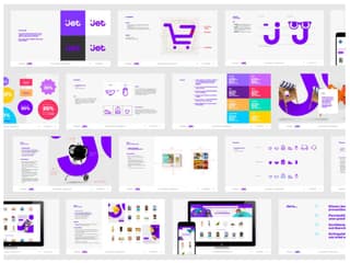
FirstBorn is a creative agency handling branding, visual, and digital strategies for its clients. For their client, Jet.com, FirstBorn crafted an established identity for the eCommerce company. In terms of typography, they collaborated with DaltonMaag to create a font specific for Jet.com. This allowed them to save money on copyright.
As for their brand standards, you can see that the dark violet motif for Jet.com is used on the style guide. Bonus points for FirstBorn for adding the primary and secondary colors, iconography, and typography specifications to ensure that Jet.com has a visual language custom-made for them.
2. Google
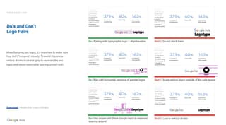
For a big company like Google, they must create visual identity guidelines for every facet of their business (e.g., marketing, ads, trends, news, etc.).
As an example, check out how Google presented their visual identity guidelines for Google Ads. They have clear-cut guidelines as to how their assets would appear on broadcast, online print, and a layout. Plus, they even provided how to use them as a written source too. Visually speaking, you can also see the Google colors incorporated onto the guidelines as well.
3. Kindbody
Kindbody tapped C42D, a New York-based branding agency, to deliver a brand strategy for the female-first healthcare startup. C42D explained the importance of the parenthesis as it refers to both body and the mind.
C42D added the color scheme plus the typography used for the logo and other branding assets. As you can see, there’s also a preview of how the logo, font, and color appears on their merchandise and websites.
4. Sentry Financial

Niftic Agency was tasked to develop a strong brand identity for Sentry Financial, wanting to make them a leader in the industry and a powerful one at that.
As you can see in the preview of their visual identity guidelines, their aesthetic is elegant thanks to the typography that the agency chose for the brand (Noe Digital). That’s how they want their customers to perceive them. It’s also elegant because of the gradient and the shades of gray for their primary color scheme.
5. Uber
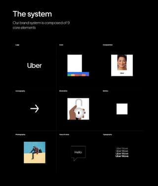
What I love about Uber’s brand style guide is that it’s detailed. From the logo, brand architecture to composition, photography, and tone of voice, they have everything covered. It’s as expected from a big brand. It’s especially important to put details because you want to ensure that your brand will look professional across different channels and with your affiliates.
6. CNN
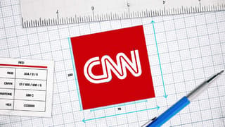
In true CNN fashion, they presented their CNN branding guidelines as a video narrated by Richard Quest. It’s a compelling animation video showing how to apply their logo on-air, on their website, letterheads, hats, and much more. Instead of publishing it on a website or a pdf, the narration helps to understand the essence of the CNN logo better.
You can watch their reel here.
7. Marqeta
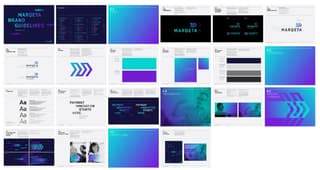
Marqeta approached Emotive Brand to help position themselves as a significant player in the FinTech industry. Emotive Brand explained that the FinTech company’s logo is an M in motion, so the brand always moves forward and is innovative as well.
Meanwhile, for Marqeta’s brand guidelines, it’s not all-inclusive, but that’s what makes it a good branding guideline too. Since it’s simple, it still includes vital elements that make up the Marqeta brand.
8. Slack
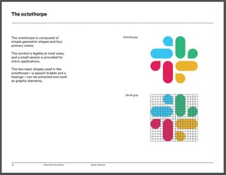
I used Slack when they still used the number sign and got surprised they rebranded the logo to the “Octothorpe.” They kept their original color scheme while presenting a new and improved Slack.
Slack is one of the few companies on this list to include illustrations as part of the brand guidelines. They want users to perceive them as an approachable, smart, witty, and human brand, and it shows in their illustrations.
As for their brand style guide, they cover almost all essential components of any branding guide, and it’s easy to understand and follow.
9. Nike Pro Services
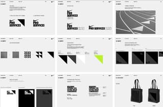
Nike allowed Manual Creative the opportunity to work on their Pro Services. The challenge was to build a brand that demonstrated exclusivity. Manual Creative delivered.
To do that, Manual Creative got inspiration from the triangles seen on the running track. It has a double meaning, wherein it implies “reaching a pinnacle.” The symbolism is part of the merchandise given to the invited members. They presented their color scheme, using the triangle as well. In terms of their overall brand manual, it includes the essential components of brand guidelines, which would suffice in learning more about Nike Pro Services.
10. Toyota
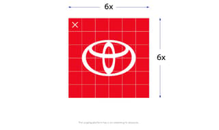
You can view Toyota’s visual identity system (VIS) through their website, and they have pages dedicated to each brand component. This allows viewers of their VIS to learn about every element in bits and pieces.
What’s consistent on every page is you can see “Toyota Red” not only just the color of the fonts on the page but their cars or advertisements as well. It shows that as one of the biggest brands in the automobile industry, Toyota aims to stand out from the rest.
11. Starbucks
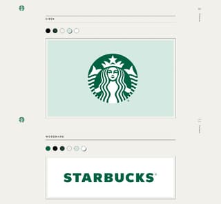
When I think of Starbucks, I remember green and the siren (aside from their drinks, of course).
Their signature Starbucks green is a massive part of their branding since 1987 after Howard Schultz, Starbucks CEO, acquired the coffee brand while running his cafè: Il Giornale. Since then, they combined the green motif from Il Giornale while combining the famous siren.
To explain further, Christine Wharton wrote in ImpactBND that Starbucks green represents “growth, freshness, uniqueness, and prosperity.” Besides, the green also provides relaxation so customers can enjoy and relax with their coffees in their stores.
On their creative expression website, where they provide brand guidelines, you’ll see their use of colors and consistent typography throughout the site.
Since Starbucks has seasonal drinks and products, they also supplied the color scheme for each season. Just like Slack, they use illustrations as a part of their branding guideline, as seen in their Starbucks card, tumblers, and coffee packaging.
Even if they don’t elaborate on the positioning and layout in their visual identity guidelines, you get an idea of how they want to present themselves to the public. It’s easy to understand what colors they want for their logos and other brand assets.
12. American Express
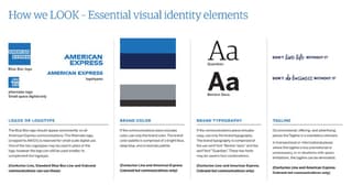
What I like about the American Express communication guidelines is it’s simple and straightforward. Their recognizable blue is used as headers in the document, wanting to establish their brand identity throughout the document. You get a sense of how they want their affiliates or brand partners to adhere to their branding.
13. Dell
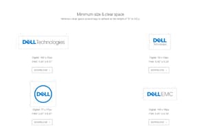
As with some companies, Dell has a dedicated page on its website to publish their guidelines. What makes them different from other brands on this list is they provide a FAQ of how to use their brand standards. This allows them to explain the main idea about elements like logos, typography, and colors on their specific pages while further expanding on how to use their branding and other assets.
14. Snapchat
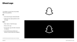
Short is sweet, and Snapchat shows that you don’t need many pages to showcase your main branding guidelines in more than 20 pages. It’s best if you can compress the guidelines in a few pages since you want to be concise in communicating how you want your brand presented. Also, the thank you at the end is a nice touch.
15. Walmart
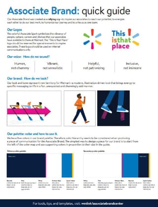
Since Walmart is a corporation, with one other brand and a global presence, it’s expected that Walmart would provide branding styles for the others as well.
For the Walmart brand alone, they have three downloadable resources for associates. One is the color palette, which you can also access on another page. They would also quiz you on their brand on that page, though. They also have a condensed quick one-page guide that explains their logo and voice. Finally, you’ll see an elaborate version of their brand on their visual identity guide. It contains the do’s and don’ts, typography, illustration, and photography elements of their brand.
Final Thoughts
Now that you’ve seen examples of how some visual or brand identity guidelines, you need to prepare a brand standards guide. Not only would it secure your brand identity, but you also get to set a standard that your customers or users would recognize. That way, you convey your brand identity correctly and you can be confident it’ll increase brand recall.


