
As businesses mold their brand identity, they think of the best way to show it to their audience. Aside from logos, symbols, and images, typography is also another approach to resonate with one’s target market. Nonetheless, entrepreneurs sometimes pay no attention to typography designs thinking that icons and symbols might represent their business better.
However, typography also does a bang-up job in emanating your brand image — even more efficiently than icons! In fact, many clients turn to Penji to craft the best typography design for their brand. After all, it takes design skills and experience to come up with visuals that speak to your audience.
What is Typography?
People interchangeably use these three terms: Typography, typeface, and font. I hate to burst your bubble, but they’re all different. Let’s start with typography.
In a nutshell, typography has everything to do with how the text looks. Whether it’s one or two font styles, typography pertains to the holistic concept of how the text or groups of texts look like.
Typography is an art that conveys a particular message to an audience. Check out our portfolio to see samples of typography designs we’ve done for previous clients.
When it comes to marketing, typography design’s primary goal is to create an independent and aesthetically pleasing look without the need for supporting images or icons.
This text should stand alone and should be able to carry the brand’s name, along with the brand’s personality. But how does it differ from typefaces and fonts? Read on to find out.
Typeface and Font: What’s the Difference?
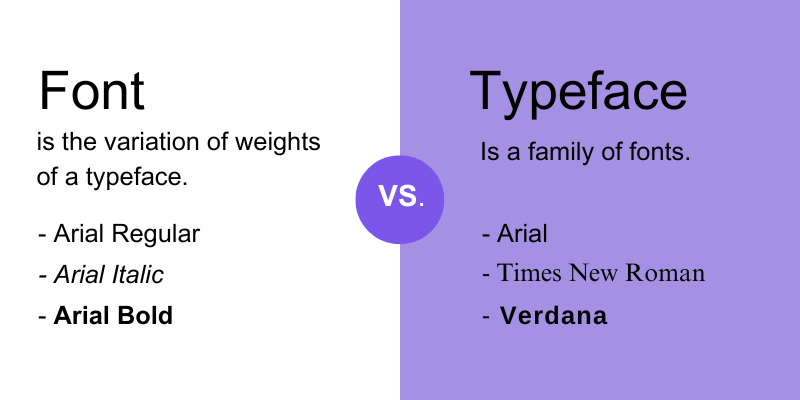
Typefaces and fonts are facets of typography. Although both are connected one way or another, they can’t be used interchangeably.
Typeface refers to the family of font styles that have similar strokes or designs. For example, these are different typefaces:
- Comic Sans MS
- Georgia
- Impact
On the other hand, fonts have everything to do with the style, weights, and size of the typeface. Weights can mean setting the typeface to regular, italic, or bold. And font size, well, it’s self-explanatory. Here’s an example to understand both better:
There are four common typefaces, and they are serif, sans serif, script, and decorative or display typefaces. Let’s dissect each one:
Serif
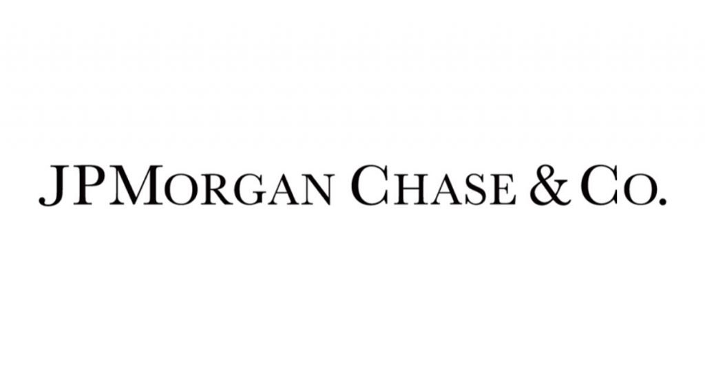
A serif typeface has little extra strokes at the end of a letter. This type usually exudes an air of authority, trust, and respectability. Brands that use a serif family of fonts tend to have class and grandeur. Typically, these brands also lean towards a more traditional system, with more formal branding.
An example would be JP Morgan Chase & Co. Since financial institutions follow more conventional management, this type would be suitable.
Sans Serif
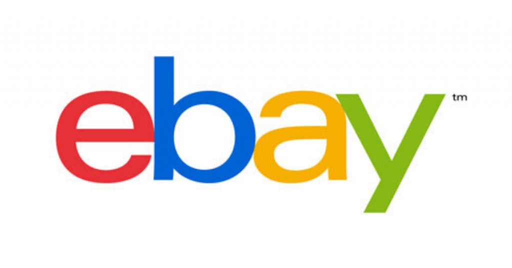
Sans serif typefaces don’t have the additional stroke at the end of the letters, making this type more fresh and modern. Designs with sans serif styles are also crisp, clean, and have a straightforward appeal.
This type is apt for brands with a younger audience and a more casual branding. The online store eBay dons a neat and straightforward sans serif logo, with different colors. It’s akin to the brand’s informal branding.
Script
Script typefaces are cursive styles that are geared towards more creative branding. Brands that want to showcase their creative flair could work well with this type. This style is also suitable for brands that lean on visuals.
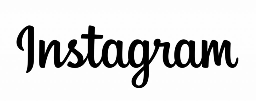
One example is Instagram’s logo. This social media platform that heavily relies on visuals has a simple and upright script logo design. Though some script typefaces exude elegance and formality, Instagram still conveys their friendly and approachable identity through a less-formal script typeface.
Decorative or Display
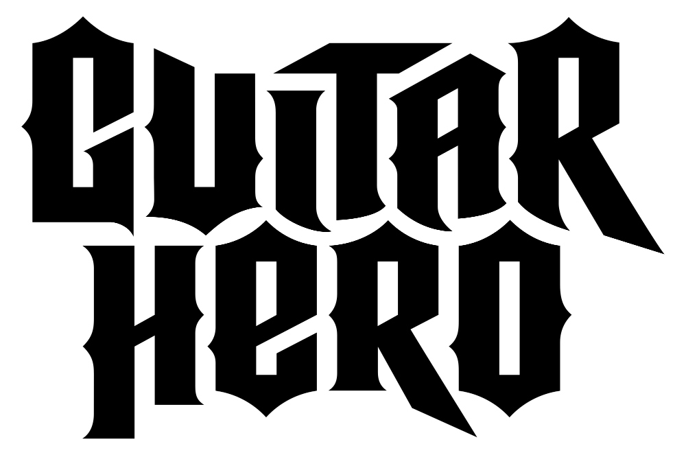
Last but not least is decorative or display typefaces. These are used for brands that have more playful and fun branding. There is a myriad of decorative typeface varieties, and brands can make their typography designs unique by giving this type their distinct twist. Guitar Hero’s typography logo design is the perfect example of this.
How Can You Make Typography Designs Work?
Typography designs don’t come out of an online designing tool in seconds. It takes careful deliberation and design factors to craft one that works well with a brand’s principle and identity.
Here are some elements to include in your typography designs:
Legibility
First off, what good is a typography design or logo if your audience can’t read it? Legibility should be of the essence when your brand relies on typography for your marketing approach.
Font Size
Think of the right font size and how you can mix various typefaces, so it comes out readable. Print projects should be in the 10-to-12 font size range, while web projects should be around 15 to 20.
Style Combinations
Mixing one or two typefaces or font styles will not only add hierarchy to your typography designs. It will also give your project design clarity that appeals to your audience. But the general rule of thumb is to stick to a maximum of three different typefaces to avoid a complex output.
Typography Spacing
Three critical factors in the art of typography are leading, tracking, and kerning:
Leading
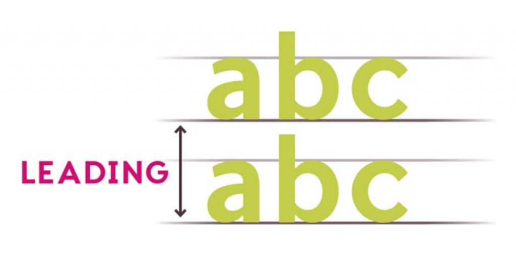
Leading refers to vertical space between each text.
Tracking
Tracking pertains to the horizontal space between each character.
Kerning
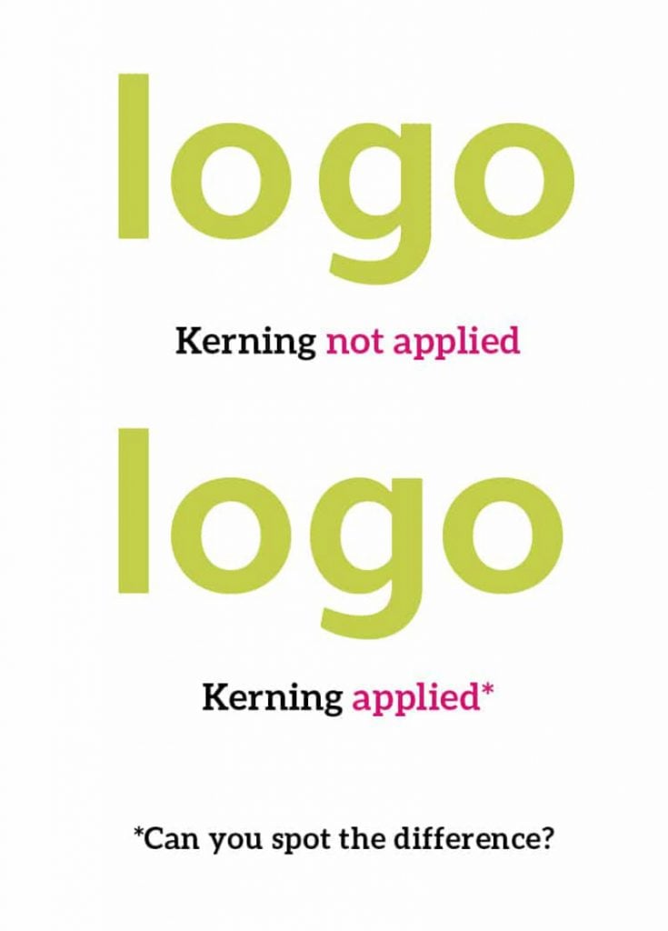
Lastly, kerning is the space between characters, just like tracking. The only difference is that unlike tracking, the spaces vary due to different character strokes and styles. Hence, this requires the naked eye to set the spacing evenly between characters.
White Space
Adding white space to your typography projects is vital to let the eyes rest. This also allows audiences to breeze through the information without difficulty.
Requesting a Typography Design from Penji
Many design newbies are intimidated upon learning the nitty-gritty of typography. There are just so many elements to consider! Also, knowing what kerning means and doing its proper application are two different things.
Luckily, you can get a typography design from Penji for as little as 24 hours, and it only takes three simple steps:
1. Create the Project
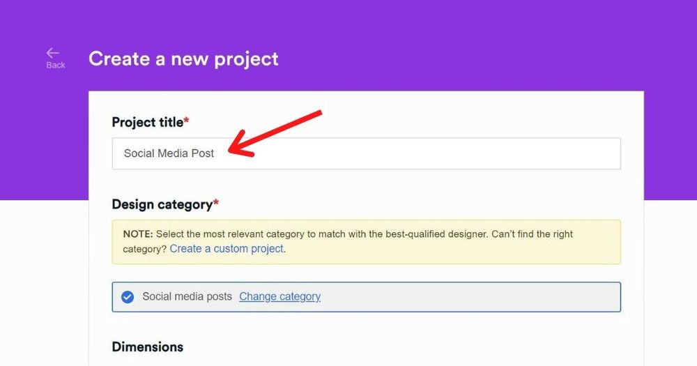
In the dashboard, click New Project. Type in the title of the project and select a category from our list. Then, choose the size. In the description box, describe the design that you have in mind. Feel free to include your preferred color scheme or choose royalty-free images if you want any incorporated in your graphic. Click Create Project, and it will be assigned to the best designer for the job.
2. Review and Revise
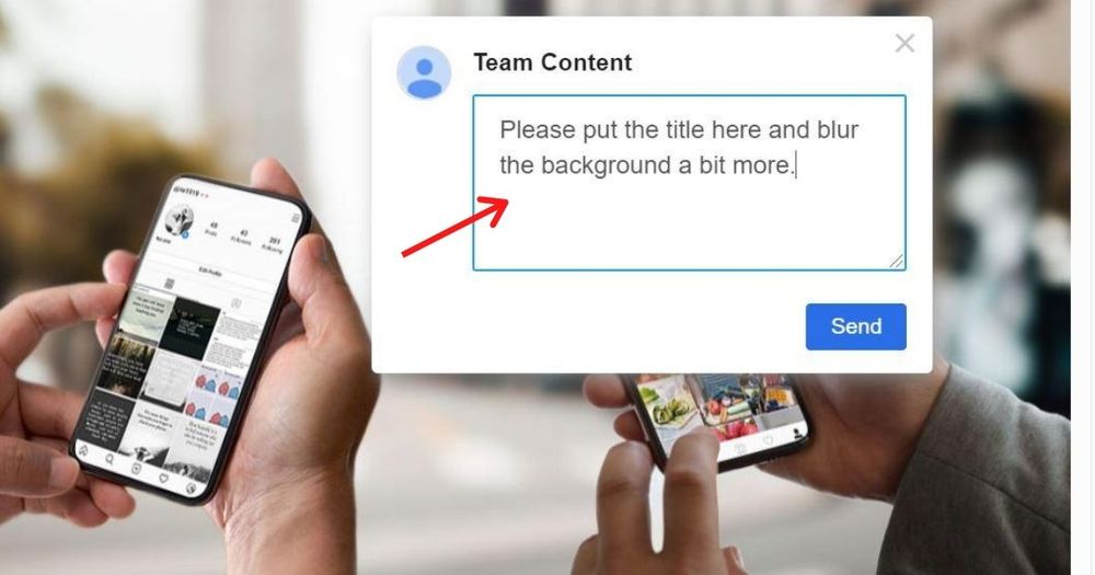
Within 24 to 48 hours, the designer will send you a draft of the design. To view it, simply click on the file in the thread. If it looks great to you, proceed to the third step. If you want it revised, click on the part you want to be changed and type in your comments.
PRO TIP: Communication is key to help the designer create a graphic that best fits your requirements. If you find it hard to describe what you need, attaching reference photos to inspire the design might help.
3. Download
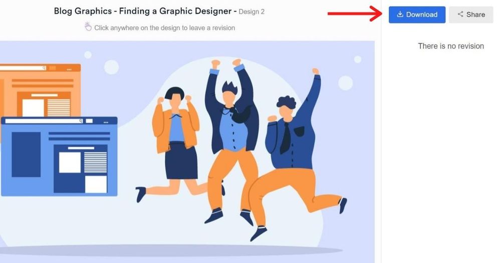
Once you’re happy with the design, click the “Download” button and it will automatically be saved to your computer.
Why Companies Are All for Typography Projects
Never underestimate the power of typography. When the right typographic elements are added, these designs could engage your audience. And fortunately, lead them at the bottom of the sales funnel.
Additionally, companies also need better typographic skills not only for their marketing collaterals but also for their websites and landing pages. From the logo, heading, down to the subtitle and body of your designs, typography plays a significant role in communicating your branding.
That said, when it comes to typography designs, a well-thought-out layout should be taken into account. Penji, an unlimited graphic design service, is a name you can entrust your typography projects. For a flat monthly rate, your business can get unlimited typography designs.
But that’s not all. Whether it’s for your brand’s brochures, billboards, posters, or calling cards, Penji’s team of professional graphic designers will always have your back.
Discover our packages today and try our services 100% risk-free for 15 days.


