


Coffee has become a lot more than a pick-me-up for the bored and sleepy. Over the years, the culture of consuming this popular stimulant has become an important part of social gatherings and human connection. It’s not surprising that cafes and retailers are now putting much focus on coffee packaging designs and solutions. For one, the types of packaging bags should be able to help preserve the quality of the beans or grounds. At the same time, the wrapping should also act as an effective marketing material.
If you’re a marketer or an entrepreneur who’s searching for coffee wrapping mockup examples, free template, or Pinterest inspiration, then you’ve come to the right place. We’re rounding up ten of the best-designed packagings in the coffee industry. We’re also going to analyze what makes them unique and how they push the brand forward.
Get professional graphic designs for your business by subscribing to Penji. Offering unlimited graphic design with unlimited revisions at a flat monthly rate, Penji is an affordable solution for ventures of all sizes.
Branding and Coffee Packaging Designs
But first, let’s take a look at the importance of coffee packaging designs in branding. According to the American Marketing Association, product wrapping does a lot in promoting awareness about the brand.
How exactly can you gear your wrapping to make the best first impression among prospects? First of all, it should prominently display the brand name. Showing the brand name on the packaging encourages brand recall, given that the name is easy to pronounce and memorize.
Secondly, it should show sufficient information about the product. In the case of coffee, the label should tell basic information vital to consumer decisions. It should say whether it’s a single-origin variety or a blend. The type of roast and the origin of the beans should also be indicated.
Last but not least, it should also show a good visual representation of brand identity. The business brand should shine through and give consumers a good idea of what the venture values and stands for.
10 Best Coffee Packaging Designs of 2020
Before you brainstorm for content design, email marketing and social media marketing, it’s best to focus on package design first. Here are ten of the best ones we’ve seen online and what makes them stand out from the rest.
1. Braxton Brewing Co.
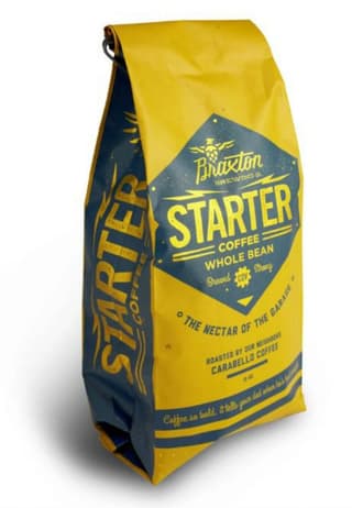
Image Credit: Braxton Brewing Co.
This packaging offers a bright and young look that attracts attention. The muted golden yellow and navy blue create a dynamic palette that intrigues the viewer. Being a brand that also offers home-brewed beer, the coffee wrapping focuses on the business’ fun and bold personality. The coffee looks like something you’d love to have to kill a post-beer-drinking-session buzz.
2. Cameron’s Specialty Coffee
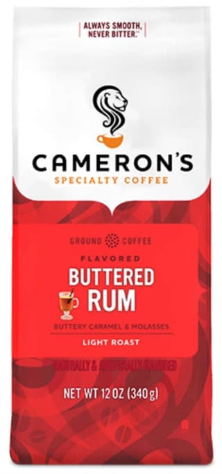
Image Credit: Cameron’s Specialty Coffee
This product looks classy and premium. The packaging places a certain emphasis on the brand logo. At the center part of the design is the variant name, Buttered Rum. Beside it is a small but delicious-looking image of a glass filled with what looks like rum and melted butter. The red and maroon abstract background gives the wrapping a cohesive look.
3. Koffee Kult
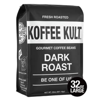
Image Credit: Koffee Kult
One look at this and you’ll know that you’re in for a cup that will jolt you out of sleep. The simple but classic combination of black and white makes for a straightforward design. In the same vein, the bold sans serif font creates a no non-sense air of authority. The bag looks like a product that’s sure of itself and what it has to offer.
4. Marley Coffee
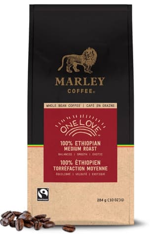
Image Credit: Marley Coffee
This business was founded by Bob Marley’s son, Rohan Marley, who created a brand inspired by music and the Earth. That identity could be seen in the product packaging. The black and kraft packaging creates a good canvas for the intricate lion logo and brand name. The label looks professional and formal, but the variant name gives it an organic feel. The small tri-color line of red, green, and yellow invokes rasta vibes the brand drew its inspiration from.
5. Thrive Market
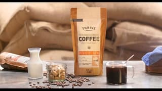
Image Credit: Thrive Market
Brown paper resealable pouch makes this coffee look rustic and honest-to-goodness homely. In the same vein, the design elements make the product look organic without appearing amateur. The variety of typefaces is more than usual. However, skillful layout made all the font styles work well together without overpowering one another.
6. George Howell
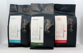
Image Credit: George Howell
This brand was founded by its namesake veteran coffee pioneer. The product features a design that aptly represents a brand built around an expert. The gold-colored brand logo stands out amid a black background. The white-toned label, on the other hand, shows basic data about the coffee. Accent hues add a pop of color to the design that would look plain otherwise.
7. Organic Tierra Del Sol
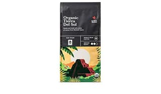
Image Credit: Organic Tierra Del Sol
This design offers a perfect mix of creativity and simplicity. The product name, written in a serif font, is emphasized on the upper left side. The center part of the design displays basic information about the coffee, including product and roast type. The gridlines and simple images make the facade easy to digest. Consequently, the colorful illustration at the bottom half part steals the show.
8. Equal Exchange
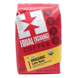
Image Credit: Equal Exchange
This is an example of a busy and playful design that works. The slanted layout features the logo at the top corner and the variant information on a bar near the bottom. The white logo and the yellow bar contrasts well with the red hues of the coffee bag. The design doesn’t have a lot of negative space. However, the cohesive background palette prevents the design from being overwhelming.
9. GGET
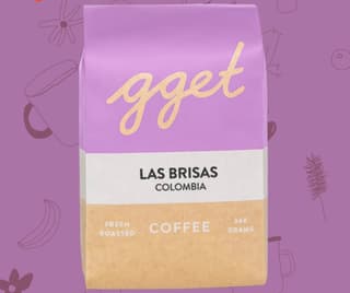
Image Credit: GGET
Short for Go Get ‘Em Tiger, GGET’s branding is young and inclusive. Their logo, which features a cursive font style, represents this identity. Their coffee variants come in minimalist but jolly designs. As a result, the coffee bags look bright and lively but far from looking noisy.
10. Devocion
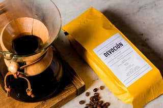
Image Credit: Devocion
This product might be one of the simplest but effective coffee packaging designs at present. The Tuscan sun yellow bag gives the wrapping all the brightness it needs to stand out. The label is fittingly plain – black text on a white background. Good layout and a distinctive typeface for the brand name gives the packaging a certain character and an air of confidence.


